

Flex 布局
准备这篇写详细点,可能会花费一下午,计划赶不上变化啊,开写!
本文参考了阮一峰老师的Flex 布局教程:语法篇和Flex 布局教程:实例篇,感谢
注意点:
-
行内元素也可以使用 Flex 布局。
.box{ display: inline-flex; } -
Webkit 内核的浏览器,必须加上
-webkit前缀。.box{ display: -webkit-flex; /* Safari */ display: flex; } -
设为 Flex 布局以后,子元素的
float、clear和vertical-align属性将失效。
概念
Flex 布局的英文全称是 Flexible Box,中文一般叫弹性盒子模型。
采用了 Flex 的元素称为 Flex 容器Flex Container,该元素下面的所有子元素自动成为该容器成员Flex Item,也可以称为容器项目。
容器默认存在两根轴:水平的主轴main axis和垂直的交叉轴cross axis。
容器的属性
- flex-direction
- flex-wrap
- flex-flow
- justify-content
- align-items
- align-content
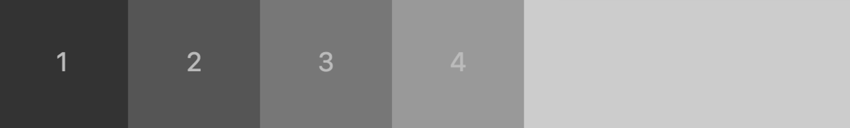
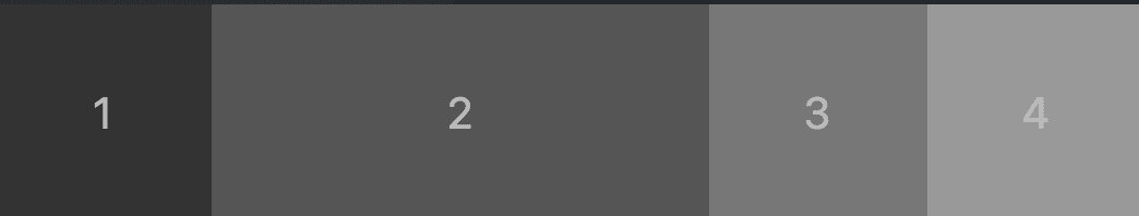
先说下本文采用的示例代码,后面的示例会基于这个修改,我会贴出关键部分,box 数量变化之类的就不贴出来了。
<html lang="en">
<head>
    <meta charset="UTF-8">
    <meta name="viewport" content="width=device-width, initial-scale=1.0">
    <meta http-equiv="X-UA-Compatible" content="ie=edge">
    <title>Flex 布局</title>
    <style>
        .total {
            display: flex;
            flex-direction: row;
        }
        .box {
            font-size: 20px;
            line-height: 100px;
            text-align: center;
            height: 100px;
            width: 100px;
        }
        .box1 {
            background: #333333;
        }
        .box2 {
            background: #555555;
        }
        .box3 {
            background: #777777;
        }
        .box4 {
            background: #999999;
        }
    </style>
</head>
<body>
    <div class="total">
        <div class="box1 box">1</div>
        <div class="box2 box">2</div>
        <div class="box3 box">3</div>
        <div class="box4 box">4</div>
    </div>
</body>
</html>
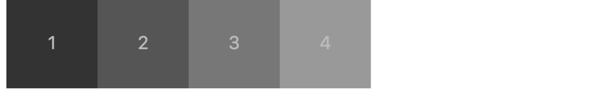
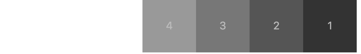
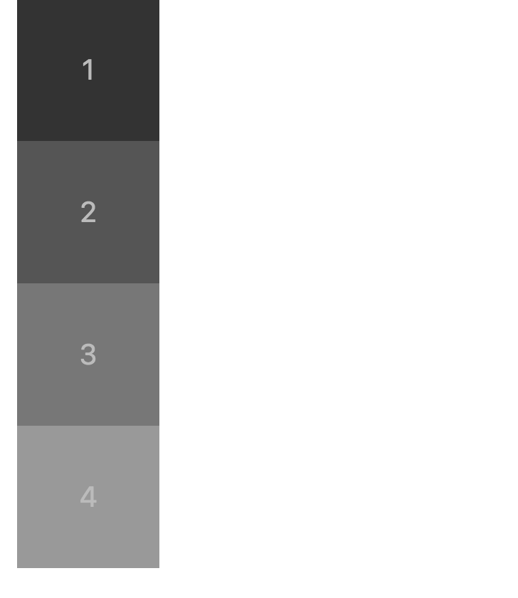
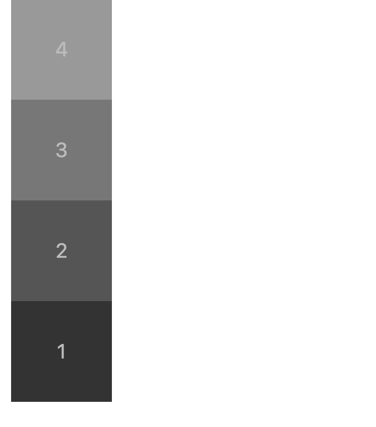
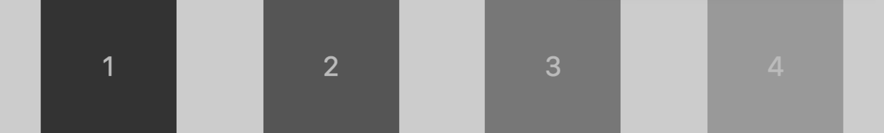
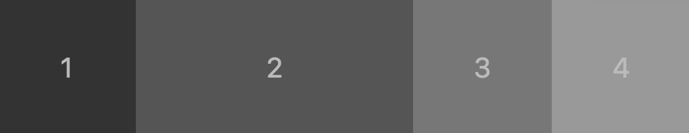
flex-direction
row(默认值):主轴为水平方向,起点在左端。row-reverse:主轴为水平方向,起点在右端。column:主轴为垂直方向,起点在上沿。column-reverse:主轴为垂直方向,起点在下沿。
row
.total {
    display: flex;
    flex-direction: row;
}
row-reverse
.total {
    display: flex;
    flex-direction: row-reverse;
}
column
.total {
    display: flex;
    flex-direction: column;
}
column-reverse
.total {
    display: flex;
    flex-direction: column-reverse;
}
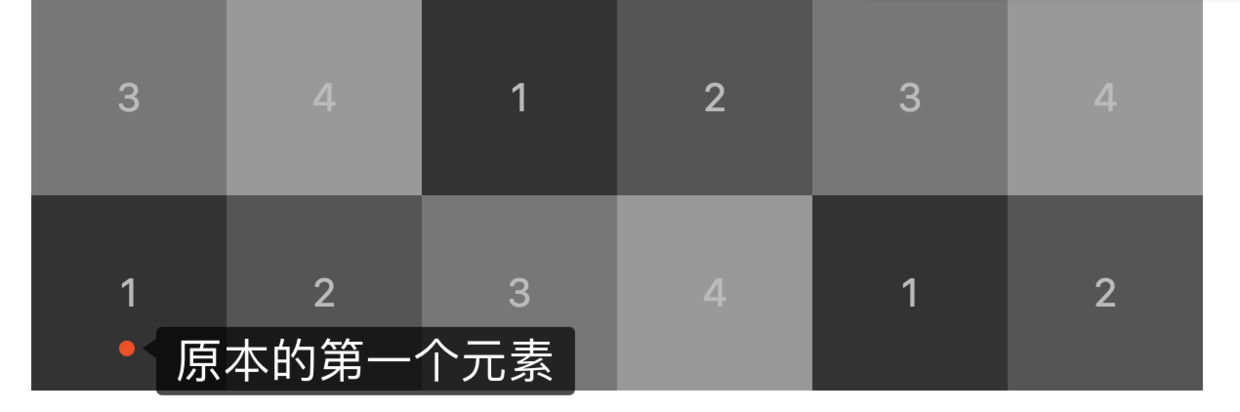
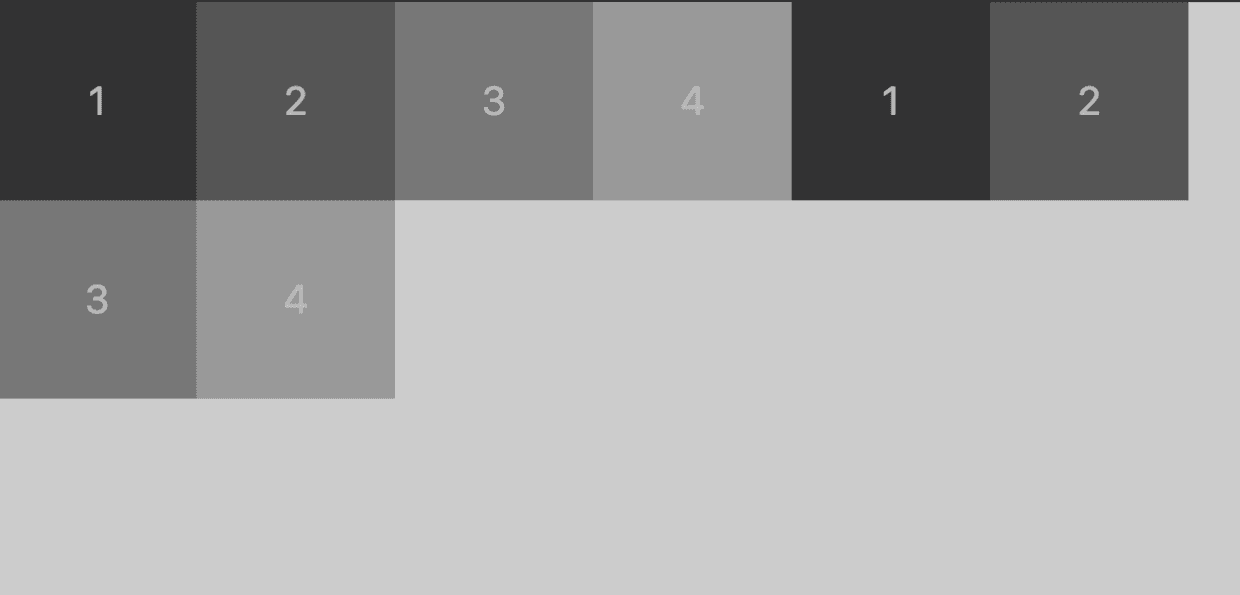
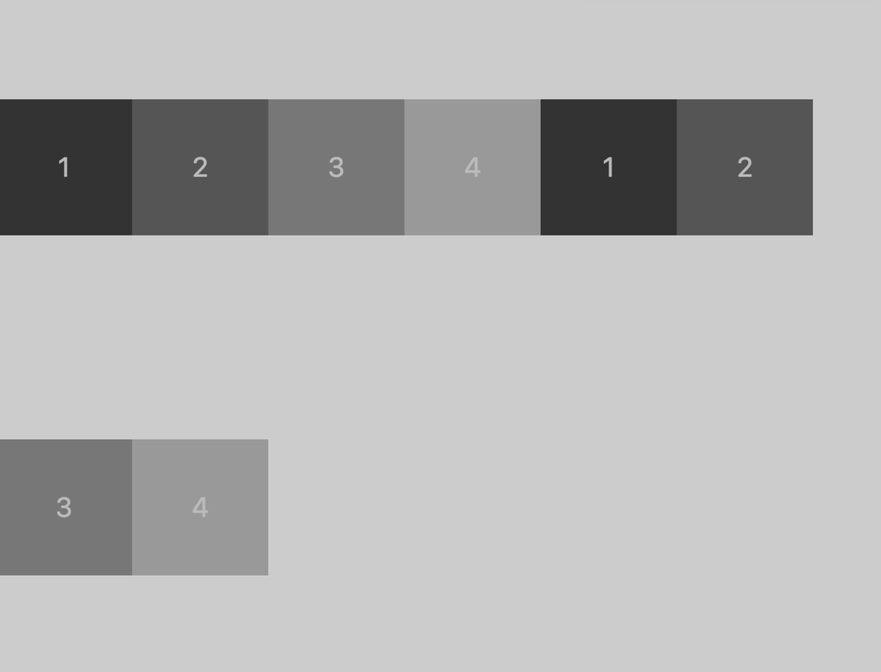
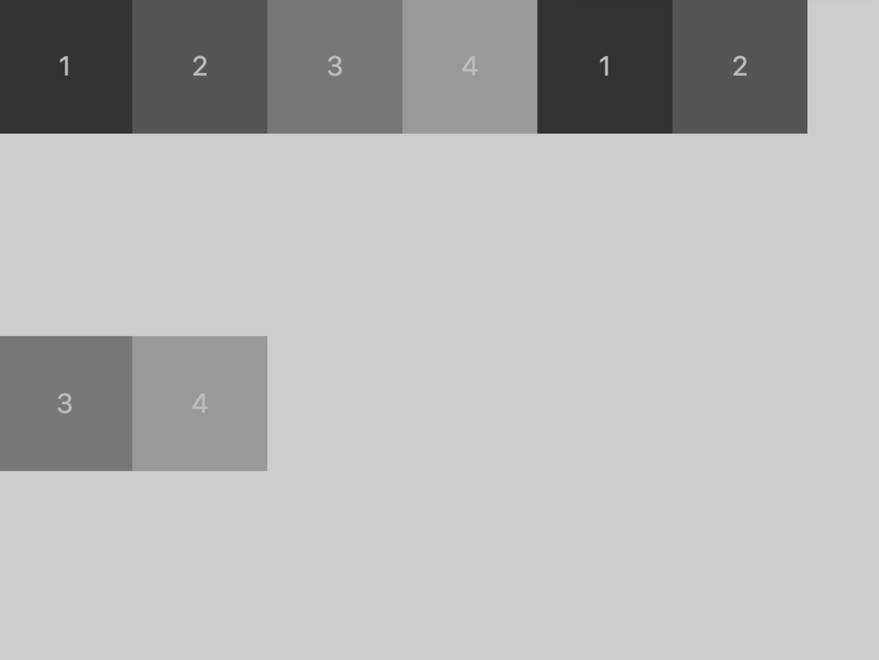
flex-wrap
nowrap(默认):不换行。元素宽度会被挤压。wrap:换行,第一行在上方。wrap-reverse:换行,第一行在下方。
nowrap
.total {
    display: flex;
    flex-direction: row;
    flex-wrap: nowrap;
}
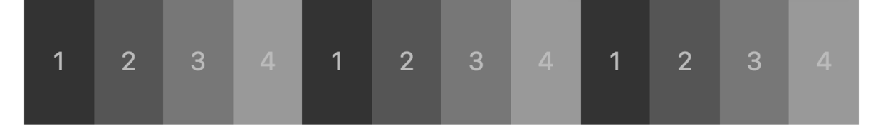
wrap
flex-wrap: wrap;
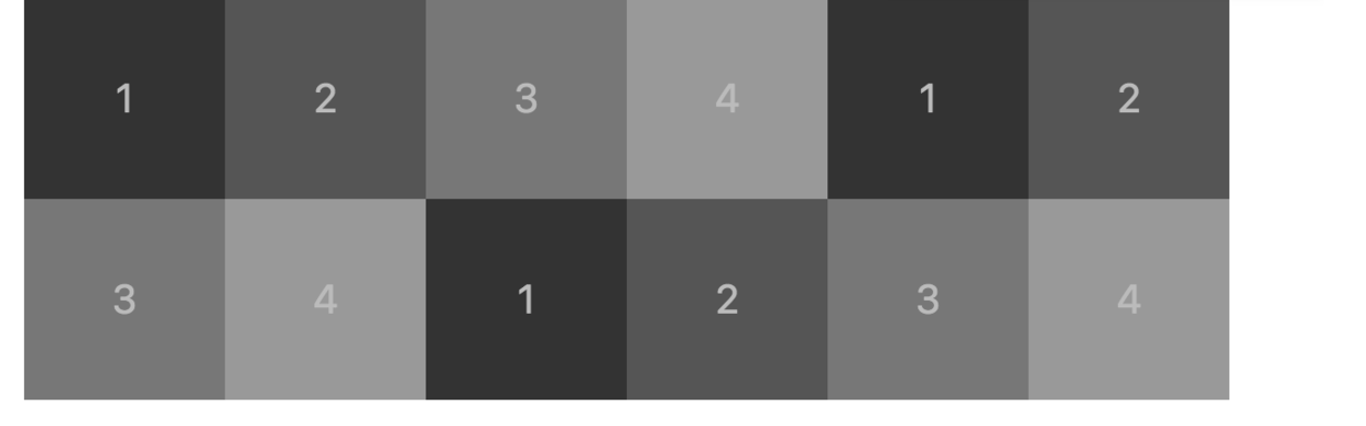
wrap-severse
flex-wrap: wrap-reverse;
flex-flow
flex-flow属性是flex-direction属性和flex-wrap属性的简写形式,默认值为row nowrap。可以将上面两者随意搭配,写起来方便一些。
.total {
    display: flex;
    flex-flow: row wrap;
}
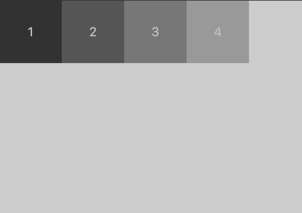
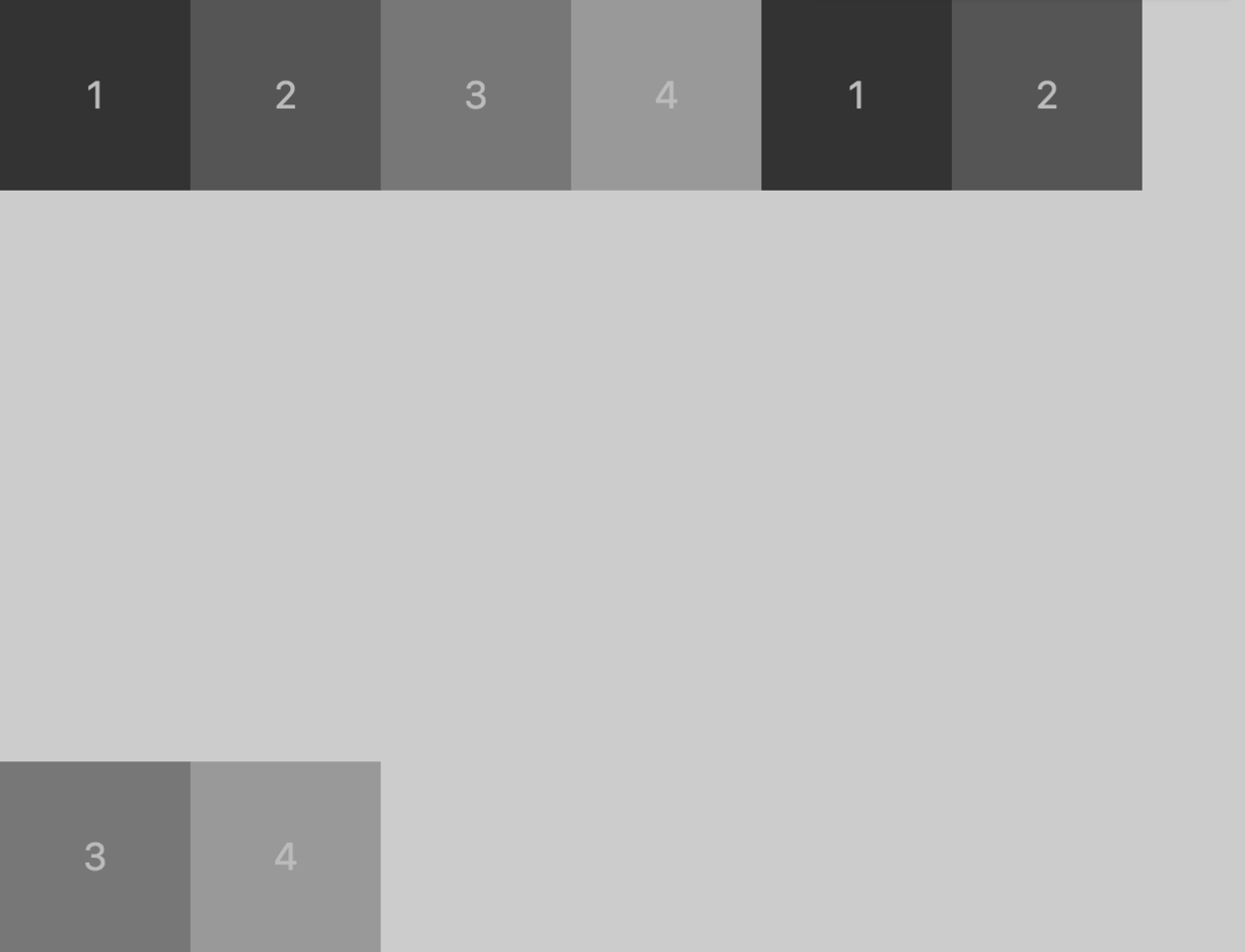
justify-content
justify-content属性定义了子元素在主轴上的对齐方式。为了显示效果更好一点,这边我把最外层的背景色换了一下。
flex-start(默认值):左对齐flex-end:右对齐center: 居中space-between:两端对齐,项目之间的间隔都相等。space-around:每个项目两侧的间隔相等。所以,项目之间的间隔比项目与边框的间隔大一倍。
flex-start
.total {
    display: flex;
    flex-flow: row wrap;
    justify-content: center;
    height: 500px;
    background: #cccccc
}
flex-end
justify-content: flex-end;

center
justify-content: center;

space-between
justify-content: space-between;

space-around
justify-content: space-around;
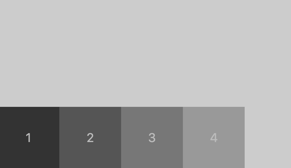
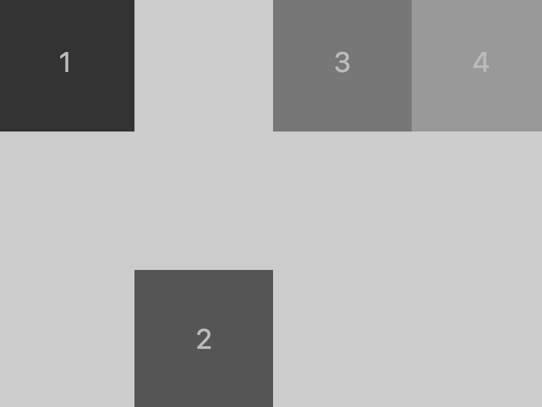
align-items
flex-start:交叉轴的起点对齐。flex-end:交叉轴的终点对齐。center:交叉轴的中点对齐。baseline: 项目的第一行文字的基线对齐。stretch(默认值):如果项目未设置高度或设为auto,将占满整个容器的高度。
flex-start / baseline / stretch (仅在我这个例子中相同,但注意自己的使用场景)
.total {
    display: flex;
    flex-flow: row wrap;
    justify-content: flex-start;
    align-items: flex-start;
    height: 500px;
    background: #cccccc
}
flex-end
align-items: flex-end;
center
align-items: center;
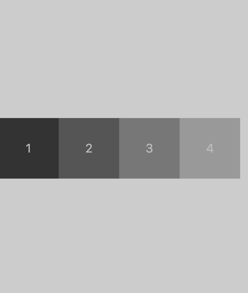
align-content
align-content属性定义了多根轴线的对齐方式。如果项目只有一根轴线,该属性不起作用。
flex-start:与交叉轴的起点对齐。flex-end:与交叉轴的终点对齐。center:与交叉轴的中点对齐。space-between:与交叉轴两端对齐,轴线之间的间隔平均分布。space-around:每根轴线两侧的间隔都相等。所以,轴线之间的间隔比轴线与边框的间隔大一倍。stretch(默认值):轴线占满整个交叉轴。
flex-start
.total {
    display: flex;
    flex-flow: row wrap;
    justify-content: flex-start;
    align-content: flex-start;
    height: 500px;
    background: #cccccc
}
flex-end
align-content: flex-end;
center
align-content: center
space-between
align-content: space-between
space-around
align-content: space-around
stretch
align-content: space-around
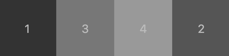
项目的属性
orderflex-growflex-shrinkflex-basisflexalign-self
order
order属性定义项目的排列顺序。数值越小,排列越靠前,默认为0。
.box2 {
    background: #555555;
    order: 1;
}
flex-grow
flex-grow属性定义项目的放大比例,默认为0,即如果存在剩余空间,也不放大。前提是有剩余空间。
.box2 {
    background: #555555;
    flex-grow: 0.5;  // 放大为原来的两倍
}
flex-shrink
flex-shrink属性定义了项目的缩小比例,默认为1,即如果空间不足,该项目将缩小。和上面类似,就不举例子了。前提是空间不足。
flex-basis
flex-basis属性定义了在分配多余空间之前,项目占据的主轴空间(main size)。浏览器根据这个属性,计算主轴是否有多余空间。它的默认值为auto,即项目的本来大小。
.box2 {

    background: #555555;

    flex-basis: 200px;

}
flex
flex属性是flex-grow, flex-shrink 和 flex-basis的简写,默认值为0 1 auto。后两个属性可选。
该属性有两个快捷值:auto (1 1 auto) 和 none (0 0 auto)。
建议优先使用这个属性,而不是单独写三个分离的属性,因为浏览器会推算相关值。
align-self
align-self属性允许单个项目有与其他项目不一样的对齐方式,可覆盖align-items属性。默认值为auto,表示继承父元素的align-items属性,如果没有父元素,则等同于stretch。
// 父元素
.total {
    display: flex;
    flex-flow: row wrap;
    align-items: flex-start;
    height: 300px;
    background: #cccccc
}
// 子元素
.box2 {
    background: #555555;
    align-self: flex-end;
}
花了半天时间把 Flex 布局梳理了一遍,记忆也更深刻了,这篇 blog 其实感觉就是把阮一峰老师的那篇 copy 了一下,然后自己动手试一下,当然实战中布局不可能这么耿直,更多的还得参考阮一峰老师的实战篇。以后多练习吧。
