

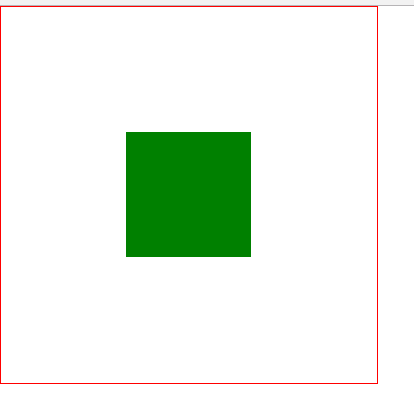
话不多说,先上效果图
效果图
html布局
<div class="wap">
		<div class="center">

		</div>
	</div>
以下是css代码
第一种
采用绝对定位
            .wap{
			width: 300px;
			height: 300px;
			border: solid 1px red;
			position: relative;
		}
		.center{
			width: 100px;
			height: 100px;
			background: green;
			position: absolute;
			top: 50%;
			left: 50%;
			transform: translate(-50%,-50%);

		}
第二种
flex布局
对进行布局的父容器的display进行设置
                .wap{
			width: 300px;
			height: 300px;
			border: solid 1px red;
			display: flex;
			justify-content: center;
			align-items: center;

		}
		.center{
			width: 100px;
			height: 100px;
			background: green;

		}
第三种
表格布局
父元素设置为 display:table-cell;vertical-align:middle;text-align:center;子元素设置为:display:inline-bock;
        .wap{
			width: 300px;
			height: 300px;
			border: solid 1px red;
			display: table-cell;
			vertical-align:middle;


		}
		.center{
			width: 100px;
			height: 100px;
			background: green;
			display: inline-block;

		}
第四种
栅格布局
给父元素设置 display:gird; justify-content:center; align-items:center;
                .wap{
			width: 300px;
			height: 300px;
			border: solid 1px red;
			display: grid;
			justify-content: center;
			align-content: center;

		}
		.center{
			width: 100px;
			height: 100px;
			background: green;

		}
第五种
还是绝对定位只不过把transform:translate(-50%,-50%)变成margin-left:50%,margin-right:50%;
