居中布局
水平居中
- text-align:center
<style>
  .container {
    text-align: center;
  }
  .children {
    display: inline-block;
    background: blue;
  }
</style>
<body>
  <div class="container">
    <div class="children">children</div>
  </div>
</body>
- margin: 0 auto
<style>
  .children {
    width: 100px;
    margin: 0 auto;
    background: blue;
  }
</style>
<body>
  <div class="container">
    <div class="children">children</div>
  </div>
</body>
- flex
<style>
  .container {
    display: flex;
    justify-content: center;
  }
  .children {
    width: 100px;
    background: blue;
  }
</style>
<body>
  <div class="container">
    <div class="children">children</div>
  </div>
</body>
- absolute+transform
<style>
  .children {
    position: absolute;
    left: 50%;
    transform: translate(-50%, 0);
    width: 100px;
    background: blue;
  }
</style>
<body>
  <div class="container">
    <div class="children">children</div>
  </div>
</body>
垂直居中
- line-height
<style>
  .container {
    height: 500px;
    line-height: 500px;
    background: green;
  }
  .children {
    display: inline;
    height: 100px;
    background: blue;
  }
</style>
<body>
  <div class="container">
    <div class="children">children</div>
  </div>
</body>
- flex
<style>
  .container {
    display: flex;
    align-items: center;
    height: 500px;
    background:green;
  }
  .children {
    height: 100px;
    background: blue;
  }
</style>
<body>
  <div class="container">
    <div class="children">children</div>
  </div>
</body>
- absolute+transform
<style>
  .container {
    position: relative;
    height: 500px;
    background:green;
  }
  .children {
    position: absolute;
    top: 50%;
    transform: translate(0, -50%);
    height: 100px;
    background: blue;
  }
</style>
<body>
  <div class="container">
    <div class="children">children</div>
  </div>
</body>
- table cell
<style>
  .container {
    display: table-cell;
    vertical-align: middle;
    height: 500px;
    background:green;
  }
  .children {
    height: 100px;
    background: blue;
  }
</style>
<body>
  <div class="container">
    <div class="children">children</div>
  </div>
</body>
- margin
<style>
  .container {
    position: relative;
    height: 500px;
    background:green;
  }
  .children {
    position: absolute;
    top:0;
    bottom: 0;
    margin: auto 0;
    height: 100px;
    background: blue;
  }
</style>
<body>
  <div class="container">
    <div class="children">children</div>
  </div>
</body>
水平垂直居中
- absolute+transform
<style>
  .container {
    position: relative;
    width: 100%;
    height: 500px;
    background:green;
  }
  .children {
    position: absolute;
    left: 50%;
    top: 50%;
    transform: translate(-50%, -50%);
    width: 100px;
    height: 100px;
    background: blue;
  }
</style>
<body>
  <div class="container">
    <div class="children">children</div>
  </div>
</body>
- flex
<style>
  .container {
    display: flex;
    justify-content: center;
    align-items: center;
    width: 100%;
    height: 500px;
    background:green;
  }
  .children {
    width: 100px;
    height: 100px;
    background: blue;
  }
</style>
<body>
  <div class="container">
    <div class="children">children</div>
  </div>
</body>
- margin
<style>
  .container {
    position: relative;
    width: 100%;
    height: 500px;
    background:green;
  }
  .children {
    position: absolute;
    left: 0;
    right: 0;
    top: 0;
    bottom: 0;
    margin: auto;
    width: 100px;
    height: 100px;
    background: blue;
  }
</style>
<body>
  <div class="container">
    <div class="children">children</div>
  </div>
</body>
- table-cell
<style>
  .container {
    display: table-cell;
    text-align: center;
    vertical-align: middle;
    width: 100vw;
    height: 500px;
    background:green;
  }
  .children {
    display: inline-block;
    width: 100px;
    height: 100px;
    background: blue;
  }
</style>
<body>
  <div class="container">
    <div class="children">children</div>
  </div>
</body>
多列布局
一列定宽,一列自适应
- float+margin
<style>
  .left {
    float: left;
    width: 100px;
    background:green;
  }
  .right {
    margin-left: 100px;
    background: blue;
  }
</style>
<body>
  <div class="left">
    left
  </div>
  <div class="right">right</div>
</body>
- float+overflow
<style>
  .left {
    float: left;
    width: 100px;
    background:green;
  }
  .right {
    overflow: hidden;
    background: blue;
  }
</style>
<body>
  <div class="left">
    left
  </div>
  <div class="right">right</div>
</body>
- table
<style>
  .parent {
    display: table;
    width: 100%;
  }
  .left {
    display: table-cell;
    width: 100px;
    background:green;
  }
  .right {
    display: table-cell;
    background: blue;
  }
</style>
<body>
  <div class="parent">
    <div class="left">left</div>
    <div class="right">right</div>
  </div>
</body>
- flex
<style>
  .parent {
    display: flex;
    width: 100%;
  }
  .left {
    width: 100px;
    background:green;
  }
  .right {
    flex: 1;
    background: blue;
  }
</style>
<body>
  <div class="parent">
    <div class="left">left</div>
    <div class="right">right</div>
  </div>
</body>
多列定宽,一列自适应
- float+overflow
<style>
  .parent {
    width: 100%;
  }
  .left-one, .left-two {
    float: left;
    width: 100px;
  }
  .left-one {
    background: green;
  }
  .left-two {
    background: yellow;
  }
  .right {
    overflow: hidden;
    background: blue;
  }
</style>
<body>
  <div class="parent">
    <div class="left-one">left-one</div>
    <div class="left-two">left-two</div>
    <div class="right">right</div>
  </div>
</body>
- table
<style>
  .parent {
    display: table;
    width: 100%;
  }
  .left-one, .left-two {
    display: table-cell;
    width: 100px;
  }
  .left-one {
    background: green;
  }
  .left-two {
    background: yellow;
  }
  .right {
    display: table-cell;
    background: blue;
  }
</style>
<body>
  <div class="parent">
    <div class="left-one">left-one</div>
    <div class="left-two">left-two</div>
    <div class="right">right</div>
  </div>
</body>
- flex
<style>
  .parent {
    display: flex;
    width: 100%;
  }
  .left-one, .left-two {
    width: 100px;
  }
  .left-one {
    background: green;
  }
  .left-two {
    background: yellow;
  }
  .right {
    flex: 1;
    background: blue;
  }
</style>
<body>
  <div class="parent">
    <div class="left-one">left-one</div>
    <div class="left-two">left-two</div>
    <div class="right">right</div>
  </div>
</body>
三栏(左右栏固定宽度中间自适应)
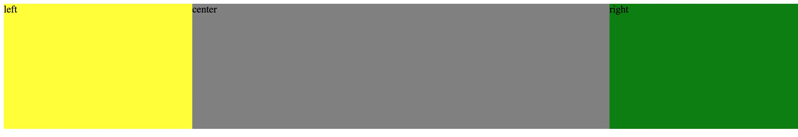
- 绝对定位
<style>
  .container div {
    position: absolute;
    min-height: 200px;
  }
  .left {
    left: 0;
    width: 300px;
    background: yellow;
  }
  .center {
    left: 300px;
    right: 300px;
    background: gray;
  }
  .right {
    right: 0;
    width: 300px;
    background: green;
  }
</style>
<body>
  <div class="container">
    <div class="left">left</div>
    <div class="center">center</div>
    <div class="right">right</div>
  </div>
</body>
- float
<style>
.container div {
min-height: 200px;
}
.left {
float: left;
width: 300px;
background: yellow;
}
.center {
background: gray;
}
.right {
float: right;
width: 300px;
background: green;
}
</style>
<body>
<div class="container">
<div class="left">left</div>
<div class="right">right</div>
<div class="center">center</div>
</div>
</body>
- flex
<style>
  .container {
    display: flex;
    min-height: 200px;
  }
  .left {
    width: 300px;
    background: yellow;
  }
  .center {
    flex: 1;
    background: gray;
  }
  .right {
    width: 300px;
    background: green;
  }
</style>
<body>
  <div class="container">
    <div class="left">left</div>
    <div class="center">center</div>
    <div class="right">right</div>
  </div>
</body>
- 表格布局
<style>
  .container {
    width:100%;
    display: table;
    min-height: 200px;
  }
  .container div {
    display: table-cell;
  }
  .left {
    width: 300px;
    background: yellow;
  }
  .center {
    background: gray;
  }
  .right {
    width: 300px;
    background: green;
  }
</style>
<body>
  <div class="container">
    <div class="left">left</div>
    <div class="center">center</div>
    <div class="right">right</div>
  </div>
</body>
- 网格布局
<style>
  .container {
    width:100%;
    display: grid;
    grid-template-rows: 200px;
    grid-template-columns: 300px auto 300px;
  }
  .left {
    background: yellow;
  }
  .center {
    background: gray;
  }
  .right {
    background: green;
  }
</style>
<body>
  <div class="container">
    <div class="left">left</div>
    <div class="center">center</div>
    <div class="right">right</div>
  </div>
</body>
等分
- float
<style>
  .parent {
    width: 100%;
  }
  .one, .two, .three, .four{
    float: left;
    width: 25%;
  }
  .one {
    background: green;
  }
  .two {
    background: yellow;
  }
  .three {
    background: blue;
  }
  .four {
    background: red;
  }
</style>
<body>
  <div class="parent">
    <div class="one">one</div>
    <div class="two">two</div>
    <div class="three">three</div>
    <div class="four">four</div>
  </div>
</body>
- table
<style>
  .parent {
    display: table;
    width: 100%;
  }
  .one, .two, .three, .four{
    width: 25%;
    display: table-cell;
  }
  .one {
    background: green;
  }
  .two {
    background: yellow;
  }
  .three {
    background: blue;
  }
  .four {
    background: red;
  }
</style>
<body>
  <div class="parent">
    <div class="one">one</div>
    <div class="two">two</div>
    <div class="three">three</div>
    <div class="four">four</div>
  </div>
</body>
- flex
<style>
  .parent {
    display: flex;
    width: 100%;
  }
  .one, .two, .three, .four{
    flex: 1;
  }
  .one {
    background: green;
  }
  .two {
    background: yellow;
  }
  .three {
    background: blue;
  }
  .four {
    background: red;
  }
</style>
<body>
  <div class="parent">
    <div class="one">one</div>
    <div class="two">two</div>
    <div class="three">three</div>
    <div class="four">four</div>
  </div>
</body>
圣杯布局
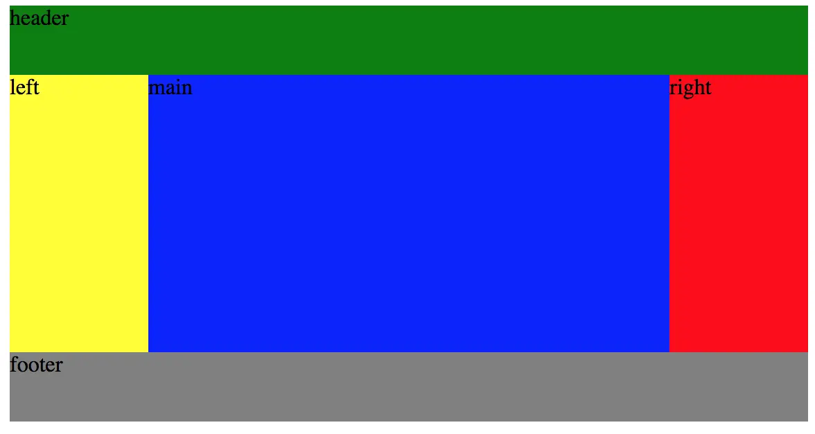
<style>
  .header {
    background: green;
    height: 50px;
  }
  .wrapper {
    height: 200px;
    display: flex;
  }
  .wrapper .left {
    width: 100px;
    background: yellow;
  }
  .wrapper .main {
    flex: 1;
    background: blue;
  }
  .wrapper .right {
    width: 100px;
    background: red;
  }
  .footer {
    height: 50px;
    background: gray;
  }
</style>
<body>
  <div class="container">
    <div class="header">header</div>
    <div class="wrapper">
      <div class="left">left</div>
      <div class="main">main</div>
      <div class="right">right</div>
    </div>
    <div class="footer">footer</div>
  </div>
</body>


