

手机(iPad也不行)专用的自适应方案
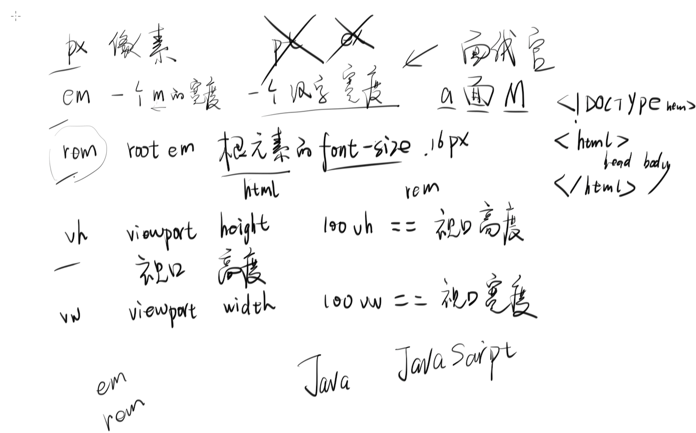
1. 什么是 REM
2. REM 和 EM 的区别是什么
如果chrome的默认最小字体为12px(一般就是这样),那么不管你怎么在CSS上设置,也不能改变字体最小值。
3. 手机端方案的特点
1. 所有手机显示的界面都是一样的,只是大小不同
2. 1 rem == html font-size == viewport width
4. 使用 JS 动态调整 REM
 <meta name="viewport" content="width=device-width, user-scalable=no, initial-scale=1.0, maximum-scale=1.0, minimum-scale=1.0">
 <script>
     var pageWidth = window.innerWidth
     document.write('<style>html{font-size:'+pageWidth+'px;}</style>')
 </script>
5. REM 可以与其他单位同时存在
 font-size: 16px;
 border: 1px solid red;
 width: 0.5rem;
6. 在 SCSS 里使用 PX2REM
- npm config set registry https://registry.npm.taobao.org/
- touch ~/.bashrc
- echo 'export SASS_BINARY_SITE="https://npm.taobao.org/mirrors/node-sass"' >> ~/.bashrc
- source ~/.bashrc
- npm i -g node-sass
- mkdir ~/Desktop/scss-demo
- cd ~/Desktop/scss-demo
- mkdir scss css
- touch scss/style.scss
- start scss/style.scss
- node-sass -wr scss -o css
编辑 scss 文件就会自动得到 css 文件
在 scss 文件里添加
@function px( $px ){
  @return $px/$designWidth*10 + rem;
}

$designWidth : 640; // 640 是设计稿的宽度,你要根据设计稿的宽度填写。如果设计师的设计稿宽度不统一,就杀死设计师,换个新的。

.child{
  width: px(320);
  height: px(160);
  margin: px(40) px(40);
  border: 1px solid red;
  float: left;
  font-size: 1.2em;
}
即可实现 px 自动变 rem
为什么你学不好 LESS/SASS/Webpack
- 你不会命令行,你非要用 Windows
- 你不会英语(有些内容可以看中文翻译)
- 你不会看文档(很重要的能力)
