

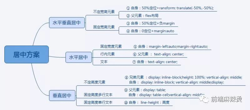
10种居中方法如下。从技术角度讲,适用于“水平垂直居中”的方法必然适用于“水平居中”和“垂直居中”的情况;适用于不定宽(高)居中的方法也必然适用于固定宽(高)居中的情况。项目中根据实际需求选用最优最简洁的方法。
以一组demo分别介绍不同方案,demo结构如下,页面需要居中的元素是“center”。“parent”,“brother”分别是“center”的父元素和兄弟元素(有需要的时候添加)。
!DOCTYPE html><html lang="en"> <head> <meta charset="UTF-8"> <title>居中 demo</title> <style> html, body { width: 100%; height: 100%; margin: 0; padding: 0; color: #fff; font-size: 30px; background-color: #FFFFCC; } .parent { /* keycodes start */ ...... /* keycodes end */ } .center { /* keycodes start */ ...... /* keycodes end */ background-color: #666600; } .blank { /* keycodes start */ ...... /* keycodes end */ } </style> </head> <body> <div class="center">内容</div> </body></html>
1、不定宽高元素 50%定位+transform: translate(-50%,-50%)
父元素设置相对定位:position:relative(不设置的话,相对最近的、非static定位的元素或者body定位)。
自身设置绝对定位position:absolute;定位top:50%,left:50%;设置transform: translate(-50%,-50%)。
HTML代码:
<div class="center">内容</div>CSS代码:
.center { /* keycodes start */ position: absolute; left: 50%; top: 50%; transform: translate(-50%,-50%); /* keycodes end */ background-color: #666600;}适用范围:
这种方法只有支持CSS3新属性transform的浏览器才能用,不需要固定宽高,需要给父元素加 position: relative。
2、不定宽高元素 flex布局
父元素设置display: flex; align-items: center;justify-content: center。
HTML代码:
<div class="parent"> <div class="center">内容</div> </div>CSS代码:
.parent { /* keycodes start */ display: flex; align-items: center; justify-content: center; /*keycodes end */ height: 100%;} .center { background-color: #666600;}适用范围:
适用于支持flex布局的浏览器,不需要固定宽高,在移动端用的会比较多。
3、固定宽高元素 50%定位+负margin
父元素设置相对定位:position:relative(不设置的话,相对最近的非static定位的元素或者body定位)。
自身设置绝对定位position:absolute;定位top:50%,left:50%;设置margin-top:-height/2,margin-left:-width/2。
HTML代码:
<div class=" center ">内容</div>CSS代码:
.center { /* 关键代码-start */ position: absolute; left: 50%; top: 50%; width: 200px; height: 200px; margin-top: -100px; margin-left: -100px; /* 关键代码-end */ background-color: #666600;}适用范围:
这种方法基本浏览器都能够兼容,适用于固定宽高的元素, 需要给父元素加 position: relative。
4、固定宽高元素 0定位+margin:auto
父元素设置相对定位:position:relative(不设置的话,相对最近的非static定位的元素或者body定位)。
自身设置绝对定位position:absolute;定位 top: 0;right: 0;bottom: 0; left: 0;设置margin:auto。
HTML代码:
<div class=" center ">内容</div>CSS代码:
.center { /* keycodes start */ position: absolute; top: 0; right: 0; bottom: 0; left: 0; width: 200px; height: 200px; margin: auto; /* keycodes end */ background-color: #666600;}适用范围:
适用于固定宽高的元素,需要给父元素加 position: relative。
水平居中5、固定宽度元素 margin :0 auto
给自身设置margin :0 auto。
HTML代码:
<div class=" center ">内容</div>CSS代码:
.center { /* keycodes start */ width: 200px; margin: 0 auto; /* keycodes end */ background-color: #666600;}适用范围:
适用于宽度固定的元素水平居中。
6、行内元素 text-align: center
给父元素设置text-align: center;
HTML代码:
<div class="parent"> <span class="center">行内元素</span></div>CSS代码:
.parent { /* keycodes start */ text-align: center; /* keycodes end */}.center { background-color: #666600;}适用范围:
适用于行内元素水平居中,但是需要额外增加父标签。
7、文本 text-align: center
文本居中只需要给自身设置text-align: center。
HTML代码:
<div class=" center ">内容</div>CSS代码:
.center { /* keycodes start */ text-align: center; /* keycodes end */ background-color: #666600;}8、不定高度元素 display: inline-block;vertical-align: middle。
自身设置display: inline-block;vertical-align: middle,兄弟元素设置display: inline-block;height: 100%;vertical-align: middle。
HTML代码:
<div class="center">内容</div><div class="brother"></div>CSS代码:
.center { /* keycodes start */ display: inline-block; vertical-align: middle; /* keycodes end */ background-color: #666600;}.blank { /* keycodes start */ display: inline-block; height: 100%; width: 0; vertical-align: middle; /* keycodes end */}适用范围:
适用于高度不确定的元素居中,需要额外增加兄弟标签。
9、固定高度多行文本 display:table-cell;vertical-align:middle。
父元素设置display:table,自身设置display:table-cell 、vertical-align:middle。
HTML代码:
<div class="parent"> <div class="center">内容</div> </div>CSS代码:
.parent { /* keycodes start */ display: table; /* keycodes end */}.center { /* keycodes start */ display: table-cell; height: 200px; vertical-align: middle; /* keycodes end */ background-color: #666600;}适用范围:
适用于固定高度的多行文本垂直居中。
10、固定高度单行文本 line-height
自身设置line-height等于高度。
HTML代码:
<div class=" center ">内容</div>CSS代码:
.center { height: 200px; line-height: 200px; background-color: #666600;}
如果你有其它好的居中方法,欢迎留言交流~


