简介
css3渐变是指一个元素的背景颜色在两个或多个颜色中平稳过渡。
我们常用的一个是线性渐变和径向渐变。
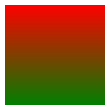
线性渐变:是指颜色沿着一个方向过渡,可以是上、下、左、右、斜各个方向,但是也只能朝一个方向过渡。
background: linear-gradient(red, green);
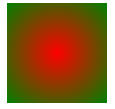
径向渐变:是指颜色从一个中心点向着四周发散。
background: radial-gradient(red, green);
线性渐变
创建渐变必须至少设置两个颜色,如果你只设置一个颜色,该属性也就只能默默的无效了。 你还需要设置一个方向,如果你不设置方向,就会使用默认方向从上到下渐变。
语法
background: linear-gradient(direction, color1, color2, ...)
方向的预定义关键字有:
top               从下到上
right             从左到右
bottom            从上到下
left              从右到左
left top          从右下到左上
right top         从左下到右上
left bottom       从右上到左下
right bottom      从左上到右下
示例
bakcground: -webkit-linear-gradient(bottom, red, green); /* Safari 5.1 - 6.0, chrome 10.0 - 26.0 */
bakcground: -moz-linear-gradient(top, red, green); /* Firefox 3.6 - 15 */
bakcground: -o-linear-gradient(top, red, green); /* Opera 11.1 - 12.0 */
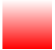
bakcground: linear-gradient(to top, red, green); /* 标准语法 */

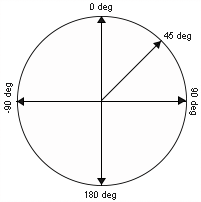
也许你感觉方向太少不够用,没关系,我们还可以用角度确定方向。
语法
background: linear-gradient(angle, color1, color2, ...)
示意图
示例
background: -webkit-linear-gradient(-90deg, red, green); /* Safari 5.1 - 6.0, chrome 10.0 - 26.0 */
background: -moz-linear-gradient(-90deg, red, green); /* Firefox 3.6 - 15 */
background: -o-linear-gradient(-90deg, red, green); /* Opera 11.1 - 12.0 */
background: linear-gradient(180deg, red, green); /* 标准语法 */


前面说了,渐变可以有多个颜色节点
语法
background: linear-gradient(color1, color2, color3, ...) /* 平均分布 */
background: lienar-gradient(color1, color2 pos, corlor3 pos, ...) /* 带有位置 */
示例
background: linear-gradient(red, green 50%, black);

上例中,第一个颜色red和最后一个颜色没有显性的标出位置,则表示它们分别位于0%和100%处,也就是开始和结束。如果第一个颜色就标出位置,例如red 20%则表示red是从20%位置处开始渐变的,而20%以前的颜色为red,没有渐变。同理,结束处的也一样,如果标出位置则表示渐变到此处结束,这后面位置是没有渐变的。示例如下:
background: linear-gradient(red 20%, green 50%, black 80%);

background: linear-gradient(red, green 50%, yellow 50%, black)
background: linear-gradient(red, green 50%, yellow 40%, black)

透明度渐变
当我们采用rgba模式写颜色时,透明度也可以渐变了。
background: linear-gradient(rgba(255, 0, 0, 0), rgba(255, 0, 0, 1))
重复的线性渐变
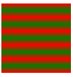
如果需要在一个元素上重复某种渐变,我们就可以使用repeating-linear-gradient()来重复这种渐变。
语法
repeating-linear-gradient(color1, color2 20%, ...)
最后一个颜色必须有位置参数并且位置大于前面一个颜色的位置且不能为100%,不然就跟普通渐变没区别。
background: repeating-linear-gradient(red, green 20%);
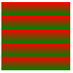
background: repeating-linear-gradient(red, green, red 20%);
径向渐变
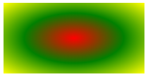
径向渐变是从一个点向四周渐变。
语法
background: radial-gradient(center, shape, size, start-color, ..., last-color)
- center:渐变起点的位置,可以为百分比,默认是图形的正中心。
- shape:渐变的形状,ellipse表示椭圆形,circle表示圆形。默认为ellipse,如果元素形状为正方形的元素,则ellipse和circle显示一样。
- size:渐变的大小,即渐变到哪里停止,它有四个值:
- closest-side:最近边
- farthest-side:最远边
- closest-corner:最近角
- farthest-corner:最远角
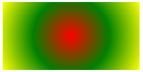
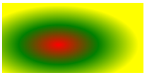
多颜色均匀渐变
background: radial-gradient(red, green, yellow);
完整写法:
bakcground: -webkit-radial-gradient(50% 50%, farthest-corner, red, green, yellow);/* (渐变起点位置选项,不加前缀不支持) */
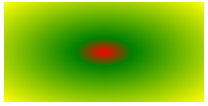
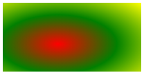
多颜色的不均匀分布
background: radial-gradient(red, green 20%, yellow);
设置渐变形状
渐变的默认形状是椭圆,我们可以手动设置简便的形状。
background: radial-gradient(circle, red, green, yellow);
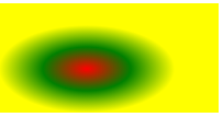
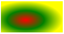
不同尺寸的渐变
渐变的终点可以手动设置,有以下四种,默认是farthest-corner最远角
background: radial-gradient(closest-side, red, green, yellow);
background: radial-gradient(farthest-side, red, green, yellow);
background: radial-gradient(closest-corner, red, green, yellow);
background: radial-gradient(farthest-corner, red, green, yellow);
最近边
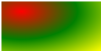
渐变起点位置
渐变的起点位置是可以改变的,用两个百分数表示,默认50% 50%,第一个百分数代表水平位置,第二个百分数代表垂直位置。
background: radial-gradient(20% 20%, red, green, yellow);
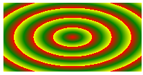
重复性渐变
repeating-radial-gradient() 函数用于重复径向渐变
background: repeating-radial-gradient(red, green, yellow 20%);