

1. box-shadow
1.1 box-shadow: h-shadow v-shadow blur spread color inset;
h-shadow:必需,水平阴影偏移距离,正值向右偏移,负值向左
v-shadow:必需,垂直阴影偏移距离,正值向下偏移,负值向上
blur:可选,模糊距离,省略则为0
spread:可选,阴影的尺寸,省略则为0
color:可选,阴影的颜色
inset:可选,默认为外部阴影(outset)
1.2 多重阴影
box-shadow:0 0 30px green,0 0 60px red;
写在前面的规则会覆盖后面的规则
1.3 ie兼容:
IE9+
2. border-radius
2.1
border-top-left-radius:5px;
border-top-right-radius:5px;
border-bottom-right-radius:5px;
border-bottom-left-radius:5px;
等价于
border-radius:5px;
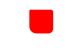
2.2
border-radius:5px 10px 20px 30px; //四个全写
如图所示:
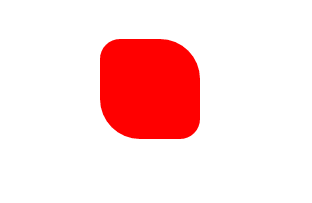
2.3
border-radius:20px 40px; //只写两个
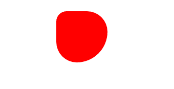
2.4
border-radius:20px 40px 60px; //写三个
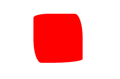
2.5
border-radius: 2em 1em 4em / 0.5em 3em;
等价于
border-top-left-radius: 2em 0.5em;
border-top-right-radius: 1em 3em;
border-bottom-right-radius: 4em 0.5em;
border-bottom-left-radius: 1em 3em;
2.6 单位值与百分比
2.6.1
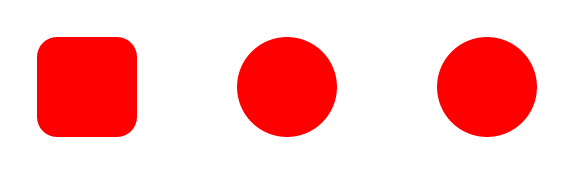
//正方形
width: 100px;
height: 100px;
/*border-radius: 40px;
border-radius: 50px;
border-radius: 60px;*/
2.6.2
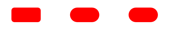
//长方形
width: 100px;
height: 50px;
/*border-radius: 10px;
border-radius: 25px;
border-radius: 50px;*/
2.6.3
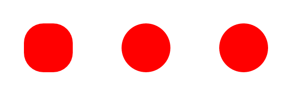
//正方形
width: 100px;
height: 100px;
/*border-radius: 20%;
border-radius: 50%;
border-radius: 60%;*/
2.6.4
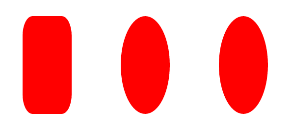
//长方形
width: 100px;
height: 200px;
/*border-radius: 20%;
border-radius: 50%;
border-radius: 60%;*/
