

三栏式布局
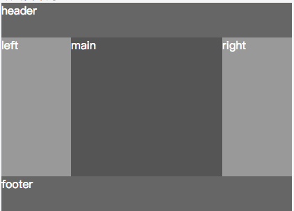
常规情况下,我们的布局框架使用以下写法,从上到下,从左到右。
<header>header</header>
<section>
    <aside>left</aside>
    <section>main</section>
    <aside>right</aside>
</section>
<footer>footer</footer>
问题倒是没什么问题,然而,如果我们希望中部 main 部分优先显示的话,是可以做布局优化的。
因为浏览器渲染引擎在构建和渲染渲染树是异步的(谁先构建好谁先显示),那么将<section>main</section>部分提前即可优先渲染。
圣杯布局
    <header>header</header>
    <section class="wrapper">
        <section class="col main">main</section>
        <aside class="col left">left</aside>
        <aside class="col right">right</aside>
    </section>
    <footer>footer</footer>

    //css
    header,footer {height: 50px; background: blue}
    .wrapper {padding: 0 100px 0 100px; overflow:hidden;}
    .col {position: relative; float: left;}
    .main {width: 100%;height: 200px; background:lightblue}
    .left {width: 100px; height: 200px; margin-left: -100%;left: -100px; background: red}
    .right {width: 100px; height: 200px; margin-left: -100px; right: -100px; background:green}
布局采用了margin负边距与百分比边距,通过负距进行left和right布局的移动,百分比边距默认参照物为容器的宽度。
缺点
当left的宽度大于main宽度时,会产生错位布局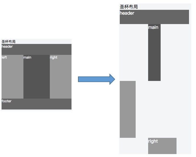
原因:
margin-left: -100%参照物为wrapper容器,容器宽度为main宽度,因此,当left宽度大于main时,margin-left值小与left宽度,因此无法布局至main同层,导致布局错误淘宝软对针对「圣杯」的缺点做了优化,并提出「双飞翼」布局。
双飞翼布局
<header>header</header>
<section class="wrapper">
    <section class="col main">
        <section class="main-wrap">main</section>
    </section>
    <aside class="col left">left</aside>
    <aside class="col right">right</aside>
</section>
<footer>footer</footer>

// css
header,footer {height: 50px; background: lightblue}
.wrapper {padding: 0; overflow:hidden;}
.main-wrapper { margin: 0 300px 0 300px }
.col {float: left;}
.main {width: 100%;height: 100px; background: blue}
.left {width: 300px; height: 100px; margin-left: -100%;background: green}
.right {width: 300px; height: 100px; margin-left: -300px; background: grey}与圣杯布局相比,去除了col的position属性,为main层多添加了一层dom结构,解决了圣杯布局的缺陷
缺点
多加一层dom树节点,增加了css样式规则表和dom树合并成布局树的计算量
Flex布局
<html>
  <body>
    <header>header</header>
    <section class="wrapper">
        <section class="main">main</section>
        <aside class="left">left</aside>
        <aside class="right">right</aside>
    </section>
    <footer>footer</footer>
  </body>
</html>

// css
header,footer {height: 50px; background: lightblue}
.wrapper { display: flex;}
.main { width: 100%;order: 2; height: 100px;background: blue}
.left { width: 300px; order: 1; background: green; height: 100px;}
.right {width: 300px; height: 100px; order: 3; background: grey}
缺点
不兼容低版本IE(不是缺点!!!)
