

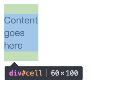
方法一:
原理:在元素属性为table使用里使用vertical-align属性
  <!DOCTYPE html>
  <html lang="en">

  <head>
    <meta charset="UTF-8">
    <meta name="viewport" content="width=device-width, initial-scale=1.0">
    <meta http-equiv="X-UA-Compatible" content="ie=edge">
    <title>Document</title>
    <style media="screen">
      #wrapper {
        display: table;
        height: 100px;
        width: 60px;
      }

      #cell {
        display: table-cell;
        vertical-align: middle;
      }
    </style>
  </head>

  <body>
    <div id="wrapper">
      <div id="cell">
        <div class="content">Content goes here</div>
      </div>
    </div>
  </body>

  </html>
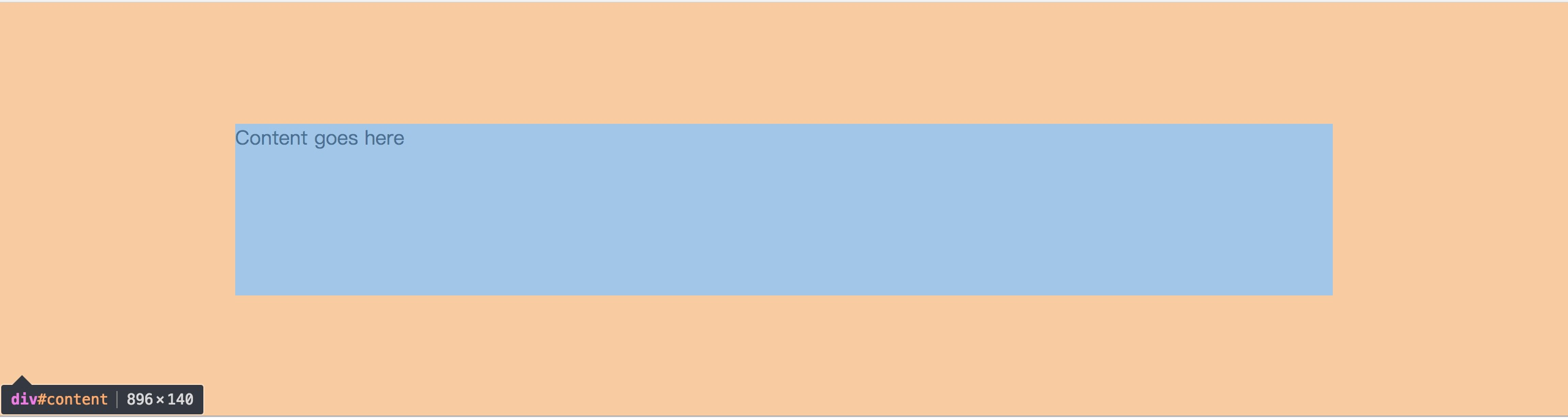
方法二:
原理:对于有固定宽高的元素,利用绝对定位设置为:top: 0; bottom: 0; left: 0; right: 0; margin: auto因为这个元素有固定的高度,并不能距离上下都为0,margin: 0会使它居中显示。
  <!DOCTYPE html>
  <html lang="en">

  <head>
    <meta charset="UTF-8">
    <meta name="viewport" content="width=device-width, initial-scale=1.0">
    <meta http-equiv="X-UA-Compatible" content="ie=edge">
    <title>Document</title>
    <style media="screen">
      #content {
        position: absolute;
        top: 0;
        bottom: 0;
        left: 0;
        right: 0;
        margin: auto;
        height: 140px;
        width: 70%;
      }
    </style>
  </head>

  <body>
    <div id="content">Content goes here</div>
  </body>

  </html>
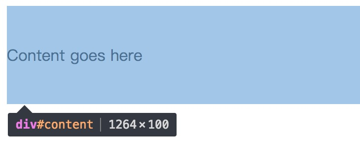
方法三:
原理:利用行高,设置line-height和元素等高就行。
  <!DOCTYPE html>
  <html lang="en">

  <head>
    <meta charset="UTF-8">
    <meta name="viewport" content="width=device-width, initial-scale=1.0">
    <meta http-equiv="X-UA-Compatible" content="ie=edge">
    <title>Document</title>
    <style media="screen">
      #content {
        height: 100px;
        line-height: 100px;
      }
    </style>
  </head>

  <body>
    <div id="content">Content goes here</div>
  </body>

  </html>
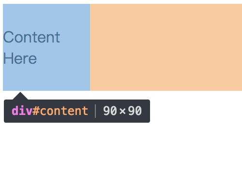
方法四:
原理:使用css3的display: -webkit-box属性,再设置-webkit-box-pack: cente; -webkit-box-align:c enter
  <!DOCTYPE html>
  <html lang="en">

  <head>
    <meta charset="UTF-8">
    <meta name="viewport" content="width=device-width, initial-scale=1.0">
    <meta http-equiv="X-UA-Compatible" content="ie=edge">
    <title>Document</title>
    <style media="screen">
    #content {
      width:90px;
      height:90px;
      display:-webkit-box;
      -webkit-box-pack:center;
      -webkit-box-align:center;
    }
    </style>
  </head>

  <body>
    <div id="content">Content Here</div>
  </body>

  </html>
方法五:
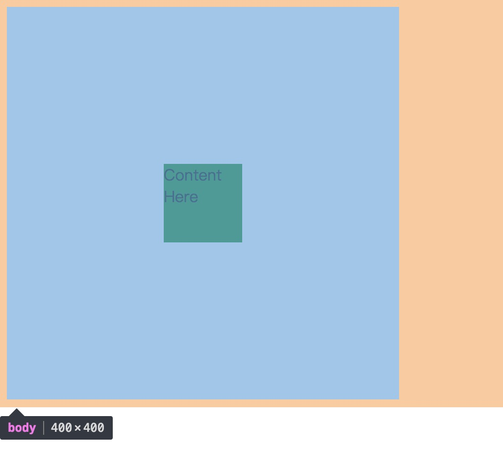
原理:使用css3的新属性transform: translate(x,y)属性
  <!DOCTYPE html>
  <html lang="en">

  <head>
    <meta charset="UTF-8">
    <meta name="viewport" content="width=device-width, initial-scale=1.0">
    <meta http-equiv="X-UA-Compatible" content="ie=edge">
    <title>Document</title>
    <style media="screen">
      #content {
        position: absolute;
        width: 80px;
        height: 80px;
        top: 50%;
        left: 50%;
        transform: translate(-50%, -50%);
        -webkit-transform: translate(-50%, -50%);
        -moz-transform: translate(-50%, -50%);
        -ms-transform: translate(-50%, -50%);
        background: green;
      }

      body {
        position: relative;
        height: 400px;
        width: 400px;
      }
    </style>
  </head>

  <body>
    <div id="content">Content Here</div>
  </body>

  </html>
方法六:
原理:使用:before元素
  <!DOCTYPE html>
  <html lang="en">

  <head>
    <meta charset="UTF-8">
    <meta name="viewport" content="width=device-width, initial-scale=1.0">
    <meta http-equiv="X-UA-Compatible" content="ie=edge">
    <title>Document</title>
    <style media="screen">
      #warp {
        position: fixed;
        display: block;
        top: 0;
        right: 0;
        bottom: 0;
        left: 0;
        text-align: center;
        background: rgba(0, 0, 0, .5);
      }

      #warp:before {
        content: '';
        display: inline-block;
        vertical-align: middle;
        height: 100%;
      }

      #warp #content {
        display: inline-block;
        width: 100px;
        height: 100px;
        line-height: 100px;
        background: yellow;
      }
    </style>
  </head>

  <body>
    <div id="warp">
      <div id="content">Content Here</div>
    </div>
  </body>

  </html>

