

我们在日常开发中经常遇到布局问题,下面罗列几种常用的css布局方案话不多说,上代码!
居中布局
以下居中布局均以不定宽为前提,定宽情况包含其中
1、水平居中
a) inline-block + text-align
.parent{ text-align: center;}.child{ display: inline-block;}tips:此方案兼容性较好,可兼容至IE8,对于IE567并不支持inline-block,需要使用css hack进行兼容
b) table + margin
.child{ display: table; margin: 0 auto;} tips:此方案兼容至IE8,可以使用<table/>代替css写法,兼容性良好
c) absolute + transform
.parent{ position: relative; height:1.5em;}.child{ position: absolute; left: 50%; transform: translateX(-50%);} tips:此方案兼容至IE9,因为transform兼容性限制,如果.child为定宽元素,可以使用以下写法,兼容性极佳
.parent{ position: relative; height:1.5em;}.child{ position: absolute; width:100px; left: 50%; margin-left:-50px;}d) flex + justify-content
.parent{ display: flex; justify-content: center;}.child{ margin: 0 auto;}tips:flex是一个强大的css,生而为布局,它可以轻松的满足各种居中、对其、平分的布局要求,但由于现浏览器兼容性问题,此方案很少被使用,但是值得期待浏览器兼容性良好但那一天!
2、垂直
a) table-cell + vertial-align
.parent{ display: table-cell; vertical-align: middle;}tips:可替换成<table />布局,兼容性良好
b) absolute + transform
.parent{ position: relative;}.child{ position: absolute; top: 50%; transform: translateY(-50%);}tips:存在css3兼容问题,定宽兼容性良好
c) flex + align-items
.parent{ display: flex; align-items: center;}tips:高版本浏览器兼容,低版本不适用
3、水平垂直
a) inline-block + table-cell + text-align + vertical-align
.parent{ text-align: center; display: table-cell; vertical-align: middle;}.child{ display: inline-block;}tips:兼容至IE8
b) absolute + transform
.parent{ position: relative;}.child{ position: absolute; left: 50%; top: 50%; transform: translate(-50%,-50%);}tips:兼容性稍差,兼容IE10以上
c) flex
.parent{ display: flex; justify-content: center; align-items: center;}tips:兼容差
多列布局
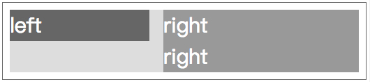
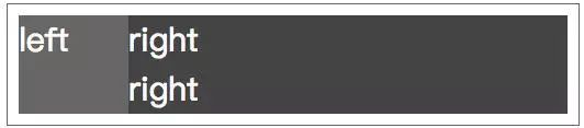
1、一列定宽,一列自适应
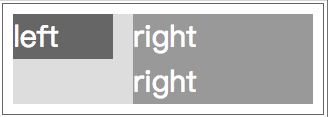
a) float + margin
.left{ float: left; width: 100px;}.right{ margin-left: 120px;}tips:此方案对于定宽布局比较好,不定宽布局推荐方法b
b) float + overflow
.left{ float: left; width: 100px; margin-right: 20px;}.right{ overflow: hidden;}tips:个人常用写法,此方案不管是多列定宽或是不定宽,都可以完美实现,同时可以实现登高布局
c) table
.parent{ display: table; width: 100%; table-layout: fixed;}.left,.right{ display: table-cell;}.left{ width: 100px; padding-right: 20px;}d) flex
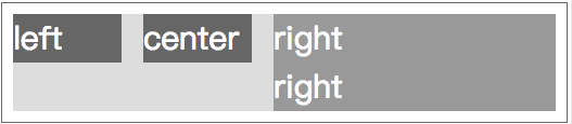
.parent{ display: flex;}.left{ width: 100px; padding-right: 20px;}.right{ flex: 1;}2、多列定宽,一列自适应
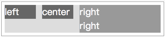
a) float + overflow
.left,.center{ float: left; width: 100px; margin-right: 20px;}.right{ overflow: hidden;}b) table
.parent{ display: table; width: 100%; table-layout: fixed;}.left,.center,.right{ display: table-cell;}.right{ width: 100px; padding-right: 20px;}c) flex
.parent{ display: flex;}.left,.center{ width: 100px; padding-right: 20px;}.right{ flex: 1;}3、一列不定宽,一列自适应
a) float + overflow
.left{ float: left; margin-right: 20px;}.right{ overflow: hidden;}.left p{width: 200px;}b) table
.parent{ display: table; width: 100%;}.left,.right{ display: table-cell;}.left{ width: 0.1%; padding-right: 20px;}.left p{width:200px;}c) flex
.parent{ display: flex;}.left{ margin-right: 20px;}.right{ flex: 1;}.left p{width: 200px;}4、多列不定宽,一列自适应
a) float + overflow
.left,.center{ float: left; margin-right: 20px;}.right{ overflow: hidden;}.left p,.center p{ width: 100px;}5、等分
a) float + margin
.parent{ margin-left: -20px;}.column{ float: left; width: 25%; padding-left: 20px; box-sizing: border-box;}b) table + margin
.parent-fix{ margin-left: -20px;}.parent{ display: table; width:100%; table-layout: fixed;}.column{ display: table-cell; padding-left: 20px;}c) flex
.parent{ display: flex;}.column{ flex: 1;}.column+.column{ margin-left:20px;}6、等高
a) float + overflow
.parent{ overflow: hidden;}.left,.right{ padding-bottom: 9999px; margin-bottom: -9999px;}.left{ float: left; width: 100px;}.right{ overflow: hidden;}b) table
.parent{ display: table; width: 100%;}.left{ display:table-cell; width: 100px; margin-right: 20px;}.right{ display:table-cell; }c) flex
.parent{ display:flex; width: 100%;}.left{ width: 100px;}.right{ flex:1;}
