
<!DOCTYPE html>
<html lang="en">
<head>
<meta charset="UTF-8">
<link rel="stylesheet" type="text/css" href="style.css">
<title>有趣的鼠标悬浮模糊效果</title>
<style type="text/css">
* {
margin: 0;
padding: 0;
box-sizing: border-box;
}
.container {
margin: 50px auto;
width: 400px;
height: 300px;
position: relative;
}
.container:hover .box {
opacity: 1;
}
.container:hover .title {
opacity: 1;
transform: translate(0);
}
.container:hover .img {
filter: blur(2px);
-webkit-filter: blur(2px);
-moz-filter: blur(2px);
-ms-filter: blur(2px);
}
.container:hover .box::before {
height: 100%;
top: 0;
}
.container:hover .box::after {
width: 100%;
left: 0;
}
.box-wrapper {
position: absolute;
text-align: center;
width: 100%;
height: 100%;
padding: 30px;
z-index: 99;
}
.box {
position: relative;
width: 100%;
height: 100%;
padding-top: 80px;
opacity: 0;
transition: opacity .8s;
}
.box::before {
content: '';
border: 3px solid
border-width: 0 3px;
position: absolute;
width: 100%;
height: 0;
top: 50%;
left: 0;
box-sizing: border-box;
transition: all .8s;
}
.box::after {
content: '';
border: 3px solid
border-width: 3px 0;
position: absolute;
width: 0;
height: 100%;
top: 0;
left: 50%;
box-sizing: border-box;
transition: all .8s;
}
.title {
background-image: -webkit-linear-gradient(left,
color: transparent;
-webkit-background-clip: text;
background-size: 200%;
transform: translate(0, 20px);
animation: flowlight 5s linear infinite;
transition: transform .8s, opacity .8s;
}
@keyframes flowlight {
0% {
background-position: 0 0;
}
100% {
background-position: -100% 0;
}
}
@-webkit-keyframes flowlight {
0% {
background-position: 0 0;
}
100% {
background-position: -100% 0;
}
}
@-moz-keyframes flowlight {
0% {
background-position: 0 0;
}
100% {
background-position: -100% 0;
}
}
@-o-keyframes flowlight {
0% {
background-position: 0 0;
}
100% {
background-position: -100% 0;
}
}
</style>
</head>
<body>
<div class="container">
<div class="box-wrapper">
<div class="box">
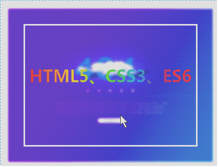
<h1 class="title">HTML5、CSS3、ES6</h1>
</div>
</div>
<img class="img" src="" alt="404">
</div>
</body>
</html>


