

1、清除浮动
浮动给我们的代码带来的麻烦,想必不需要多说,我们会用很多方式来避免这种麻烦,其中我觉得最方便也是兼容性最好的一种是....// 清除浮动
.clearfix{
  zoom: 1;
}
.clearfix:after{
  display: block;
  content: '';
  clear: both;
}


2、垂直水平居中
在css的世界里水平居中比垂直居中来的简单一些,经过了多年的演化,依然没有好的方式来让元素垂直居中(各种方式各有优缺点,但都不能达到兼容性好,破坏力小的目标),以下是几种常见的实现方式绝对定位方式且已知宽高
position: absolute;
top: 50%;
left: 50%;
margin-top: -3em;
margin-left: -7em;
width: 14em;
height: 6em;

绝对定位 + 未知宽高 + translate
position: absolute;
left: 50%;
top: 50%;
transform: translate(-50%, -50%);
//需要补充浏览器前缀

flex 轻松搞定水平垂直居中( 未知宽高)
display: flex;
align-items: center;
justify-content: center;


3、 文本末尾添加省略号
当文本的内容超出容器的宽度的时候,我们希望在其默认添加省略号以达到提示用户内容省略显示的效果。宽度固定,适合单行显示...
overflow: hidden;
text-overflow: ellipsis;
white-space: nowrap;


宽度不固定,适合多行以及移动端显示
overflow: hidden;
text-overflow: ellipsis;
display: -webkit-box;
-webkit-line-clamp: 3;
-webkit-box-orient: vertical;


4、制造文本的模糊效果
当我们希望给文本制造一种模糊效果感觉的时候,可以这样做color: transparent;
text-shadow:0 0 2px rgba(0,0,0,.5);


5、动画实现简洁loading效果
我们来实现一个非常简洁的loading效果.loading:after{
  display: inline-block;
  overflow: hidden;
  vertical-align: bottom;
  content: '\2026';
  -webkit-animation: ellipsis 2s infinite;
}

// 动画部分
@-webkit-keyframes ellipsis{
  from{
    width: 2px;
  }
  to{
    width: 15px;
  }
}


6、自定义文本选中样式
默认情况下,我们在网页上选中文字的时候,会给选中的部分一个深蓝色背景颜色(可以自己拿起鼠标试试),如果我们想自己定制被选中的部分的样式呢?// 注意只能修改这两个属性 字体颜色 选中背景颜色

element::selection{
  color: green;
  background-color: pink;
}
element::-moz-selection{
  color: green;
  background-color: pink;
}


7、顶角贴纸效果
有时候我们会有这样的需求,在一个列表展示页面,有一些列表项是新添加的、或者热度比较高的,就会要求在其上面添加一个贴纸效果的小条就像hexo默认博客的fork me on github那个效果一样,如下图。 接下来我们开始一步步完成最左边的这个效果
html
<div class="wrap">
  <div class="ribbon">
    <a href="#">Fork me on GitHub</a>
  </div>
</div>

css
/* 外层容器几本设置  */
.wrap{
  width: 160px;
  height:160px;
  overflow:hidden;
  position: relative;
  background-color: #f3f3f3;
}

.ribbon{
  background-color: #a00;
  overflow: hidden;
  white-space: nowrap;
  position: absolute;
  /* shadom */
  -webkit-box-shadow: 0 0 10px #888;
  -moz-box-shadow: 0 0 10px #888;
  box-shadow: 0 0 10px #888;
  /* rotate */
  -webkit-transform: rotate(-45deg);
  -moz-transform: rotate(-45deg);
  -ms-transform: rotate(-45deg);
  -o-transform: rotate(-45deg);
  transform: rotate(-45deg);
  /* position */
  left: -50px;
  top: 40px;
}

.ribbon a{
  border: 1px solid #faa;
  color: #fff;
  display: block;
  font: bold 81.25% 'Helvetica Neue', Helvetica, Arial, sans-serif;
  margin: 1px 0;
  padding: 10px 50px;
  text-align: center;
  text-decoration: none;
  /* shadow */
  text-shadow: 0 0 5px #444;
}


8、input占位符
当我们给部分input类型的设置placeholder属性的时候,有的时候需要修改其默认的样式。input::-webkit-input-placeholder{
  color: green;
  background-color: #F9F7F7;
  font-size: 14px;
}
input::-moz-input-placeholder{
  color: green;
  background-color: #F9F7F7;
  font-size: 14px;
}
input::-ms-input-placeholder{
  color: green;
  background-color: #F9F7F7;
  font-size: 14px;
}


9、移动端可点击元素去处默认边框
在移动端浏览器上,当你点击一个链接或者通过Javascript定义的可点击元素的时候,会出现蓝色边框,说实话,这是很恶心的,怎么去掉呢?-webkit-tap-highlight-color: rgba(255,255,255,0);


10、首字下沉
要实现类似word中首字下沉的效果可以使用以下代码element:first-letter{
  float:left;
  color:green;
  font-size:30px;
}

11、小三角
在很多地方我们可以用得上小三角,接下来我们画一下四个方向的三角形.triangle{
  /* 基础样式 */
  border:solid 10px transparent;
}
/*下*/
.triangle.bottom{
 border-top-color: green;
}
/*上*/
.triangle.top{
 border-bottom-color: green;
}
/*左*/
.triangle.top{
 border-right-color: green;
}
/*右*/
.triangle.top{
 border-left-color: green;
}


可以看出画一个小三角非常简单,只要两行样式就可以搞定,对于方向只要想着画哪个方向则设置反方向的样式属性就可以
12、鼠标手型
一般情况下,我们希望在以下元素身上添加鼠标手型a
submit
input[type="iamge"]
input[type="button"]
button
label
selecta[href],input[type='submit'], input[type='image'],input[type='button'], label[for], select, button {
  cursor: pointer;
}


13、屏蔽Webkit移动浏览器中元素高亮效果
在访问移动网站时,你会发现,在选中的元素周围会出现一些灰色的框框,使用以下代码屏蔽这种样式-webkit-touch-callout: none;
-webkit-user-select: none;
-khtml-user-select: none;
-moz-user-select: none;
-ms-user-select: none;
user-select: none;
 移动端兼容性问题1.手机旋转字体会自动调整
*{text-size-adjust:none}
2.click出现点击区域闪一下
a{-webkit-tap-highlight-color:rgba(0,0,0,0)}
3.textarea,input默认框内有阴影
textarea,input{appearance:none}
4.iOS下默认识别页面中的电话
<meta name="format-detection" contnent="telephone=no">
5.:active兼容处理
(1)给body添加ontouchstart
(2)document.addEventListener('touchstart',function(){},false)
6.某些圆角实效
background-clip:padding-box;
7.IE10 Inputy有叉号
input:ms-clear{display:none}
* {
margin: 0;
padding: 0;
text-decoration: none;
-webkit-overflow-scrolling: touch !important;
/*iOS惯性滚动*/
outline: none;
-webkit-font-smoothing: antialiased;
/*字体细长*/
-moz-osx-font-smoothing: grayscale;
}
body {
position: relative;
margin: 0 auto;
width: 100%;
height: 100%;
min-width: 900px;
overflow-x: hidden;
font-family: "微软雅黑";
-webkit-touch-callout: none;
/*禁用长按页面时的弹出菜单*/
-webkit-tap-highlight-color: white;
box-sizing: border-box;
}
li {
list-style: none;
}
ul,
ol {
list-style-type: none;
}
select,
input,
img,
select {
vertical-align: middle;
}
img {
border: none;
display: inline-block
}
i {
font-style: normal
}
a {
text-decoration: none;
-webkit-appearance: none;
}
*:focus {
outline: none;
}
input,
textarea,
button {
resize: none;
-webkit-appearance: none;
outline: none;
}
input {
-webkit-box-sizing: border-box;
-moz-box-sizing: border-box;
box-sizing: border-box;
}
strong {
font-weight: bold;
}
h3,
h4 {
font-weight: normal
}
input::-webkit-input-placeholder,
textarea::-webkit-input-placeholder {
color: #cecece;
}
input:-moz-placeholder,
textarea:-moz-placeholder {
color: #cecece;
}
input[type="button"],
input[type="submit"],
input[type="file"],
button {
cursor: pointer;
-webkit-appearance: none;
}
table {
border-collapse: collapse;
border-spacing: 0;
}
.hover-hand {
cursor: pointer;
/*悬浮显示手*/
}
/*禁止选中copy*/
.dont-select {
-moz-user-select: none;
-webkit-user-select: none;
-ms-user-select: none;
-khtml-user-select: none;
user-select: none;
}
/*float*/
.left {
float: left;
}
.right {
float: right;
}
.clearfloat:after {
content: "";
display: block;
height: 0;
clear: both;
zoom: 1;
visibility: hidden;
}
.clearfloat {
zoom: 1;
clear: both;
}
.clear {
clear: both;
zoom: 1;
}
.hide {
display: none !important;
}
.show {
display: block;
}
/*font-size*/
.font12 {
font-size: 12px;
}
.font13 {
font-size: 13px;
}
.font14 {
font-size: 14px;
}
.font15 {
font-size: 15px;
}
.font16 {
font-size: 16px;
}
.font18 {
font-size: 18px;
}
.font19 {
font-size: 19px;
}
.font20 {
font-size: 20px;
}
.font22 {
font-size: 22px;
}
.font24 {
font-size: 24px;
}
.font26 {
font-size: 26px;
}
.font28 {
font-size: 28px;
}
.font30 {
font-size: 30px;
}
.font32 {
font-size: 32px;
}
.font36 {
font-size: 36px;
}
.font48 {
font-size: 48px;
}
.font60 {
font-size: 60px;
}
.color-white {
color: white;
}
.color-red {
color: red;
}
.color-green {
color: green;
}
.color-black {
color: black;
}
.cl1685d3 {
color: #1685D3;
}
.bg1685D3 {
background: #1685D3;
}
.color-blue {
color: blue;
}
.color-yellow {
color: yellow;
}
.color-pink {
color: pink;
}
.bg-yellow {
background: yellow;
}
.bg-red {
background: red;
}
.border-blue {
border: 1px solid blue;
}
.border-black {
border: 1px solid black;
}
.border-white {
border: 1px solid white;
}
.tc {
text-align: center;
}
.tl {
text-align: left;
}
.tr {
text-align: right;
}
/*一行多行显示省略号*/
.one-line {
overflow: hidden;
white-space: nowrap;
text-overflow: ellipsis;
/*clip 修剪文本。*/
}
.more-line {
display: -webkit-box !important;
overflow: hidden;
text-overflow: ellipsis;
word-break: break-all;
-webkit-box-orient: vertical;
-webkit-line-clamp: 2;
}
/*flex*/
.flex {
display: flex;
flex-wrap: nowrap;
flex-direction: row;
flex-flow: row nowrap;
justify-content: flex-start;
/*flex-start | flex-end | center | space-between | space-around;*/
align-items: flex-start;
/*flex-start | flex-end | center | baseline | stretch;*/
align-content: flex-start;
/*flex-start | flex-end | center | space-between | space-around | stretch;*/
align-self: auto;
}
/*移动端1px*/
.onepx-border:before {
content: '';
position: absolute;
top: 0px;
left: 0px;
width: 200%;
height: 200%;
border: 1px solid blue;
transform-origin: 0 0;
transform: scale(0.5, 0.5);
box-sizing: border-box;
border-radius: 10px;
}
/*滚动条样式*/
::-webkit-scrollbar {
width: 6px;
height: 6px
}
::-webkit-scrollbar-track-piece {
background: #eee;
}
::-webkit-scrollbar-thumb:vertical {
background: #666;
}第二版:
* {
	margin: 0;
	padding: 0;
	border: 0px;
	-webkit-tap-highlight-color: rgba(0, 0, 0, 0);
	/*清除手机tap事件后element 时候出现的一个高亮*/
	text-decoration: none;
	-webkit-overflow-scrolling: touch !important;
	/*iOS惯性滚动*/
	outline: none;
	-webkit-font-smoothing: antialiased;
	/*字体细长*/
	-moz-osx-font-smoothing: grayscale;
}

body {
	position: relative;
	margin: 0 auto;
	width: 100%;
	height: 100%;
	min-width: 900px;
	overflow-x: hidden;
	font-family: "微软雅黑";
	-webkit-touch-callout: none;
	/*禁用长按页面时的弹出菜单*/
	-webkit-tap-highlight-color: white;
	box-sizing: border-box;
	-webkit-transform: translateZ(0);
	/*CSS开启硬件加速*/
	-webkit-backface-visibility: hidden;
	/*使用CSS transforms 或者 animations时可能会有页面闪烁的bug*/
}

li {
	list-style: none;
}

ul,
ol {
	list-style-type: none;
}

select,
input,
img,
select {
	vertical-align: middle;
}

img {
	border: none;
	display: inline-block
}

i {
	font-style: normal
}

a {
	text-decoration: none;
	-webkit-appearance: none;
}

*:focus {
	outline: none;
}

input,
textarea,
button {
	resize: none;
	-webkit-appearance: none;
	/*移除浏览器默认的样式,比如chrome的input默认样式*/
	outline: none;
}

input {
	-webkit-box-sizing: border-box;
	-moz-box-sizing: border-box;
	box-sizing: border-box;
}

strong {
	font-weight: bold;
}

h3,
h4 {
	font-weight: normal
}

input::-webkit-input-placeholder,
textarea::-webkit-input-placeholder {
	color: #cecece;
}

input:-moz-placeholder,
textarea:-moz-placeholder {
	color: #cecece;
}

input[type="button"],
input[type="submit"],
input[type="file"],
button {
	cursor: pointer;
	-webkit-appearance: none;
}

table {
	border-collapse: collapse;
	border-spacing: 0;
}

.hover-hand {
	cursor: pointer;
	/*悬浮显示手*/
}

.use-3D {
	-webkit-transform: rotateY(60deg);
	/* Chrome, Safari, Opera */
	-webkit-transform-style: preserve-3d;
	/* Chrome, Safari, Opera */
	transform: rotateY(60deg);
	transform-style: preserve-3d;
}

.perspective {
	/*perspective 透视  : 这个属性的存在决定你看到的元素是2d还是3d。一般设置在包裹元素的父类上。*/
	perspective: 400px;
}


/*禁止选中copy*/

.dont-select {
	-moz-user-select: none;
	-webkit-user-select: none;
	-ms-user-select: none;
	-khtml-user-select: none;
	user-select: none;
}


/*float*/

.left {
	float: left;
}

.right {
	float: right;
}

.clearfloat:after {
	content: "";
	display: block;
	height: 0;
	clear: both;
	zoom: 1;
	visibility: hidden;
}

.clearfloat {
	zoom: 1;
	clear: both;
}

.clear {
	clear: both;
	zoom: 1;
}

.hide {
	display: none !important;
}

.show {
	display: block;
}


/*font-size*/

.font12 {
	font-size: 12px;
}

.font13 {
	font-size: 13px;
}

.font14 {
	font-size: 14px;
}

.font15 {
	font-size: 15px;
}

.font16 {
	font-size: 16px;
}

.font18 {
	font-size: 18px;
}

.font19 {
	font-size: 19px;
}

.font20 {
	font-size: 20px;
}

.font22 {
	font-size: 22px;
}

.font24 {
	font-size: 24px;
}

.font26 {
	font-size: 26px;
}

.font28 {
	font-size: 28px;
}

.font30 {
	font-size: 30px;
}

.font32 {
	font-size: 32px;
}

.font36 {
	font-size: 36px;
}

.font48 {
	font-size: 48px;
}

.font60 {
	font-size: 60px;
}

.color-white {
	color: white;
}

.color-red {
	color: red;
}

.color-green {
	color: green;
}

.color-black {
	color: black;
}

.cl1685d3 {
	color: #1685D3;
}

.bg1685D3 {
	background: #1685D3;
}

.color-blue {
	color: blue;
}

.color-yellow {
	color: yellow;
}

.color-pink {
	color: pink;
}

.bg-yellow {
	background: yellow;
}

.bg-red {
	background: red;
}

.border-blue {
	border: 1px solid blue;
}

.border-black {
	border: 1px solid black;
}

.border-white {
	border: 1px solid white;
}

.tc {
	text-align: center;
}

.tl {
	text-align: left;
}

.tr {
	text-align: right;
}


/*一行多行显示省略号*/

.one-line {
	overflow: hidden;
	white-space: nowrap;
	text-overflow: ellipsis;
	/*clip  修剪文本。*/
}

.more-line {
	display: -webkit-box !important;
	overflow: hidden;
	text-overflow: ellipsis;
	word-break: break-all;
	-webkit-box-orient: vertical;
	-webkit-line-clamp: 2;
}

.auto-gp {
	/*自动换行*/
	word-wrap: break-word;
	word-break: normal;
}


/*flex*/

.flex {
	display: flex;
	flex-wrap: nowrap;
	flex-direction: row;
	flex-flow: row nowrap;
	justify-content: flex-start;
	/*flex-start | flex-end | center | space-between | space-around;*/
	align-items: flex-start;
	/*flex-start | flex-end | center | baseline | stretch;*/
	align-content: flex-start;
	/*flex-start | flex-end | center | space-between | space-around | stretch;*/
	align-self: auto;
}


/*移动端1px*/

.onepx-border:before {
	content: '';
	position: absolute;
	top: 0px;
	left: 0px;
	width: 200%;
	height: 200%;
	border: 1px solid blue;
	transform-origin: 0 0;
	transform: scale(0.5, 0.5);
	box-sizing: border-box;
	border-radius: 10px;
}


/*滚动条样式*/

::-webkit-scrollbar {
	width: 6px;
	height: 6px
}

::-webkit-scrollbar-track-piece {
	background: #eee;
}

::-webkit-scrollbar-thumb:vertical {
	background: #666;
}
解决img元素底部会出现的空白
空白的出现
做网页设计就避免不了在网页中添加图片,一些炫酷的图片可以是你的网页增色不少。对于如何在网页里添加一个图片,大家都已经很清楚了,使用< img >标签就行了。
今天我们来看看在添加图片过程中出现的一个小问题。为何图片的底部会出现一个空白间隙呢。
请点击查看代码:
<!DOCTYPE html>
<html>
<head>
  <meta charset="utf-8">
  <title>JS Bin</title>
</head>
<body>
  <div style="border: 1px solid red;">
    <!-- 请自行删掉img前的空格 -->
    < img src="http://img6.cache.netease.com/henan/2015/5/11/2015051117081131913_500.jpg" alt="">
  </div>
</body>
</html>
很简单的代码对吗?可是它展现的效果会是我们所希望吗?请看页面的效果 :
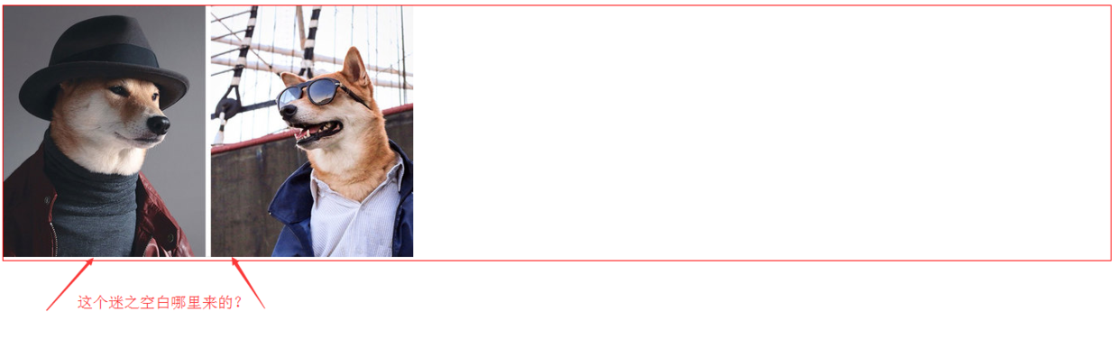
示例1.png
空白出现的原因
< img >等inline元素默认是和父级元素的 baseline 对齐的,即:vertical-align 的默认值是 baseline;而 baseline 又和父级底边 bottom 有一定距离。
也就是说,< img >元素的底部只到达下图中蓝线的位置。
因此,图片底部的迷之空白实际上是baseline和bottom之间的这段距离。
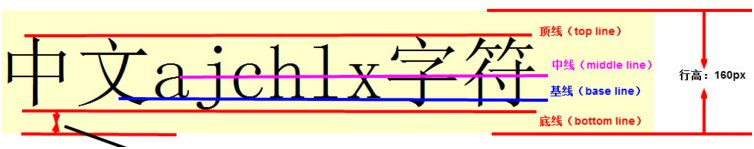
baseline.png
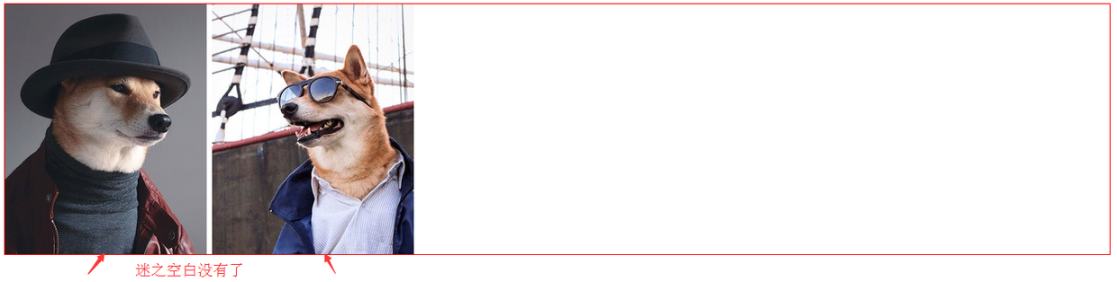
解决空白的出现
既然知道了空白出现的原因,那么我们怎么解决这个问题呢?
有三种方法:
设置图片的 vertical-align
img{
  vertical-align: bottom;
}
设置vertical-align的三个值(top、bottom、middle)中的任何一个都可以解决。
设置图片父层元素的 font-size 为 0
div{ font-size: 0; }- 把图片的 display 设置为 block
解决后的效果展示:img{ display: block; }
示例2.png
小结
- inline元素默认是和父级元素的baseline对齐的。
- 图片底部的迷之空白实际上是baseline和bottom之间的这段距离。
- 我们可以通过设置一些css样式避免这个空白的出现。
参考资料
以上是对于图片底部出现空白问题的一些思考和整理,如有不足之处,还请多多指正教导。
移动端web开发技巧
这是一个最好的时代,因为我们站在潮流中;但也是一个最坏的时代,因为我们站在潮头上。
META相关1. 添加到主屏后的标题(IOS)
<meta name="apple-mobile-web-app-title" content="标题">
2. 启用 WebApp 全屏模式(IOS)
当网站添加到主屏幕后再点击进行启动时,可隐藏地址栏(从浏览器跳转或输入链接进入并没有此效果)
<meta name="apple-mobile-web-app-capable" content="yes" />
<meta name="apple-touch-fullscreen" content="yes" />
3. 百度禁止转码
通过百度手机打开网页时,百度可能会对你的网页进行转码,往你页面贴上它的广告,非常之恶心。不过我们可以通过这个meta标签来禁止它:
<meta http-equiv="Cache-Control" content="no-siteapp" />
4. 设置状态栏的背景颜色(IOS)
设置状态栏的背景颜色,只有在 "apple-mobile-web-app-capable" content="yes" 时生效
<meta name="apple-mobile-web-app-status-bar-style" content="black-translucent" />
content 参数:
- default :状态栏背景是白色。
- black :状态栏背景是黑色。
- black-translucent :状态栏背景是半透明。 如果设置为 default 或 black ,网页内容从状态栏底部开始。 如果设置为 black-translucent ,网页内容充满整个屏幕,顶部会被状态栏遮挡。
5. 移动端手机号码识别(IOS)
在 iOS Safari (其他浏览器和Android均不会)上会对那些看起来像是电话号码的数字处理为电话链接,比如:
- 7位数字,形如:1234567
- 带括号及加号的数字,形如:(+86)123456789
- 双连接线的数字,形如:00-00-00111
- 11位数字,形如:13800138000
可能还有其他类型的数字也会被识别。我们可以通过如下的meta来关闭电话号码的自动识别:
<meta name="format-detection" content="telephone=no" />
开启电话功能
<a href="tel:123456">123456</a>
开启短信功能:
<a href="sms:123456">123456</a>
6. 移动端邮箱识别(Android)
与电话号码的识别一样,在安卓上会对符合邮箱格式的字符串进行识别,我们可以通过如下的meta来管别邮箱的自动识别:
<meta content="email=no" name="format-detection" />
同样地,我们也可以通过标签属性来开启长按邮箱地址弹出邮件发送的功能:
<a mailto:dooyoe@gmail.com">dooyoe@gmail.com</a>
7. 添加智能 App 广告条 Smart App Banner(IOS 6+ Safari)
<meta name="apple-itunes-app" content="app-id=myAppStoreID, affiliate-data=myAffiliateData, app-argument=myURL">
8. IOS Web app启动动画
由于iPad 的启动画面是不包括状态栏区域的。所以启动图片需要减去状态栏区域所对应的方向上的20px大小,相应地在retina设备上要减去40px的大小
<!-- iPhone -->
<link href="apple-touch-startup-image-320x460.png" media="(device-width: 320px)" rel="apple-touch-startup-image">
<!-- iPhone (Retina) -->
<link href="apple-touch-startup-image-640x960.png" media="(device-width: 320px) and (-webkit-device-pixel-ratio: 2)" rel="apple-touch-startup-image">
<!-- iPad (portrait) -->
<link href="apple-touch-startup-image-768x1004.png" media="(device-width: 768px) and (orientation: portrait)" rel="apple-touch-startup-image">
<!-- iPad (landscape) -->
<link href="apple-touch-startup-image-748x1024.png" media="(device-width: 768px) and (orientation: landscape)" rel="apple-touch-startup-image">
<!-- iPad (Retina, portrait) -->
<link href="apple-touch-startup-image-1536x2008.png" media="(device-width: 1536px) and (orientation: portrait) and (-webkit-device-pixel-ratio: 2)" rel="apple-touch-startup-image">
<!-- iPad (Retina, landscape) -->
<link href="apple-touch-startup-image-2048x1496.png" media="(device-width: 1536px)  and (orientation: landscape) and (-webkit-device-pixel-ratio: 2)" rel="apple-touch-startup-image">
(landscape:横屏 | portrait:竖屏)
9. 添加到主屏后的APP图标
指定web app添加到主屏后的图标路径,有两种略微不同的方式:
<!-- 设计原图 -->
<link href="short_cut_114x114.png" rel="apple-touch-icon-precomposed">
<!-- 添加高光效果 -->
<link href="short_cut_114x114.png" rel="apple-touch-icon">
- apple-touch-icon:在IOS6及以下的版本会自动为图标添加一层高光效果(IOS7开始已使用扁平化的设计风格)
- apple-touch-icon-precomposed:使用“设计原图图标”
效果:
图标尺寸:
可通过指定size属性来为不同的设备提供不同的图标(但通常来说,我们只需提供一个114 x 114 pixels大小的图标即可 )
官方说明如下
Create different sizes of your app icon for different devices. If you’re creating a universal app, you need to supply app icons in all four sizes.

For iPhone and iPod touch both of these sizes are required:

57 x 57 pixels

114 x 114 pixels (high resolution)

For iPad, both of these sizes are required:

72 x 72 pixels

144 x 144 (high resolution)
10. 优先使用最新版本 IE 和 Chrome
<meta http-equiv="X-UA-Compatible" content="IE=edge,chrome=1" />
11.viewport模板
<!DOCTYPE html>
<html>
<head>
<meta charset="utf-8">
<meta content="width=device-width,initial-scale=1.0,maximum-scale=1.0,user-scalable=no" name="viewport">
<meta content="yes" name="apple-mobile-web-app-capable">
<meta content="black" name="apple-mobile-web-app-status-bar-style">
<meta content="telephone=no" name="format-detection">
<meta content="email=no" name="format-detection">
<title>标题</title>
<link rel="stylesheet" href="index.css">
</head>
<body>
这里开始内容
</body>
</html>
常见问题1、移动端如何定义字体font-family
三大手机系统的字体:
ios 系统
- 默认中文字体是Heiti SC
- 默认英文字体是Helvetica
- 默认数字字体是HelveticaNeue
- 无微软雅黑字体
android 系统
- 默认中文字体是Droidsansfallback
- 默认英文和数字字体是Droid Sans
- 无微软雅黑字体
winphone 系统
- 默认中文字体是Dengxian(方正等线体)
- 默认英文和数字字体是Segoe
- 无微软雅黑字体
各个手机系统有自己的默认字体,且都不支持微软雅黑
如无特殊需求,手机端无需定义中文字体,使用系统默认
英文字体和数字字体可使用 Helvetica ,三种系统都支持
* 移动端定义字体的代码 */
body{font-family:Helvetica;}
2、移动端字体单位font-size选择px还是rem
对于只需要适配手机设备,使用px即可
对于需要适配各种移动设备,使用rem,例如只需要适配iPhone和iPad等分辨率差别比较挺大的设备
rem配置参考:
html {font-size:10px}
@media screen and (min-width:480px) and (max-width:639px) {
    html {
        font-size: 15px
    }
}
@media screen and (min-width:640px) and (max-width:719px) {
    html {
        font-size: 20px
    }
}
@media screen and (min-width:720px) and (max-width:749px) {
    html {
        font-size: 22.5px
    }
}
@media screen and (min-width:750px) and (max-width:799px) {
    html {
        font-size: 23.5px
    }
}
@media screen and (min-width:800px) and (max-width:959px) {
    html {
        font-size: 25px
    }
}
@media screen and (min-width:960px) and (max-width:1079px) {
    html {
        font-size: 30px
    }
}
@media screen and (min-width:1080px) {
    html {
        font-size: 32px
    }
}
3、移动端touch事件(区分webkit 和 winphone)
当用户手指放在移动设备在屏幕上滑动会触发的touch事件
以下支持webkit
- touchstart——当手指触碰屏幕时候发生。不管当前有多少只手指
- touchmove——当手指在屏幕上滑动时连续触发。通常我们再滑屏页面,会调用event的preventDefault()可以阻止默认情况的发生:阻止页面滚动
- touchend——当手指离开屏幕时触发
- touchcancel——系统停止跟踪触摸时候会触发。例如在触摸过程中突然页面alert()一个提示框,此时会触发该事件,这个事件比较少用
以下支持winphone 8
- MSPointerDown——当手指触碰屏幕时候发生。不管当前有多少只手指
- MSPointerMove——当手指在屏幕上滑动时连续触发。通常我们再滑屏页面,会调用css的html{-ms-touch-action: none;}可以阻止默认情况的发生:阻止页面滚动
- MSPointerUp——当手指离开屏幕时触发
4、移动端click屏幕产生200-300 ms的延迟响应
移动设备上的web网页是有300ms延迟的,玩玩会造成按钮点击延迟甚至是点击失效。
以下是历史原因:
2007年苹果发布首款iphone上IOS系统搭载的safari为了将适用于PC端上大屏幕的网页能比较好的展示在手机端上,使用了双击缩放(double tap to zoom)的方案,比如你在手机上用浏览器打开一个PC上的网页,你可能在看到页面内容虽然可以撑满整个屏幕,但是字体、图片都很小看不清,此时可以快速双击屏幕上的某一部分,你就能看清该部分放大后的内容,再次双击后能回到原始状态。
双击缩放是指用手指在屏幕上快速点击两次,iOS 自带的 Safari 浏览器会将网页缩放至原始比例。
原因就出在浏览器需要如何判断快速点击上,当用户在屏幕上单击某一个元素时候,例如跳转链接<a href="#"></a>,此处浏览器会先捕获该次单击,但浏览器不能决定用户是单纯要点击链接还是要双击该部分区域进行缩放操作,所以,捕获第一次单击后,浏览器会先Hold一段时间t,如果在t时间区间里用户未进行下一次点击,则浏览器会做单击跳转链接的处理,如果t时间里用户进行了第二次单击操作,则浏览器会禁止跳转,转而进行对该部分区域页面的缩放操作。那么这个时间区间t有多少呢?在IOS safari下,大概为300毫秒。这就是延迟的由来。造成的后果用户纯粹单击页面,页面需要过一段时间才响应,给用户慢体验感觉,对于web开发者来说是,页面js捕获click事件的回调函数处理,需要300ms后才生效,也就间接导致影响其他业务逻辑的处理。
解决方案:
- fastclick可以解决在手机上点击事件的300ms延迟
- zepto的touch模块,tap事件也是为了解决在click的延迟问题
触摸事件的响应顺序
1、ontouchstart
2、ontouchmove
3、ontouchend
4、onclick
解决300ms延迟的问题,也可以通过绑定ontouchstart事件,加快对事件的响应
5、什么是Retina 显示屏,带来了什么问题
retina:一种具备超高像素密度的液晶屏,同样大小的屏幕上显示的像素点由1个变为多个,如在同样带下的屏幕上,苹果设备的retina显示屏中,像素点1个变为4个
在高清显示屏中的位图被放大,图片会变得模糊,因此移动端的视觉稿通常会设计为传统PC的2倍
那么,前端的应对方案是:
设计稿切出来的图片长宽保证为偶数,并使用backgroud-size把图片缩小为原来的1/2
//例如图片宽高为:200px*200px,那么写法如下
.css{width:100px;height:100px;background-size:100px 100px;}
其它元素的取值为原来的1/2,例如视觉稿40px的字体,使用样式的写法为20px
.css{font-size:20px}
6、ios系统中元素被触摸时产生的半透明灰色遮罩怎么去掉
ios用户点击一个链接,会出现一个半透明灰色遮罩, 如果想要禁用,可设置-webkit-tap-highlight-color的alpha值为0,也就是属性值的最后一位设置为0就可以去除半透明灰色遮罩
a,button,input,textarea{-webkit-tap-highlight-color: rgba(0,0,0,0)}
7、部分android系统中元素被点击时产生的边框怎么去掉
android用户点击一个链接,会出现一个边框或者半透明灰色遮罩, 不同生产商定义出来额效果不一样,可设置-webkit-tap-highlight-color的alpha值为0去除部分机器自带的效果
a,button,input,textarea{
    -webkit-tap-highlight-color: rgba(0,0,0,0)
    -webkit-user-modify:read-write-plaintext-only;
}
-webkit-user-modify有个副作用,就是输入法不再能够输入多个字符
另外,有些机型去除不了,如小米2
对于按钮类还有个办法,不使用a或者input标签,直接用div标签
8、winphone系统a、input标签被点击时产生的半透明灰色背景怎么去掉
<meta name="msapplication-tap-highlight" content="no">
9、webkit表单元素的默认外观怎么重置
.css{-webkit-appearance:none;}
10、webkit表单输入框placeholder的颜色值能改变么
input::-webkit-input-placeholder{color:#AAAAAA;}
input:focus::-webkit-input-placeholder{color:#EEEEEE;}
11、webkit表单输入框placeholder的文字能换行么
ios可以,android不行~
12. 关闭iOS键盘首字母自动大写
在iOS中,默认情况下键盘是开启首字母大写的功能的,如果启用这个功能,可以这样:
<input type="text" autocapitalize="off" />
13. 关闭iOS输入自动修正
和英文输入默认自动首字母大写那样,IOS还做了一个功能,默认输入法会开启自动修正输入内容,这样的话,用户经常要操作两次。如果不希望开启此功能,我们可以通过input标签属性来关闭掉:
<input type="text" autocorrect="off" />
14. 禁止文本缩放
当移动设备横竖屏切换时,文本的大小会重新计算,进行相应的缩放,当我们不需要这种情况时,可以选择禁止:
html {
          -webkit-text-size-adjust: 100%;
}
需要注意的是,PC端的该属性已经被移除,该属性在移动端要生效,必须设置 `meta viewport’。
15. 移动端如何清除输入框内阴影
在iOS上,输入框默认有内部阴影,但无法使用 box-shadow 来清除,如果不需要阴影,可以这样关闭:
input,
textarea {
  border: 0; /* 方法1 */
  -webkit-appearance: none; /* 方法2 */
}
16. 快速回弹滚动
我们先来看看回弹滚动在手机浏览器发展的历史:
- 早期的时候,移动端的浏览器都不支持非body元素的滚动条,所以一般都借助 iScroll;
- Android 3.0/iOS解决了非body元素的滚动问题,但滚动条不可见,同时iOS上只能通过2个手指进行滚动;
- Android 4.0解决了滚动条不可见及增加了快速回弹滚动效果,不过随后这个特性又被移除;
- iOS从5.0开始解决了滚动条不可见及增加了快速回弹滚动效果
在iOS上如果你想让一个元素拥有像 Native 的滚动效果,你可以这样做:
.xxx {
    overflow: auto; /* auto | scroll */
    -webkit-overflow-scrolling: touch;
}
PS:iScroll用过之后感觉不是很好,有一些诡异的bug,这里推荐另外一个 iDangero Swiper,这个插件集成了滑屏滚动的强大功能(支持3D),而且还有回弹滚动的内置滚动条,官方地址:
17. 移动端禁止选中内容
如果你不想用户可以选中页面中的内容,那么你可以在css中禁掉:
.user-select-none {
  -webkit-user-select: none;  /* Chrome all / Safari all */
  -moz-user-select: none;     /* Firefox all (移动端不需要) */
  -ms-user-select: none;      /* IE 10+ */
}
18. 移动端取消touch高亮效果
在做移动端页面时,会发现所有a标签在触发点击时或者所有设置了伪类 :active 的元素,默认都会在激活状态时,显示高亮框,如果不想要这个高亮,那么你可以通过css以下方法来进行全局的禁止:
html {
    -webkit-tap-highlight-color: rgba(0, 0, 0, 0);
}
但这个方法在三星的机子上无效,有一种妥协的方法是把页面非真实跳转链接的a标签换成其它标签,可以解决这个问题。
19. 如何禁止保存或拷贝图像(IOS)
通常当你在手机或者pad上长按图像 img ,会弹出选项 存储图像 或者 拷贝图像,如果你不想让用户这么操作,那么你可以通过以下方法来禁止:
img { -webkit-touch-callout: none; }
20.模拟按钮hover效果
移动端触摸按钮的效果,可明示用户有些事情正要发生,是一个比较好体验,但是移动设备中并没有鼠标指针,使用css的hover并不能满足我们的需求,还好国外有个激活css的active效果,代码如下,
<!DOCTYPE html>
<html>
<head>
<meta charset="utf-8">
<meta content="width=device-width,initial-scale=1.0,maximum-scale=1.0,user-scalable=no" name="viewport">
<meta content="yes" name="apple-mobile-web-app-capable">
<meta content="black" name="apple-mobile-web-app-status-bar-style">
<meta content="telephone=no" name="format-detection">
<meta content="email=no" name="format-detection">
<style type="text/css">
a{-webkit-tap-highlight-color: rgba(0,0,0,0);}
.btn-blue{display:block;height:42px;line-height:42px;text-align:center;border-radius:4px;font-size:18px;color:#FFFFFF;background-color: #4185F3;}
.btn-blue:active{background-color: #357AE8;}
</style>
</head>
<body>

<div class="btn-blue">按钮</div>

<script type="text/javascript">
document.addEventListener("touchstart", function(){}, true)
</script>
</body>
</html>
兼容性ios5+、部分android 4+、winphone 8
要做到全兼容的办法,可通过绑定ontouchstart和ontouchend来控制按钮的类名
<!DOCTYPE html>
<html>
<head>
<meta charset="utf-8">
<meta content="width=device-width,initial-scale=1.0,maximum-scale=1.0,user-scalable=no" name="viewport">
<meta content="yes" name="apple-mobile-web-app-capable">
<meta content="black" name="apple-mobile-web-app-status-bar-style">
<meta content="telephone=no" name="format-detection">
<meta content="email=no" name="format-detection">
<style type="text/css">
a{-webkit-tap-highlight-color: rgba(0,0,0,0);}
.btn-blue{display:block;height:42px;line-height:42px;text-align:center;border-radius:4px;font-size:18px;color:#FFFFFF;background-color: #4185F3;}
.btn-blue-on{background-color: #357AE8;}
</style>
</head>
<body>

<div class="btn-blue">按钮</div>

<script type="text/javascript">
var btnBlue = document.querySelector(".btn-blue");
btnBlue.ontouchstart = function(){
    this.className = "btn-blue btn-blue-on"
}
btnBlue.ontouchend = function(){
    this.className = "btn-blue"
}
</script>
</body>
</html>
21.屏幕旋转的事件和样式
事件
window.orientation,取值:正负90表示横屏模式、0和180表现为竖屏模式;
window.onorientationchange = function(){
            switch(window.orientation){
                case -90:
                case 90:
                alert("横屏:" + window.orientation);
                case 0:
                case 180:
                alert("竖屏:" + window.orientation);
                break;
            }
}
样式
//竖屏时使用的样式
@media all and (orientation:portrait) {
    .css{}
}

//横屏时使用的样式
@media all and (orientation:landscape) {
    .css{}
}
22.audio元素和video元素在ios和andriod中无法自动播放
应对方案:触屏即播
$('html').one('touchstart',function(){
    audio.play()
})
23.摇一摇功能
HTML5 deviceMotion:封装了运动传感器数据的事件,可以获取手机运动状态下的运动加速度等数据。
24.手机拍照和上传图片
<input type="file">的accept 属性
<!-- 选择照片 -->
<input type=file accept="image/*">
<!-- 选择视频 -->
<input type=file accept="video/*">
使用总结:
- ios 有拍照、录像、选取本地图片功能
- 部分android只有选取本地图片功能
- winphone不支持
- input控件默认外观丑陋
25. 消除transition闪屏
.css{
    /*设置内嵌的元素在 3D 空间如何呈现:保留 3D*/
    -webkit-transform-style: preserve-3d;
    /*(设置进行转换的元素的背面在面对用户时是否可见:隐藏)*/
    -webkit-backface-visibility: hidden;
}
开启硬件加速
- 解决页面闪白
保证动画流畅
.css {
   -webkit-transform: translate3d(0, 0, 0);
   -moz-transform: translate3d(0, 0, 0);
   -ms-transform: translate3d(0, 0, 0);
   transform: translate3d(0, 0, 0);
}
设计高性能CSS3动画的几个要素
- 尽可能地使用合成属性transform和opacity来设计CSS3动画,
- 不使用position的left和top来定位
- 利用translate3D开启GPU加速
26. android 上去掉语音输入按钮
input::-webkit-input-speech-button {display: none}
框架1. 移动端基础框架
- zepto.js 语法与jquery几乎一样,会jquery基本会zepto~
iscroll.js 解决页面不支持弹性滚动,不支持fixed引起的问题~ 实现下拉刷新,滑屏,缩放等功能~
underscore.js 该库提供了一整套函数式编程的实用功能,但是没有扩展任何JavaScript内置对象。
- fastclick 加快移动端点击响应时间
animate.css CSS3动画效果库
Normalize.css Normalize.css是一种现代的、CSS reset为HTML5准备的优质替代方案
2. 滑屏框架
适合上下滑屏、左右滑屏等滑屏切换页面的效果
3.瀑布流框架
工具推荐
