

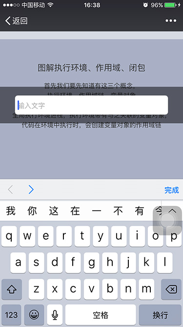
一、带input的fixed在ios下失效
在ios下,一个页面如果有fixed浮层,并且浮层里面有input,那么当input focused的时候,fiexed层的位置就会错乱。
如图:
例子:demo.zhangruojun.com/static/page…
/*
 * @author: zhangruojun;
 * @design: ;
 * @update: 2016-05-24;
 */

/*reset*/
body, dl, dd, h1, h2, h3, h4, h5, h6, p, form { margin: 0; }
ol, ul, input {margin: 0; padding: 0; }
ol, ul { list-style: none; }
body { -webkit-font-smoothing: antialiased; font-family: Arial, DroidSansFallback, Helvetica, Tahoma, \5FAE\8F6F\96C5\9ED1, sans-serif, Sans; }
h1, h2, h3, h4, h5, h6, p { font-weight: normal; }
a, button, button:active, input { -webkit-tap-highlight-color: rgba(0, 0, 0, 0); -webkit-tap-highlight-color: transparent; -webkit-appearance: none; }
em, i { font-style: normal; }
a { text-decoration: none; }
img { border: none; }
input:focus { outline: none; }


/*rem = px / 30 */
html, body { position: relative; height: 100%; }


.page { overflow: auto;  -webkit-overflow-scrolling: touch;  }
.wrapper { position: relative; font-size: 0.8rem; color: #333;  }
.container { position: relative; height: 100%;  overflow: auto;  -webkit-overflow-scrolling: touch; font-size: 0.8rem; color: #333; }

.intro-detail { padding-bottom: 4.77rem; }
.modal { overflow: hidden; min-height: 20rem; }
.cont-md { padding: 3.0rem 0 0 0; text-align: center; line-height: 1.6; white-space: nowrap; }
.cont-md .tit { font-size: 1.07rem; line-height: 1.4; }
.cont-md .lead { margin: 1.0rem 0 0 0; }

.intro-detail .modal:nth-child(1) { background-color: #f4f5f6; }
.intro-detail .modal:nth-child(2) { background-color: #d6dae3; }
.intro-detail .modal:nth-child(3) { background-color: #A9B0C5; }
.intro-detail .modal:nth-child(4) { background-color: #6D789D; color: #fff; }


.sticky-bt { display: -webkit-box; -webkit-box-pack: center; -webkit-box-orient: vertical; display: flex; display: -webkit-flex; flex-direction: column; -webkit-flex-direction: column; justify-content: center; -webkit-justify-content: center; }
.sticky-bt { position: fixed; left: 0; right: 0; bottom: 0; height: 4.77rem; background-color: rgba(0, 0, 0, .5); z-index: 10; }
.btn-primary { display: block; width: 20.1rem; height: 2.93rem; line-height: 2.93rem; border-radius: 2.93rem; margin: 0 auto; background: #4D5572; font-size: 1.2rem; color: #fff; text-align: center; transition: .3s; }
.btn-primary:active { transform: scale(.98); }
.inp-bt { display: block; box-sizing: border-box; width: 90%; height: 2.5rem;  padding: .3rem; margin: 0 auto; border: 1px solid #ccc; border-radius: 6px; font-size: 14px; }


.sticky-bt.intop { bottom: auto; top: 0; }


/*dpi*/
/* for 1080+ px width screen */
@media only screen and (min-width: 1080px){
    html, body { font-size: 51.67px; }
}
/* for 1080 px width screen */
@media only screen and (max-width:1080px) {
    html, body { font-size: 45px; }
}
/* for 800 px width screen */
@media only screen and (max-width:800px) {
    html, body { font-size:33px; }
}
/* for 720 px width screen */
@media only screen and (max-width:720px) {
    html, body { font-size:30px; }
}
/* for 640 px width screen */
@media only screen and (max-width:640px) {
    html, body { font-size: 27px; }
}
/* for 540 px width screen */
@media only screen and (max-width:540px) {
    html, body { font-size: 22.5px; }
}
/* for 480 px width screen */
@media only screen and (max-width:480px) {
    html, body { font-size: 20px; }
}
/* for 450 px width screen */
@media only screen and (max-width:450px) {
    html, body { font-size: 18.9px; }
}
/* for 414 px width screen */
@media only screen and (max-width:414px) {
    html, body { font-size: 17.25px; }
}
/* for 375 px width screen */
@media only screen and (max-width:375px) {
    html, body { font-size: 15.625px; }
}
/* for 320 px width screen */
@media only screen and (max-width:320px) {
    html, body { font-size: 13.5px; }
}
<!DOCTYPE html>
<html>
<head>
    <meta charset="utf-8" />
    <title></title>
    <meta name="viewport" content="width=device-width, initial-scale=1.0, minimum-scale=1.0, maximum-scale=1.0, user-scalable=no" />
    <meta name="format-detection" content="telephone=no, email=no"/>
    <link rel="stylesheet" type="text/css" href="css/style.css" />
</head>
<body>

    <div class="sticky-bt intop">
        <input class="inp-bt" placeholder="输入文字" type="text"/>
    </div>

    <div class="wrapper"><!--container-->
        <div class="intro-detail">
            <div class="modal">
                <div class="cont-md">
                    <h2 class="tit">图解执行环境、作用域、闭包</h2>
                    <div class="lead">
                        <p>首先我们要先知道有这三个概念,<br/>执行环境、作用域链、变量对象</p>
                        <p>当开始执行上面这段js代码的时候,<br/>全局执行环境进栈,执行环境带有与之关联的变量对象,<br/>代码在环境中执行时,会创建变量对象的作用域链</p>
                    </div>
                </div>
            </div>
            <div class="modal">
                <div class="cont-md">
                    <h2 class="tit">图解执行环境、作用域、闭包</h2>
                    <div class="lead">
                        <p>normal函数执行完之后,它的执行环境将被推出环境栈,<br/>当前环境回到全局执行环境。<br/>normal函数执行时所创建的活动对象(变量对象)<br/>也随之销毁(没有指针指向它,<br/>垃圾回收时会将其回收掉,释放内存).</p>
                    </div>
                </div>
            </div>
            <div class="modal">
                <div class="cont-md">
                    <h2 class="tit">图解执行环境、作用域、闭包</h2>
                    <div class="lead">
                        <p>首先我们要先知道有这三个概念,<br/>执行环境、作用域链、变量对象</p>
                        <p>当开始执行上面这段js代码的时候,<br/>全局执行环境进栈,执行环境带有与之关联的变量对象,<br/>代码在环境中执行时,会创建变量对象的作用域链</p>
                    </div>
                </div>
            </div>
            <div class="modal">
                <div class="cont-md">
                    <h2 class="tit">图解执行环境、作用域、闭包</h2>
                    <div class="lead">
                        <p>normal函数执行完之后,它的执行环境将被推出环境栈,<br/>当前环境回到全局执行环境。<br/>normal函数执行时所创建的活动对象(变量对象)<br/>也随之销毁(没有指针指向它,<br/>垃圾回收时会将其回收掉,释放内存).</p>
                    </div>
                </div>
            </div>
        </div>
    </div>

    <div class="sticky-bt">
        <input class="inp-bt" placeholder="输入文字" type="text"/>
    </div>


<script>document.body.addEventListener('touchstart', function () {});</script>

</body>
</html>
(扫码查看页面效果)
解决方法是,将除了fiexed层的内容放在div.container里面并加上以下样式。即整个body设置100%的高度不做滚动,只给内容div自己滚动。
.container{
    position: relative;
    height: 100%;
    overflow: auto;
    -webkit-overflow-scrolling: touch;
}例子:demo.zhangruojun.com/static/page…
/*
 * @author: zhangruojun;
 * @design: ;
 * @update: 2016-05-24;
 */

/*reset*/
body, dl, dd, h1, h2, h3, h4, h5, h6, p, form { margin: 0; }
ol, ul, input {margin: 0; padding: 0; }
ol, ul { list-style: none; }
body { -webkit-font-smoothing: antialiased; font-family: Arial, DroidSansFallback, Helvetica, Tahoma, \5FAE\8F6F\96C5\9ED1, sans-serif, Sans; }
h1, h2, h3, h4, h5, h6, p { font-weight: normal; }
a, button, button:active, input { -webkit-tap-highlight-color: rgba(0, 0, 0, 0); -webkit-tap-highlight-color: transparent; -webkit-appearance: none; }
em, i { font-style: normal; }
a { text-decoration: none; }
img { border: none; }
input:focus { outline: none; }


/*rem = px / 30 */
html, body { position: relative; height: 100%; }


.page { overflow: auto;  -webkit-overflow-scrolling: touch;  }
.wrapper { position: relative; font-size: 0.8rem; color: #333;  }
.container { position: relative; height: 100%;  overflow: auto;  -webkit-overflow-scrolling: touch; font-size: 0.8rem; color: #333; }

.intro-detail { padding-bottom: 4.77rem; }
.modal { overflow: hidden; min-height: 20rem; }
.cont-md { padding: 3.0rem 0 0 0; text-align: center; line-height: 1.6; white-space: nowrap; }
.cont-md .tit { font-size: 1.07rem; line-height: 1.4; }
.cont-md .lead { margin: 1.0rem 0 0 0; }

.intro-detail .modal:nth-child(1) { background-color: #f4f5f6; }
.intro-detail .modal:nth-child(2) { background-color: #d6dae3; }
.intro-detail .modal:nth-child(3) { background-color: #A9B0C5; }
.intro-detail .modal:nth-child(4) { background-color: #6D789D; color: #fff; }


.sticky-bt { display: -webkit-box; -webkit-box-pack: center; -webkit-box-orient: vertical; display: flex; display: -webkit-flex; flex-direction: column; -webkit-flex-direction: column; justify-content: center; -webkit-justify-content: center; }
.sticky-bt { position: fixed; left: 0; right: 0; bottom: 0; height: 4.77rem; background-color: rgba(0, 0, 0, .5); z-index: 10; }
.btn-primary { display: block; width: 20.1rem; height: 2.93rem; line-height: 2.93rem; border-radius: 2.93rem; margin: 0 auto; background: #4D5572; font-size: 1.2rem; color: #fff; text-align: center; transition: .3s; }
.btn-primary:active { transform: scale(.98); }
.inp-bt { display: block; box-sizing: border-box; width: 90%; height: 2.5rem;  padding: .3rem; margin: 0 auto; border: 1px solid #ccc; border-radius: 6px; font-size: 14px; }


.sticky-bt.intop { bottom: auto; top: 0; }


/*dpi*/
/* for 1080+ px width screen */
@media only screen and (min-width: 1080px){
    html, body { font-size: 51.67px; }
}
/* for 1080 px width screen */
@media only screen and (max-width:1080px) {
    html, body { font-size: 45px; }
}
/* for 800 px width screen */
@media only screen and (max-width:800px) {
    html, body { font-size:33px; }
}
/* for 720 px width screen */
@media only screen and (max-width:720px) {
    html, body { font-size:30px; }
}
/* for 640 px width screen */
@media only screen and (max-width:640px) {
    html, body { font-size: 27px; }
}
/* for 540 px width screen */
@media only screen and (max-width:540px) {
    html, body { font-size: 22.5px; }
}
/* for 480 px width screen */
@media only screen and (max-width:480px) {
    html, body { font-size: 20px; }
}
/* for 450 px width screen */
@media only screen and (max-width:450px) {
    html, body { font-size: 18.9px; }
}
/* for 414 px width screen */
@media only screen and (max-width:414px) {
    html, body { font-size: 17.25px; }
}
/* for 375 px width screen */
@media only screen and (max-width:375px) {
    html, body { font-size: 15.625px; }
}
/* for 320 px width screen */
@media only screen and (max-width:320px) {
    html, body { font-size: 13.5px; }
}
<!DOCTYPE html>
<html>
<head>
    <meta charset="utf-8" />
    <title></title>
    <meta name="viewport" content="width=device-width, initial-scale=1.0, minimum-scale=1.0, maximum-scale=1.0, user-scalable=no" />
    <meta name="format-detection" content="telephone=no, email=no"/>
    <link rel="stylesheet" type="text/css" href="css/style.css" />
</head>
<body>

    <div class="sticky-bt intop">
        <input class="inp-bt" placeholder="输入文字" type="text"/>
    </div>

    <div class="container"><!--wrapper-->
        <div class="intro-detail">
            <div class="modal">
                <div class="cont-md">
                    <h2 class="tit">图解执行环境、作用域、闭包</h2>
                    <div class="lead">
                        <p>首先我们要先知道有这三个概念,<br/>执行环境、作用域链、变量对象</p>
                        <p>当开始执行上面这段js代码的时候,<br/>全局执行环境进栈,执行环境带有与之关联的变量对象,<br/>代码在环境中执行时,会创建变量对象的作用域链</p>
                    </div>
                </div>
            </div>
            <div class="modal">
                <div class="cont-md">
                    <h2 class="tit">图解执行环境、作用域、闭包</h2>
                    <div class="lead">
                        <p>normal函数执行完之后,它的执行环境将被推出环境栈,<br/>当前环境回到全局执行环境。<br/>normal函数执行时所创建的活动对象(变量对象)<br/>也随之销毁(没有指针指向它,<br/>垃圾回收时会将其回收掉,释放内存).</p>
                    </div>
                </div>
            </div>
            <div class="modal">
                <div class="cont-md">
                    <h2 class="tit">图解执行环境、作用域、闭包</h2>
                    <div class="lead">
                        <p>首先我们要先知道有这三个概念,<br/>执行环境、作用域链、变量对象</p>
                        <p>当开始执行上面这段js代码的时候,<br/>全局执行环境进栈,执行环境带有与之关联的变量对象,<br/>代码在环境中执行时,会创建变量对象的作用域链</p>
                    </div>
                </div>
            </div>
            <div class="modal">
                <div class="cont-md">
                    <h2 class="tit">图解执行环境、作用域、闭包</h2>
                    <div class="lead">
                        <p>normal函数执行完之后,它的执行环境将被推出环境栈,<br/>当前环境回到全局执行环境。<br/>normal函数执行时所创建的活动对象(变量对象)<br/>也随之销毁(没有指针指向它,<br/>垃圾回收时会将其回收掉,释放内存).</p>
                    </div>
                </div>
            </div>
        </div>
    </div>

    <div class="sticky-bt">
        <input class="inp-bt" placeholder="输入文字" type="text"/>
    </div>


<script>document.body.addEventListener('touchstart', function () {});</script>

</body>
</html>
(扫码查看页面效果)
二、iframe里的fixed在ios下失效
如果我们的页面里面嵌入了一个iframe, iframe页面里面又正好有fixed浮层,那么这个时候ios下查看这个页面,会发现fixed失效了。
例子:demo.zhangruojun.com/static/page…
(扫码查看页面效果)
底部按钮浮层并没有固定在屏幕的底部,而是掉在页面底部去了。
这是ios自带的bug,android下并不会有这个问题。
解决方法还是,将除了fiexed层的内容放在div.container里面并加上以下样式:
{
    position: relative;
    height: 100%;
    overflow: auto;
    -webkit-overflow-scrolling: touch;
 }
demo.zhangruojun.com/static/page…
(扫码查看页面效果)
三、1跟2总结
将html,body高度设置为100%,将页面内容都装在高度为100%的容器里面,滚动不放在body,放在这个子容器,然后fixed层作为其兄弟节点存在。
四、Android某些机型下
Android某些机型下,fixed在底部的input,会被弹出来的软键盘挡住。
不要把input放在fixed层里面,换一种交互方式。
原文地址:zhangruojun.com/iframeli-de…
移动端1px实现:
<!DOCTYPE html>
<html>

	<head>
		<meta charset="utf-8" />
		<title></title>
		<meta http-equiv="Pragma" content="no-cache" />
		<meta name="viewport" content="width=device-width,initial-scale=1,minimum-scale=1,maximum-scale=1,user-scalable=no" />

		<style type="text/css">
			.onepx-border {
				padding: 30px 0px;
				position: relative;
				background: white;
			}

			.onepx-border:before {
				content: '';
				position: absolute;
				top: 0px;
				left: 0px;
				width: 200%;
				height: 200%;
				border: 1px solid blue;
				transform-origin: 0 0;
				transform: scale(0.5, 0.5);
				box-sizing: border-box;
				border-radius: 10px;
			}
			.border{
				margin-top: 10px;
				padding: 30px 0px;
				position: relative;
				border: 1px solid red;
				border-radius: 5px;    /*要变成上面的一半*/
			}
		</style>
	</head>

	<body>
		<div class="onepx-border">
			qugdwywqfyuwqyu
		</div>
		<div class="border">
			qugdwywqfyuwqyu
		</div>
	</body>

</html>
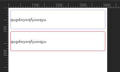
单个边的1px方案
由于andorid不能设置0.5px像素的边框,所以需要通过伪元素来模拟边框,先使伪元素的高度为1px,然后使用transform: scale(.5)缩小相应的大小即可。具体实现代码如下:
.item {
    position: relative;
    &:before{
        content: '';
        position: absolute;
        left: 0;
        top: 0;
        bottom: auto;
        right: auto;
        width: 1px;
        height: 100%;
        background-color: @color;
        display: block;
        z-index: 1;
        html.pixel-ratio-2 & {
          .transform(scaleX(0.5));
        }
        html.pixel-ratio-3 & {
          .transform(scaleX(0.33));
        }
    }
}
然后不同方向的边框,只需要跳转伪元素的位置和缩放位置即可。该实现方案来自Framework7
边框按钮的1px方案
除了当个方向的边框外,还有一种全边框的按钮,如果不做处理会显得特别粗,但是伪元素只有 before 和 after 显然刚才的单边的方案不能用,所以只能采用其他方案。
当然还是利用伪元素画边框然后通过缩小,达到边框变细的目的。首先我们使用伪元素画四条边,在将宽高调整到200%,最后再缩小50%,由于边框是1px不会因宽高的改变而改变,所以我们缩小时边框也会跟着变细。
.block-line {
    position: relative;
    border: 1px solid #000;  // 正常情况下
    html.pixel-ratio-2 & {
        border-color: rgba(0, 0, 0, 0);
        &:before {
            content: "";
            width: 200%;
            height: 200%;
            position: absolute;
            top: 0;
            left: 0;
            border: 1px solid #000;
            transform: scale(0.5);
            transform-origin: 0 0;
            padding: 1px;
            box-sizing: border-box;
            pointer-events: none;
        }
    }

    html.pixel-ratio-3 & {
        border-color: rgba(0, 0, 0, 0);
        &:before {
            content: "";
            width: 300%;
            height: 300%;
            position: absolute;
            top: 0;
            left: 0;
            border: 1px solid #000;
            transform: scale(0.33);
            transform-origin: 0 0;
            padding: 1px;
            box-sizing: border-box;
            pointer-events: none;
        }
    }
}
此解决方案来自Frozen UI
