教程简介
-
1、阅读对象
本篇教程适合新手阅读,老手直接略过
-
2、教程难度
初级
-
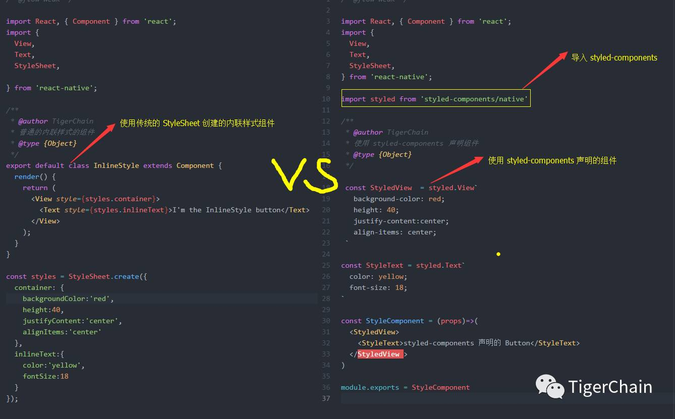
demo 地址:https://github.com/githubchen001/rn-lesson/tree/master/lesson01/02、stylecomponents/styleComponent
正文
我们都知道在 RN 中使用的的内联样式,是通过 StyleSheet 组件创建出来的样式「当然也可以使用 const style={} 来定义」
对于 web 开发者来说,特别是使用 css 样式的人来说写样式的时候总是不自觉的要加一个 - ,那么你也可以使用样式组件—styled-components ,这们来重点介绍一下 styled-components
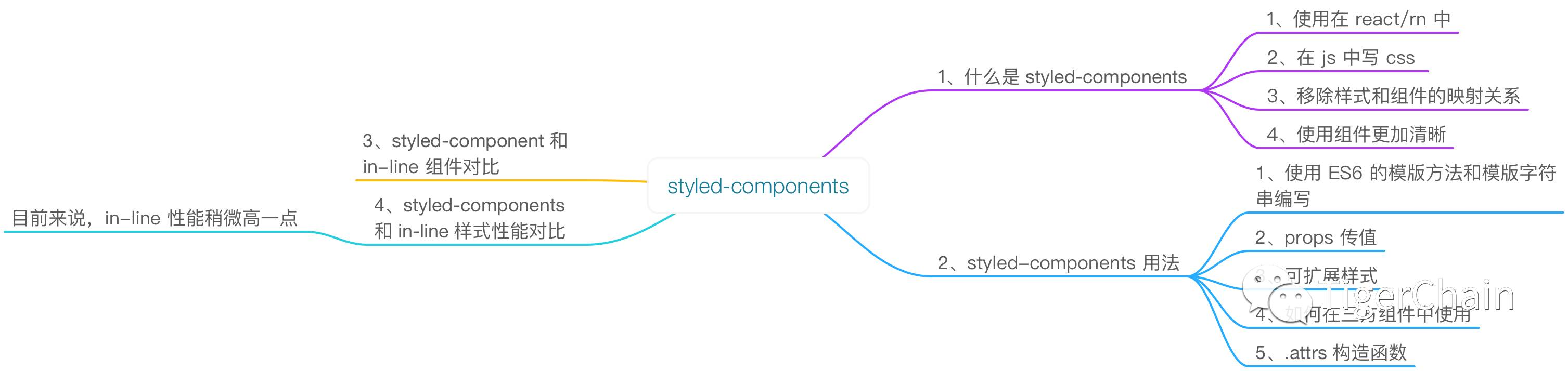
一、 什么是 styled-components
熟悉前端的童鞋都知道,html 中引入 css 有三种方式
-
嵌入式
<head>
 <style type="text/css">
   h3{color:red}
   span{color:blue}
</style> <head>-
内联式
<p style="color:#FFEECC;font-weight:bold;">内联样式</p>-
外部引用入,有 link import 等
这里说一下 link
<link rel="stylesheet" type="text/css" href="theme.css" /><html>
 指令语句</html>
在 RN 中使用的也是内联样式,那有没有一个既有 web 开发中 css 书写特性,也能把 React 组件化思想结合在一起「有样式的组件」组件呢?styled-components 就能满足我们的需求
styled-components 则是一个把组件和 style 联系在一起的一个组件库,为 React 和 ReactNative 提供一个干净,易于使用的界面,说白了就是在 js 上写 css ,移除了组件和样式的映射关系。是 style 的另一种思想,简单的举个例子来直观的感受一下吧,如下:定义了一个带有样式的 Button ,怎么样帅吧
const Button = styled.Button`
   color:red;
   font-size:16;
   margin:1;
   padding:0.5,1;
   ...
`
PS:其中 styled.Button 是一个标签模版函数,紧跟在后面的 `…` 是一个模版字符串,模版函数和模版字符串都是 ES6 的语法,如果不清楚的可以查看 ES6 相关知识
二、styled-components 的使用
这里我们以 RN 举例子来说明,React 使用套路是一样的
1、在指定目录下创建一个 RN 项目
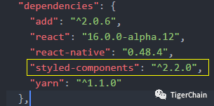
react-native init styleComponent2、安装 styled-components
npm install --save styled-components 或 yarn add styled-components我们看一下 package.json 中已经成功添加了 styled-components 并且版本是 2.2.0
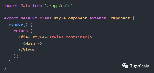
3、新建 app 目录,并且新建 main.js,并将 main.js 添加到时 index.android.js 和 index.ios.js 中
修改 index.android.js 和 index.ios.js 核心代码
4、在 app 目录中新建 inlineStyle.js 和 StyleComponent.js 文件
-
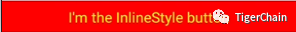
我们使用传统的 rn 样式方法来创建一个背景为红色,并且字为红色的按钮,如下:
# inlineStyle.js

import React, { Component } from 'react';
import {
  View,
  Text,
  StyleSheet,
} from 'react-native';/**
 * @author TigerChain
 * 普通的内联样式的组件
 * @type {Object}
 */export default class InlineStyle extends Component {
  render() {       return (            <View style={styles.container}>
        <Text style={styles.inlineText}>I'm the InlineStyle button</Text>
      </View>
    );
  }
}

const styles = StyleSheet.create({
  container: {
    backgroundColor:'red',
    height:40,
    justifyContent:'center',
    alignItems:'center'
  },
  inlineText:{
    color:'yellow',
    fontSize:18
  }
});-
2、定义 StyleComponent.js
# StyleComponent.js

import React, { Component } from 'react';
import {
  View,
  Text,
  StyleSheet,
} from 'react-native';

import styled from 'styled-components/native'/**
 * @author TigerChain
 * 使用 styled-components 声明组件
 * @type {Object}
 */

 const StyledView  = styled.View`
   background-color: red;
   height: 40;
   justify-content:center;
   align-items: center;
 `const StyleText = styled.Text`
  color: yellow;
  font-size: 18;
`const StyleComponent = (props)=>(    <StyledView>
    <StyleText>styled-components 声明的 Button</StyleText>
  </StyledView >)

module.exports = StyleComponent
style-components 格式
我们可以看到使用 styled-components 来编写样式组件的格式是
const CustomView = styled.XXX`

 样式

`
其中 XXX 就是 RN 中的组件,比如 Text,View,Button 等
PS:使用 styled-components 要先引入这个库
import styled from 'styled-components/native'
我们来对比一下两种方式吧
把两个组件组合到 main.js 中
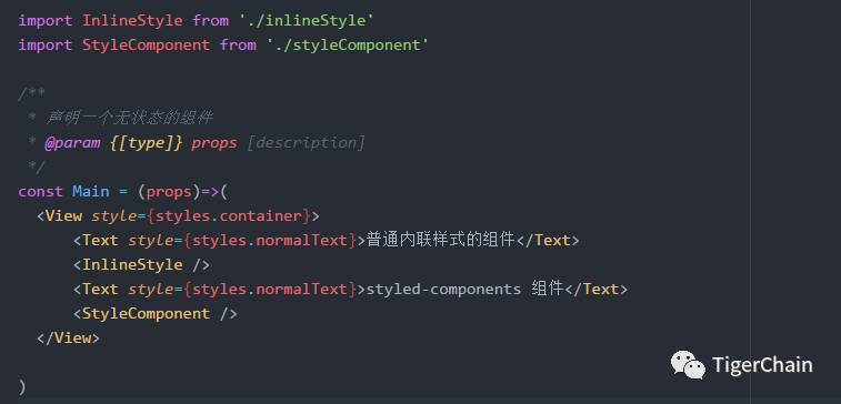
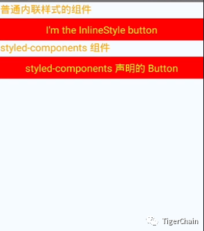
两种方式写的生成的一个相同的组件最后运行效果如下:
经过以上代码,我们简单的了解了一下 styled-components 是个什么鸟,并且如何使用,下面我们来说一些高级用法吧
三、styled-components 的高级用法
1、传递属性「定制组件」
-
1、我们先看一个 React 的例子吧「注意这里说的是 React 」
假如我们想要定义按钮的样式,分别为大、小,我们会这样做,新建一个 css 文件
css 文件
.button{ background:red; border-radius: 8px; color: yellow;}.large{ height:60px; width:180px;}.small{ height:40px; width:100px;}js 文件
class CustomButton extends React.Component {
  render() {          return (            <div>
        <button className="small">按钮</button>
        <button className="large">按钮</button>
      </div>
    )
  }
}
我们想在 rn 使用 styled-components 实现以上类似的功能如何办呢?传递 props 就派上用场了,废话不多说,直接上代码
-
2、使用 styled-components 完成上面的按钮组件
修改 styleComponent.js,并声明一个可指定大小的按钮组件
const CustomButton = styled.View`
  background-color: ${props => props.red?'red':blue};
  border-radius: 8;
  margin-top: 10;
  justify-content: center;
  align-items: center;
  height: ${props => props.small?40:60};
  width:${props => props.small?100:180}
`
然后引用即可
<CustomButton small red>
   <StyleText >TigerChain</StyleText>
</CustomButton>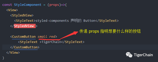
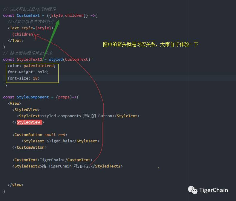
2、对任何组件进行样式化
我们项目中有时会用三方组件,我们想必变三方组件的样式,styles-components 也是完美支持的,看核心代码
// 定义可被任意样式的组件 熟悉 props 的都知道这里的 children是啥意思,style 就不用说了
const CustomText = ({style,children}) =>(
  //这里还可以是任意三方组件
  <Text style={style}>
    {children}
  </Text>
)
// 给上面的组件添加样式
const StyledText2 = styled(CustomText)`
  color: palevioletred;
  font-weight: bold;
  font-size: 18;
`;
使用方式
  <CustomText>TigerChain</CustomText>
  <StyledText2>给 TigerChain 添加样式</StyledText2>
运行查看结果:

大体一个过程如下:
3、样式继承
-
格式:
const CustomComponent = styled.Component`
    样式
`

const MyComponent = CustomComponent.extend`
    扩展样式或重写样式
    ...
`-
在 styleComponent.js 中添加自定义样式扩展组件
//定义可继承的组件const MyCusTomText = styled.Text`
  color: red;
  margin-top: 8;
`//扩展组件const ExtendText = MyCusTomText.extend`
  font-size:25;
  font-weight:bold;
`-
使用
  <MyCusTomText>自定义文本</MyCusTomText>
<ExtendText>扩展文本</ExtendText>-
运行查看结果

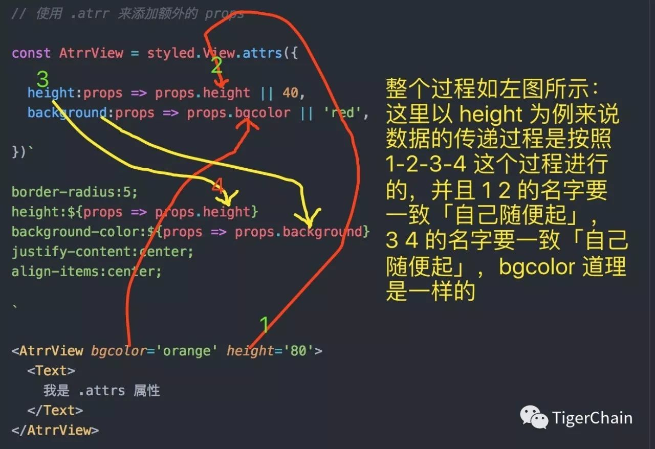
4、附加 props 使用 .attrs 构造函数
在 .attrs 构造函数中,我们可以声明静态 props ,动态 props ,目的是为了避免传递不必要的属性
-
格式:
const MyView = styled.View.attrs({
    ...
    xxx:props => props.yyy
    ...
})`
    xxx:${props => props.xxx}
`-
以上格式看起来比较模糊,我们通过代码来感受一下
// 使用 .atrr 来添加额外的 propsconst AtrrView = styled.View.attrs({    //声明一些 props 属性
  height:props => props.height || 40,
  background:props => props.bgcolor || 'red',

})`
border-radius:5;
height:${props => props.height}
background-color:${props => props.background}
justify-content:center;
align-items:center;
`
使用并查看结果
<AtrrView bgcolor='orange' height='80'> <Text> 我是 .attrs 属性 </Text></AtrrView>结果如下:

过程分析
总结:
经过以上我们对 styled-componets 有了一个大体的认识和了解,styled-components 还支持动画等,具体可以去官网查看,总结 styled-componentd 有以下特点
-
是 css in js 的一种实现方式
-
移除了样式和组件的映射关系
-
使用组件看起来更清晰
-
使样式组件和逻辑组件更好的区分开,使得两种组件解耦
-
与传统单一职责相比,styled-components 就相当于富二代,与生俱来就可以写一个 style 的组件「传统的推崇 html css js 等都要分开」
这个玩意开始写的时候人很别扭「特别对于喜欢 js css html 分离的人」,但是写着写着就有一种巴黎欧莱雅的感觉—-你值得拥有
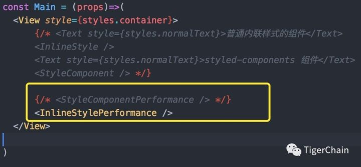
三、性能对比
既然 styled-components 让组件拥有完整的功能,并且是目前前端变化的趋势,那么我们到底该不该使用 styled-components 呢?说到这里估计有人要骂笔者了「我靠,我都照着你说的的代码撸了一遍了,你居然这样说…」。我只想说年轻人,稍安勿躁
一个组件不光是好用就是我们要选择的理由,我们还要考虑性能、组件对包大小的影响,兼容性的影响等等,这里我们对比一下 styled-components 和传统的 in-line css 的性能
开始撸码
在上面 demo 的基本上添加代码,在这里我们要统计一代码的执行时间,所以安装一个依赖库 react-native-console-time-polyfill
yarn add react-native-console-time-polyfill-
1、在 app 目录中新建 StyledComponentsPerformance.js
/* @flow weak */import React, { Component} from 'react';
import {
  View,
  Text,
  StyleSheet,
  ListView
} from 'react-native';

import styled from 'styled-components/native'import 'react-native-console-time-polyfill'import data from './Data'const ListItemView = styled.View`
  padding-top: 5;
  padding-bottom: 5;
  border-bottom-width: 1;
  border-bottom-color: red;
`;const ListItemText = styled.Text`
  color:red;
  font-size: 18;
`;const ScrollViewStyled = styled.ScrollView`
`;const ListViewStyled = styled.ListView`
`;/**
 * 样式组件性能测试
 * @type {ListView}
 */export default class StyleComponentPerformance extends Component {
  constructor(props) {
    super(props);          const ds = new ListView.DataSource({ rowHasChanged: (r1, r2) => r1 !== r2 });    this.state = {
      dataSource: ds.cloneWithRows(data),
    };
  }
  componentWillMount() {       console.log(`ListView - 渲染 ${data.length} 个组件`);       console.time('styled-components');
  }

  componentDidMount() {       console.timeEnd('styled-components');
  }

  renderRow = (row) =>(        <ListItemView><ListItemText>{row.name}</ListItemText></ListItemView>
  )

  renderListView() {
    return (            <ListViewStyled
        dataSource={this.state.dataSource}
        renderRow={this.renderRow}
        enableEmptySections={true}
      />
    );
  }

  renderScrollView() {
    return (            <ScrollViewStyled>
        {data.map((row, index) => <ListItemView key={index}><ListItemText>{row.name}</ListItemText></ListItemView>)}            </ScrollViewStyled>
    );
  }

  render() {
    return this.renderListView();
    // return this.renderScrollView();
  }
}-
2、在 app 中目录中新建 InlineStylePerformance.js
/* @flow weak */import React, { Component } from 'react';
import {
  View,
  Text,
  StyleSheet,
  ListView,
  ScrollView
} from 'react-native';

import 'react-native-console-time-polyfill'import data from './Data'/**
 * inLine style 性能测试
 * @type {ListView}
 */export default class InlineStylePerformance extends Component {
  constructor(props) {
      super(props);              const ds = new ListView.DataSource({ rowHasChanged: (r1, r2) => r1 !== r2 });      this.state = {
        dataSource: ds.cloneWithRows(data),
      };
    }

    componentWillMount() {           console.log(`ListView - 渲染 ${data.length} 个组件`);           console.time('inline-style');
    }

    componentDidMount() {           console.timeEnd('inline-style');
    }

    renderRow = (row) =>(           <View style={styles.ListItemView}><Text style={styles.textStyle}>{row.name}</Text></View>
    )

    renderListView() {
      return (                <ListView
          dataSource={this.state.dataSource}
          renderRow={this.renderRow}
          enableEmptySections={true}
        />
      );
    }

    renderScrollView() {
      return (                 <ScrollView>
          {data.map((row, index) => (                        <View style={styles.ListItemView} key={index}><Text style={styles.textStyle}>{row.name}</Text></View>
          ))}                </ScrollView>
      );
    }

    render() {
      return this.renderListView();
      // return this.renderScrollView();
    }
}

const styles = StyleSheet.create({
  ListItemView: {
  paddingTop: 5,
  paddingBottom: 5,
  borderBottomWidth: 1,
  borderBottomColor: 'red',
},
textStyle:{
  fontSize:18,
  color:'red',
}

});-
3、新建 Data.js
const data = []for(let i=0;i<2000;i++){
  data.push({name:`测试 === ${i}`})
}

export default data-
4、测试,在 main.js 引入即可
在这里我们在模拟器或是真机上开启远程 debug 调试,然后打开 chrome 调试就可以看到 console 打出的 log 了
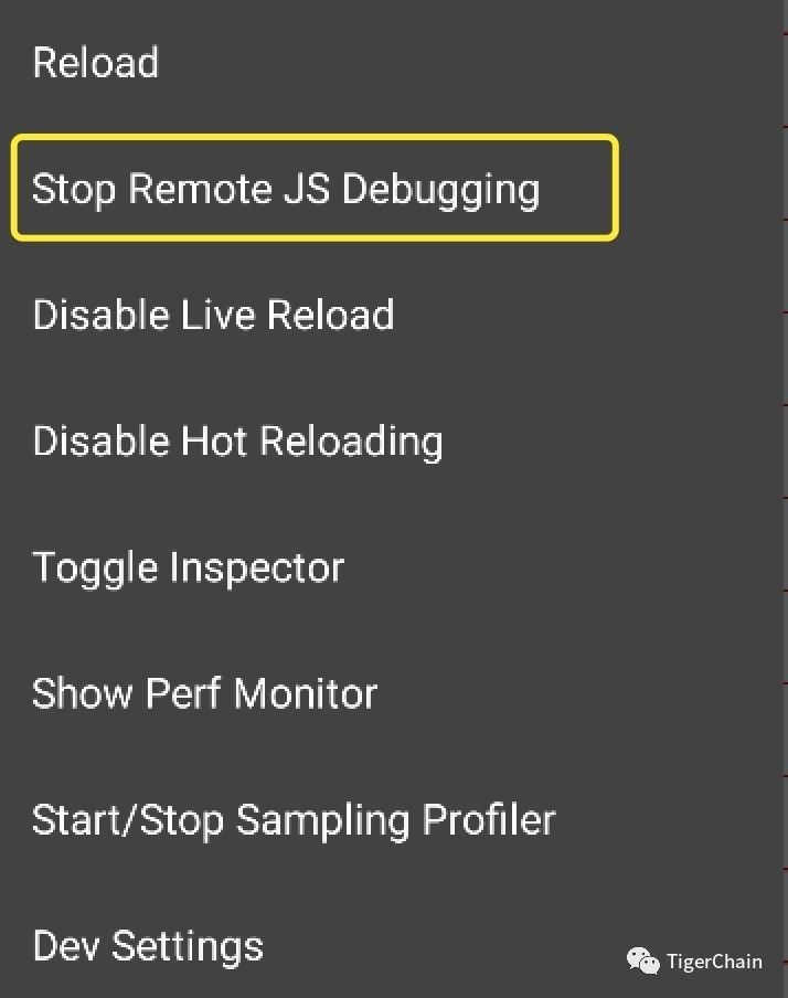
打开 chrome 调试工具
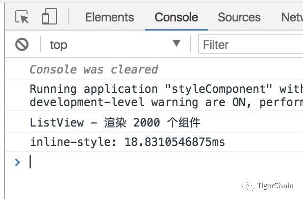
经过五次对比,得出以下结果

结论
-
由于我们是开启远程调试工具,所以和网络也有关系,得出的结论不一定是最准确的
-
但是也说明了一些问题 styled-components 目前的版本来说「2.2.0」性还是比 in-line 样式的性能稍有点差,
-
styled-components 完全可以使用在项目中,并且相信以后的版本会逐渐缩小和 in-line 样式的性能的微小差距
到此为止,我们就介绍完了 styled-components 的用法和性能比较,快上手试试吧
以后文章会第一时间发在公号,长按即可关注
关注我长按下图识别图中二维码或是扫描添加即可关注
公众号:TigerChain