

SVG的path(路径)是一个非常强大的属性!使用它可以实现很多的有趣的动画效果,比如现在很流行的描边绘制动画效果等等。
今天这篇文章就是使用SVG path(路径)来实现一个酷炫的页面过渡动画效果。为了提高开发效率,这里使用Pug和Sass来这两个HTML和CSS预编译语言来编写HTML和CSS。
要实现的效果如下图所示,灵感主要是来源于Clément Brichon在Dribble上的一个效果。
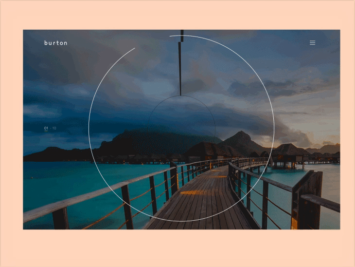
这个效果实现的一个思路是,使用SVG path(路径)来实现一个黑色的图层盖在背景图片上,然后通过改变path(路径)的属性来实现途中所示的动画效果。
要注意一点的是,SVG到现在为止不是所有的浏览器都支持,特别是桌面设备上。不过在chrome等现代浏览器上是没问题的。
SVG path动画
这个动画主要是使用SVG path(路径)来实现的,即描边绘制动画效果。可以看看以前的关于描边绘制动画效果入门文章。也可以看看下面这两篇文章的介绍:
Animated line drawing in SVG by Jake Archibald。
How SVG Line Animation Works by Chris Coyier。
这次我们使用的技术有点变化,一般这种秒变绘制动画都使用stroke-dashoffset这个属性来实现的,这次我们将使用stroke-dasharray来实现描边绘制动画效果。使用stroke-dasharray可以更加的灵活些,比如可以控制path(路径)的绘制方向。想知道更多的细节的话,可以去看看之前写的一篇文章。
使用Pug来编写HTML
开始之前先使用Pug(它更出名的一个名字是Jade)这个高效的模板引擎来编写HTML,可以看看这篇入门教程。
Pug的语法非常简单,就是使用诸如变量等特性来编写HTML。看下面的代码,你就知道是多么的简单了。
//- Background image and button
<div class="background-image"></div>
<button>Toggle Animation</button>

//- Some variables to help with maths
- var circlesNumber = 5;
- var strokeWidth = 150;
- var radius = 100;
- var width = radius * 2;
- var height = radius * 2;
- var left = width / 2;
- var top = height / 2;

//- The main function to build a circle (SVG path)
//- Formula taken from this answer: http://stackoverflow.com/a/10477334
mixin circle(className)
    <path class="#{className}" d="M #{left} #{top} m -#{radius} 0 a #{radius} #{radius} 0 1 0 #{radius * 2} 0 a #{radius} #{radius} 0 1 0 -#{radius * 2} 0"/>

//- Center circle
<svg class="svg-center" width="#{width}" height="#{height}">
    + circle('path-center')
</svg>

//- Reset some variables to build the other circles
- width = 10000;
- height = 5000;
- left = width / 2;
- top = height / 2;
- radius += strokeWidth / 2 - 1;

//- Very big SVG
<svg class="svg-borders" width="#{width}" height="#{height}">

    //- Build the circles, increasing the radius at each iteration
    while circlesNumber--
        + circle('path-borders')
        - radius += strokeWidth - 1;
</svg>
通过上面的代码,我们使用SVG path(路径)生成了一些圆圈,然后使用一些样式,来使这些圆圈足够大以便覆盖背景图片。
SVG path(路径)绘制动画
基本的结构准备好了,下面就使用SVG path(路径)来实现动画效果。代码如下:
// Same variables used in HTML
$circlesNumber: 6;
$strokeWidth: 150;
$radius: 100;

// PI value (approximately)
$pi: 3.15;

// A big length
$maxLen: 10000;

// Loop to generate convenient stroke-* values
@while $circlesNumber > 0 {

  // Calculate the SVG path length (approximately)
  $currentRadius: $radius + ($circlesNumber) * $strokeWidth - $strokeWidth / 2;
  $len: 2 * $pi * $currentRadius;

  // Draw the entire path
  .path-borders:nth-child(#{$circlesNumber}) {
    stroke-dashoffset: $maxLen;
    stroke-dasharray: $maxLen 0 $len;
  }

  .open-state {

    // "Erase" the path, with alternating direction
    .path-borders:nth-child(#{$circlesNumber}) {
      @if ($circlesNumber % 2 == 0) {
        stroke-dasharray: $maxLen 0 0;
      } @else {
        stroke-dasharray: $maxLen $len $len;
      }
    }
  }

  // Next iteration
  $circlesNumber: $circlesNumber - 1;
}
我们来看看编译之后输出的一段CSS动画代码:
.path-borders:nth-child(2) {
  stroke-dashoffset: 10000;
  stroke-dasharray: 10000 0 2047.5;
}

.open-state .path-borders:nth-child(2) {
  stroke-dasharray: 10000 0 0;
}
可以看到,如果使用CSS来编写,就要手动计算出每一个path(路径)的长度,还是有点工作量的。如果使用SCSS的话,就可以可以它提供的计算功能来自动计算每一个path(路径)长度就可以了,不需要一个个手动计算了。
一些动画细节
最后,为了使动画更加的细腻,需要打磨一些动画细节。
.open-state {

  // Scaling down the image
  .background-image {
    transform: scale(1);
  }

  // Rotating SVG paths (except the center circle)
  .svg-borders {
    transform: translate(-50%, -50%) rotate(90deg);
  }

  // Animating the center circle
  .path-center {
    stroke-width: 400px;
  }
}
一个酷炫的页面过渡动画效果就完成了。demo体验地址。
更多的代码细节,可以去github上看看。
本文主要是从Creative Splash Transition with CSS and SVG这篇文章整理而来,有删减,有疏漏或者理解不到位的地方,还请多多指教!
