

在前面介绍了Susy2的配置(config)和简写(shorthand)之后,给大家介绍一下Tookit中几个常用的宏,然后动手做一个 Bootstrap 栅格系统
Tookit
Susy 2 的 Tookit 是围绕我们的简写语法(shorthand)构建的。通过 shorthand 调整初始配置值来控制每一个细节,让你不会被束缚在一套栅格系统上。
常用Tookit
Span [mixin]
span是一个高频度的混合宏,可以灵活设定元素的栅格位置。
- 语法格式: span($span) { @content }
- $span:
shorthand <span> - @content: Sass content block
//input scss

$susy: (
  container:1000px,
  column-width:100px,
  math:static,
  columns: 10,  // The number of columns in your grid
  gutters: .25, // The size of a gutter in relation to a single column
  gutter-position:split
);

.col-left{
    @include span(1);
}

.col-right{
  @include span(2 last);
}

.col-half {
  @include span(50%);
}

// ======= output css =========

.col-left {
  width: 100px;
  float: left;
  margin-left: 12.5px;
  margin-right: 12.5px;
}

.col-right {
  width: 225px;
  float: right;
  margin-left: 12.5px;
  margin-right: 12.5px;
}

.col-half {
  width: 50%;
  float: left;
  margin-left: 12.5px;
  margin-right: 12.5px;
}
susy-media [mixin]
susy-media 提供了基本的媒体查询,并内置在 susy-breakpoint 混合宏中。
- 语法格式: susy-media($query, $no-query)
- $query:
<min-width> [<max-width>] | <string> | <pair> | <map> - $no-query:
<boolean>|<string>
// input scss
@include susy-media(30em) {
  background-color: #FFF;
}
// output css
@media (min-width: 30em) {
  background-color: #FFF;
}

// input scss
@include susy-media(30em 60em) { /*...*/ }
// output css
@media (min-width: 30em) and (max-width: 60em) { /*...*/ }


// input scss
@include susy-media(min-height 30em) { /*...*/ }
// output css
@media (min-height: 30em) { /*...*/ }
susy-breakpoint [mixin]
susy-breakpoint 为混合宏susy-media或者第三方breakpoint插件提供不同媒体断点查询。
- 语法格式: susy-breakpoint($query, $layout, $no-query)
- $query: media query shorthand
- $layout:
shorthand <layout> - $no-query:
<boolean>|<string>
// input scss
$susy: (
  container:1000px,
  column-width:100px,
  math:static,
  columns: 10,  // The number of columns in your grid
  gutters: .25, // The size of a gutter in relation to a single column
  gutter-position:split
);

@include susy-breakpoint(30em, 8) {
  // nested code uses an 8-column grid,
  // starting at a 30em min-width breakpoint...
  .example { @include span(3); }
}

// output css

@media (min-width: 30em) {
  .example {
    width: 350px;
    float: left;
    margin-left: 12.5px;
    margin-right: 12.5px;
  }
}
更多的Tookit请查看官方文档 susydocs.oddbird.net/en/latest/t…
创建一个 Bootstrap 栅格系统
| 超小屏幕 手机 (<768px) | 小屏幕 平板 (≥768px) | 中等屏幕 桌面显示器 (≥992px) | 大屏幕 大桌面显示器 (≥1200px) | |
|---|---|---|---|---|
| 栅格系统行为 | 总是水平排列 | 开始是堆叠在一起的,当大于这些阈值时将变为水平排列C | ||
.container 最大宽度 |
None (自动) | 750px | 970px | 1170px |
| 类前缀 | .col-xs- |
.col-sm- |
.col-md- |
.col-lg- |
| 列(column)数 | 12 | |||
| 最大列(column)宽 | 自动 | ~62px | ~81px | ~97px |
| 槽(gutter)宽 | 30px (每列左右均有 15px) | |||
| 可嵌套 | 是 | |||
| 偏移(Offsets) | 是 | |||
| 列排序 | 是 |
全局配置
$susy:(
debug:(image:show), // 开启debug
columns:12,
gutters: 0,
gutter-position: inside,
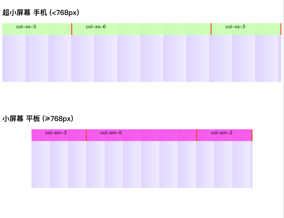
);小于 768px 的适配
// 展示容器元素
.container-xs{
  height: 200px;
  @include container;
  // 大于0 , 小于768px
  @include susy-breakpoint(0 768px){
    @include container;
  }
}

[class^=col-xs]{
  // PS:由于susy2的gutters只能设置百分比,不能给绝对值,因而选择另一种方式
  // 当class前面有col-xs的文字时,则自动加上padding左右的设定。
  padding-left: 15px;
  padding-right: 15px;

  background-color:rgba(#CFFFA3,.8);
  border-right:3px #F94B22 solid;
  text-indent:2em;
  height:40px;
}

// col-xs 版
@for $i from 1 through 12 {
    .col-xs-#{$i}{
      @include span($i)
    }
}
大于等于768px 的适配
// col-sm 版 : >= 768px
// 这里列宽为什么是32.5?而不是62呢?
// 道理很简单,因为 gutter-position:inside,会给元素设置 box-sizing:border-box
// layout shorthand :
// 12grids
// 32.5px columnWidth
// 30px gutterWidth
$SmallDevice:(12 (32.5px 30px) inside);
$breakSmallDevice: 768px;  //设定断点

[class^=col-sm]{

  background-color:rgba(#F959EB,.8);
  border-right:3px #F94B22 solid;
  text-indent:2em;
  height:40px;
}

// 展示容器元素
.container{
  height: 200px;
  @include container;
  @include susy-breakpoint($breakSmallDevice,$SmallDevice){
    @include container;
  }
}


@include susy-breakpoint($breakSmallDevice){
  @for $i from 1 through 12 {
    @include with-layout($SmallDevice){
      .col-sm-#{$i}{
        @include span($i);
      }
    }
  }
}

// 以此类推,≥992px,≥1200px都同样可以实现。
效果图
通过这个例子,我们可以发现,制作一个栅格系统,用Susy2,只需要用到span,container,susy-breakpoint,width-layout就可以轻松制作出来。
