

Ever wanted an image to fit exactly into a certain given dimension, but while keeping its aspect ratio and avoid having a squished image? This wasn’t something that could easily be done using CSS for the longest time. One trick was to resort to using a background image instead to go around the issue. Well the problem is no more with the object-fit property!
Along with inherit, initial and unset, there are 5 more possible values for object-fit:
- contain: The image keeps its original aspect ratio, but resized so that the longest of either the height or width can fit in the given dimensions.
- cover: The image keeps its original aspect ratio and the image area is completely covered.
- fill: The initial value. The image will fill its given area, even if it means losing its aspect ratio.
- none: The image is not resized at all, and the original image size fills the given area.
- scale-down: The smaller of either contain or none.
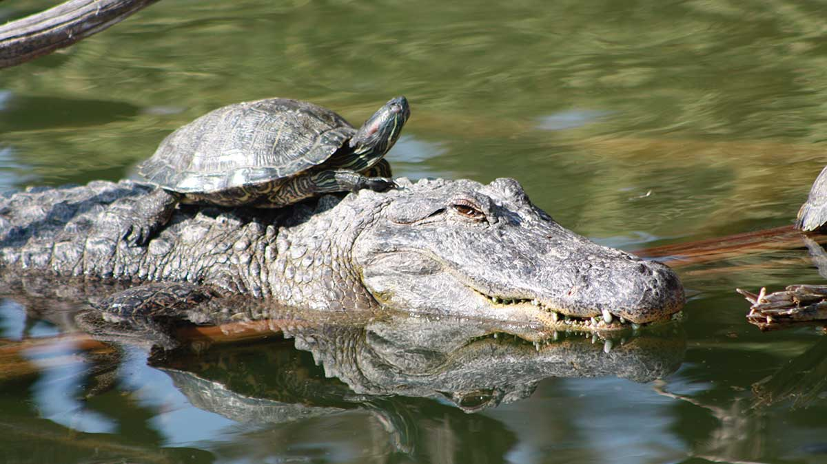
Let’s demonstrate with an example. The following image’s original width is 1200px and height is 674px. Here it’s shown at half its size, 600px by 337px:
Now we have a problem if we need the image to be the same height, but fit in half the width. The original aspect ratio is lost and the result is a squished image:
object-fit can fix that issue for us. Let’s showcase the different values:
object-fit: contain
.alligator-turtle {
  object-fit: contain;
}
object-fit: cover
.alligator-turtle {
  object-fit: cover;
}
object-fit: fill
.alligator-turtle {
  object-fit: fill;
}
object-fit: none
.alligator-turtle {
  object-fit: none;
}
object-fit: scale-down
.alligator-turtle {
  object-fit: scale-down;
}
In this particular example, object-fit: cover is probably what will work the best for our needs.
object-position
Now, say your image was cropped with object-fit, but the part of the image that’s shown is not positioned as you’d like. You can use the object-position property to control exactly that.
Let’s start with our object-fit: cover example:
.alligator-turtle {
  object-fit: cover;

  width: 300px;
  height: 337px;
}
Now let’s change the position of the visible part of the image on the X axis so that we see the right-most edge of the image:
.alligator-turtle {
  object-fit: cover;
  object-position: 100% 0;

  width: 300px;
  height: 337px;
}
And finally, here’s what happens if you provide a position that’s out of bounds:
.alligator-turtle {
  object-fit: cover;
  object-position: -20% 0;

  width: 300px;
  height: 337px;
}
