

本文为菜鸟窝编辑吴佳林的连载。
这篇文章主要讲视图容器的最后一个组件:swiper,滑块视图容器.先来看下swiper长什么样子。
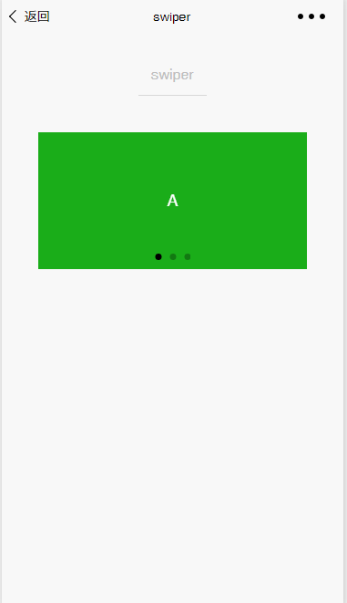
如上图所示,大家应该这个组件不是很陌生了,它就是平时我们在APP见得最多的轮播图。当然上面只是一个颜色背景,想要替换成图片也是完全可以的。
属性
- indicator-dots:是否显示面板指示点,默认是false
- indicator-color:指示点颜色
- indicator-active-color:当前选中的指示点颜色
- autoplay:是否自动切换
- current:当前所在页面的 index
- interval:自动切换时间间隔
- duration:滑动动画时长
- circular: 是否采用衔接滑动
- bindchange:current 改变时会触发 change 事件
swiper-item
swiper-item 就是里面 swiper 展示的面板。是不是多少个面板就需要多少个 swiper-item 呢?不是的,一般开发中,我们的 swiper-item 会嵌套在 block 标签里面,然后在 block 里面跟参数值写上 for 循环,就是可以动态展示我们的轮播的面板了。
示例使用
这些到底如何使用呢?下面看一个 demo 代码(部分)
wxml 文件
    <view class="container">
      <swiper indicator-dots="{{indicatorDots}}" autoplay="{{autoplay}}" interval="{{interval}}" duration="{{duration}}">
            <block wx:for="{{background}}" wx:key="*this">
              <swiper-item>
                <view class="swiper-item {{item}}"></view>
              </swiper-item>
            </block>
          </swiper>
    </view>
js文件
    Page({
      data: {
        background: ['demo-text-1', 'demo-text-2', 'demo-text-3'],
        indicatorDots: true,
        vertical: false,
        autoplay: false,
        interval: 2000,
        duration: 500
      },
      changeIndicatorDots: function (e) {
        this.setData({
          indicatorDots: !this.data.indicatorDots
        })
      },
      changeAutoplay: function (e) {
        this.setData({
          autoplay: !this.data.autoplay
        })
      },
      intervalChange: function (e) {
        this.setData({
          interval: e.detail.value
        })
      },
      durationChange: function (e) {
        this.setData({
          duration: e.detail.value
        })
      }
    })
关注公众号免费领取" N套客户端实战项目教程"

