

CSS 的 Grid Layout 已经开始在浏览器上有资词啦!
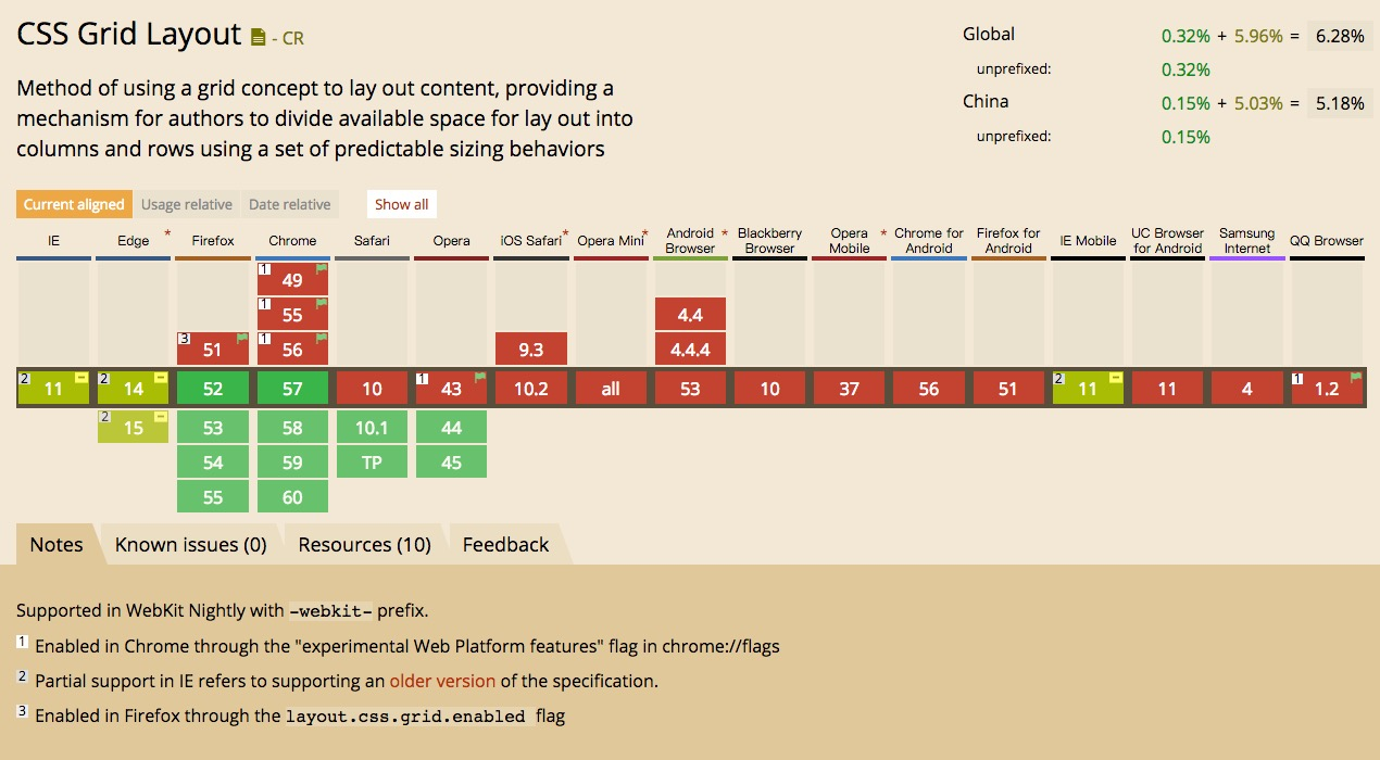
可以看到在 FF 的52版本以上已经支持了,Chrome 从57开始支持,如果用 dev 版本或者 canary 版本都可以了,safari 包括10.1和 tp 版都已经支持了。
可以愉快的搞起来啦。
友情提醒,如果想看到某些代码的效果,请在上文提到的支持 Grid 的浏览器中查看本文,移动端浏览器通通不支持。
基本概念
一个 Grid 其实就是由一系列相交的线组成的结构,其主要的概念如下
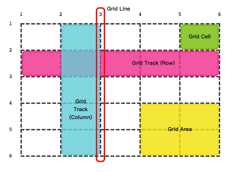
- grid lines 组成 grid 的线,垂直或者水平,并且从1开始计数
- grid tracks 在 grid 中的行和列,其中水平的为行(row),竖直的为列(column)
- grid cells 行和列的交点
- grid area 由一系列相邻的 cells 组成的长方形区域
创建一个 Grid
首先就是一个新的display值,叫做grid。
将某个元素的 display 设置为 grid 就可以创建一个 grid layout 了。
< div class="grid">
  < div>< /div>
  < div>< /div>
  < div>< /div>
  < div>< /div>
  < div>< /div>
  < div>< /div>
  < div>< /div>
  < div>< /div>
< /div>
然后写点 CSS
.grid {
  display: grid;
  grid-template-columns: 100px 100px 100px 100px;
  grid-template-rows: 100px 100px;
  grid-gap: 20px;
}
.grid div {
  background-color: grey;
}
然后就可以看到如下效果啦:
See the Pen aJypqZ by Yang Cong (@nighting) on CodePen.
grid-template-columns 属性,定义了 grid 的各个列的宽度
grid-template-rows 属性,定义了grid 的各个行的高度
这样就可以画出一整个 grid 了
而 grid-gap 属性,定义了各个 grid cells 之间的距离
自适应的 Grid
如你发现,上面的定义只是创建了一个 grid,并没能自适应屏幕。
Grid 标准引入了一个新的单位,fr,我们可以使用 fr 单位来做自适应。
1fr 是一个『分数单位』,用来表示『元素剩余的空间』 — MDN
.grid  {
  display: grid;
  grid-template-columns: 1fr 1fr 1fr 1fr;
  grid-template-rows: 200px 200px;
  grid-gap: 20px;
}
.grid div:nth-child(2n) {
  background-color: darkgrey;
}
.grid div:nth-child(2n+1) {
  background-color: grey;
}
效果如下
See the Pen ZeJerK by Yang Cong (@nighting) on CodePen.
minmax()
我们可能不单单需要一个简单的长度,也不一定需要某个元素无限扩大或收缩。这时候就可以使用 minmax 函数,这个函数接收两个参数,分别是 min 和 max 的长度,比如
grid-template-columns: minmax(300px, 1fr) minmax(200px, 400px) 300px;效果如下
See the Pen bqrJpy by Yang Cong (@nighting) on CodePen.
使用 repeat()
你可能也发现了,如果我需要四列,那我需要写4个长度,如果需要100列……天呐,无法想象。机智的劳动人民怎么会允许这种事情的发生,于是随带着 Grid 一起的还有个CSS函数,repeat()
repeat(times:Number, length:Length)如下
- repeat(4, 1pr) === 1pr 1pr 1pr 1pr
- repeat(3, 100px) === 100px 100px 100px
因此上面的 CSS 也可以改写成如下:
.grid  {
  display: grid;
  grid-template-columns: repeat(4, 1fr);
  grid-template-rows: repeat(2, 200px);
  grid-gap: 20px;
}
效果还是如上!
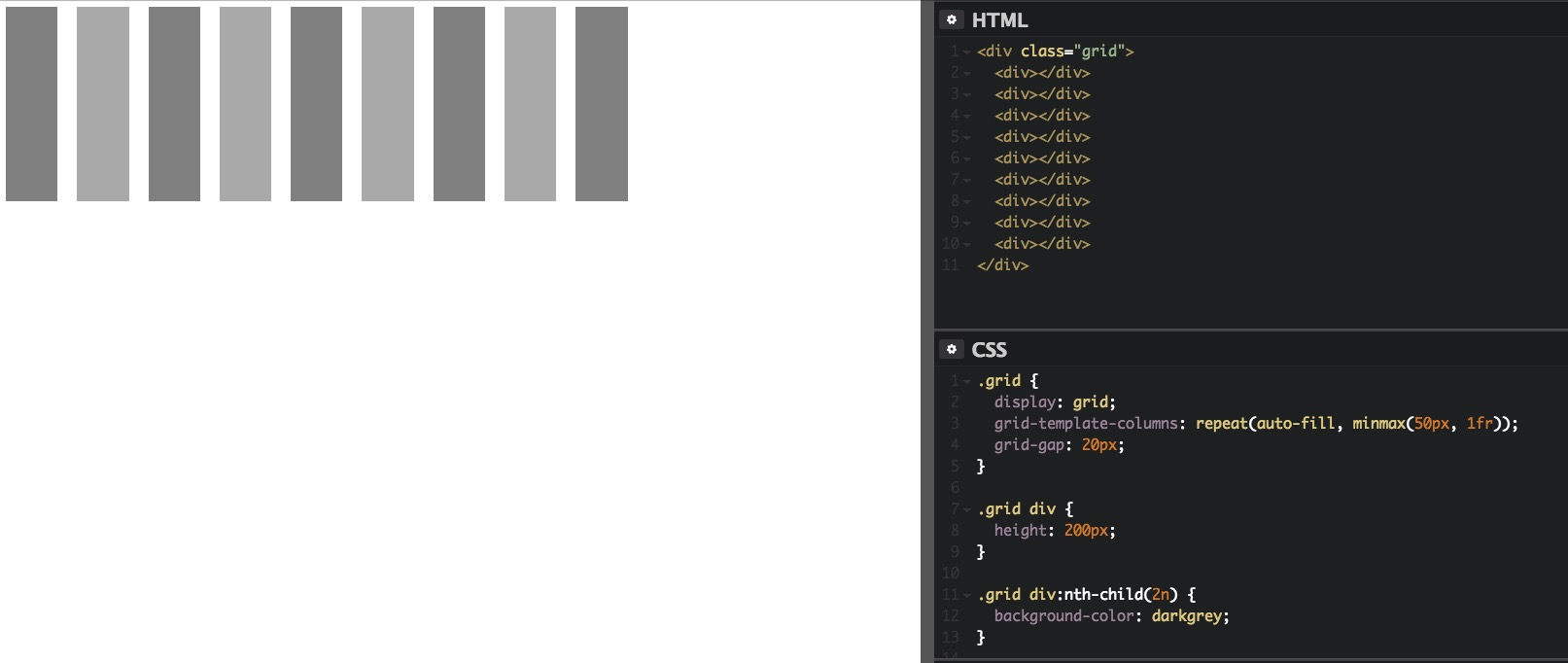
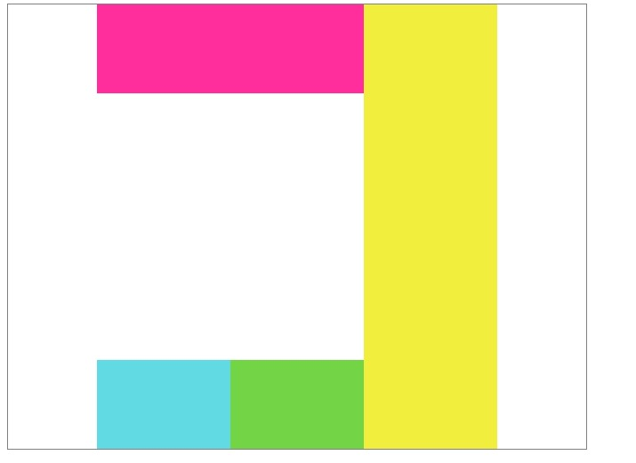
auto-fit & auto-fill
有时候我们并不需要确定行数和列数,可能我们希望能根据浏览器的窗口大小来自动的适应。这时候我们就会用到 auto-fill 和 auto-fit 属性。两者的区别我也不是很清楚,貌似 auto-fill 会尽可能多得去增加行数和列数,而 auto-fit 则相反。
我们可以看到下面两张图的差别:
以及
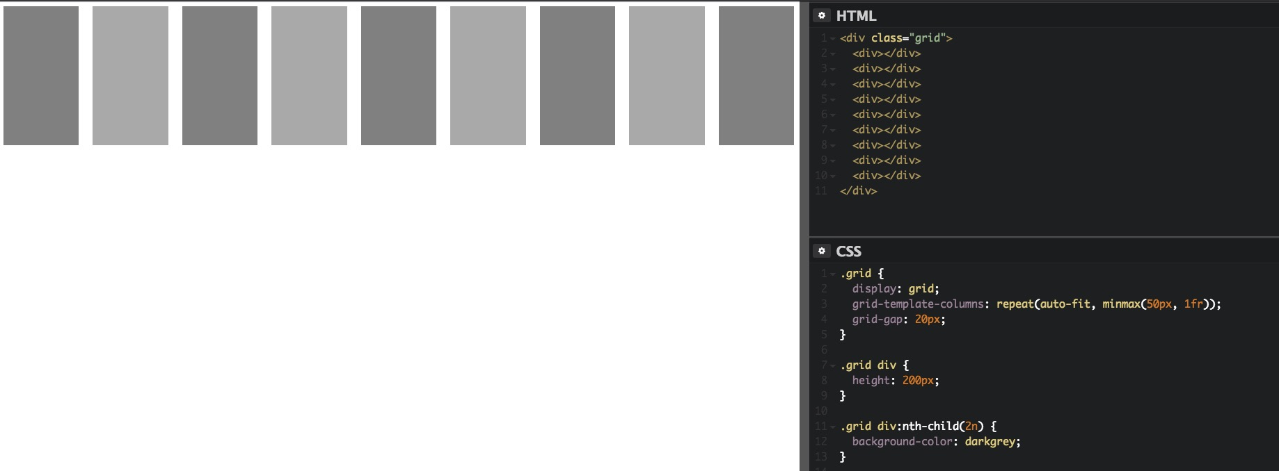
从表现上看,auto-fit 不会产生空的行或者列。
See the Pen gmxJma by Yang Cong (@nighting) on CodePen.
template areas
Grid 还提供了一种用于排版的方法,也就是 template areas,手动得将想要的layout 设置,而且还是『可视化』的哦
具体代码如下
< div class="grid">
  < header class="box">< /header>
  < aside class="box">< /aside>
  < article class="box">< /article>
  < footer class="box">< /footer>
< /div>
这是我们很常见的头部+导航+主要内容+底部的布局
header {
  grid-area: hd;
  background-color: #ff2e9c;
}
aside {
  grid-area: sidebar;
  background-color: #61dae4;
}
article {
  grid-area: at;
  background-color: #73d545;
}
footer {
  grid-area: ft;
  background-color: #f2ee3e;
}
.grid {
  display: grid;
  grid-gap: 20px;
  grid-template-rows: 50px 400px 50px;
  grid-template-areas:
    "hd hd"
    "sidebar at"
    "sidebar ft";
}
.box {
  border-radius: 8px;
}
最主要的代码就是 grid-template-areas 这个属性啦,里面的值生动得呈现了最终的效果。
See the Pen yMobap by Yang Cong (@nighting) on CodePen.
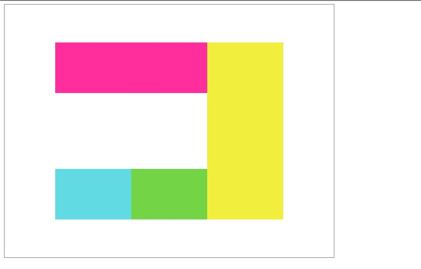
定位和占位
有时候我们并不想按照特定的顺序来排列,也有某些部分想要更多的 cell
我们可以使用属性 grid-column-start 和 grid-column-end 以及对应的 grid-row-start和grid-row-end 来进行定位和占位
为了方便,我们可以使用缩写属性 grid-column 和 grid-row
< div class="grid">
  < div id="a">< /div>
  < div id="b">< /div>
< /div>
.grid {
display: grid;
grid-template-columns: repeat(5, 100px);
grid-template-rows: repeat(5, 100px);
grid-gap: 20px;
}
#a {
background-color: #ff2e9c;
grid-column: 2 / 3;
grid-row: 3 / 4;
}
#b {
background-color: #61dae4;
grid-column: 3 / 5;
grid-row: 2 / span 3;
}最终的结果是酱的:
See the Pen NpvjMa by Yang Cong (@nighting) on CodePen.
其中出现了一个 span 的值,表示跨度。
还记得开头出现的 gird lines 吗,是从1开始计数的,这里我们定位的值即是 grid lines 的标号。
比如 grid-row: 2 / span 3 ,表示该元素纵向从第二根线开始,并且占据3个 cell。
对齐
align-content 和 justify-content
justify-content 用于定义 grid 在水平方向 如何对齐
align-content 用于定义 grid 在垂直方向 如何对齐
他们有如下几个值
- start
- center
- end
- space-between
- space-around
- space-evenly
- stretch
具体表现如下:
DOM结构
< div class="grid">
  < div>< /div>
  < div>< /div>
  < div>< /div>
  < div>< /div>
< /div>
CSS
.grid {
  display: grid;
  grid-template-rows: 100px 100px;
  grid-template-columns: 150px 150px 150px;
  height: 500px;
  width: 650px;
  border: 1px solid grey;
}
.grid div:nth-child(1) {
  grid-column: 1 / 3;
  grid-row: 1;
  background-color: #ff2e9c;
}
.grid div:nth-child(2) {
  gird-column: 1;
  grid-row: 2;
  background-color: #61dae4;
}
.grid div:nth-child(3) {
  gird-column: 2;
  grid-row: 2;
  background-color: #73d545;
}
.grid div:nth-child(4) {
  gird-column: 3;
  grid-row: 1 / 3;
  background-color: #f2ee3e;
}
align-content: strat; justify-content: start;
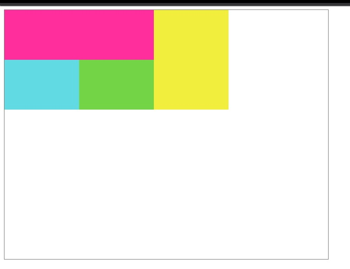
align-content: center; justify-content: center;
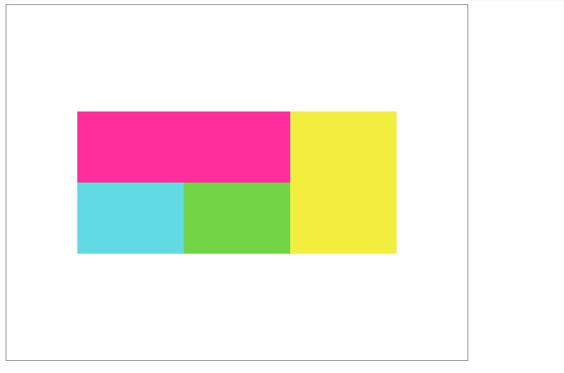
align-content: end; justify-content: end;
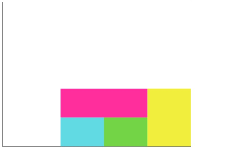
align-content: center; justify-content: space-evenly;
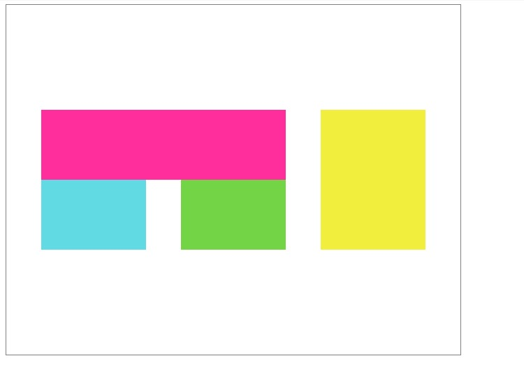
align-content: space-around; justify-content: center;
align-content: space-between; justify-content: center;
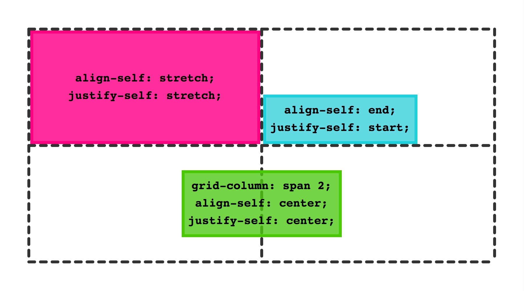
justify-self 和 align-self
justify-self 用于定义grid 内元素在水平方向的排列
align-self 用于定于 grid 内元素在垂直方向的排列
有如下几种值
- start
- end
- center
- stretch 默认值
使用和效果如下:
See the Pen ZeJdvg by Yang Cong (@nighting) on CodePen.
这俩属性是用在子元素上的,如果想给某个 grid 内的所有元素统一添加,可以使用
- align-items
- justify-items
这两个属性
在 webkit 官网的介绍中也有这样一张能够一目了然的图
从入门到入门
有了 Grid 布局,我们可以很方便得完成非常多复杂的布局。
譬如之前研究过的双飞翼布局和圣杯布局,通过 Grid 来写的话,是非常方便的。
再譬如一些非常复杂的图文混排的布局,grid 也可以非常轻松的实现。
不过现在 grid 的支持度还很低,从目前还有无数公司兼容 IE6的生态来讲,想在生产环境用上 grid 仿(jiu)佛(shi)是个遥不可及的事情……
不过这也抵不住前端汪折腾的心啊。
参考
Firefox 52: Introducing Web Assembly, CSS Grid and the Grid Inspecto
