import matplotlib.pyplot as plt
import numpy as np
import numpy.random as randn
import pandas as pd
from pandas import Series,DataFrame
from pylab import mpl
mpl.rcParams['axes.unicode_minus'] = False
plt.rc('figure', figsize=(10, 6))
%matplotlib inline
1. figure对象
Matplotlib的图像均位于figure对象中。
fig = plt.figure()
2. subplot子图
- add_subplot:向figure对象中添加子图。
add_subplot(a, b, c):a,b 表示讲fig分割成axb的区域,c 表示当前选中要操作的区域(c从1开始)。
add_subplot返回的是AxesSubplot对象,plot 绘图的区域是最后一次指定subplot的位置
ax1 = fig.add_subplot(2,2,1)
ax2 = fig.add_subplot(2,2,2)
ax3 = fig.add_subplot(2,2,3)
ax4 = fig.add_subplot(2,2,4)
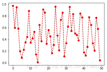
random_arr = randn.rand(50)
plt.plot(random_arr,'ro--')
plt.show()
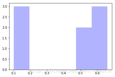
plt.hist(np.random.rand(8), bins=6, color='b', alpha=0.3)
(array([ 3.,  0.,  0.,  0.,  2.,  3.]),
 array([ 0.10261627,  0.19557319,  0.28853011,  0.38148703,  0.47444396,
         0.56740088,  0.6603578 ]),
 <a list of 6 Patch objects>)
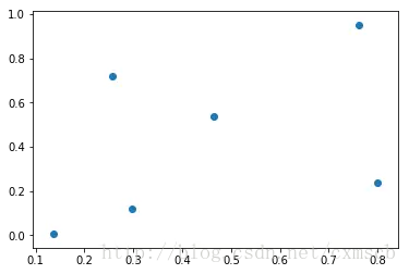
plt.scatter(np.arange(30), np.arange(30) + 3 * randn.randn(30))
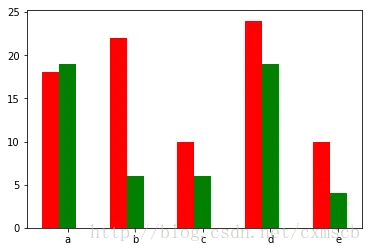
fig, ax = plt.subplots()
x = np.arange(5)
y1, y2 = np.random.randint(1, 25, size=(2, 5))
width = 0.25
ax.bar(x, y1, width, color='r')
ax.bar(x+width, y2, width, color='g')
ax.set_xticks(x+width)
ax.set_xticklabels(['a', 'b', 'c', 'd', 'e'])
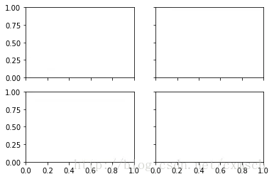
fig, axes = plt.subplots(2, 2, sharex=True, sharey=True)
- subplots_adjust:调整subplots的间距
plt.subplots_adjust(left=0.5,top=0.5)
fig, axes = plt.subplots(2, 2)
random_arr = randn.randn(8)
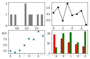
fig, axes = plt.subplots(2, 2)
axes[0, 0].hist(random_arr, bins=16, color='k', alpha=0.5)
axes[0, 1].plot(random_arr,'ko--')
x = np.arange(8)
y = x + 5 * np.random.rand(8)
axes[1,0].scatter(x, y)
x = np.arange(5)
y1, y2 = np.random.randint(1, 25, size=(2, 5))
width = 0.25
axes[1,1].bar(x, y1, width, color='r')
axes[1,1].bar(x+width, y2, width, color='g')
axes[1,1].set_xticks(x+width)
axes[1,1].set_xticklabels(['a', 'b', 'c', 'd', 'e'])
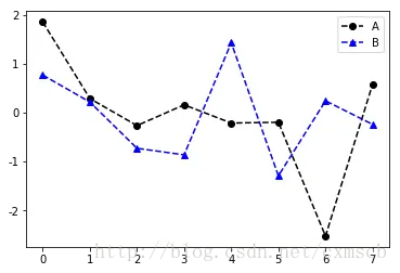
random_arr1 = randn.randn(8)
random_arr2 = randn.randn(8)
fig, ax = plt.subplots()
ax.plot(random_arr1,'ko--',label='A')
ax.plot(random_arr2,'b^--',label='B')
plt.legend(loc='best')
- 设置刻度范围:set_xlim、set_ylim
- 设置显示的刻度:set_xticks、set_yticks
- 刻度标签:set_xticklabels、set_yticklabels
- 坐标轴标签:set_xlabel、set_ylabel
- 图像标题:set_title
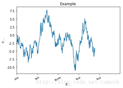
fig, ax = plt.subplots(1)
ax.plot(np.random.randn(380).cumsum())
ax.set_xlim([0, 500])
ax.set_xticks(range(0,500,100))
ax.set_xticklabels(['one', 'two', 'three', 'four', 'five'],
rotation=30, fontsize='small')
ax.set_xlabel('X:...')
ax.set_ylabel('Y:...')
ax.set_title('Example')
3. Plotting functions in pandas
plt.close('all')
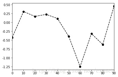
s = Series(np.random.randn(10).cumsum(), index=np.arange(0, 100, 10))
s
fig,ax = plt.subplots(1)
s.plot(ax=ax,style='ko--')
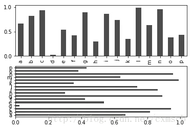
fig, axes = plt.subplots(2, 1)
data = Series(np.random.rand(16), index=list('abcdefghijklmnop'))
data.plot(kind='bar', ax=axes[0], color='k', alpha=0.7)
data.plot(kind='barh', ax=axes[1], color='k', alpha=0.7)
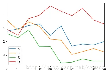
df = DataFrame(np.random.randn(10, 4).cumsum(0),
               columns=['A', 'B', 'C', 'D'],
               index=np.arange(0, 100, 10))
df
|
A |
B |
C |
D |
| 0 |
-0.523822 |
1.061179 |
-0.882215 |
-0.267718 |
| 10 |
-0.178175 |
-0.367573 |
-1.465189 |
-1.095390 |
| 20 |
0.276166 |
0.816511 |
-0.344557 |
1.297281 |
| 30 |
0.529400 |
0.159374 |
-2.765168 |
1.784692 |
| 40 |
-1.129003 |
-1.665272 |
-2.746512 |
3.140976 |
| 50 |
0.265113 |
-1.821224 |
-5.140850 |
2.377449 |
| 60 |
-2.699879 |
-3.895255 |
-5.011561 |
1.715174 |
| 70 |
-2.384257 |
-3.480928 |
-4.519131 |
2.805369 |
| 80 |
-2.525243 |
-3.031608 |
-4.840125 |
1.106624 |
| 90 |
-2.020589 |
-3.519473 |
-4.823292 |
0.522323 |
df.plot()
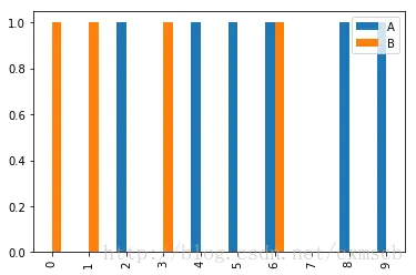
df = DataFrame(np.random.randint(0,2,(10, 2)),
               columns=['A', 'B'],
               index=np.arange(0, 10, 1))
df
|
A |
B |
| 0 |
0 |
1 |
| 1 |
0 |
1 |
| 2 |
1 |
0 |
| 3 |
0 |
1 |
| 4 |
1 |
0 |
| 5 |
1 |
0 |
| 6 |
1 |
1 |
| 7 |
0 |
0 |
| 8 |
1 |
0 |
| 9 |
1 |
0 |
df.plot(kind='bar')
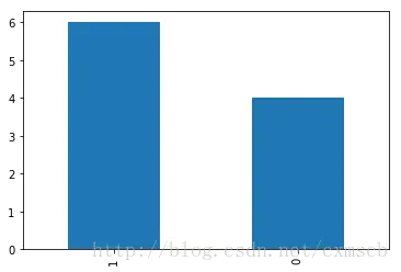
df.A.value_counts().plot(kind='bar')
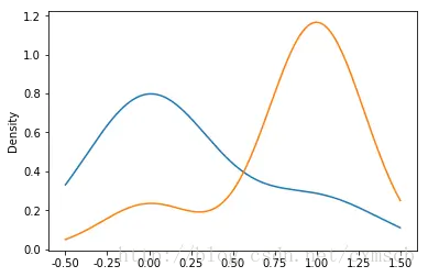
df.A[df.B == 1].plot(kind='kde')
df.A[df.B == 0].plot(kind='kde')
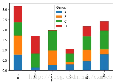
df = DataFrame(np.random.rand(6, 4),
               index=['one', 'two', 'three', 'four', 'five', 'six'],
               columns=pd.Index(['A', 'B', 'C', 'D'], name='Genus'))
df
| Genus |
A |
B |
C |
D |
| one |
0.760750 |
0.951159 |
0.643181 |
0.792940 |
| two |
0.137294 |
0.005417 |
0.685668 |
0.858801 |
| three |
0.257455 |
0.721973 |
0.968951 |
0.043061 |
| four |
0.298100 |
0.121293 |
0.400658 |
0.236369 |
| five |
0.463919 |
0.537055 |
0.675918 |
0.487098 |
| six |
0.798676 |
0.239188 |
0.915583 |
0.456184 |
df.plot(kind='bar',stacked='True')
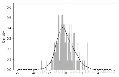
values = Series(np.random.normal(0, 1, size=200))
values.hist(bins=100, alpha=0.3, color='k', normed=True)
values.plot(kind='kde', style='k--')
df = DataFrame(np.random.randn(10,2),
               columns=['A', 'B'],
               index=np.arange(0, 10, 1))
df
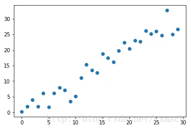
plt.scatter(df.A, df.B)