

Core Plot指南:入门
- 原文链接 : Core Plot Tutorial: Getting Started
- 原文作者 : Attila Hegedüs
- 译者 : yrq110
Core Plot是一个2D图表库,可以用于iOS、Mac OS X和tvOS,使用了苹果的Quartz与Core Animation框架实现,在BSD许可下发布。
在这篇教程中,你将会学到如何使用Core Plot创建饼图与条形图,还有如何添加很酷的图表交互功能!
开始前需要安装Xcode 8.0并且对Swift、Interface Builder和storyboard有一些基本的认识与理解,如果你对这些方面不太了解需要看看其他教程学习一下。
教程中使用CocoaPods来安装依赖的第三方库,若你没用过CocoaPods可以先看看这个教程学习一下。
入门
在这篇教程中会做一个显示货币汇率的app。在这里下载开始项目,解压后打开SwiftRates.xcworkspace。
项目中的一些关键类:
DataStore.swift一个从Fixer.io请求汇率数据的辅助类。Rate.swift显示所选日期货币汇率的model。Currency.swift货币类型的model,所支持的货币在Resources/Currencies.plist中定义。MenuViewController.swiftapp启动时显示的第一个view controller,在这里用户选择一个基本货币和两个比较货币。HostViewController.swift一个view controller容器,根据分段控件的选择来显示PieChartViewController或BarGraphViewController,并且将从DataStore中获取的汇率数据应用于所选择的view controller。PieChartViewController.swift使用饼图显示所选日期的汇率,首先会实现这个图表。BarGraphViewController.swift使用条形图显示一定天数的汇率.实现饼图后这就是个小case!
构建并运行一下看看。
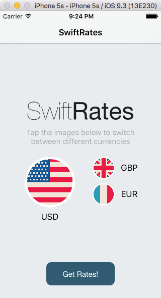
选择Get Rates进入HostViewController界面,改变分段控件的选择,app还没有实现这些功能...
是时候学习使用Core Plot绘图了!
安装Core Plot
首先需要安装Core Plot,使用CocoaPods安装比较简单。
将下面这行添加到Podfile中:
pod 'CorePlot', '~> 2.2'打开终端,进入项目目录,执行pod install。
安装完成后构建项目。没毛病,现在准备好Core Plot了,谢谢你,CocoaPods :]
如果出了一些错误,可以尝试一下使用sudo gem install cocoapods更新CocoaPods然后再执行pod install。
创建饼图
打开PieChartViewController.swift文件导入Core Plot:
import CorePlot接着添加如下属性:
@IBOutlet weak var hostView: CPTGraphHostingView!CPTGraphHostingView负责"管理"一个图表(graph),可以把它当做一个"图表容器"。
接着,在类的大括号结束符后添加如下类扩展:
extension PieChartViewController: CPTPieChartDataSource, CPTPieChartDelegate {

  func numberOfRecords(for plot: CPTPlot) -> UInt {
    return 0
  }

  func number(for plot: CPTPlot, field fieldEnum: UInt, record idx: UInt) -> Any? {
    return 0
  }

  func dataLabel(for plot: CPTPlot, record idx: UInt) -> CPTLayer? {
    return nil
  }

  func sliceFill(for pieChart: CPTPieChart, record idx: UInt) -> CPTFill? {
    return nil
  }

  func legendTitle(for pieChart: CPTPieChart, record idx: UInt) -> String? {
    return nil
  }
}
通过CPTPieChartDataSource提供Core Plot图表的数据,通过CPTPieChartDelegate得到用户的响应事件,会在之后填充这些方法的内容。
设置graph管理视图
打开Main.storyboard,选择PieChartViewController。
把一个新的UIView拖拽到这个视图中,将它的类改为CPTGraphHostingView,连接到hostView。
在每条边上添加约束使其嵌在父视图上,确保Constrain to margins没有被勾选:
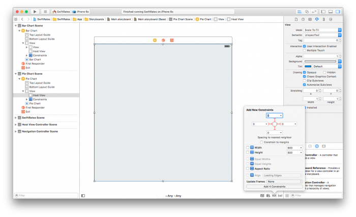
背景色随意设置,我使用透明度是92%的灰度色。
回到PieChartViewController.swif文件,在viewDidLoad()后添加如下方法:
override func viewDidLayoutSubviews() {
  super.viewDidLayoutSubviews()
  initPlot()
}

func initPlot() {
  configureHostView()
  configureGraph()
  configureChart()
  configureLegend()
}

func configureHostView() {
}

func configureGraph() {
}

func configureChart() {
}

func configureLegend() {
}
子视图布局好后在这里设置需要绘制的图标,这里是最早设置视图尺寸的地方,需要在这里设置图表的参数。
initPlot()中的每一个方法都是图标设置中的一环,这种写法使代码更具组织性。
添加如下代码到configureHostView()方法中:
hostView.allowPinchScaling = false这里禁用了饼图的捏合缩放,决定饼图的管理视图是否会对捏合手势作出响应。
接着在hostView中添加一个graph。在configureGraph()方法中添加如下代码:
// 1 - 创建并设置graph
let graph = CPTXYGraph(frame: hostView.bounds)
hostView.hostedGraph = graph
graph.paddingLeft = 0.0
graph.paddingTop = 0.0
graph.paddingRight = 0.0
graph.paddingBottom = 0.0
graph.axisSet = nil

// 2 - 创建文本样式
let textStyle: CPTMutableTextStyle = CPTMutableTextStyle()
textStyle.color = CPTColor.black()
textStyle.fontName = "HelveticaNeue-Bold"
textStyle.fontSize = 16.0
textStyle.textAlignment = .center

// 3 - 设置graph的标题与文本样式
graph.title = "\(base.name) exchange rates\n\(rate.date)"
graph.titleTextStyle = textStyle
graph.titlePlotAreaFrameAnchor = CPTRectAnchor.top
下面是对代码的分解:
- 首先新建了一个CPTXYGraph实例,将其设为hostView的hostedGraph属性值,结合图形与管理视图。CPTGraph包含一个标准图表中的所有元素:边界、标题、绘制的数据、坐标轴和图例。默认情况下,CPTXYGraph的每一条边有20px的内边距。看起来并不是很好,你需要将它设为0。
- 接着通过创建CPTMutableTextStyle实例设置图形的文本样式。
- 最后设置图表的标题,将它的样式设为刚刚创建好的样式,并将锚点设为视图矩形的顶部。
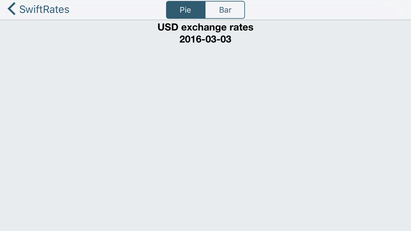
构建并运行app,你应该会看到屏幕上方显示的graph标题。
绘制饼图
标题看着还行,不过怎么能做的更好?来看看如何绘制饼图!
将如下代码添加到configureChart()方法中:
// 1 - 获取graph引用
let graph = hostView.hostedGraph!

// 2 - 创建chart
let pieChart = CPTPieChart()
pieChart.delegate = self
pieChart.dataSource = self
pieChart.pieRadius = (min(hostView.bounds.size.width, hostView.bounds.size.height) * 0.7) / 2
pieChart.identifier = NSString(string: graph.title!)
pieChart.startAngle = CGFloat(M_PI_4)
pieChart.sliceDirection = .clockwise
pieChart.labelOffset = -0.6 * pieChart.pieRadius

// 3 - 设置边界样式
let borderStyle = CPTMutableLineStyle()
borderStyle.lineColor = CPTColor.white()
borderStyle.lineWidth = 2.0
pieChart.borderLineStyle = borderStyle

// 4 - 设置文本样式
let textStyle = CPTMutableTextStyle()
textStyle.color = CPTColor.white()
textStyle.textAlignment = .center
pieChart.labelTextStyle = textStyle

// 5 - 将chart添加到graph中
graph.add(pieChart)
这些代码干了什么:
- 首先得到一个图的引用。
- 接着实例化CPTPieChart,设置它的委托与数据源为view controller,并设置它的外观。
- 设置表的边界样式。
- 设置表的文本样式。
- 最后将chart添加到graph中。
如果你现在就运行app的话会看不到任何改变...这是因为还需要为饼图实现数据源与委托。
首先使用如下代码替换numberOfRecords(for:)中的内容:
func numberOfRecords(for plot: CPTPlot) -> UInt {
  return UInt(symbols.count)
}
这个方法决定了在图中显示的分块数,会为每一种货币分配一个扇形区域。
接着使用如下代码替换number(for:field:record:)中的内容:
func number(for plot: CPTPlot, field fieldEnum: UInt, record idx: UInt) -> Any? {
  let symbol = symbols[Int(idx)]
  let currencyRate = rate.rates[symbol.name]!.floatValue
  return 1.0 / currencyRate
}
饼图使用这个方法在idx中得到货币符号的值。
应该注意到了这个值并不是个百分率,这个方法计算当前货币相对于基本货币的汇率:返回值1.0 / currencyRate是“当前货币相对于1个基本货币”的值。
CPTPieChart会计算每一块区域的百分比值,使用这些值决定扇形区域的大小。
接着,使用如下代码替换dataLabelForPlot(for:record:)方法:
func dataLabel(for plot: CPTPlot, record idx: UInt) -> CPTLayer? {
  let value = rate.rates[symbols[Int(idx)].name]!.floatValue
  let layer = CPTTextLayer(text: String(format: "\(symbols[Int(idx)].name)\n%.2f", value))
  layer.textStyle = plot.labelTextStyle
  return layer
}
这个方法返回饼图区域的标签,返回的类型是CPTLayer,它与CALayer很像,不同的是CPTLayer可以在macOS和iOS上使用,并且提供了Core Plot的一些绘制细节。
在这里新建并返回了一个CPTTextLayer对象,它用于显示文本的CPTLayer子类。最后给饼图中的区域赋予颜色。使用如下代码替换sliceFillForPieChart(for:, record:)方法:
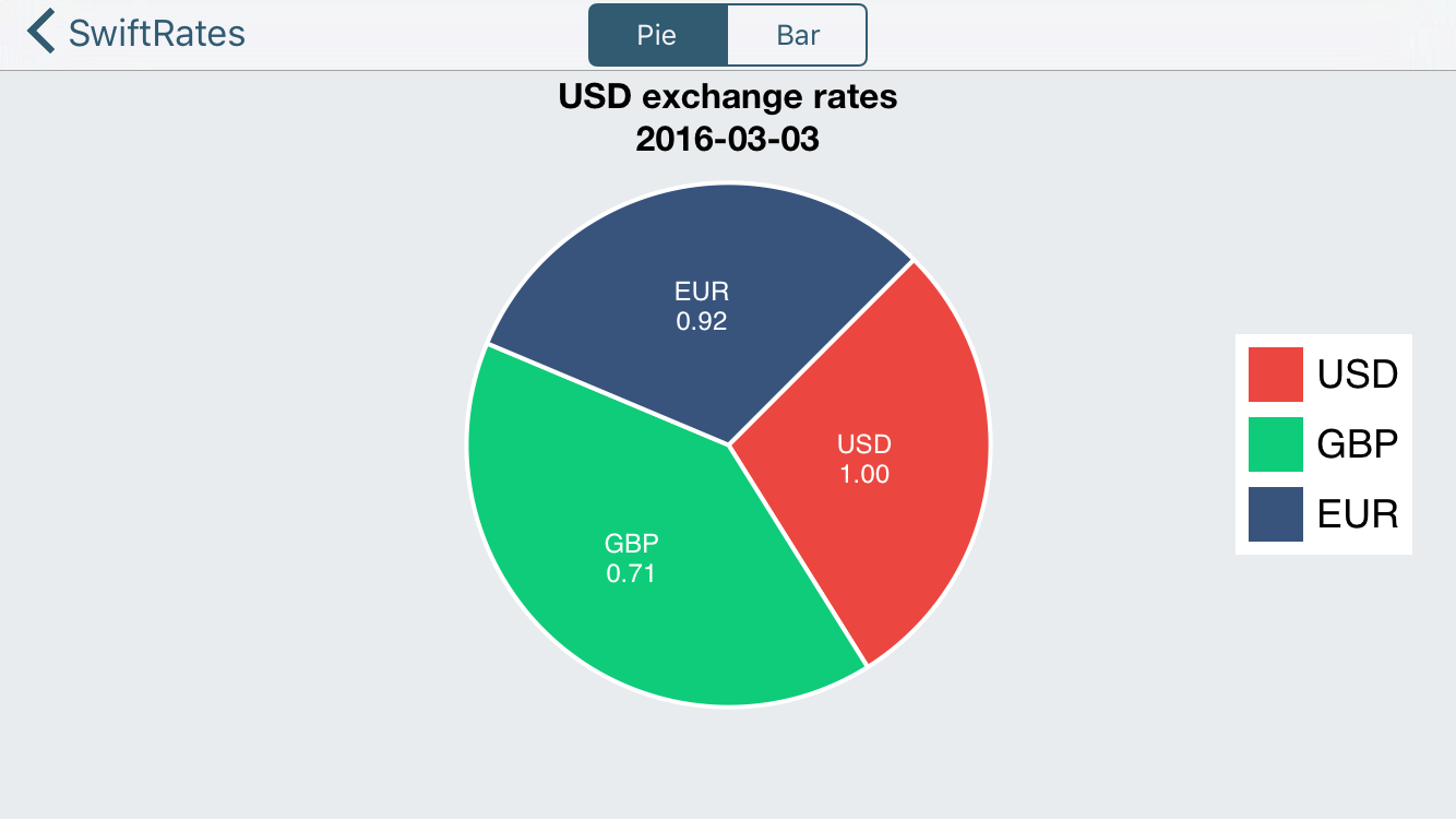
func sliceFill(for pieChart: CPTPieChart, record idx: UInt) -> CPTFill? {
switch idx {
case 0: return CPTFill(color: CPTColor(componentRed:0.92, green:0.28, blue:0.25, alpha:1.00))
case 1: return CPTFill(color: CPTColor(componentRed:0.06, green:0.80, blue:0.48, alpha:1.00))
case 2: return CPTFill(color: CPTColor(componentRed:0.22, green:0.33, blue:0.49, alpha:1.00))
default: return nil
}
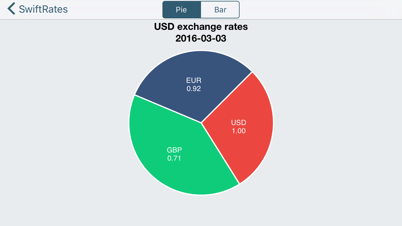
}构建并运行,会看到一个漂亮的饼图:
加些图注!
图表看起来不错,不过有图注的话会更好,接下来给图表添加一个图注。
首先,使用如下代码替换configureLegend()方法中的内容:
func configureLegend() {
  // 1 - 获取graph对象
  guard let graph = hostView.hostedGraph else { return }

  // 2 - 创建图注
  let theLegend = CPTLegend(graph: graph)

  // 3 - 设置图注
  theLegend.numberOfColumns = 1
  theLegend.fill = CPTFill(color: CPTColor.white())
  let textStyle = CPTMutableTextStyle()
  textStyle.fontSize = 18
  theLegend.textStyle = textStyle

  // 4 - 将图注添加到图
  graph.legend = theLegend
  if view.bounds.width > view.bounds.height {
    graph.legendAnchor = .right
    graph.legendDisplacement = CGPoint(x: -20, y: 0.0)

  } else {
    graph.legendAnchor = .bottomRight
    graph.legendDisplacement = CGPoint(x: -8.0, y: 8.0)
  }
}
还需要提供每一片区域的图注数据。
使用如下代码替换legendTitleForPieChart(for:record:)方法中的内容:
func legendTitle(for pieChart: CPTPieChart, record idx: UInt) -> String? {
  return symbols[Int(idx)].name
}
构建并运行,迎接一个 "传奇(legendary,包含图注的,这里一语双关)"的图表。
创建条形图(Raising the Bar,提高标准,这里双关)
现在你画饼图应该挺6了,是时候提高一些标准,试下画条形图了!
打开BarGraphViewController,导入Core Plot:
import CorePlot添加一个outlet:
@IBOutlet var hostView: CPTGraphHostingView!像画饼图一样,host view需要包含这个条形图。
添加如下属性:
var plot1: CPTBarPlot!
var plot2: CPTBarPlot!
var plot3: CPTBarPlot!
这里创建的三个CPTBarPlot属性分别对应graph中的每一种货币。
注意这里已经定义了三个IBOutlet标签与三个IBAction方法,并且已与故事板连接。
最后,在文件末尾处添加如下扩展:
extension BarGraphViewController: CPTBarPlotDataSource, CPTBarPlotDelegate {

  func numberOfRecords(for plot: CPTPlot) -> UInt {
    return 0
  }

  func number(for plot: CPTPlot, field fieldEnum: UInt, record idx: UInt) -> Any? {
    return 0
  }

  func barPlot(_ plot: CPTBarPlot, barWasSelectedAtRecord idx: UInt, with event: UIEvent) {

  }
}
这里跟饼图很像: 通过CPTBarPlotDataSource给条形图提供数据,通过CPTBarPlotDelegate获取用户交互事件。
再次设置graph管理视图
跟刚才所做的一样,使用Interface Builder添加管理视图。
回到Main.storyboard中,选择BarGraphViewController场景。
把一个新的UIView拖到视图中,将class改为CPTGraphHostingView,将outlet连接到view controller的hostView对象上。
在Utilities\Size Inspector(尺子状的标签)中调整成如下尺寸: X = 0, Y = 53, Width = 600, Height = 547
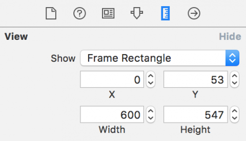
添加四条边的约束,确保Constrain to margins没有被勾选。

最后设置任意的背景色,仍然使用的是透明度为92%的灰度色。
绘制条形图
UI组件都弄好了,现在来绘制条形图吧。
首先回到BarGraphViewController中,需要添加几个常量属性。在其他属性后添加如下属性:
let BarWidth = 0.25
let BarInitialX = 0.25
来需要一个辅助函数来计算最高汇率,在updateLabels()方法后添加如下函数:
func highestRateValue() -> Double {
  var maxRate = DBL_MIN
  for rate in rates {
    maxRate = max(maxRate, rate.maxRate().doubleValue)
  }
  return maxRate
}
接着在highestRateValue()后添加如下方法:
override func viewDidLayoutSubviews() {
  super.viewDidLayoutSubviews()
  initPlot()
}

func initPlot() {
  configureHostView()
  configureGraph()
  configureChart()
  configureAxes()
}

func configureHostView() {
}

func configureGraph() {
}

func configureChart() {
}

func configureAxes() {
}
是不是有点眼熟? 对的,这个结构跟之前一样。
在configureHostView()方法中添加如下:
hostView.allowPinchScaling = false这次也不需要捏合缩放,禁用它。
在configureGraph()方法中添加如下代码:
// 1 - 新建graph
let graph = CPTXYGraph(frame: hostView.bounds)
graph.plotAreaFrame?.masksToBorder = false
hostView.hostedGraph = graph

// 2 - 设置graph
graph.apply(CPTTheme(named: CPTThemeName.plainWhiteTheme))
graph.fill = CPTFill(color: CPTColor.clear())
graph.paddingBottom = 30.0
graph.paddingLeft = 30.0
graph.paddingTop = 0.0
graph.paddingRight = 0.0

// 3 - 设置样式
let titleStyle = CPTMutableTextStyle()
titleStyle.color = CPTColor.black()
titleStyle.fontName = "HelveticaNeue-Bold"
titleStyle.fontSize = 16.0
titleStyle.textAlignment = .center
graph.titleTextStyle = titleStyle

let title = "\(base.name) exchange rates\n\(rates.first!.date) - \(rates.last!.date)"
graph.title = title
graph.titlePlotAreaFrameAnchor = .top
graph.titleDisplacement = CGPoint(x: 0.0, y: -16.0)

// 4 - 设置绘制区域
let xMin = 0.0
let xMax = Double(rates.count)
let yMin = 0.0
let yMax = 1.4 * highestRateValue()
guard let plotSpace = graph.defaultPlotSpace as? CPTXYPlotSpace else { return }
plotSpace.xRange = CPTPlotRange(locationDecimal: CPTDecimalFromDouble(xMin), lengthDecimal: CPTDecimalFromDouble(xMax - xMin))
plotSpace.yRange = CPTPlotRange(locationDecimal: CPTDecimalFromDouble(yMin), lengthDecimal: CPTDecimalFromDouble(yMax - yMin))
分析下上面的代码:
- 首先实例化一个CPTXYGraph对象,其实就是一个条形图,将其与hostView连接起来。
- 接着声明默认的主题为空白主题,设置上侧与左侧的内边距给坐标轴留出空间。
- 设置文本样式,表格标题与标题位置。
- 最后设置CPTXYPlotSpace,它负责将设备的坐标系映射到graph的坐标系。
在这个graph中需要在同一块区域内绘制出三种汇率,当然,也可以分别在不同区域进行绘制。
在绘图区域中会假定一个汇率的区间范围,在之后会看到如何在事先不知道这个范围的情况下让绘图区域的尺寸自动调节。
graph搞定后,是时候添加一些条形图了,在configureChart()方法中添加如下代码:
// 1 - 设置三个条形图
plot1 = CPTBarPlot()
plot1.fill = CPTFill(color: CPTColor(componentRed:0.92, green:0.28, blue:0.25, alpha:1.00))
plot2 = CPTBarPlot()
plot2.fill = CPTFill(color: CPTColor(componentRed:0.06, green:0.80, blue:0.48, alpha:1.00))
plot3 = CPTBarPlot()
plot3.fill = CPTFill(color: CPTColor(componentRed:0.22, green:0.33, blue:0.49, alpha:1.00))

// 2 - 设置线条样式
let barLineStyle = CPTMutableLineStyle()
barLineStyle.lineColor = CPTColor.lightGray()
barLineStyle.lineWidth = 0.5

// 3 - 将条形添加到graph
guard let graph = hostView.hostedGraph else { return }
var barX = BarInitialX
let plots = [plot1!, plot2!, plot3!]
for plot: CPTBarPlot in plots {
  plot.dataSource = self
  plot.delegate = self
  plot.barWidth = NSNumber(value: BarWidth)
  plot.barOffset = NSNumber(value: barX)
  plot.lineStyle = barLineStyle
  graph.add(plot, to: graph.defaultPlotSpace)
  barX += BarWidth
}
上面的代码做了什么:
- 实例化每个条形图并设置填充颜色。
- 实例化一个CPTMutableLineStyle对象,它表示每个条形图外边界的样式。
- 给每个条形图进行一个公共的配置,包含数据源与委托、每个图的宽度与相对距离、线条样式,最后将图形添加到graph中。
现在还看不到条形图,先构建一下app确保所有代码都能编译成功。
为了在条形图中显示数据,需要实现委托方法来给graph提供必要的数据。
使用如下代码替换numberOfRecordsForPlot(for:)中的内容:
return UInt(rates.count)这个方法会返回要显示的记录个数。
使用如下代码替换numberForPlot(for:field:record:)中的内容:
if fieldEnum == UInt(CPTBarPlotField.barTip.rawValue) {
  if plot == plot1 {
    return 1.0 as AnyObject?
  }
  if plot == plot2 {
    return rates[Int(idx)].rates[symbols[0].name]!
  }
  if plot == plot3 {
    return rates[Int(idx)].rates[symbols[1].name]!
  }
}
return idx
CPTBarPlotField.BarTip属性表示条形图的相对尺寸,使用已有的属性进行检索得到所需的汇率数据,idx值为汇率的索引值。
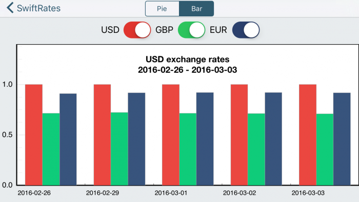
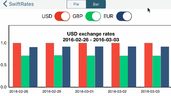
构建并运行,应该会看到下面这样:

快成功了! 还有件事没做,你会注意到图中并没有坐标轴的标识信息。
在configureAxes()方法中添加如下代码来解决这个问题:
// 1 - 设置样式
let axisLineStyle = CPTMutableLineStyle()
axisLineStyle.lineWidth = 2.0
axisLineStyle.lineColor = CPTColor.black()
// 2 - 获取graph的轴线集
guard let axisSet = hostView.hostedGraph?.axisSet as? CPTXYAxisSet else { return }
// 3 - 设置x轴
if let xAxis = axisSet.xAxis {
  xAxis.labelingPolicy = .none
  xAxis.majorIntervalLength = 1
  xAxis.axisLineStyle = axisLineStyle
  var majorTickLocations = Set<NSNumber>()
  var axisLabels = Set<CPTAxisLabel>()
  for (idx, rate) in rates.enumerated() {
    majorTickLocations.insert(NSNumber(value: idx))
    let label = CPTAxisLabel(text: "\(rate.date)", textStyle: CPTTextStyle())
    label.tickLocation = NSNumber(value: idx)
    label.offset = 5.0
    label.alignment = .left
    axisLabels.insert(label)
  }
  xAxis.majorTickLocations = majorTickLocations
  xAxis.axisLabels = axisLabels
}
// 4 - 设置y轴
if let yAxis = axisSet.yAxis {
  yAxis.labelingPolicy = .fixedInterval
  yAxis.labelOffset = -10.0
  yAxis.minorTicksPerInterval = 3
  yAxis.majorTickLength = 30
  let majorTickLineStyle = CPTMutableLineStyle()
  majorTickLineStyle.lineColor = CPTColor.black().withAlphaComponent(0.1)
  yAxis.majorTickLineStyle = majorTickLineStyle
  yAxis.minorTickLength = 20
  let minorTickLineStyle = CPTMutableLineStyle()
  minorTickLineStyle.lineColor = CPTColor.black().withAlphaComponent(0.05)
  yAxis.minorTickLineStyle = minorTickLineStyle
  yAxis.axisLineStyle = axisLineStyle
}
简单的说,上面的代码首先定义了坐标轴线条与标签的样式,接着通过检索得到graph中的坐标轴集合,设置x轴与y轴。
构建并运行一下看看变化。
完善
的确更好,不是吗? 唯一的缺点就是坐标轴信息是空白的————没有给予任何关于汇率的准确信息。
可以这样来弥补这个问题:当用户点击每个条形图中的粗线条时显示具体的数据,为此需要增加一个属性:
var priceAnnotation: CPTPlotSpaceAnnotation?接下来在barPlot(for:barWasSelectedAtRecord:with:)方法中添加如下代码:
// 1 - 条形图是否隐藏?
  if plot.isHidden == true {
    return
  }
  // 2 - 若未隐藏则创建文本样式
  let style = CPTMutableTextStyle()
  style.fontSize = 12.0
  style.fontName = "HelveticaNeue-Bold"

  // 3 - 创建标记
  guard let price = number(for: plot,
                           field: UInt(CPTBarPlotField.barTip.rawValue),
                           record: idx) as? CGFloat else { return }

  priceAnnotation?.annotationHostLayer?.removeAnnotation(priceAnnotation)
  priceAnnotation = CPTPlotSpaceAnnotation(plotSpace: plot.plotSpace!, anchorPlotPoint: [0,0])

  // 4 - 创建数字格式化器
  let formatter = NumberFormatter()
  formatter.maximumFractionDigits = 2
  // 5 - 创建标记的文本层
  let priceValue = formatter.string(from: NSNumber(cgFloat: price))
  let textLayer = CPTTextLayer(text: priceValue, style: style)

  priceAnnotation!.contentLayer = textLayer
  // 6 - 获取条形图索引
  var plotIndex: Int = 0
  if plot == plot1 {
    plotIndex = 0
  }
  else if plot == plot2 {
    plotIndex = 1
  }
  else if plot == plot3 {
    plotIndex = 2
  }
  // 7 - 设置标记的锚点
  priceAnnotation!.anchorPlotPoint = [NSNumber(cgFloat: x), NSNumber(cgFloat: y)]
  // 8 - 添加标记
  guard let plotArea = plot.graph?.plotAreaFrame?.plotArea else { return }
  plotArea.addAnnotation(priceAnnotation)
}
分析一下代码:
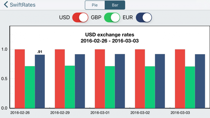
- 如果条形图隐藏了则不会添加标记,直接返回,虽然条形图现在不具有隐藏的功能,会在下一部分来实现。
- 创建标记的文本样式。
- 得到所指定条形图的数值,并创建一个标记对象。
- 创建一个数字格式化器,用它来格式化要显示的数据。
- 创建一个文本层显示格式化后的数据,并将标记的内容层设置为这个文本层。
- 获取需要显示标记的条形图索引。
- 根据条形图的索引计算标记的位置,使用计算后的位置设置标记的锚点。
- 最后将标记添加到graph中。
构建并运行,每当你点击条形图中的粗线条时,就会在它的上面显示出数值。
好极了! :]
隐藏和显现
条形图看起来不错,不过顶部的开关按钮貌似没什么作用,是时候实现它的功能了。
首先需要添加一个辅助方法,在switch3Changed(_:)后添加这个方法:
func hideAnnotation(graph: CPTGraph) {
  guard let plotArea = graph.plotAreaFrame?.plotArea,
    let priceAnnotation = priceAnnotation else {
      return
  }
  plotArea.removeAnnotation(priceAnnotation)
  self.priceAnnotation = nil
}
这段代码的作用是若存在标记则移除它。
下面想让用户使用开关按钮来改变条形图中所显示的货币。
为了实现它,需要使用下面的代码替换switch1Changed(_:), switch2Changed(_:)和switch3Changed(_:)方法:
@IBAction func switch1Changed(_ sender: UISwitch) {
  let on = sender.isOn
  if !on {
    hideAnnotation(graph: plot1.graph!)
  }
  plot1.isHidden = !on
}

@IBAction func switch2Changed(_ sender: UISwitch) {
  let on = sender.isOn
  if !on {
    hideAnnotation(graph: plot2.graph!)
  }
  plot2.isHidden = !on
}

@IBAction func switch3Changed(_ sender: UISwitch) {
  let on = sender.isOn
  if !on {
    hideAnnotation(graph: plot3.graph!)
  }
  plot3.isHidden = !on
}
逻辑非常简单,如果开关按钮是关闭状态则隐藏对应的条形图和标记,若为打开状态则设置条形图为可见的。
构建并运行,可以随意切换显示的条形图,干的不错!
最后
可以从这里下载完整的项目文件。
