

Thinking in Vue系列文章是本人在使用Vue过程中的一些思考和探索,包括但不限于对Vue的个人理解和解读、对Vue使用的一些经验总结、对Vue源码的解读。Demo项目托管在Github, Demo演示基于Github Pages,建议阅读同时参考Demo演示。
对组件的支持是Vue的一个强大的特性,随着Vue在国内外的用户越来越多,开源社区也出现了许多基于Vue的UI组件库,国内比较知名的有element, vue-strap, vue-beauty, radon-ui。这些ui组件库都实现了比较常用的一些UI组件,提供了比较友好的接口,能够用于快速的构建应用界面。本人也尝试参考这些优秀的UI组件库,实现一套UI组件库。在此记录组件设计过程中的思考和尝试。
组件设计中需要考虑的一个重要问题是如何保持组件的可扩展性和可定制性,为使用者提供良好的接口。本文将以一个button组件为例,探索组件扩展的可行方案。
对于组件扩展的支持,Vue提供了Vue.extend方法用于在扩展组件构造器,以及extends选项用于扩展单文件组件,但是从API文档文档上来看,对扩展的原生支持没有提供对原组件模板的扩展方法,这就意味着不能在模板中添加属性和事件绑定。
在实际使用过程中我用到了一个简单的实现组件扩展的方法,在派生组件模板使用原组件或直接将原组件作为派生组件模板的根元素,这种形式的扩展实际上在组件中增加了一层,这就意味着原组件的属性绑定和自定义事件的绑定都只能在派生组件中使用。这一方面可以形成对原组件的良好封装,甚至在使用派生组件时完全不需要考虑原组件的接口,另一方面又导致派生组件需要完全代理原组件的接口(比如接受原组件的事件并在派生组件上触发事件,或者将派生组件的props传递给原组件的props)一般而言,这两个方面中的好处大于坏处。
下面是实践环节:
通常情况下button组件的功能相当简单,只是用于触发一个点击事件。观察几个知名的ui组件库的设计,发现button的样式变化是比较多的,那么就以定制样式为方向进行尝试。
首先实现一个基础的button组件,name为base-button。在h5原生的button元素上定制需要覆盖比较多的默认样式,放弃。这里选用a元素作为实际的dom元素,加上一个基本的class="button"。模板结构比较简单,就直接使用render函数生成了。除了button基本的样式,另外提供了两个预置的可选样式。
//button.vue
<script>
    export default {
        name: 'base-button',
        render(h) {
            return h('a',
                {
                    class: ['button']
                }, this.$slots.default)
        }
    }
</script>
<style>
    a.button {
        display: inline-block;
        padding: 0.5em 1em;
        cursor: pointer;
        box-sizing: border-box;
        border: 1px solid transparent;
        border-radius: 4px;
        color: #333;
        background-color: #fff;
        border-color: #ccc;
    }
    a.button.dark {
        background-color: black;
        color: white;
    }
    a.button.light {
        background-color: white;
        color: black;
        border: solid 1px black;
    }
</style>
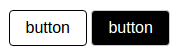
在页面中直接使用class就可以使用预置的样式
<base-button class="light">button</base-button>
<base-button class="dark">button</base-button>
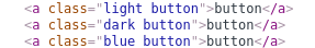
也可以在页面中直接添加class和对应的css,设置背景色和前景色、边框色
<style>
    .button.blue {
        background-color: blue;
        color: white;
    }
</style>
//in template
<base-button class="blue">button</base-button>

渲染得到的html如下
下面考虑这样的需求:我们的应用中可能用到一些不依赖业务上下文同时具备一定语义的button比如“确定”和“取消”,在使用频率较高的情况下,我们不希望每次使用时都为其设定class之类的样式属性,而只考虑其在业务中的功能比如click事件的绑定。此时尝试在base-button的基础上定制类似于“确定”和“取消”的语义化的组件。由于是通过为button增加class改模板,所以不能通过原生的extends实现,而是采用增加一层的方法。下面是ok-button的代码,类似的可以设计cancel-button组件
//button-ok.vue
<script>
    import Button from './button.vue'
    export default {
        render(h){
            return h(
                Button,
                {
                    class: ['ok']
                },
                this.$slots.default
            )
        }
    }
</script>
<style>
    .button.ok {
        background-color: green;
        color: white;
    }
</style>
在页面中使用
<ok-button>ok</ok-button>
<cancel-button>cancel</cancel-button>
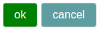
渲染得到的html和devtool中的组件树如下,可以看到组件树中的两层组件对应文档中的同一个元素

派生的ok-button和cancel-button使用时不需要再设置样式相关的属性,只需要设置标签间的default slot并绑定事件,但是这种方案有很大的问题,每一个定制的*-button都需要一个单独的文件,文件之间的重复代码相当多,另外没有提取css的情况下,每一个*-button组件的样式都会在文档中生成一个style标签。
我们需要一个方案把重复代码合并,只通过一定的参数生成多种定制button。前面提到的几个组件库都参考了bootstrap的方案,为button预设几个可选的type,通过设置type属性对button进行定制。我们也尝试实现类似的方案,type参考了element-ui。
//button-type.vue
<script>
    import Button from './button.vue'
    export default {
        name: 'type-button',
        render(h){
            return h(
                Button,
                {
                    class: [this.type]
                },
                this.$slots.default
            )
        },
        props: {
            type: {
                validator: function(typeStr){
                    if(typeof typeStr === 'string'){
                        switch(typeStr){
                            case 'ok':
                            case 'cancel':
                            case 'success':
                            case 'warning':
                            case 'danger':
                            case 'info': return true;
                            default: return false;
                        }
                    } else return false;
                }
            }
        }
    }
</script>
<style scoped>
    .button.success {
        background-color: #13ce66;
        color: white;
    }
    .button.warning {
        background-color: #f7ba2a;
        color: white;
    }
    .button.danger {
        background-color: #ff4949;
        color: white;
    }
    .button.info {
        background-color: #50bfff;
        color: white;
    }
    .button.ok {
        background-color: deepskyblue;
        color: white;
    }
    .button.cancel {
        background-color: rebeccapurple;
        color: white;
    }
</style>
在页面中使用
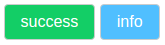
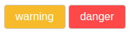
<type-button type="success">success</type-button>
<type-button type="warning">warning</type-button>
<type-button type="danger">danger</type-button>
<type-button type="info">info</type-button>
<type-button type="ok">OK</type-button>
<type-button type="cancel">cancel</type-button>
 这种方案合并了多种定制button的配置和样式代码,但是又失去了语义化组件标签的简洁性,type属性仍然只是起到了与class相同的作用。此时可以考虑在type-button的基础上再加一层,实现语义化的组件标签。基于type-button的扩展不需要提供模板和提供样式,因此可以使用纯js代码来实现,还可以在一个js文件中定义多个组件,使用es6的解构语法引入。根据情况可以使用
函数化组件,函数化组件本身不会产生实例,可以减少一层组件,件树中只能看到原组件。
这种方案合并了多种定制button的配置和样式代码,但是又失去了语义化组件标签的简洁性,type属性仍然只是起到了与class相同的作用。此时可以考虑在type-button的基础上再加一层,实现语义化的组件标签。基于type-button的扩展不需要提供模板和提供样式,因此可以使用纯js代码来实现,还可以在一个js文件中定义多个组件,使用es6的解构语法引入。根据情况可以使用
函数化组件,函数化组件本身不会产生实例,可以减少一层组件,件树中只能看到原组件。
//button-sem-type.js
import TypeButton from './button-type.vue';
export const SuccessButton = {
  name: 'success-button',
  functional: true,//函数化
  render: (h, context) => h(TypeButton, {
    props: {
      type: 'success'
    }
  }, context.slots().default)
}

export const InfoButton = {
  name: 'info-button',
  render(h) {
    return h(TypeButton, {
      props: {
        type: 'info'
      }
    }, this.$slots.default)
  }
}
在页面中使用
<script>
import { SuccessButton, InfoButton } from '../lib/button/button-sem-type'
</script>
//in template
<success-button>success</success-button>
<info-button>info</info-button>
基于type-button的实现方式适用于在已有的提供了类type接口UI组件库的基础上进行扩展,而在我们自己定义base-button的基础上,可以直接对base-button进行扩展,减少一层组件。而基于base-button扩展需要另外添加css文件并引入。
//button-sem.css
.button.warning {
  background-color: #f7ba2a;
  color: white;
}

.button.danger {
  background-color: #ff4949;
  color: white;
}

//button-sem.js
import Button from './button.vue'
import './button-sem.css';

export const WarningButton = {
  render(h) {
    return h(Button, {
      class: ['warning']
    }, this.$slots.default)
  }
}

export const DangerButton = {
  functional: true,
  name: 'danger-button',
  render: (h, context) => h(Button, {
    class: ['danger']
  }, context.slots().default)
}
在页面中使用
<script>
import { WarningButton, DangerButton } from '../lib/button/button-sem'
</script>
//in template
<warning-button>warning</warning-button>
<danger-button>danger</danger-button>
可以看到两个*-button的配置中重复代码仍然很多,不妨使用一个工厂函数进行生成。
//button-gtor.css
.button.success {
    background-color: #13ce66;
    color: white;
}

.button.warning {
    background-color: #f7ba2a;
    color: white;
}

.button.danger {
    background-color: #ff4949;
    color: white;
}

.button.info {
    background-color: #50bfff;
    color: white;
}

.button.ok {
    background-color: deepskyblue;
    color: white;
}

.button.cancel {
    background-color: rebeccapurple;
    color: white;
}

//button-gtor.js
import Button from './button.vue'
import './button-gtor.css';
function generator(prefix) {
  return {
    functional: true,
    name: prefix + '-button',
    render: (h, context) => h(
      Button, {
        class: [prefix]
      },context.slots().default)
  }
}

export const SuccessButtonG = generator('success')
export const WarningButtonG = generator('warning')
export const DangerButtonG = generator('danger')
export const InfoButtonG = generator('info')
export const OkButtonG = generator('ok')
export const CancelButtonG = generator('cancel')
在页面中使用
<script>
import { SuccessButtonG, InfoButtonG, WarningButtonG, DangerButtonG, OkButtonG, CancelButtonG } from '../lib/button/button-gtor'
</script>
//in template
<success-button-g>success</success-button-g>
<warning-button-g>warning</warning-button-g>
<danger-button-g>danger</danger-button-g>
<info-button-g>info</info-button-g>
<ok-button-g>ok</ok-button-g>
<cancel-button-g>cancel</cancel-button-g>
 这种方案提供了语义化的组件标签,省去了使用时设置样式相关属性的过程,同时这些组件的配置对象是由一个工厂函数生成的,最大程度地合并了重复的代码。
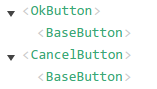
下面比较一下各种方案下产生的组件树
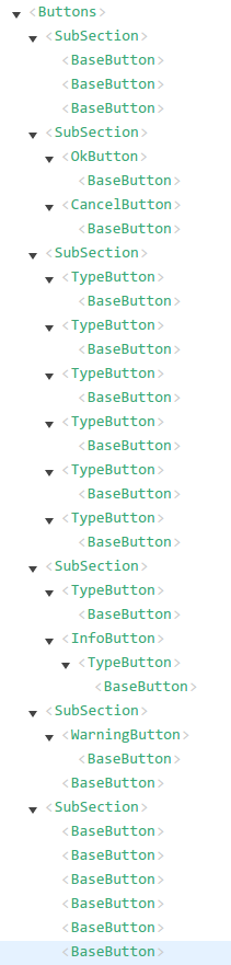 第一个SubSection中直接为base-button添加class,只有1层组件
第二个SubSection中在独立的.vue文件的模板中将原组件作为根组件,2层组件
第三个SubSection中使用type属性进行组件样式设置,也是两层组件
第四个SubSection中基于type-button增加了一层,但在组件树中使用看到使用了函数化组件的success-button只有2层,最高层是type-button也就是说函数化的组件不会产生实例,而未使用函数化组件的info-button在组件树有3层,对应同一个a元素
第五个SubSection中基于base-button增加一层,在组件树中使用函数化组件的danger-button也没有产生一层,因此只有1层base-button
第六个SubSection中是使用工厂函数生成同时使用了函数化组件,在组件树中只有一层。即
从渲染得到的html来看,这几种方式得到的效果完全相同,只会得到一个具有两种class的a元素,这个a元素可能对应组件树中的多个层。
关于事件绑定
以上仅仅为了定制button样式而进行了扩展,下面考虑一下button的点击事件绑定。
在base-button中,createElement函数接受的是一个原生html标签,数据对象中使用on选项绑定的是原生的dom事件。
而在基于base-button派生的组件中,creteElement接受的第一个参数是原组件,数据对象中直接使用on选项绑定的是原组件中使用vm.$emit触发的自定义事件,也可以使用nativeOn绑定原生的dom事件。
在上面的例子中使用nativeOn更好的选择,因为由base-button扩展得到的每层组件实际上使用的是同一个a元素,也就是说使用nativeOn捕获的都是a元素上的原生dom事件,并没有什么区别,而采用在base-button中捕获并在处理函数中使用vm.$emit触发自定义事件就会显得多余。但如果base-button本身实现了一些特殊的功能比如限制点击事件频率,那么还是需要使用on捕获响应的事件来使派生组件也获得这个功能。
总结
本次对Vue组件在样式上的扩展进行了一系列的尝试,产生了几种还不错的思路,在实际使用过程中的效果和问题还有待于检验。
就一个button组件本身的实现和扩展而言,可能并不需要这么多炫酷的方法,本文仅仅以button作为一个例子,对可行的扩展思路进行探索,由此产生的一些创新性的想法可能会对其他类型的组件及其扩展方案起到一定的启发。
本文中使用到了一些不常见的技巧,比如在.js文件中定义组件,这种方式需要使用render函数生成模板,而且无法定义独立的css(虽然可以在数据对象中使用style选项为组件绑定样式),也失去了vue-loader提供的一些增强功能比如scoped,但是这种方式又有它的一些好的效果:可以在一个.js文件中定义相关的多个组件,必要时使用工厂函数进行批量的生成,使用时时可以使用es6的解构语法灵活的引入,这使得它非常适用于组件库的定义。另外值得注意的是,组件的样式是通过额外的css引入,这意味着可以基于已有的css框架定制我们想要的语义化的标签。
函数化组件的使用能减少组件的层次并提高渲染效率,但同时需要注意的是组件树中的组件仍然是原组件,而函数化组件的props和事件绑定并不会自动传递给原组件,仍需要在数据对象中显式地进行传递。
