

本文已经翻译成中文《[译] 深度讲解 Android 主题层级》,欢迎参加「掘金翻译计划」,翻译优质的技术文章。
Theme.AppCompat, Theme.Base.AppCompat, Base.V7.Theme.AppCompat, Base.v11.Theme.AppCompat, Base.v21.Theme.AppCompat, ThemeOverlay, Platform.AppCompat, DeviceDefault, Material, Holo, Classic…
If you work with Android themes and support library you have probably at some point seen all those names and asked yourself:
- What are these Base.V{something}, Theme.Base.AppCompat Platform.AppCompat ?
- How are all these themes organized ?
- Which one should i use ?
In this article i’m going to answer those questions and try to clarify for those who don’t know how all of these fit together.
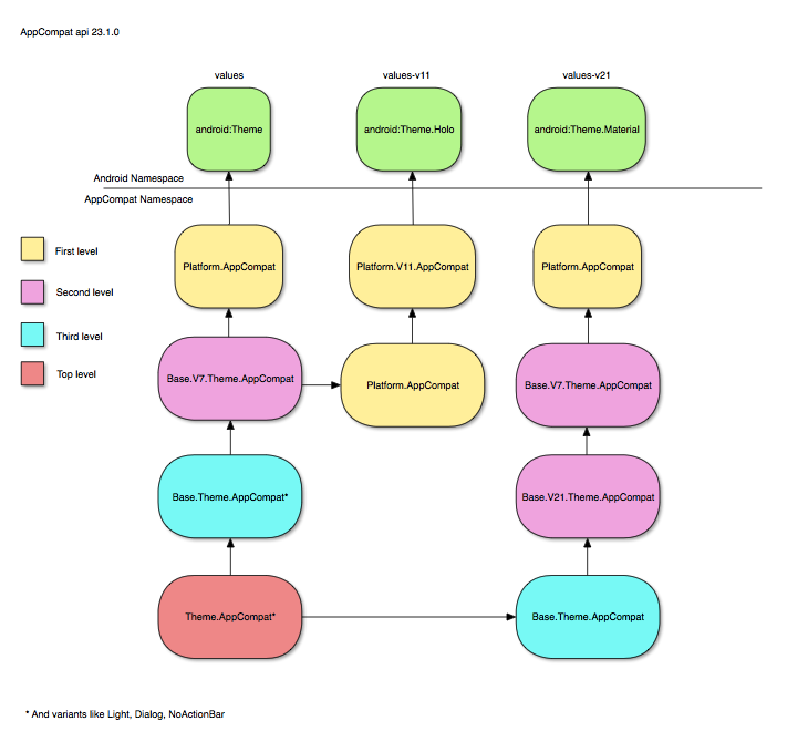
AppCompat v7
The v7 support library has a theme structure that aims to give the Material appearance in all Android platforms starting in api v7, because different Android platforms have defined different themes, styles and attributes the theme hierarchy is complex and not very intuitive at first. This is where Base.V… and Platform.AppCompat come into play.
There is even a README file in Github that Android developers wrote to explain the theme hierarchy, i recommend you to take a look at it.
Contribute to platform_frameworks_support development by creating an account on GitHub.github.com
In AppCompat themes are structured in four levels, each level inheriting from the level below:
Level1 → Level2 → Level3 → Level4
Besides that, there is a values-v{api} folder for each Android api that needs to define and/or overwrite it’s own styles and attributes:
values, values-v11, values-v14, values-v21, values-v22, values-v23
Level 4 (Bottom level)
The bottom level that contains the Platform.AppCompat theme, this theme always point to the Android theme defined in that api, for example:
values
Platform.AppCompat -> android:Theme
values-v11
Platform.AppCompat -> android:Theme.Holo
values-v21
Platform.AppCompat -> android:Theme.Material
Level 3
This is where most of the work is done and where Base.V7.Theme.AppCompat, Base.V11.Theme.AppCompat, Base.V21.Theme.AppCompat, etc are defined. These themes inherit from Platform.AppCompat
values
Base.V7.Theme.AppCompat* → Platform.AppCompat → android:Theme
values-v11
Base.V11.Theme.AppCompat → Platform.AppCompat → android:Theme.Holo
values-v21
Base.V21.ThemeAppCompat → Base.V7.ThemeAppCompat → Platform.AppCompat → android:Theme.Material
*and variants like Base.V7.Theme.AppCompat.Light, Base.V7.Theme.AppCompat.Dialog, etc…
The Base.V{api}.Theme.AppCompat themes is where most of the attributes are defined and where almost all the work is done. All attributes from ActionBar, DropwDown, ActionMode, Panel, List, Spinner, Toolbar etc are defined in this themes. You can take a detailed look at this link:
Contribute to platform_frameworks_support development by creating an account on GitHub.github.com
Level 2
As far as i get themes from this level are only alias to third level themes, according to Android explanation:
There are the themes which are pointers to the correct third level theme.They can also be used to set attributes for that specific platform (and platforms up until the next declaration).
values
Base.Theme.AppCompat* → Base.V7.Theme.AppCompat
values-v21
Base.Theme.AppCompat → Base.V21.Theme.AppCompat
*and variants like Base.Theme.AppCompat.Light, Base.Theme.AppCompat.Dialog, etc…
Level 1 (Top Level)
This is where themes like Theme.AppCompat, Theme.AppCompat.Light, Theme.AppCompat.NoActionBar, etc are defined, developers should use these Themes and not the ones below these level.
values
Theme.AppCompat → Base.Theme.AppCompat
These themes are only defined in values folder and will inherit from the correct themes in the levels below depending on the Android api where the app is running. For example:
- Running in v7 (Android 2.2)
Theme.AppCompat → Base.Theme.AppCompat → Base.V7.Theme.AppCompat → Platform.AppCompat → android:Theme
- Running in v11 (Android 3.0)
Theme.AppCompat → Base.Theme.AppCompat → Base.V7.Theme.AppCompat → Platform.AppCompat → Platform.V11.AppCompat → android:Theme.Holo
- Running in v21 (Android 5.0)
Theme.AppCompat → Base.Theme.AppCompat → Base.V21.Theme.AppCompat → Base.V7.Theme.AppCompat → Platform.AppCompat → android:Theme.Material
This is how you get the same Material appearance in all Android api’s, as you can see it can get complicated when you start looking through the theme hierarchy.
ThemeOverlays
Looking at all the Themes available we can see a family of Themes called ThemeOverlay:
- ThemeOverlay
- ThemeOverlay.Light
- ThemeOverlay.ActionBar.Light
- ThemeOverlay.ActionBar.Dark
What’s the purpose of these Themes ? Defining only the necessary attributes for a specific use case and no more. For example ThemeOverlay only defines textColor, textAppearance and window colors attributes and a couple more like colorControlButton.
ThemeOverlay.ActionBar.Light only defines colorControlButton to be equal to ?attr:textColorSecondary and is meant to be used as a Toolbar theme.
Conclusion
While i was learning AppCompat themes i wrote a little app that helps you navigate in Android themes and styles maybe it’s helpful to someone.
NOTE: The link in Play Store may not be active for a couple of hours
AppCompat themes are specially complicated because the layers of abstraction needed to make it work across all platform…themekitapp.com
I hope this article helps you understanding how AppCompat themes are organized, there were a couple more things i wanted to talk about but it will make the article too long, maybe in a second part.
Sérgio Serra
sergioserra99@gmail.com
Android Developer @ FixeAds
