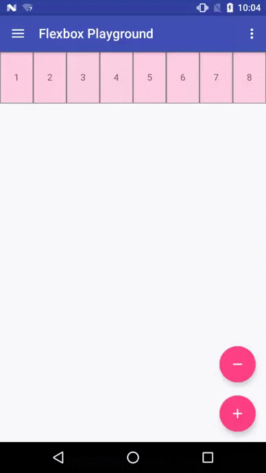
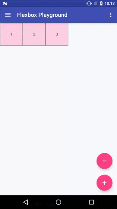
FlexboxLayout
FlexboxLayout is a library project which brings the similar capabilities of
CSS Flexible Box Layout Module to Android.
Installation
Add the following dependency to your build.gradle file:
dependencies {
    compile 'com.google.android:flexbox:0.1.1'
}
Usage
FlexboxLayout extends the ViewGroup like LinearLayout and RelativeLayout.
You can specify the attributes from a layout XML like:
<com.google.android.flexbox.FlexboxLayout
    xmlns:android="http://schemas.android.com/apk/res/android"
    xmlns:app="http://schemas.android.com/apk/res-auto"
    android:layout_width="match_parent"
    android:layout_height="match_parent"
    app:flexWrap="wrap"
    app:alignItems="stretch"
    app:alignContent="stretch" >

    <TextView
        android:id="@+id/textview1"
        android:layout_width="120dp"
        android:layout_height="80dp"
        app:layout_flexBasisPercent="50%"
        />

    <TextView
        android:id="@+id/textview2"
        android:layout_width="80dp"
        android:layout_height="80dp"
        app:layout_alignSelf="center"
        />

    <TextView
        android:id="@+id/textview3"
        android:layout_width="160dp"
        android:layout_height="80dp"
        app:layout_alignSelf="flex_end"
        />
</com.google.android.flexbox.FlexboxLayout>
Or from code like:
FlexboxLayout flexboxLayout = (FlexboxLayout) findViewById(R.id.flexbox_layout);
flexboxLayout.setFlexDirection(FlexboxLayout.FLEX_DIRECTION_COLUMN);

View view = flexboxLayout.getChildAt(0);
FlexboxLayout.LayoutParams lp = (FlexboxLayout.LayoutParams) view.getLayoutParams();
lp.order = -1;
lp.flexGrow = 2;
view.setLayoutParams(lp);
Supported attributes
You can specify the following attributes for the FlexboxLayout:
flexDirection

flexWrap
- This attribute controls whether the flex container is single-line or multi-line, and the
direction of the cross axis. Possible values are: - nowrap (default)
- wrap
- wrap_reverse

- This attribute controls whether the flex container is single-line or multi-line, and the
justifyContent
- This attribute controls the alignment along the main axis. Possible values are:
- flex_start (default)
- flex_end
- center
- space_between
- space_around

alignItems
- This attribute controls the alignment along the cross axis. Possible values are:
- stretch (default)
- flex_start
- flex_end
- center
- baseline

alignContent
- This attribute controls the alignment of the flex lines in the flex container. Possible values
are: - stretch (default)
- flex_start
- flex_end
- center
- space_between
- space_around

- This attribute controls the alignment of the flex lines in the flex container. Possible values
Also you can specify the following attributes for the children of a FlexboxLayout.
layout_order
- This attribute can change how the ordering of the children views are laid out.
By default, children are displayed and laid out in the same order as they appear in the
layout XML. If not specified,1is set as a default value.
- This attribute can change how the ordering of the children views are laid out.
layout_flexGrow
- This attribute determines how much this child will grow if positive free space is
distributed relative to the rest of other flex items included in the same flex line.
If not specified,0is set as a default value.
- This attribute determines how much this child will grow if positive free space is
layout_flexShrink
- This attribute determines how much this child will shrink if negative free space is
distributed relative to the rest of other flex items included in the same flex line.
If not specified,1is set as a default value.
- This attribute determines how much this child will shrink if negative free space is
layout_alignSelf
- This attribute determines the alignment along the cross axis (perpendicular to the
main axis). The alignment in the same direction can be determined by the
alignItemsin the parent, but if this is set to other than
auto, the cross axis alignment is overridden for this child. Possible values are: - auto (default)
- flex_start
- flex_end
- center
- baseline
- stretch
- This attribute determines the alignment along the cross axis (perpendicular to the
layout_flexBasisPercent
- The initial flex item length in a fraction format relative to its parent.
The initial main size of this child view is trying to be expanded as the specified
fraction against the parent main size.
If this value is set, the length specified fromlayout_width
(orlayout_height) is overridden by the calculated value from this attribute.
This attribute is only effective when the parent’s length is definite (MeasureSpec mode is
MeasureSpec.EXACTLY). The default value is-1, which means not set.
- The initial flex item length in a fraction format relative to its parent.
Known differences from the original CSS specification
This library tries to achieve the same capabilities of the original
Flexible Box specification as much as possible,
but due to some reasons such as the way specifying attributes can’t be the same between
CSS and Android XML, there are some known differences from the original specification.
(1) There is no flex-flow
equivalent attribute
* Because flex-flow is a shorthand for setting the flex-direction and flex-wrap properties,
specifying two attributes from a single attribute is not practical in Android.
(2) There is no flex equivalent attribute
* Likewise flex is a shorthand for setting the flex-grow, flex-shrink and flex-basis,
specifying those attributes from a single attribute is not practical.
(3) layout_flexBasisPercent is introduced instead of
flexBasis
* Both layout_flexBasisPercent in this library and flex-basis property in the CSS are used to
determine the initial length of an individual flex item. The flex-basis property accepts width
values such as 1em, 10px, and content as strings as well as percentage values such as
10% and 30%, whereas layout_flexBasisPercent only accepts percentage values.
But specifying initial fixed width values can be done by specifying width (or height) values in
layout_width (or layout_height, varies depending on the flexDirection). Also, the same
effect can be done by specifying “wrap_content” in layout_width (or layout_height) if
developers want to achieve the same effect as ‘content’. Thus, layout_flexBasisPercent only
accepts percentage values, which can’t be done through layout_width (or layout_height) for
simplicity.
(4) min-width and min-height can’t be specified
* Which isn’t implemented just yet.
How to make contributions
Please read and follow the steps in CONTRIBUTING.md
License
Please see License
