Divide and execute to become the Caesar of project planning and task management diagramming. Get inShort today!
iPad Drag and Drop
In recent months, many have called for a renewed emphasis on the iPad platform in the hopes that with further refinements it might become a replacement or worthy supplement to the OS X desktop paradigm. In his 2016 WWDC Wish List, Steve Troughton-Smith noted that one of the crucial features still missing is a system-wide drag and drop:
With the addition of split-screen multitasking, much has been said about drag & drop on iOS. It seems like an obvious thing to add, on the surface, but when you think it through there are a lot of ways it could be detrimental to the OS. Finding a way to enable drag & drop without screwing over all the existing gestures in the OS, whilst still making it faster than copy/paste - that’s not as easy as you think. Despite that, I do think it’s worth figuring out, and makes so much sense on a touchscreen with its direct manipulation model.
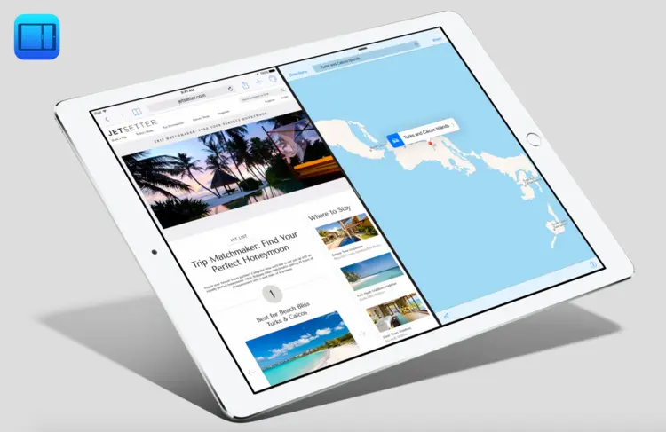
It has long been known that iOS features drag and drop functionality, notably on the home screen for app icon arrangement. This is ultimately about adjusting the interface.

Drag and drop in the iOS Mail header fields.
But just the other day while adjusting the addresses in the iOS Mail app, I came across what might be the direction Apple takes for direct manipulation of content itself through drag and drop. If this interaction is expanded to the whole OS, it could be a huge boon for mobile productivity. As Troughton-Smith points out, it will have to be introduced thoughtfully.
Improving Control Center
I previously noted that it seemed like a severe oversight that the iOS Control Center didn't allow users access to many primary system toggles that were being introduced. This became significant for me with the introduction of Low Power Mode, which can be a real life-saver with a phone more than a few months into contract.
This past week, I was reminded of the mockup I drew several months back of an improved Control Center when I saw an excellent prototype made by Sam Beckett. Talk about high production value. Apple would be making a big mistake by not promptly snapping up Mr. Beckett.
While Beckett was quite thorough in his design, one element that he and Apple haven't addressed is creating an explicit delineation between the top row and the bottom row of Control Center buttons and icons.
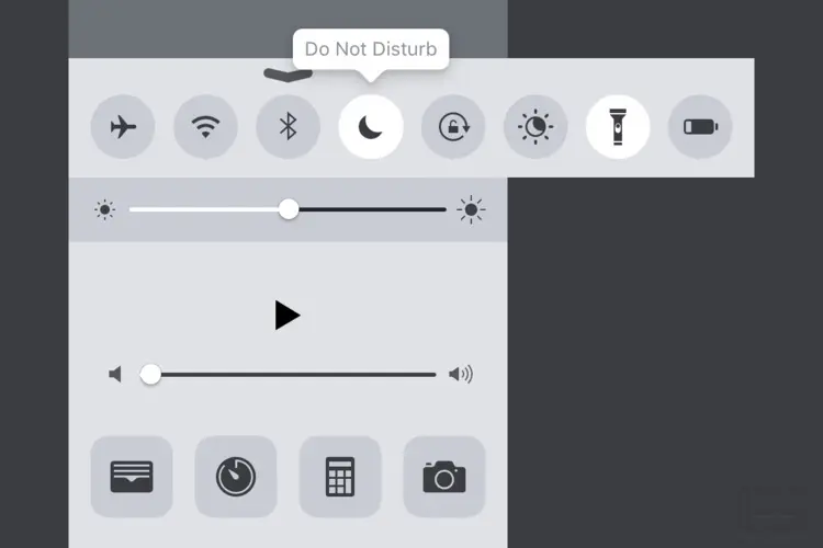
The current Control Center.
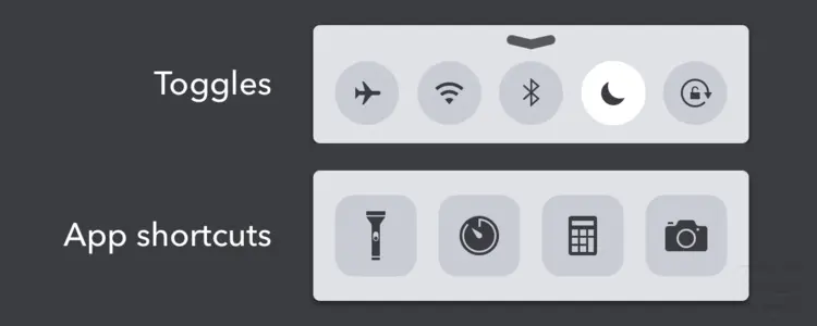
As it stands today, the top row of circular buttons indicates a consistent pattern of displaying mode toggles for the operating system, whether it be for Airplane Mode, Wi-Fi, Do Not Disturb etc. The bottom row has the traditional app icon mask, indicating that it is appropriate to display app shortcuts in that area. This pattern is largely followed except for the placement of the flashlight toggle.
This was my proposed solution to the current ambiguity around placement of toggles and app shortcuts. Note that the flashlight has been placed in the toggle area and the app shortcut for the Wallet app has replaced it. Additionally, if no labels are to going to be on by default, then tooltips should display on press. Spillover toggles and apps that wouldn't fit in the screen area could be scrolled into view.
While it would be one more glyph icon for designers to draw, in addition to the recommended eleven app icon sizes, the proliferation of third-party app shortcuts could prove useful.
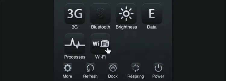
An SBSettings theme by Jackie Tran from 2010.
All this attention being showed to Control Center reminds me of the jailbreak theming days when people used the tweak SBSettings to enable toggling of system settings.
Fences on Apple Watch
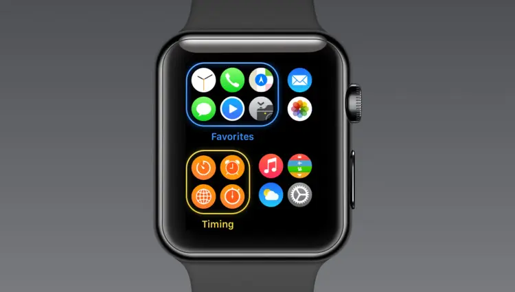
As users get considerably more apps on Apple Watch, it could be useful for Apple to include a Fences-like feature for grouping them. I drew this quick mockup to show how fence groups might work on a future version of Apple Watch
Behind the Scenes Icon Design
It's always a nice treat to get to see the evolution of icons and glyphs in app design.

Here are the drafts for the new Night Shift feature for Control Center that have been constantly changing prior to launch. It must have been tough for the designers to pick which glyph to go with as each has its own appeal.
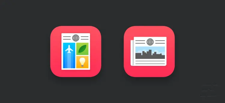
Apple News' second iteration seems more appropriate in that it makes better skeuomorphic reference to the traditional form of newspapers, but loses some of the character of the original approach.
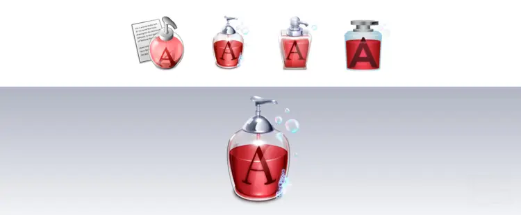
From its Iconfactory origins to its current unfortunate state, the Textsoap icon has gone through some significant revisions over the years. The second version really knocked it out of the park.

Similar to the Textsoap icon, Apple's Numbers icon has gotten blunted since OS X Yosemite. Nevertheless, the Numbers icon has always fascinated me given that it is one of the only icons on OS X to have its own unique perspective.

The Preview app glyph for highlighting has an incredibly clever use of gradients that's subtle but effective. This is the kind of icon artistry that we simply don't see anymore. Here I've exploded and redrawn the icon to show its detail.
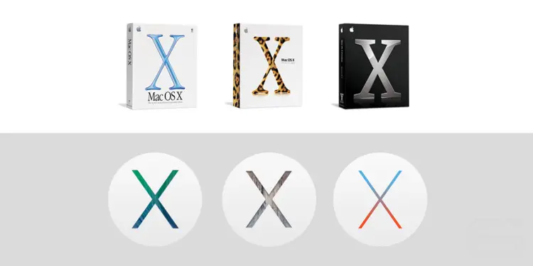
The branding for Apple's operating systems over the years. This is what aesthetic degeneration looks like.
Steve Jobs, Son of Man
Back in 2012, Joost van der Ree made this under-recognized wallpaper interpretation of Magritte's Son of Man by mashing it up with Steve Jobs. You can download the wallpaper here.
The Brothers Grimsby Developer Conference
Last but not least, Sacha Baron Cohen lampoons Apple.
