DaisyDisk gives you a real-time overview of your OS X disk drives so you can easily find junk and free up disk space.
The following is a preview of the kind of critical writing you'll find in my upcoming Humanist Interface book:
More than two years have passed since the 2013 WWDC when iOS 7's flattened and utterly illegible software keyboard first saw the light of day. Upon its initial release, the keyboard's visual design was the least of the design community's concern. For most, iOS 7 was a cause for celebration. The keyboard itself was and remains to this day the embodiment of modern minimalist virtue.
In my early critique of the keyboard, I pointed out that even after many revisions since the release of the iOS 7 beta, "something so core to the operation of a smartphone as its keyboard remains ambiguously designed." For the most part, Apple has still not solved the chief complaint in the critique: the illegible shift key. Instead, they have simply sidestepped the issue.
How We Got Here
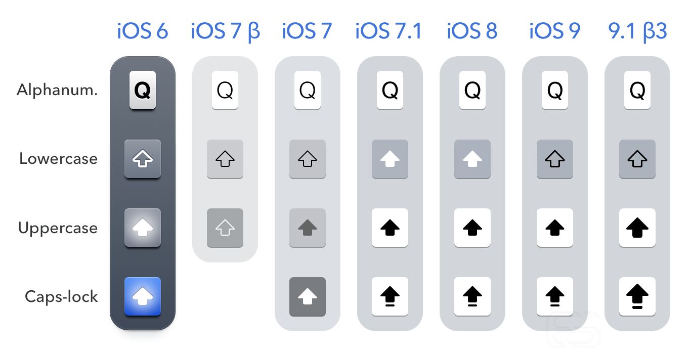
Devolution of the iOS keyboard. (Note: I include the iOS 8 keyboard in this graphic to illustrate that Apple felt it was acceptable for users to use the faulty shift key for two years, despite its ambiguous rendering having provoked confusion among the vast majority of users.
In my previous critique, I explained the following:
In earlier versions of iOS, realistic lighting, shading and expressive color were put to good use in order to differentiate the key states. In the modern minimalist interpretation…the design was built on the assumption that multiple redundant, obvious and emphatic cues about the capitalization of text were excessive and unnecessary.
The keyboard that launched with iOS 7 featured paper-thin glyphs, and was particularly bright with low-contrast. But for all its faults, it did feature three unique shift key states. As soon as this minor bit of coherence was noticed by Apple designers, it was found to be out of place with the rest of the minimalist operating system, and had to be promptly changed.
The shift from iOS 7 to iOS 7.1.
The crucial change occurred between iOS 7 and 7.1. Apple added a bar under the arrow on the caps-lock glyph, but this improvement was nullified when the shift key's active state was made to look exactly the same as the deactivated alphanumeric keys.
Unlike designers, users were quick to express their confusion at the new shift key design. Eventually, some in the design community took note of the shift key's illegible design. Several alternatives were proposed by members of the community, including notably Geoff Teehan of Teehan & Lax, and iOS developer Allen Pike.
Alternative shift key designs by Geoff Teehan, Allen Pike and me.
Teehan's addition of a flat inner shadow was a useful, but misapplied, technique. The shift key should only stay depressed in the caps-lock state, not the uppercase state. The logic behind this continued depression is made with reference to the "lock" in "caps-lock." Furthermore, it is not enough to add an inner shadow if it is so subtle that the key does not appear to be depressed. Overt depth cues and lighting make the key states obvious.
Almost every proposal offered by the community suffered from the perennial problem of accepting the premise–they ceded to Apple's artificial minimalist constraints in their redesigns, thus handicapping the improvements they offered. What is clear is that designing sufficiently differentiated states is ultimately a matter of whether we make that our priority and in doing so improve our interfaces for users.
Today's Landscape
With the release of iOS 9, there have been a variety of changes to the software keyboard. Unfortunately, none of them have addressed the fundamental problems of its visual design, as much as pundits might claim otherwise.
Transition from iOS 8 to iOS 9.
It is true that in iOS 9, Apple reverted the shift key's lowercase glyph state back to a hollow rendering. But this change does nothing to clarify the issue of the uppercase state resembling the inactive alphanumeric keys. Nevertheless, pundits have credulously praised the new hollow state as a revolutionary move.
Federico Viticci explains,
iOS 9 introduces a simpler design that makes its On/Off state more obvious. When turned off, the Shift key has a gray background with a hollow glyph that matches the adjacent keys. When turned on, the entire key turns white with a black, filled glyph. The new design clearly indicates the activation state of the Shift key, and it goes a long way in removing doubts on whether Shift is enabled or not, solving a major usability issue of the iOS 7/8 keyboard."
John Gruber followed suit: "The good news is, Apple did improve the Shift key on iOS 9. When not engaged, the arrow glyph on the key cap is now hollow."
In truth, the design of the shift keys has hardly changed at all. And even with the changes, the communication is still inferior to the version that shipped with iOS 7.
Case-shifting keys
Android case-shifting keyboard.
Despite not much changing in the way of aesthetics, Apple did introduce a major new feature in iOS 9, one long held by Android and Windows Phone: the case-shifting keyboard. In a case-shifting keyboard, the letter keys themselves change state, offering users another visual indicator of state in addition to the shift key.
Windows 10 Beta case-shifting keyboard.
Geoff Teehan originally proposed in 2014 that Apple adopt the case-shifting keyboard for iOS in response to the ambiguity of the iOS 7 shift key, though he did so with skepticism,
"This isn’t the perfect solution…I’m not entirely sure how I’d feel about having the characters change all the time—I do find it a bit jarring on Android."
iOS case-shifting keyboard.
As it turns out, there has been a significant backlash among users, many of whom seem to prefer the all-capital keyboard setting, or at the very least were startled by the unannounced change.
John Gruber had a similar response to Teehan, explaining that the keyboard felt "jarring. Feels like I’m changing keyboards, not changing case." Craig Hockenberry of the Iconfactory noted, "There’s that fraction of a second where you think you did something wrong." Joe Cieplinski of Bombing Brain described the keyboard's flashes as "Unnecessary and disorienting." One wonders if some sort of introduction to the feature might have helped prevent or dampen some of these reactions.
Giving it Time
Usually, the response "give it time" amounts to defensive condescension on the part of designers in the face of frustrated users. I contend that the case-shifting keyboard may just be a rare exception to the rule. The case shifting keyboard makes visual differentiation of keys in the lower case state easy due to their varying footprints. Moreover, it acts as a form of WYSIWYG.
Alignments
Some have argued that the alignments of the lowercase keyboard are off, and that the uniformity of all-caps keyboards is a worthy end. (Marc Edwards of Bjango published an interesting exploration of button-text alignments back in 2011).
For those users who do prefer a uniform all-caps keyboard, the setting for shutting off case-shifting keys is available, although its location is strange to say the least.
Preference as Disability
One can change back to the all-caps keyboard in Accessibility settings.
Apple is unapologetic about their decision to remove the all-caps keyboard. But their designers have done a service for the users they have diagnosed with the disability of preferring an all-caps keyboard. They included an option in the Accessibility settings to return to the earlier keyboard: General > Accessibility > Keyboard > Show Lowercase Keys.
Frankly, they should have placed the setting together with all the other standard keyboard settings, in General > Keyboard. Though perhaps that would be tantamount to admitting the change was a contentious one. It is not an insult to include accessibility settings. What is an insult is to store your bad design decisions there.
Cop out
Whether or not one prefers the case-shifting keyboard, its introduction is ultimately a form of misdirection. The case-shifting keyboard may sufficiently communicate whether the next letter will be lower or uppercase, but at present it cannot indicate if the keyboard is in caps-lock mode.
Furthermore, nothing prevented Apple from implementing a case-shifting keyboard for the first 6 versions of iOS. The fact that the shift key remains ambiguous illustrates Apple's willful ignorance of the benefits of redundant cues.
Character Preview
A keyboard with Character Preview enabled.
In addition to the case-shifting keys, Apple also introduced a setting for turning off character previews, the popup indicators that display after pressing a key. This time they put the setting in the proper location: Settings > General > Keyboard).
Character Preview disabled.
The character preview has been instrumental to the usability of the iPhone keyboard, since one's thumbs inevitably cover up the key as it is typed. (This feedback is less necessary on the iPad since it has larger tap targets). Despite this, in the interests of minimalism, Apple introduced the show Character Preview setting as disabled by default during the beta for iOS 9 (The defaults have since been reversed).
Some argue that the setting for disabling character preview was added for those inputting sensitive information—which is a somewhat plausible rationale. Nevertheless, this setting shouldn't be buried deep in settings. It should be readily available on the keyboard itself.
Skeuomorphism and Tactility
One and a half centuries of keyboards, from typewriters to computer terminals, has set a precedent for the all-caps keyboard. Dynamically changing graphics were, of course, impossible given the rigid construction of earlier keyboards (Art Lebedev notwithstanding).
In making the transition to screen-based keyboards, we are afforded an opportunity to trade one-to-one referential accuracy for the medium's ability to extend metaphors. It is for this reason that I argue that the case-shifting keyboard deserves a transition period. It is a much more powerful extension of the keyboard metaphor. This is the same reason the character preview is such a powerful design innovation.
The character preview, despite Apple's attempts to diminish its visual weight, relies on the illusion of depth.
At present, aural feedback in the form of the skeuomorphic click sound is often not audible. In the absence of true haptic feedback on screens (I’m not referring to 3D Touch or Apple’s Taptic Engine) visual design is by definition the primary form of feedback. It follows that we should allow ourselves the full use of our visual acuity where it is applicable.
The Competition
Considering the tenor of this essay, it might be surprising to read the following: among its competitors, iOS has the most successful visual design. Take the Windows 10 beta keyboard: it makes no distinction between the lowercase and uppercase states. Alternatively, consider Android: it lacks button borders, making it difficult to target a particular key. Some might argue that Android eschews borders due to the Swype functionality, but Windows Phone has similar functionality and the borders on its keys are hardly an impediment to users of Swype. For those who tap to type, these borders are crucial. Given that among the three competitors, iOS has neither of these problems, it is therefore the least-worst option.
50 Shades of Blue-grey
In limiting their analysis to the shift key, which is only the tip of the iceberg, every critique of the iOS keyboard thus far has missed something crucial. The minimalist color scheme imposed by Apple (not to mention Google and Microsoft) is what makes the keyboard fundamentally broken.
Some keys result in a white active state, while others result in a grey one. When character preview is on, alphanumeric keys turn white with a popup key, but while it's off, a grey active state results.
As can be seen above in elements sampled from iOS 9, there is total inconsistency among keys in how they appear when active and inactive. In iOS 9, this remains unchanged. Crucially, the case-shifting keyboard does not change this fact. And the incoherence of this color scheme is only made more apparent when one disables character preview.
These issues could be solved by Apple simply permitting the use of additional shades of blue-grey. "More" being anathema to Apple's design philosophy, it is unlikely that improvements will happen anytime soon.
A Way Forward
Based on the above research, I have put together the following set of aesthetic guidelines for the coherent visual design of software keyboards:
- Each unique key state must be differentiated from the others–in particular, shift-key states should not have a similar style to alphanumeric keys
- Keys should operate with consistency unless there is a good rationale for them not to
- Caps-lock states should be depressed to communicate the continuous output of capitals
- Depth and borders are essential for indicating tap target areas and tactility.
- Redundancy in cues is an asset, not a liability
- By default, keyboards should provide character previews
- Case-shifting should be available to users as a recommended option
- All keyboard settings should be placed in the same preferences menu
- It is preferable that these settings be made accessible from the keyboard itself
Apple just released iOS 9.1 Beta 3, and without fanfare, they've made the shift glyph (and delete glyph) massive on the active states. Interesting timing.