

I recently saw Paul Lewis’ screencast demonstrating how trivial it can be to fix a particular kind of performance issue caused by scrolling. I knew the problem looked familiar and I realized it was right in my front yard, so to speak.
Four Kitchens’ very own website uses the exact same design feature: an
element with a large, viewport-sized background image held in place by background-attachment: fixed while
the foreground scrolls.
The problem with fixed
Let’s start with what we don’t want to change: the design. I don’t want to step on peoples’ toes, and I don’t want to throw great work out just because it doesn’t scroll fast enough for my taste. That’s mean. As a performance-minded developer, it’s up to me to fix this problem without altering the original design. That said, the scrolling performance on this piece of our homepage was miserable — something like 10 FPS. That’s very noticeable on the page. Since this is our homepage it’s something each visitor will notice within 5 or so seconds (unless they load the page and immediately click on the nav).
As Paul explains in his short video, using background-attachment: fixed causes
a paint operation every time the user scrolls. Why? Well, the page has
to reposition the content, and then, since its background image is supposed
to appear as if it’s holding still, the browser has to repaint that image
in a new location relative to its actual DOM elements. The performance
for this feature is so bad that iOS simply ignores this property.
Diagnosing the problem
You can peer into the rendering process by opening the Timeline section of Chrome DevTools, hitting the record button in the upper left, then scrolling on our old homepage. You used to get something like the following graph. I have color-coded the 30fps (red) and 60fps (blue) lines on the graph. When one of the vertical bars exceeds 60fps, humans perceive this as a small jitter in the scrolling. When it constantly exceeds the 60fps line, we perceive it as not smooth. When it starts bumping into or exceeding the 30fps line, we think it’s pretty bad or possibly even broken.
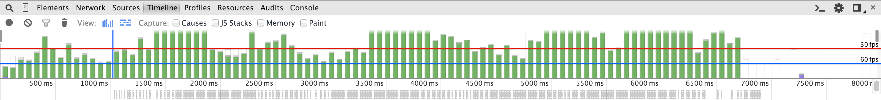
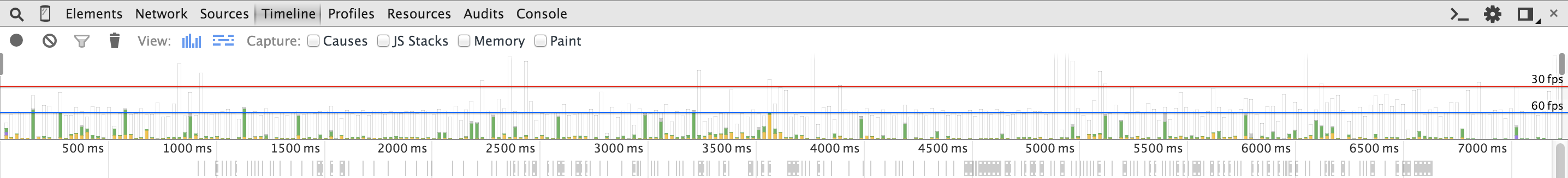
As you can see, the bars are exceeding 30 FPS and are completely green. Green means that the pixels have to be repainted on screen; we can likely fix this in CSS. To make the comparison easier, I’ll show you the after-shot now:
Just a side note: there are other colors that you might see in the Timeline view. Purple is a layout which means the DOM needed to be adjusted, and yellow is scripting which means that JS took a long time to execute, thus blocking the main thread. Right now let’s focus on fixing repaints, represented by green.
Fixing fixed
As it turns out, Paul’s solution for JSConf’s site was exactly what we
needed on our own homepage: the background image just needed its own element
so it could move independently of the others. Look at the two versions
of the code. It happens to be SCSS but there is nothing too special going
on. You could make the same changes in plain CSS (marked by comments) and
they’ll work in any browser which supports will-change.
Original CSS
.what-we-do-cards {
  @include clearfix;
  border-top: 10px solid rgba(255, 255, 255, .46);
  background-color: white;
  background: url('/img/front/strategy.jpg') no-repeat center center;
  background-attachment: fixed;
  background-size: cover;
  color: $white;
  padding-bottom: 4em;
}
You can see that our background image uses two GPU-intensive features
of CSS: background-size: cover and background-attachment: fixed.
Once we fix this painting issue neither will be a problem, since they will
only be calculated once to render the initial page. Scrolling will no longer
cause repainting once the image sits in its own layer.
GPU-friendly CSS
.what-we-do-cards {
  @include clearfix;
  border-top: 10px solid rgba(255, 255, 255, .46);
  color: $white;
  padding-bottom: 4em;
  overflow: hidden; // added for pseudo-element
  position: relative; // added for pseudo-element

  // Fixed-position background image
  &::before {
    content: ' ';
    position: fixed; // instead of background-attachment
    width: 100%;
    height: 100%;
    top: 0;
    left: 0;
    background-color: white;
    background: url('/img/front/strategy.jpg') no-repeat center center;
    background-size: cover;
    will-change: transform; // creates a new paint layer
    z-index: -1;
  }
}
Most important is the will-change: transform property applied
to the new pseudo-element (created by using the ::before selector.
will-change is an official web standardthat instructs
a browser to render the element independently of its surroundings. Used
sparingly, this property allows us to say “hey browser, this element will change somehow
in the future, please paint it on its own unique layer so that its surroundings
don’t affect how it is painted.”
The code described in this post has been deployed, so go check out our scroll-friendly homepage:
Learn more
If you’d like to learn more about will-change, I’d recommend
reading Everything you need to know about will-change by Sara Soueidan.
This feature of CSS can really help in some situations, but it has an equal
chance of hurting performance when misused. So please use it sparingly
and learn about it before going overboard.
Everything you need to know about will-change
If you’d like to learn more about render performance in general, visit jankfree.org to peruse a list of resources that teach you how to identify and fix performance problems just like this one.
