

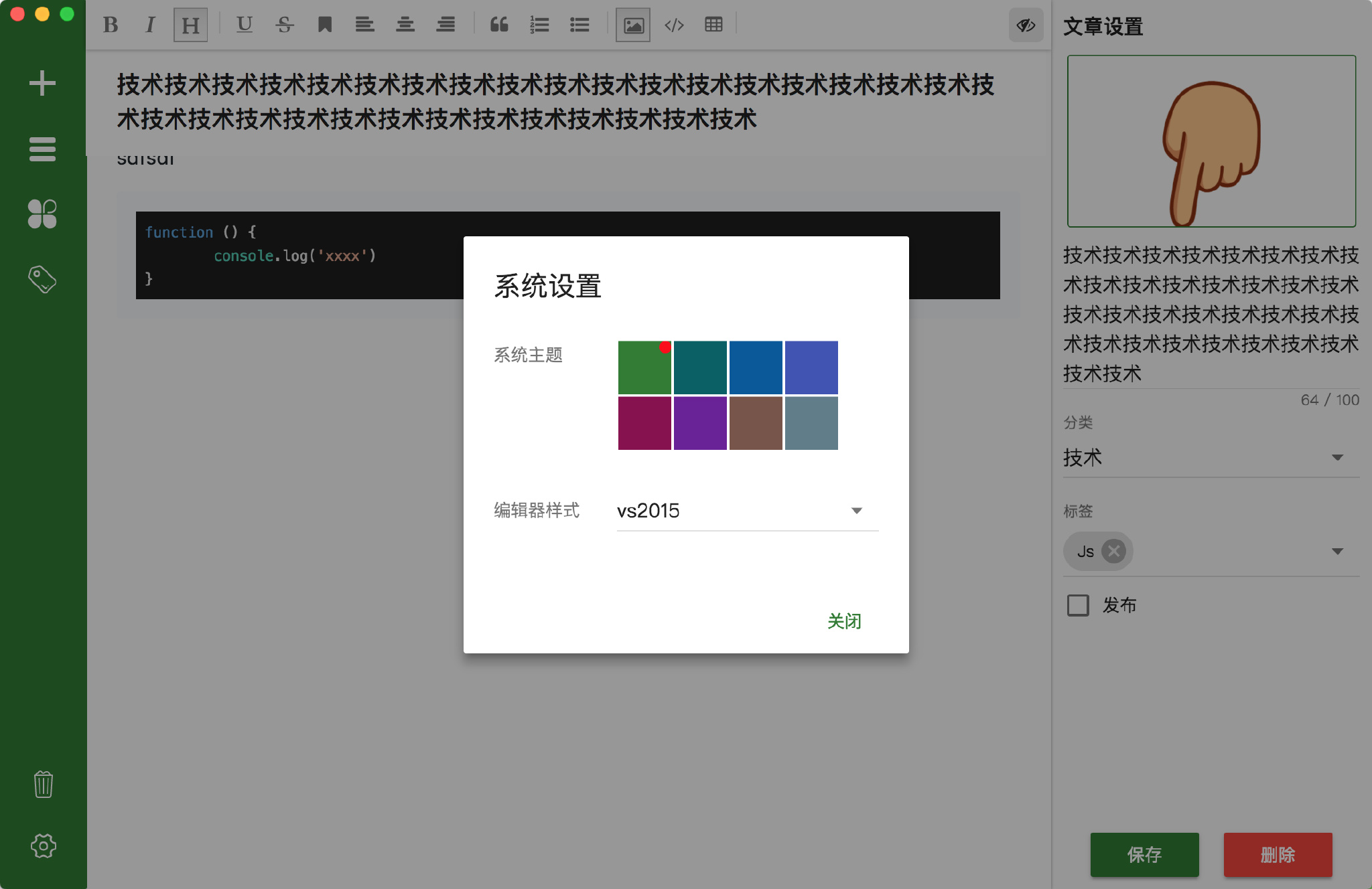
增加设置弹框,切换的主题主要有两个:系统的主题,和编辑器的主题。
系统主题
系统主题颜色切换主要是通过修改覆盖css样式来达到切换的目的;Muse-UI提供有一个切换主题的方法,我们通过设置她可以直接使用。
import theme from 'muse-ui/lib/theme';
theme.use('dark');
但是内置只有两种类型,我们可以自定义其他的样式:
import theme from 'muse-ui/lib/theme';
theme.add('teal', {
  primary: '#009688',
  secondary: '#ff4081',
  success: '#4caf50',
  warning: '#ffeb3b',
}, 'light');
theme.use('teal');
也可以通过addCreateTheme实现样式扩展。
这里我定义了8中样式,如下:
let list = [
  { name: "green", color: "#2e7d32" },
  { name: "cyan", color: "#006064" },
  { name: "blue", color: "#01579b" },
  { name: "indigo", color: "#3f51b5" },
  { name: "pink", color: "#880e4f" },
  { name: "purple", color: "#6a1b9a" },
  { name: "brown", color: "#795548" },
  { name: "grey", color: "#607d8b" }
];
list.forEach(i => {
  theme.add(
    i.name,
    { primary: i.color, text: { secondary: i.color } },
    "light"
  );
});
并且扩展了一些样式,你也可以覆盖muse-ui的样式。
// 主题样式扩展
theme.addCreateTheme(theme => {
  return `
  .mu-item-action>.mu-secondary-text-color,
  .mu-option.is-selected .mu-item,
  .mu-checkbox-checked,
  .mu-input__focus,
  .mu-form-item__focus {
    color: ${theme.primary};
  }
  .mu-primary-boder{
      border:1px solid ${theme.primary};
      border-radius:3px;
  }
  .mu-chip.mu-primary-color,
  #editor .add-image-link-wrapper .add-image-link .op-btn.sure{
      background:${theme.primary};
  }
  .mu-circle-spinner{
    border-color:${theme.primary};
  }
  `;
});
然后在设置页面通过theme.use();方法来切换样式即可。
编辑器主题
mavonEditor提供了一个codeStyle配置,我可以通过修改这个值,达到修改代码样式的目的:
主要支持的样式列表
注: 可通过vux来管理这两个主题的值。

