

公众号已开放投稿
好文章不怕没人看,还有收益

作者:Anlia链接:jianshu.com/p/c52ceee36f70来源:简书著作权归作者所有,已授权原创,禁止私自转载
前言:以前老是用别人造的轮子,知其然不知其所以然,有时看懂了别人写的过多几个月又忘了,遂来开个坑把一步步实现和思路写下来,弄成一个系列。由于上班时间不多,争取一周撸个一到两篇出来。
本篇只着重于思路和实现步骤,里面用到的一些知识原理不会非常细地拿来讲,如果有不清楚的api或方法可以在网上搜下相应的资料,肯定有大神讲得非常清楚的,我这就不献丑了。本着认真负责的精神我会把有关知识的博文链接也贴出来(其实就是懒不想写那么多哈哈),大家可以自行传送。
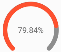
老规矩,先上效果图:
目录
-
绘制一个圆弧
-
为圆弧添加动画效果
-
添加背景圆弧
-
测量及自适应圆形进度条View的宽高
-
自定义attr属性
-
实现可跟随进度条进度变化的文字效果
-
实现进度条颜色渐变动画
1. 绘制一个圆弧
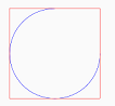
本着先写后优化的思想,怎么简单怎么来,像参数定义,自定义View大小适配什么的都先不去管,后面再慢慢填坑,我们就先简单画一个圆弧(为了更好地观察圆弧的绘制区域,我们会将绘制圆弧的矩形区域画出来)。
代码如下:
public class CircleBarView extends View { private Paint rPaint;//绘制矩形的画笔 private Paint progressPaint;//绘制圆弧的画笔 public CircleBarView(Context context, AttributeSet attrs) { super(context, attrs); init(context,attrs); } private void init(Context context,AttributeSet attrs){ rPaint = new Paint(); rPaint.setStyle(Paint.Style.STROKE);//只描边,不填充 rPaint.setColor(Color.RED); progressPaint = new Paint(); progressPaint.setStyle(Paint.Style.STROKE);//只描边,不填充 progressPaint.setColor(Color.BLUE); progressPaint.setAntiAlias(true);//设置抗锯齿 } @Override protected void onDraw(Canvas canvas) { super.onDraw(canvas); float x = 50; float y = 50; RectF rectF = new RectF(x,y,x+300,y+300);//建一个大小为300 * 300的正方形区域 canvas.drawArc(rectF,0,270,false,progressPaint);//这里角度0对应的是三点钟方向,顺时针方向递增 canvas.drawRect(rectF,rPaint); }}
界面布局:
<?xml version="1.0" encoding="utf-8"?><RelativeLayout xmlns:android="http://schemas.android.com/apk/res/android" xmlns:app="http://schemas.android.com/apk/res-auto" xmlns:tools="http://schemas.android.com/tools" android:layout_width="match_parent" android:layout_height="match_parent"> <LinearLayout android:layout_width="match_parent" android:layout_height="match_parent" android:orientation="vertical"> <com.anlia.progressbar.CircleBarView android:id="@+id/circle_view" android:layout_width="wrap_content" android:layout_height="wrap_content" /> </LinearLayout></RelativeLayout>
在Activity中进行注册:
circleBarView = (CircleBarView)findViewById(R.id.circle_view);
效果如图:
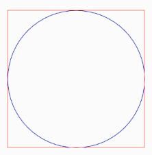
2. 为圆弧添加动画效果
我们需要给圆弧的绘制加上一个动画效果,这里主要用到Animation方面的知识,我们改下之前的CircleBarView代码:
private float sweepAngle;//圆弧经过的角度private void init(Context context,AttributeSet attrs){ //省略部分代码... anim = new CircleAnim();}@Overrideprotected void onDraw(Canvas canvas) { //省略部分代码... canvas.drawArc(rectF,0,sweepAngle,false,progressPaint);}public class CircleBarAnim extends Animation{ public CircleBarAnim(){ } @Override protected void applyTransformation(float interpolatedTime, Transformation t) { super.applyTransformation(interpolatedTime, t); sweepAngle = interpolatedTime * 360; postInvalidate(); }}//写个方法给外部调用,用来设置动画时间public void setProgressNum(int time) { anim.setDuration(time); this.startAnimation(anim);}
在Activity中调用setProgressNum()方法:
circleBarView.setProgressNum(3000);//设置动画时间为3000毫秒,即3秒
效果如图:
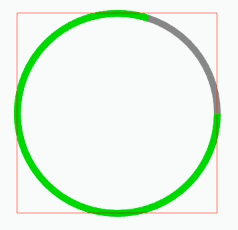
3. 添加背景圆弧
根据我们最终实现的效果图,我们还需要绘制一个完整的圆弧作为进度条圆弧的背景,同时我们需要修改一下之前的setProgressNum()方法,将当前进度条的值作为参数传进去,以便计算进度条绘制的角度。
继续改我们之前的CircleBarView代码:
private Paint bgPaint;//绘制背景圆弧的画笔private float progressNum;//可以更新的进度条数值private float maxNum;//进度条最大值private float progressSweepAngle;//进度条圆弧扫过的角度private float startAngle;//背景圆弧的起始角度private float sweepAngle;//背景圆弧扫过的角度private void init(Context context,AttributeSet attrs){ //省略部分代码... progressPaint = new Paint(); progressPaint.setStyle(Paint.Style.STROKE);//只描边,不填充 progressPaint.setColor(Color.GREEN); progressPaint.setAntiAlias(true);//设置抗锯齿 progressPaint.setStrokeWidth(15);//随便设置一个画笔宽度,看看效果就好,之后会通过attr自定义属性进行设置 bgPaint = new Paint(); bgPaint.setStyle(Paint.Style.STROKE);//只描边,不填充 bgPaint.setColor(Color.GRAY); bgPaint.setAntiAlias(true);//设置抗锯齿 bgPaint.setStrokeWidth(15); progressNum = 0; maxNum = 100;//也是随便设的 startAngle = 0; sweepAngle = 360;}@Overrideprotected void onDraw(Canvas canvas) { super.onDraw(canvas); //省略部分代码... canvas.drawArc(rectF,startAngle,sweepAngle,false,bgPaint); canvas.drawArc(rectF,startAngle,progressSweepAngle,false,progressPaint);}public class CircleBarAnim extends Animation{ public CircleBarAnim(){ } @Override protected void applyTransformation(float interpolatedTime, Transformation t) { super.applyTransformation(interpolatedTime, t); progressSweepAngle = interpolatedTime * sweepAngle * progressNum / maxNum;//这里计算进度条的比例 postInvalidate(); }}public void setProgressNum(float progressNum, int time) { //省略部分代码... this.progressNum = progressNum;}
在Activity中调用setProgressNum()方法:
circleBarView.setProgressNum(100,3000);
效果如图:
4. 测量及自适应View的宽高
在上面的代码中,View的宽高是由绘制圆弧的矩形区域大小决定的,直接写死在了init()方法中,而我们的实际需求是View的宽高可以由我们在外部进行设置,且无论怎么设置宽高View都应该是一个正方形(宽高相等),因此我们需要重写View的onMeasure()方法。
继续修改我们的CircleBarView代码:
private RectF mRectF;//绘制圆弧的矩形区域private float barWidth;//圆弧进度条宽度private int defaultSize;//自定义View默认的宽高private void init(Context context,AttributeSet attrs){ //省略部分代码... defaultSize = DpOrPxUtils.dip2px(context,100); barWidth = DpOrPxUtils.dip2px(context,10); mRectF = new RectF(); progressPaint.setStrokeWidth(barWidth); bgPaint.setStrokeWidth(barWidth);}@Overrideprotected void onMeasure(int widthMeasureSpec, int heightMeasureSpec) { super.onMeasure(widthMeasureSpec, heightMeasureSpec); int height = measureSize(defaultSize, heightMeasureSpec); int width = measureSize(defaultSize, widthMeasureSpec); int min = Math.min(width, height);// 获取View最短边的长度 setMeasuredDimension(min, min);// 强制改View为以最短边为长度的正方形 if(min >= barWidth*2){//这里简单限制了圆弧的最大宽度 mRectF.set(barWidth/2,barWidth/2,min-barWidth/2,min-barWidth/2); }}private int measureSize(int defaultSize,int measureSpec) { int result = defaultSize; int specMode = View.MeasureSpec.getMode(measureSpec); int specSize = View.MeasureSpec.getSize(measureSpec); if (specMode == View.MeasureSpec.EXACTLY) { result = specSize; } else if (specMode == View.MeasureSpec.AT_MOST) { result = Math.min(result, specSize); } return result;}
其中用到了dp和px相互转换的工具类(相关知识有兴趣的可以自己上网搜下),这里也将相关代码贴出来:
public class DpOrPxUtils { public static int dip2px(Context context, float dpValue) { final float scale = context.getResources().getDisplayMetrics().density; return (int) (dpValue * scale + 0.5f); } public static int px2dip(Context context, float pxValue) { final float scale = context.getResources().getDisplayMetrics().density; return (int) (pxValue / scale + 0.5f); }}
5. 自定义 attr 属性
我们的View中有许多属性需要在布局文件中进行设置,例如进度条颜色、宽度等等,这里我们选取最基本的五个属性(其余的可根据需要另行扩展):进度条圆弧颜色、背景圆弧颜色、起始角度、扫过的角度(可以理解为进度条的最大长度)、进度条宽度进行自定义。
首先在res\values文件夹中添加attr.xml,为CircleBarView自定义属性:
<?xml version="1.0" encoding="utf-8"?><resources> <!--注意这里的name要和自定义View的名称一致,不然在布局文件中无法引用--> <declare-styleable name="CircleBarView"> <attr name="progress_color" format="color"></attr> <attr name="bg_color" format="color"></attr> <attr name="bar_width" format="dimension"></attr> <attr name="start_angle" format="float"></attr> <attr name="sweep_angle" format="float"></attr> </declare-styleable></resources>
修改CircleBarView,为自定义属性赋值:
private int progressColor;//进度条圆弧颜色private int bgColor;//背景圆弧颜色private float startAngle;//背景圆弧的起始角度private float sweepAngle;//背景圆弧扫过的角度private float barWidth;//圆弧进度条宽度private void init(Context context,AttributeSet attrs){ //省略部分代码... TypedArray typedArray = context.obtainStyledAttributes(attrs,R.styleable.CircleBarView); progressColor = typedArray.getColor(R.styleable.CircleBarView_progress_color,Color.GREEN);//默认为绿色 bgColor = typedArray.getColor(R.styleable.CircleBarView_bg_color,Color.GRAY);//默认为灰色 startAngle = typedArray.getFloat(R.styleable.CircleBarView_start_angle,0);//默认为0 sweepAngle = typedArray.getFloat(R.styleable.CircleBarView_sweep_angle,360);//默认为360 barWidth = typedArray.getDimension(R.styleable.CircleBarView_bar_width,DpOrPxUtils.dip2px(context,10));//默认为10dp typedArray.recycle();//typedArray用完之后需要回收,防止内存泄漏 progressPaint.setColor(progressColor); progressPaint.setStrokeWidth(barWidth); bgPaint.setColor(bgColor); bgPaint.setStrokeWidth(barWidth);}@Overrideprotected void onDraw(Canvas canvas) { super.onDraw(canvas); canvas.drawArc(mRectF,startAngle,sweepAngle,false,bgPaint); canvas.drawArc(mRectF,startAngle,progressSweepAngle,false, progressPaint);}
在布局文件中设置自定义属性试试效果:
<!--省略部分代码--><RelativeLayout xmlns:app="http://schemas.android.com/apk/res-auto"> <LinearLayout android:layout_width="match_parent" android:layout_height="match_parent" android:orientation="vertical"> <com.anlia.progressbar.CircleBarView app:start_angle="135" app:sweep_angle="270" app:progress_color="@color/red" app:bg_color="@color/gray_light" app:bar_width="20dp"/> </LinearLayout></RelativeLayout>
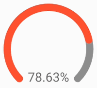
效果如图:

6. 实现跟随进度变化的文字效果
根据需求,我们需要显示可以跟随进度条进度变化的文字,网上许多实现的方法都是在自定义View中实现相应的文字处理逻辑,然后使用canvas.drawText()方法去绘制文字。我个人觉得这样写比较麻烦且可扩展性不高,下面提供另外一种思路供大家参考。
我的做法是将条形进度条和文字显示区分开来,文字显示的组件直接在布局文件用TextView就可以了,将TextView传入CircleBarView,然后在CircleBarView提供接口编写文字处理的逻辑即可。这样实现的好处在于后期我们要是想改变文字的字体、样式、位置等等都不需要再在CircleBarView中伤筋动骨地去改,实现了文字与进度条解耦。
具体实现如下,修改我们的CircleBarView:
private TextView textView;private OnAnimationListener onAnimationListener;public class CircleBarAnim extends Animation{ //省略部分代码... @Override protected void applyTransformation(float interpolatedTime, Transformation t) { super.applyTransformation(interpolatedTime, t); //省略部分代码... if(textView !=null){ textView.setText(onAnimationListener.howToChangeText(interpolatedTime,progressNum,maxNum)); } }}/** * 设置显示文字的TextView * @param textView */public void setTextView(TextView textView) { this.textView = textView;}public interface OnAnimationListener { /** * 如何处理要显示的文字内容 * @param interpolatedTime 从0渐变成1,到1时结束动画 * @param progressNum 进度条数值 * @param maxNum 进度条最大值 * @return */ String howToChangeText(float interpolatedTime, float progressNum, float maxNum);}
然后在Activity中调用接口:
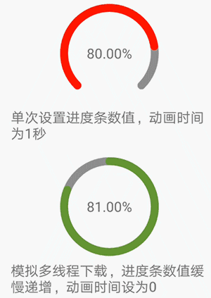
circleBarView.setOnAnimationListener(new CircleBarView.OnAnimationListener() { @Override public String howToChangeText(float interpolatedTime, float progressNum, float maxNum) { DecimalFormat decimalFormat=new DecimalFormat("0.00"); String s = decimalFormat.format(interpolatedTime * progressNum / maxNum * 100) + "%"; return s; }});circleBarView.setProgressNum(80,3000);
布局文件也相应修改:
<RelativeLayout android:layout_width="100dp" android:layout_height="100dp" android:layout_gravity="center_horizontal" android:layout_marginTop="10dp"> <com.anlia.progressbar.CircleBarView android:id="@+id/circle_view" android:layout_width="match_parent" android:layout_height="match_parent" android:layout_gravity="center_horizontal" app:start_angle="135" app:sweep_angle="270" app:progress_color="@color/red" app:bg_color="@color/gray_light" app:bar_width="8dp"/> <TextView android:id="@+id/text_progress" android:layout_width="wrap_content" android:layout_height="wrap_content" android:layout_centerVertical="true" android:layout_centerHorizontal="true"/></RelativeLayout>
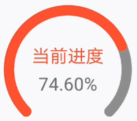
来看下效果:
其他文字效果也只需要改改布局文件就好:
这里只是简单地提供一点思路,如果大家有更复杂的需求在此基础上扩展接口即可。
7. 实现进度条颜色渐变动画
在上一点的基础上稍微做点延伸,实现进度条的颜色渐变动画,这里的颜色线性渐变算法由@ Aaron_cxx提供,大家如果对颜色渐变算法感兴趣的可以看下这位大大的博客。
下面继续改我们的CircleBarView,这里只要稍微扩展一下我们的OnAnimationListener接口即可:
public interface OnAnimationListener { //省略部分代码... /** * 如何处理进度条的颜色 * @param paint 进度条画笔 * @param interpolatedTime 从0渐变成1,到1时结束动画 * @param progressNum 进度条数值 * @param maxNum 进度条最大值 */ void howTiChangeProgressColor(Paint paint, float interpolatedTime, float progressNum, float maxNum);}//记得在我们的动画中调用howTiChangeProgressColorpublic class CircleBarAnim extends Animation{ //省略部分代码... @Override protected void applyTransformation(float interpolatedTime, Transformation t) { super.applyTransformation(interpolatedTime, t); //省略部分代码... onAnimationListener.howTiChangeProgressColor(progressPaint,interpolatedTime,progressNum,maxNum); }}
同样的,在Activity中编写相应的逻辑:
circleBarView.setOnAnimationListener(new CircleBarView.OnAnimationListener() { //省略部分代码... @Override public void howTiChangeProgressColor(Paint paint, float interpolatedTime, float progressNum, float maxNum) { LinearGradientUtil linearGradientUtil = new LinearGradientUtil(Color.YELLOW,Color.RED); paint.setColor(linearGradientUtil.getColor(interpolatedTime)); }});
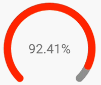
效果如图:
至此本篇从零开始实现的教程就告一段落了,如果大家看了感觉还不错麻烦点个喜欢,你们的支持是我最大的动力~要是小伙伴们想要扩展一些新的功能,也可以在评论区给我留言,我有空会把新功能的实现教程更新上去。
END

我的好友 Tamic 在 GitChat 上,做了一个主题为“普通程序员,如何两年做到月薪 20k+”的分享。我在这里推荐给大家,也希望能够对一些正在追求编程路上的程序员有一定的帮助。
关于 Tamic:
我奎哥,参与过千万级日活百度浏览器 App 的开发,参与过平安某知名 App 的架构,有知名技术公司和知名金融公司的经历!长期在 CSDN 和简书分享技术原创,职业思维原创等,让许多程序员得到知识成长!
感兴趣的识别邀请卡中二维码参与 Chat :

1. 关注并后台回复 Kotlin ,送优质学习资源
2. 精彩推荐:
自定义可平移、旋转、缩放的 ImageView,你也可以做到 图解 Android Studio 技巧 | 玩转 TODO 及自定义 TODO 还在为不写技术博客找理由?写好一篇博客,只需四步
感谢点赞或转发分享
扫码关注,及时获取推送

有帮助?点击右上角 
分享给好友,或转发到朋友圈

点击“阅读原文”,查看更多内容
