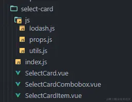
lodash.js

import cloneDeep from 'lodash/cloneDeep'
import debounce from 'lodash/debounce'
import xor from 'lodash/xor'

export default {
  cloneDeep,
  debounce,
  xor,
}
props.js
export default {
value: {
type: [String, Number, Array],
},
disabled: {
type: Boolean,
default: false,
},
options: {
required: true,
type: Array,
},
field: {
type: Object,
default: {
label: "label",
value: "value",
},
},
allowClear: {
type: Boolean,
default: false,
},
showArrows: {
type: Boolean,
default: true,
},
overlayPlacement: {
type: String,
default: "bottomLeft",
validate: function (value) {
return ["bottomLeft", "bottomRight", "topLeft", "topRight"].includes(
value
);
},
},
mode: {
type: String,
default: "default",
validate: function (value) {
return ["default", "multiple"].includes(value);
},
},
rows: {
type: Number,
default: 4,
validate: function (value) {
return value >= 1 && value <= 5;
},
},
placeholder: {
type: String,
default: "请选择",
},
dropdownWidth: {
type: Number,
default: 400,
},
dropdownMaxHeight: {
type: Number,
default: 200,
},
getPopupContainer: {
type: Function,
default: void 0,
},
size: {
type: String,
default: "default",
validate: function (value) {
return ["large", "default", "small"].includes(value);
},
},
footerSize: {
type: String,
default: void 0,
validate: function (value) {
return value === void 0 || ["large", "default", "small"].includes(value);
},
},
autoClose: {
type: Boolean,
default: true,
},
required: {
type: [Boolean, Number],
default: false,
validate: function (value) {
return typeof value === "boolean" || value >= 1;
},
},
ignoreInitChange: {
type: Boolean,
default: false,
}
};
utils.js

export function getTextWidth(text) {
  let span = document.createElement("span");
  let result = {};
  result.width = span.offsetWidth;
  result.height = span.offsetHeight;
  span.style.visibility = "hidden";
  span.style.fontSize = "12px";
  span.style.fontFamily = "思源黑体";
  span.style.display = "inline-block";
  span.style.whiteSpace = "nowrap";
  document.body.appendChild(span);
  let reg = new RegExp(" ", "g");
  text = text.replace(reg, "a");
  if (typeof span.textContent != "undefined") {
    span.textContent = text;
  } else {
    span.innerText = text;
  }
  let width = parseFloat(window.getComputedStyle(span).width) - result.width;
  span.remove();
  return width;
}

export function splitOptionsByRows(options, rows) {
  return Object.freeze(
    options.reduce(function(res, item, index) {
      let i = parseInt(index / rows);
      if (res[i] == null) {
        res[i] = [];
      }
      res[i].push(item);
      return res;
    }, [])
  );
}

export function isContain(root, n) {
  let node = n;
  while (node) {
    if (node === root) {
      return true;
    }
    node = node.parentNode;
  }
  return false;
}

export function formatEmpty(value, emptyText = "-") {
  if (value === null || value === "") {
    return emptyText;
  }
  return value;
}
index.js

import SelectCard from './SelectCard.vue'

export default SelectCard
SelectCard.vue
<template>
<div
class="select-card"
ref="container"
>
<p-dropdown
ref="dropdown"
:disabled="disabled"
:visible="open"
:get-popup-container="setPopupContainer"
:placement="overlayPlacement"
overlayClassName="select-card-dropdown"
>
<combobox
ref="combobox"
:disabled="disabled"
:value="cache"
:open="open"
:is-multiple="isMultiple"
:show-clear="allowClearState && cache[0] !== void 0"
:show-arrows="showArrows"
:placeholder="placeholder"
:size="size"
@clear="clear"
@click="comboboxClick"
/>
<div
:class="['select-card-overlay', { empty: isEmpty }]"
slot="overlay"
ref="overlay"
:tabindex="-1"
@focusout="focusout"
>
<p-spin :spinning="loading">
<recycle-scroller
class="select-card-overlay-content"
:key="contentKey"
ref="scroller"
:style="scrollStyle"
:items="curOptions"
:item-size="lineSize"
key-field="0"
v-slot="{ item }"
>
<div class="select-card-overlay-content-line">
<select-item
v-for="j in Array.from(Array(rows), (v, k) => k)"
:key="j"
:mode="mode"
:empty="isEmptyItem(item[j])"
:title="getAttr(item[j], 'label')"
:value="getAttr(item[j])"
:data="item[j]"
:dataIndex="j"
:checked="cache.includes(getAttr(item[j]))"
:container="$refs.scroller.$el"
@change="(checked) => setChecked(getAttr(item[j]), checked)"
/>
</div>
</recycle-scroller>
<p-divider style="margin: 4px 0 0" />
<div
class="select-card-overlay-footer"
ref="footer"
>
<p-input
ref="search"
class="footer-input"
:size="footerSize || size"
v-model.lazy="search"
@input="searchChange"
/>
<p-button-link
class="footer-btn"
:size="footerSize || size"
:disabled="!isMultiple"
@click="chooseAll"
>
全选
</p-button-link>
<p-button-link
class="footer-btn"
:size="footerSize || size"
:disabled="!isMultiple"
@click="chooseReverse"
>
反选
</p-button-link>
<p-button-link
class="footer-btn"
:size="footerSize || size"
@click="closeDropdown"
>
确定
</p-button-link>
</div>
<div
class="empty"
v-if="isEmpty"
>
<p-empty :image="simpleImage" />
</div>
</p-spin>
</div>
</p-dropdown>
</div>
</template>
<script>
import { RecycleScroller } from "vue-virtual-scroller";
import _ from "./js/lodash";
import Props from "./js/props";
import { splitOptionsByRows, isContain, formatEmpty } from "./js/utils";
import Combobox from "./SelectCardCombobox.vue";
import SelectItem from "./SelectCardItem.vue";
import Empty from "poros/ui/lib/empty";
export default {
inheritAttrs: false,
name: "SelectCard",
props: Props,
watch: {
value: {
deep: true,
immediate: true,
handler: function () {
this.checkType().then(() => {
let cache = this.isMultiple
? this.value
: this.value === void 0
? []
: [this.value];
if (JSON.stringify(cache) !== JSON.stringify(this.cache)) {
if (this.ignoreInitChange && this.allowEmit) {
this.allowEmit = false;
}
this.cache = cache;
}
});
},
},
options: {
deep: true,
immediate: true,
handler: function () {
if (this.options) {
this.loadOptions(this.options);
}
},
},
rows () {
this.getLinesData(this.originOptions);
},
open (value) {
if (value) {
this.contentKey++;
this.$refs.dropdown.$nextTick(() => {
this.scrollToView();
});
} else {
if (this.search !== "") {
setTimeout(() => {
this.curOptions = _.cloneDeep(this.curOptionsSnap);
this.contentKey++;
}, 300);
}
this.search = "";
this.$emit("close", this.isMultiple ? [...this.cache] : this.cache[0]);
}
},
cache: {
deep: true,
handler: function () {
this.emitChange();
},
},
},
computed: {
isEmpty () {
return this.curOptions.length === 0;
},
isMultiple () {
return this.mode === "multiple";
},
isFilter () {
return typeof this.$listeners.search === "function";
},
lineSize () {
return this.size === "large" ? 40 : this.size === "small" ? 24 : 32;
},
footerHeight () {
return this.size === "large" ? 48 : this.size === "small" ? 32 : 40;
},
scrollStyle () {
return `width: 100%;min-width: ${this.isEmpty ? 0 : this.dropdownWidth
}px;height:${this.curOptions.length * this.lineSize >
this.dropdownMaxHeight - this.footerHeight - 4
? this.dropdownMaxHeight - this.footerHeight - 4
: this.curOptions.length * this.lineSize + 4
}px;`;
},
requiredNumber () {
return Number(this.required);
},
requiredMin () {
if (this.mode === "default" && this.requiredNumber > 1) {
return 1;
}
return this.requiredNumber;
},
allowClearState () {
if (this.requiredNumber > 0) {
return false;
}
return this.allowClear;
},
},
components: {
RecycleScroller,
Combobox,
SelectItem,
},
provide () {
return {
getOptionLabel: this.getOptionLabel,
getAttr: this.getAttr,
};
},
data () {
return {
allowEmit: true,
cache: [],
curOptions: [],
open: false,
loading: false,
contentKey: 0,
};
},
beforeCreate () {
this.simpleImage = Empty.PRESENTED_IMAGE_SIMPLE;
},
created () {
this.options && this.loadOptions(this.options);
},
mounted () { },
methods: {
isEmptyItem (value) {
return value === void 0;
},
setPopupContainer (trigger) {
let container;
if (typeof this.getPopupContainer === "function") {
container = this.getPopupContainer(trigger);
}
return container || this.$refs.container;
},
closeDropdown () {
this.open = false;
},
delayCloseDropdown () {
this.delaySetOpenState(false);
},
focusout (e) {
if (!this.open) return;
const { $refs: { overlay } = {} } = this;
const { currentTarget, relatedTarget } = e;
if (
currentTarget === overlay &&
(!relatedTarget || !isContain(overlay, relatedTarget))
) {
this.delaySetOpenState(false);
}
},
comboboxClick (e) {
e.preventDefault();
if (this.disabled) {
return;
}
if (this.open) {
this.delaySetOpenState(false);
} else {
this.open = true;
this.$nextTick(() => {
this.$refs.search &&
this.$refs.search.$nextTick(this.$refs.search.focus);
});
}
},
delaySetOpenState (state) {
if (this.delayTimer) {
clearTimeout(this.delayTimer);
}
this.delayTimer = setTimeout(() => {
this.open = state;
}, 200);
},
getOptionLabel (target, byValue) {
if (target === void 0) {
return void 0;
}
const { getAttr, originOptions } = this;
if (byValue) {
if (this.originOptions === void 0) {
return target;
}
target = originOptions.find((o) => getAttr(o) == target);
}
return getAttr(target, "label");
},
getAttr (item, attr = "value") {
let rightAttr = ["value", "label"].includes(attr);
return item !== void 0
? rightAttr
? typeof item === "object" && item !== null
? attr === "label"
? formatEmpty(item[this.field[attr]])
: item[this.field[attr]]
: attr === "label"
? formatEmpty(item)
: item
: void 0
: void 0;
},
clear () {
this.cache = [];
},
checkType () {
if (this.value !== void 0) {
let type = typeof this.value;
if (
(!this.isMultiple &&
!(["string", "number"].includes(type) || this.value === null)) ||
(this.isMultiple && !Array.isArray(this.value))
) {
throw new Error(
`type of value cannot be ${type}, it should be ${!this.isMultiple ? "string or number" : "array"
}`
);
}
}
return Promise.resolve();
},
loadOptions (options) {
this.originOptions = Object.freeze(options);
this.search = "";
this.curOptions = splitOptionsByRows(this.originOptions, this.rows);
this.curOptionsSnap = _.cloneDeep(this.curOptions);
this.contentKey++;
this.$refs.combobox && this.$refs.combobox.update();
},
setChecked (value, checked) {
const { isMultiple } = this;
if (isMultiple) {
if (checked) {
this.cache.push(value);
} else {
if (this.cache.length <= this.requiredMin) {
return;
}
let index = this.cache.indexOf(value);
this.cache.splice(index, 1);
}
} else {
if (checked) {
this.cache.splice(0, 1, value);
} else {
if (this.cache.length <= this.requiredMin) {
return;
}
this.cache = [];
}
}
},
emitChange () {
const { isMultiple, cache, autoClose } = this;
let requireClose = false,
value = isMultiple ? [...cache] : cache[0];
if (!isMultiple && cache.length >= 1 && autoClose) {
requireClose = true;
}
if (this.allowEmit) {
this.allowEmit && this.$emit("input", value);
this.allowEmit && this.$emit("change", value);
} else {
this.allowEmit = true;
}
if (requireClose) {
this.$nextTick(this.delayCloseDropdown);
}
},
searchChange: _.debounce(function () {
this.loading = true;
setTimeout(() => {
let options = this.originOptions.filter(
(o) =>
this.getAttr(o, "label")
.toString()
.toLowerCase()
.indexOf(this.search.toLowerCase()) > -1
);
this.curOptions = splitOptionsByRows(options, this.rows);
this.scrollToItem(0);
this.contentKey++;
this.loading = false;
}, 20);
}, 300),
getCurValues () {
return this.curOptions.flat().map((option) => this.getAttr(option));
},
chooseAll () {
const { cache, getCurValues } = this;
let values = getCurValues();
this.cache = Array.from(new Set([...cache, ...values]));
},
chooseReverse () {
const { cache, getCurValues } = this;
let values = getCurValues();
let reverseValues = _.xor(cache, values);
let reversLength = reverseValues.length;
if (this.required && reversLength <= this.requiredMin) {
reverseValues.push(
...this.originOptions
.filter((item) => !reverseValues.includes(this.getAttr(item)))
.slice(0, this.requiredMin - reversLength)
.map((item) => this.getAttr(item))
);
this.$message.info(
`数据要求必填,要求必选${this.requiredMin}个,将默认选择前${this
.requiredMin - reversLength}个`
);
}
this.cache = reverseValues;
},
scrollToView () {
let index = this.curOptions.findIndex(
(arr) =>
arr.findIndex((item) => this.getAttr(item) === this.cache[0]) > -1
);
setTimeout(() => {
this.scrollToItem(index);
}, 20);
},
scrollToItem (index) {
this.$refs.scroller && this.$refs.scroller.scrollToItem(index);
},
},
};
</script>
<style lang="less" scoped>
.select-card {
position: relative;
&-overlay {
border: 1px solid #e8e8e8;
background: #ffffff;
position: relative;
&.empty {
height: 136px;
}
&-content {
padding: 4px 10px 0;
overflow: hidden auto;
&-line {
display: flex;
}
}
&-footer {
padding: 4px 10px;
display: flex;
.footer-input {
flex: 1;
max-width: 180px;
}
.footer-btn {
margin-left: 10px;
}
}
.empty {
position: absolute;
top: 0;
z-index: 1;
background-color: #ffffff;
height: 134px;
width: 100%;
}
}
}
</style>
<style lang="less">
.select-card-dropdown {
// box-shadow: 0px 2px 6px 0px #ccc;
box-shadow: 0 2px 8px rgba(0, 0, 0, 0.15);
}
</style>
SelectCardCombobox.vue

<template>
  <div
    :class="[
      'select-card-combobox',
      { 'combobox--open': open, 'combobox--disabled': disabled },
      'combobox--' + size,
    ]"
    :style="comboboxStyle"
    @click="comboboxClick"
  >
    <template v-if="!showPlaceholder">
      <div class="select-selection" :style="selectionStyle">
        {{ text }}
      </div>
      <div
        :class="['select-selection-count', 'select--' + size]"
        v-if="showCountNumber"
      >
        {{ "+ " + (value.length - 1) + " ..." }}
      </div>
    </template>
    <div class="clear-icon icon" v-if="showClear" @click="clearAll">
      <p-icon type="close-circle" theme="filled" />
    </div>
    <div class="arrow-icon icon" v-if="showArrows">
      <p-icon type="down" />
    </div>
    <div
      v-show="showPlaceholder"
      class="select-placeholder"
      style="user-select: none"
    >
      {{ placeholder }}
    </div>
  </div>
</template>

<script>
import { getTextWidth } from "./js/utils";
export default {
  inheritAttrs: false,
  name: "SelectCardCombobox",
  props: {
    value: Array,
    open: Boolean,
    isMultiple: Boolean,
    showArrows: Boolean,
    showClear: Boolean,
    placeholder: String,
    size: String,
    disabled: Boolean,
  },
  inject: ["getOptionLabel"],
  watch: {
    value: {
      deep: true,
      immediate: true,
      handler: function () {
        this.update();
      },
    },
  },
  computed: {
    selection() {
      return this.value[0] || void 0;
    },
    showPlaceholder() {
      return this.value.length > 0 ? false : true;
    },
    showCountNumber() {
      return this.value.length > 1 ? true : false;
    },
    countNumberWidth() {
      return this.value.length > 1
        ? getTextWidth("+ " + (this.value.length - 1) + " ...")
        : 0;
    },
    selectionStyle() {
      return `max-width: calc(100% - ${
        this.countNumberWidth ? this.countNumberWidth + 22 : 0
      }px);`;
    },
    comboboxStyle() {
      return this.showArrows || this.showClear ? "padding-right: 24px;" : "";
    },
  },
  data() {
    return {
      text: "",
    };
  },
  created() {},
  mounted() {
    this.update();
  },
  methods: {
    clearAll(e) {
      e.stopPropagation();
      e.preventDefault();
      this.$emit("clear");
    },
    update() {
      this.text =
        this.selection != null ? this.getOptionLabel(this.selection, true) : "";
    },
    comboboxClick(e) {
      this.$emit("click", e);
    },
  },
};
</script>

<style lang="less" scoped>
.select-card-combobox {
  cursor: pointer;
  border: 1px solid #d9d9d9;
  border-radius: 4px;
  height: 30px;
  display: flex;
  position: relative;

  padding: 4px 11px;
  height: 30px;
  line-height: 1.8;
  transition: border 0.3s;
  &.combobox--large {
    height: 40px;
    padding: 8px 11px;
    font-size: 14px;
  }
  &.combobox--small {
    height: 24px;
    padding: 3px 7px;
    line-height: 1.5;
  }
  &.combobox--open {
    border-color: @primary-color;
    .arrow-icon {
      ::v-deep svg {
        transform: rotate(180deg);
      }
    }
  }
  .select-selection {
    text-overflow: ellipsis;
    white-space: nowrap;
    overflow: hidden;
  }
  .select-selection-count {
    margin-left: 6px;
    background-color: #fafafa;
    border-radius: 2px;
    // padding: 0 4px 5px;
    padding: 0 10px;
    line-height: 20px;
    user-select: none;
    border: 1px solid #e8e8e8;
    line-height: 1.5;
    padding: 0 8px;
    &.select--small {
      line-height: 1.2;
      padding: 0 4px;
    }
    &.select-large {
    }
  }
  .icon {
    position: absolute;
    top: 50%;
    right: 11px;
    z-index: 1;
    display: inline-block;
    width: 12px;
    height: 12px;
    margin-top: -9px;
    color: rgba(0, 0, 0, 0.25);
    background-color: #fff;
    &.clear-icon {
      z-index: 2;
      opacity: 0;
      transition: opacity 0.3s;
      &:hover {
        color: rgba(0, 0, 0, 0.45);
      }
    }
    &.arrow-icon {
      transform-origin: 50% 50%;
      ::v-deep svg {
        transition: transform 0.3s;
      }
    }
  }
  &:hover .clear-icon {
    opacity: 1;
  }
  // &.open{
  //   border-color: #3c64e8;
  //   box-shadow: 0 0 0 2px rgba(23, 64, 220, .2);
  // }
  .select-placeholder {
    flex: 1;
    overflow: hidden;
    color: #bfbfbf;
    white-space: nowrap;
    text-overflow: ellipsis;
    pointer-events: none;
    position: absolute;
    top: 50%;
    right: 11px;
    left: 11px;
    transform: translateY(-50%);
    transition: all 0.3s;
    text-align: left;
  }

  &.combobox--disabled {
    cursor: not-allowed;
    background-color: #f5f5f5;
    .select-selection {
      color: rgba(0, 0, 0, 0.25);
    }
    .icon {
      background-color: #f5f5f5;
    }
  }
}
</style>
SelectCardItem.vue

<template>
  <div
    :class="['select-card-overlay-content-item', { 'item--checked': checked }]"
    @click="itemClick"
  >
    <template v-if="!empty">
      <span class="item-checkbox">
        <p-icon class="item-checkbox-icon" type="check" v-if="checked" />
      </span>
      <div class="item-label">
        <m-overflow-tooltip placement="top" :title="title" />
      </div>
    </template>
  </div>
</template>

<script>
export default {
  inheritAttrs: false,
  name: "SelectCardItem",
  props: {
    mode: String,
    checked: Boolean,
    value: [String, Number],
    title: [String, Number],
    empty: Boolean,
    container: Object,
    data: [String, Number, Object, Boolean],
    dataIndex: Number,
  },
  computed: {
    isMultiple() {
      return this.mode === "multiple";
    },
  },
  created() {},
  mounted() {},
  methods: {
    itemClick(e) {
      e.preventDefault();
      e.stopPropagation();
      !this.empty && this.$emit("change", !this.checked);
    },
  },
};
</script>

<style lang="less" scoped>
.select-card-overlay-content-item {
  flex: 1;
  width: 0;
  display: flex;
  line-height: 32px;
  cursor: pointer;
  &.item--checked {
    color: @primary-color;
  }
  &:hover .item-label {
    color: #3c64e8;
  }
  .item-checkbox {
    width: 8px;
    margin-right: 8px;
    &-icon {
      //transition: all 0.3s;
      transition: all 0.2s cubic-bezier(0.12, 0.4, 0.29, 1.46) 0.1s;
    }
  }
  .item-label {
    height: 30px;
    max-width: calc(100% - 24px);
    position: relative;
  }
}
</style>


