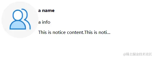
- Flex左右布局
- 左侧,图片固定尺寸
- 右侧,文本内容超出,显示省略号
<!DOCTYPE html>
<head>
<meta charset="UTF-8">
<title>Document</title>
</head>
<body>
<div class="main">
<img class="left" src="https://p3-passport.byteimg.com/img/user-avatar/8dad9c284ff6d5e355a53b8d1fed7301~180x180.awebp" alt=""></img>
<div class="content">
<h4 class="name">a name</h4>
<p class="info">a info</p>
<p class="notice">This is notice content.This is notice content.This is notice content.This is notice content.This is notice content.This is notice content.This is notice content.This is notice content.This is notice content.</p>
</div>
</div>
<style>
.main {
display: flex;
width: 300px
}
.left {
flex: 0 0 100px;
height: 100px;
}
.content {
flex: 1;
width: 0px;
height: 100px;
}
.content > * {
white-space: nowrap;
overflow: hidden;
text-overflow: ellipsis;
}
</style>
</body>
</html>


