@全局
四种样式引入
<style>
    p {
        width: 200px;
        height: 200px;
        background-color: red;
    }
</style>

<link rel="stylesheet" type="text/css" href="../css/demo1.css" />

<style>
    @import url(../css/demo1.css);
</style>

行内样式略
颜色表示
color: hsl(0,100%,50%)
background-color:linear-gradient(red,green,blue)
样式继承
层叠次序
- z-index:number; 默认为0,可以写负值
滚动条
overflow-y: auto;
@选择器
常用伪类
<!-- a:link      超链接访问前样式-->
<!-- a:visited   超链接访问后样式-->
<!-- a:hover     鼠标悬停样式(常用)-->
<!-- a:active    鼠标按下样式-->
<!-- input:focus 元素获取焦点执行样式-->
选择器名字
.nav1>li {
float: left;
}
div:hover~div {
display: inline-block;
}
选择器权重
- 类型选择器 0001
- class选择器 0010
- id选择器 0100
- 行内样式权重 1000
- 权重最大 !important
- 后代/包含选择器 所有选择器之和
- 群组选择器权重为自身
鼠标滑过父元素
.nav1 li:hover .a1 {
background-color: #333;
color: #fff;
}
.nav1 li:hover ul {
display: block;
}
.nav1 ul li:hover a {
background-color: cornflowerblue;
color: #fff;
}
ul li:hover a:nth-child(odd) {
display: block;
background-color: red;
color: #fff;
}
ul li:hover a:nth-child(even) {
display: none;
}
href目标伪类
p {
display: none;
}
p:target {
display: block;
}
body:target p {
display: block;
}
<body id="body1">
<a href="#p1">新闻1</a>
<a href="#p2">新闻2</a>
<a href="#body1">全部新闻</a>
<p id="p1">...</p>
<p id="p2">...</p>
</body>
鼠标选中段落
<!-- ::selection 元素内容被选中时添加样式(火狐需要加前缀-moz-) -->
p::selection {
color: red;
background-color: green;
font-weight: 900;
font-size: 14px;
}
表单元素
<!-- 1. :enabled 可用的表单元素添加样式 -->
<!-- 2. :disabled 不可用的表单元素添加样式(disabled ) -->
<!-- 3. :checked 被选中的表单元素添加样式 -->
input:enabled {
background-color: red;
}
input:disabled {
background-color: green;
}
input:checked+span {
color: red;
}
按序号选取
p:first-child {
background-image: url(../images/gyy.jpg);
}
p:last-child {
background-image: url(../images/wj.jpeg);
}
p:nth-child(5) {
background-color: #555;
color: #fff;
}
p:nth-child(odd) {
font-weight: 900;
}
p:nth-child(even) {
font-weight: 100;
}
p:nth-child(2n) {
font-weight: 100;
}
p:nth-child(2n-1) {
font-weight: 900;
}
p:nth-child(-n+3) {
font-style: italic;
}
p:nth-child(-n+6):nth-child(n+4) {
background-image: url(../images/sc.png);
}
p:first-of-type {
background-color: red;
}
p:last-of-type {
background-color: green;
}
p:nth-last-of-type(2) {
background-color: yellow;
}
p:empty {
display: none;
}
属性选择器
a[href] {
color: red;
}
a[class="a1"] {
background-color: green;
}
a[class*="a"] {
font-weight: 900;
}
a[href^="h"] {
font-style: italic;
}
a[href$="m"] {
font-size: 30px;
}
伪元素
div::before {
content: "前";
width: 100px;
height: 100px;
background-color: red;
display: block;
}
div::after {
content: "后";
width: 100px;
height: 100px;
background-color: green;
display: block;
}
div::first-letter {
color: #fff;
font-size: 30px;
}
div::first-line {
font-weight: 900;
}
@字体
定义字体
@font-face {
    font-family: "阴体";
    src: url(../images/ct.TTF);
}
字词间距
.p1:hover {
letter-spacing: 10px;
}
.p2:hover {
word-spacing: 30px;
}
font: 20px/350px "";
vertical-align: middle;
综合设置
font: 12px/30px "";
font: 100 14px/40px "";
@特效
盒子阴影
box-shadow: 0 1px 1px #888;
box-shadow: inset 0 1px 1px rgb(0 0 0 / 8%);
box-shadow: inset 0 1px 1px rgb(0 0 0 / 8%), 0 0 20px rgb(255 0 0 / 60%);
文字阴影
text-shadow: 3px 3px 3px #333, 6px 6px 3px #999;
多个过渡动画
transition: border-color ease-in-out .15s, box-shadow ease-in-out .15s;
@图片
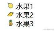
图片项目符号
.nav2 li:nth-child(1) {
    list-style-image: url(../images/榴莲.png);
}

.nav2 li:nth-child(2) {
    list-style-image: url(../images/水果.png);
}

.nav2 li:nth-child(3) {
    list-style-image: url(../images/菠萝.png);
}
<ul class="nav2">
<li>水果1</li>
<li>水果2</li>
<li>水果3</li>
</ul>
背景图
background-size: 100px 200px;
background-size: 100% 100%;
background-size: cover;
background-size: contain;
background-image: url(../images/gyy.png);
background-color: pink;
background-repeat: no-repeat;
background-position: center center;
background: url(../images/phone.png) no-repeat center 100px fixed;
background: linear-gradient(pink, purple);
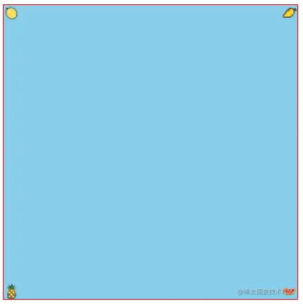
background:
url(../images/榴莲.png),
url(../images/水果.png) right top,
url(../images/菠萝.png) left bottom,
url(../images/西瓜.png) right bottom
skyblue;
雪碧图
div {
    width: 20px;
    height: 12px;
    border: 1px solid #666;
    background: url(../images/wangyi.png) no-repeat;
    background-position: -180px -483px;
}

div:hover {
    background-position-x: -94px;
}
@盒模型
垂直margin塌陷
- 首个子盒子的margin-top会坑爹使之margin-top塌陷
- 解法:父盒子加overflow-hidden
- PS:没有为什么,记下来就完了
.parent {
width: 300px;
height: 200px;
background-color: red;
overflow: hidden;
}
.son {
width: 100px;
height: 100px;
background-color: green;
margin-top: 100px;
}
垂直margin合并
- 问题:两个相邻元素上下的margin值 不会叠加 按照较大值设置
- 解决:给其中一个标签外层嵌套元素,并添加overflow:hidden;
<article style="overflow: hidden;">
    <div>box1</div>
</article>

<div>box2</div>
@列表套路
@表单套路
@兼容性
兼容前缀
- -webkit- 谷歌浏览器前缀
- -o- 欧朋浏览器前缀
- -ms- ie浏览器前缀
- -moz- 火狐浏览器前缀
@面试题
CSS画三角形
div {
width: 0;
height: 0;
border-width: 100px;
border-style: solid;
border-color: transparent;
border-top-color: #333;
}
水平垂直居中
- 子绝父相 + 四边为0 + margin-auto
.box1 {
    position: relative;
}

.box1 img {
    position: absolute;
    top: 0;
    left: 0;
    right: 0;
    bottom: 0;
    margin: auto;
}
.box2 {
    position: relative;
}

.box2 img {
    width: 100px;
    height: 100px;
    position: absolute;
    left: 50%;
    top: 50%;
    margin-top: -50px;
    margin-left: -50px;
}
.box3 {
position: relative;
}
.box3 img {
position: absolute;
left: 50%;
top: 50%;
transform: translate(-50%, -50%);
}
.box4 {
display: flex;
justify-content: center;
align-items: center;
}


