

简介
在我作为一个前端开发者的日常生活中,我通常把CSS当作一个2D层的集合。除了使用z-index对它们重新排序外,我并不经常在三维空间中移动东西。
然而,多年来,浏览器已经捆绑了一个能力惊人的3D CSS引擎!有人甚至建立了一个实验性的第一人称模型。有人甚至用它制作了一个实验性的第一人称射击游戏原型😮。
今天,我想利用这个3D引擎来执行一个巧妙的技巧:折叠图片。
这就是我们要做的事情。看看Francois Hoang的这张美丽的霓虹灯照片是如何通过3D折叠动画展现的。
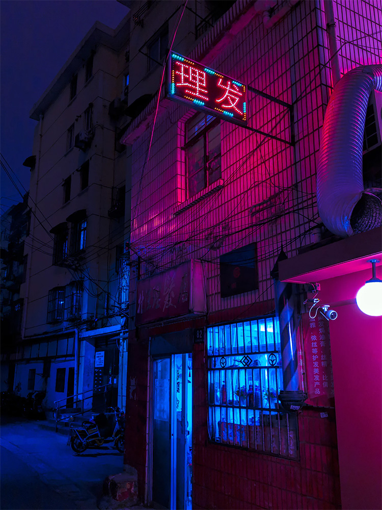
这是一个互动的演示!尝试拖动右边的滑块。
这种效果可以在很多情况下发挥作用。
-
作为图片的预加载器。它们一旦准备好就会展开,而折叠后的副本可以使用一个更低分辨率的base64编码版本
-
作为点击查看图片时的加载动画,为一个普通的功能增加奇异的魅力。
-
用于JS游戏开发
本教程是针对React的,但这些概念可以很容易地移植到vanilla JS/CSS,以及其他前端框架。
诀窍
不幸的是,DOM没有这方面的基元;你实际上无法将一个DOM节点折叠成两半。
相反,我们需要偷偷摸摸;我们将使用两张图片,并对它们进行设置,使其看起来像一张图片。
每张图片都被设置为占据实际高度的50%,然后底部图片的background-position ,并向上移动。
background-position: '0 0%'
很有说服力,对吗?通过将同一张图片并列两次,并调整背景图片的偏移量,我们就能给人一种单一图片的印象。
为了将底部图片折叠起来,我们需要利用一些CSS属性。
转型
变换是我们获得各种效果的途径。通过变换,我们可以移动东西,把它放大或缩小,倾斜或旋转它。
在我们的例子中,我们想使用旋转,沿着X轴。
透视
在默认情况下,变换看起来仍然非常 "2d"。上面的旋转看起来不是很正确,因为离观察者较近的物体应该看起来更大。
解决这个问题的方法是给父容器应用一个 "透视 "属性。这个值的单位是px,代表了观察者与被转换的物品之间的距离。数字越小,变换效果越强烈。
变革的起源
默认情况下,旋转会假定你想让项目围绕其中心点旋转。transform-origin 属性允许我们改变旋转的支点(以及所有其他变换的支点!)。
试着把它从默认的 "中心 "值改为 "顶部 "或 "底部"。
我们的MVP
有了所有这些部件,我们可以为这个效果实现一个 "最小可行产品"。下面是我们把它们结合起来后得到的东西。
const Foldable = ({ width, height, src }) => {
  const [    foldAngle,    setFoldAngle,  ] = React.useState(0);

  // Both our top half and bottom half share
  // a few common styles
  const sharedStyles = {
    width,
    height: height / 2,
    backgroundSize: `${width}px ${height}px`,
    backgroundImage: `url(${src})`,
  };

  return (
    <div style={{ perspective: 500 }}>
      {/* Top half */}
      <div style={sharedStyles}/>

      {/* Bottom half */}
      <div
        style={{
          ...sharedStyles,
          // Shift our background up to
          // make it contiguous with the
          // top half:
          backgroundPosition: `0px -100%`,

          // Apply the folding rotation:
          transform: `rotateX(${foldAngle}deg)`,
          transformOrigin: 'center top',

          // This optional prop can improve
          // performance, by letting the
          // browser optimize it:
          willChange: 'transform',
        }}
      />

      {/* Slider control */}
      <br />
      <label htmlFor="slider">Fold ratio:</label>
      <input
        id="slider"
        type="range"
        min={0}
        max={180}
        value={foldAngle}
        onChange={ev =>
          setFoldAngle(ev.target.value)
        }
        style={{ width }}
      />
    </div>
  );
};

render(
  <Foldable
    width={200}
    height={300}
    src={src}
  />
);
有了一点点CSS和React状态的洒脱,我们就有了我们想要的基本效果
可访问性
这个解决方案有一个微妙的问题:对于使用屏幕阅读器的用户来说,图片应该有alt 标签。没有办法为带有背景图片的<div> ,指定一个alt 标签。通过使用background-image ,我们使这个图像对辅助技术来说不可见。
令人高兴的是,有一个简单的解决方案。让我们为我们的折叠元素的上半部分使用一个真正的<img> 标签。为了防止整个图像显示出来,我们将把它放在一个半高的div中,用overflow: hidden 。
下面是这个样子的。
const Foldable = ({ width, height, src }) => {
  const [    foldAngle,    setFoldAngle,  ] = React.useState(0);

  // Both our top half and bottom half share
  // a few common styles
  const sharedStyles = {
    width,
    height: height / 2,
  };

  return (
    <div style={{ perspective: 500 }}>
      {/* Top half */}
      <div
        style={{
          ...sharedStyles,
          // This property's new ⤸
          overflow: 'hidden',
        }}
      >
        {/* This image is new ⤸ */}
        <img
          src={src}
          alt="a neon Chinese alley"
          style={{
            width,
            height,
          }}
        />
      </div>

      {/* Bottom half */}
      <div
        style={{
          ...sharedStyles,

          // Only the bottom half gets a bg-image
          backgroundSize: `${width}px ${height}px`,
          backgroundImage: `url(${src})`,

          // Shift our background up to
          // make it contiguous with the
          // top half:
          backgroundPosition: `0px -100%`,

          // Apply the folding rotation:
          transform: `rotateX(${foldAngle}deg)`,
          transformOrigin: 'center top',

          // This optional prop can improve
          // performance, by letting the
          // browser optimize it:
          willChange: 'transform',
        }}
      />

      {/* Slider control */}
      <br />
      <label htmlFor="slider">Fold ratio:</label>
      <input
        id="slider"
        type="range"
        min={0}
        max={180}
        value={foldAngle}
        onChange={ev =>
          setFoldAngle(ev.target.value)
        }
        style={{ width }}
      />
    </div>
  );
};

render(
  <Foldable
    width={200}
    height={300}
    src={src}
  />
);
增加异想天开的细节是很好的,但如果以牺牲可访问性为代价,就不是这样了。
抛光
不过,你可能已经注意到,它缺少了原始演示中的一些提示和口哨。让我们来充实其中的一些内容。
添加背影
在我们的原始演示中,卡片的 "背面 "有一个稍微透明的白色背景。这个想法是为了使它看起来像一张略微透亮的纸。
让我们先孤立地解决这个问题,然后再把它加入到我们的完整演示中。
首先,我们需要一个新的div ,有一个几乎不透明的白色背景。我们将把它放在与我们的卡片相同的地方。
const RotatingCard = ({
  src,
  width,
  height
}) => (
  <div style={{ perspective: 1000 }}>
    <Wrapper>
      {/* Our image being rotated */}
      <img
        alt="a neon chinese alley"
        src={src}
        style={{
          width,
          height,
          display: 'block',
        }}
      />

      {/* Our backface */}
      <div
        style={{
          position: 'absolute',
          top: 0,
          left: 0,
          right: 0,
          bottom: 0,
          backgroundColor:
            'hsla(0, 100%, 100%, 0.9)'
        }}
      />
    </Wrapper>
  </div>
)

////////////////////////////////////
/* Relevant bits above this line */
//////////////////////////////////

// I'm using "styled-components" to do the CSS
// rotation animation. This is how you specify
// a CSS keyframes animation.
const rotationKeyframes = keyframes`
  from {
    transform: rotateY(0deg);
  }

  to {
    transform: rotateY(360deg);
  }
`

const Wrapper = styled.div`
  position: relative;
  display: inline-block;
  animation:
    ${rotationKeyframes}
    4000ms
    linear
    infinite;
`

// `src` is injected in from the parent
// blog post.
render(
  <RotatingCard
    width={210}
    height={280}
    src={src}
  />
)
接下来,我们需要确保这个div只在卡片面向观众的时候显示。令人高兴的是,CSS有一种优雅的方式来处理这种情况,它就在语言中。
我们还需要了解一些属性。
背面的可见性和变换样式
backface-visibility 属性允许我们指定一个项目在任何方向上旋转超过90度时是否应该可见。
在这种情况下,我们还需要向父元素(负责动画的元素)添加transform-style: preserve-3d 。这个属性允许元素在三维空间中定位,并允许backface-visibility ,以便在这种情况下正确工作。
const RotatingCard = ({
  src,
  width,
  height
}) => (
  <div style={{ perspective: 1000 }}>
    <Wrapper
      style={{
        // This property's new ⤸
        transformStyle: 'preserve-3d',
      }}
    >
      {/* Our image being rotated */}
      <img
        alt="a neon chinese alley"
        src={src}
        style={{
          width,
          height,
          display: 'block',
        }}
      />

      {/* Our backface */}
      <div
        style={{
          // This property is also new ⤸
          backfaceVisibility: 'hidden',
          position: 'absolute',
          top: 0,
          left: 0,
          right: 0,
          bottom: 0,
          backgroundColor:
            'hsla(0, 100%, 100%, 0.9)',
        }}
      />
    </Wrapper>
  </div>
)

////////////////////////////////////
/* Relevant bits above this line */
//////////////////////////////////

// I'm using "styled-components" to do the CSS
// rotation animation. This is how you specify
// a CSS keyframes animation.
const rotationKeyframes = keyframes`
  from {
    transform: rotateY(0deg);
  }

  to {
    transform: rotateY(360deg);
  }
`

const Wrapper = styled.div`
  position: relative;
  display: inline-block;
  animation:
    ${rotationKeyframes}
    4000ms
    linear
    infinite;
`

// `src` is injected in from the parent
// blog post.
render(
  <RotatingCard
    width={210}
    height={280}
    src={src}
  />
)
鹰眼的读者--或者,那些能读懂中文的人--可能已经注意到,这个效果是倒过来的。现在,我们只有在卡片朝前的时候才能看到我们的白色 "背面"。
这是有道理的,因为卡片和背面的方向都是一样的。我们只是在整个东西旋转的时候隐藏了背面。
我们可以通过偷偷摸摸的方式来解决这个问题,给我们的背面元素一个180度的Y轴旋转。想想看,这就像把两张扑克牌叠在一起,然后把最上面的那张翻过来,让两张牌互相对着。这样,你总是能看到一个元素的正面,而另一个元素的背面。
我们还可以应用一个非常轻微的Z-translate,把元素推到离观众比牌更远的地方。这就解决了一个问题,即元素可能会出现闪烁,因为卡片和背景都在三维空间中占据着同一个点。我们把它推离用户,这样背面实际上就在卡片本身的后面(这意味着当它被旋转时,它将在卡片的前面)。
const RotatingCard = ({
  src,
  width,
  height
}) => (
  <div style={{ perspective: 1000 }}>
    <Wrapper
      style={{
        // This property's new ⤸
        transformStyle: 'preserve-3d',
      }}
    >
      {/* Our image being rotated */}
      <img
        alt="a neon chinese alley"
        src={src}
        style={{
          width,
          height,
          display: 'block',
        }}
      />

      {/* Our backface */}
      <div
        style={{
          // This property is also new ⤸
          backfaceVisibility: 'hidden',
          position: 'absolute',
          top: 0,
          left: 0,
          right: 0,
          bottom: 0,
          backgroundColor:
            'hsla(0, 100%, 100%, 0.9)',
        }}
      />
    </Wrapper>
  </div>
)

////////////////////////////////////
/* Relevant bits above this line */
//////////////////////////////////

// I'm using "styled-components" to do the CSS
// rotation animation. This is how you specify
// a CSS keyframes animation.
const rotationKeyframes = keyframes`
  from {
    transform: rotateY(0deg);
  }

  to {
    transform: rotateY(360deg);
  }
`

const Wrapper = styled.div`
  position: relative;
  display: inline-block;
  animation:
    ${rotationKeyframes}
    4000ms
    linear
    infinite;
`

// `src` is injected in from the parent
// blog post.
render(
  <RotatingCard
    width={210}
    height={280}
    src={src}
  />
)
空间方向是很难可视化的(尤其是嵌套旋转!),所以如果不是很明显地看到这个技巧的作用,也不要气馁。玩玩实时可编辑的代码应该会有帮助!
将其添加到我们的原始演示中
我们如何将其纳入我们的<Foldable> 组件?我们只需将这个新的背面元素添加到我们的 "下半部分 "div中,并确保使用3D定位。
const Foldable = ({ width, height, src }) => {
  const [    foldAngle,    setFoldAngle,  ] = React.useState(0);

  // Both our top half and bottom half share
  // a few common styles
  const sharedStyles = {
    width,
    height: height / 2,
  };

  return (
    <div style={{ perspective: 500 }}>
      {/* Top half */}
      <div
        style={{
          ...sharedStyles,
          overflow: 'hidden',
        }}
      >
        <img
          src={src}
          alt="a neon Chinese alley"
          style={{
            width,
            height,
          }}
        />
      </div>

      {/* Bottom half */}
      <div
        style={{
          ...sharedStyles,
          backgroundSize: `${width}px ${height}px`,
          backgroundImage: `url(${src})`,
          backgroundPosition: `0px -100%`,
          transform: `rotateX(${foldAngle}deg)`,
          transformOrigin: 'center top',
          willChange: 'transform',
          // This property is new ⤸
          transformStyle: 'preserve-3d',
        }}
      >
        {/* This child is new ⤸ */}
        <div
          style={{
            position: 'absolute',
            top: 0, left: 0, right: 0, bottom: 0,
            background:
              'hsla(0, 100%, 100%, 0.9)',
            backfaceVisibility: 'hidden',
            transform:
              'rotateX(180deg) translateZ(.5px)',
          }}
        />
      </div>

      {/* Slider control */}
      <br />
      <label htmlFor="slider">Fold ratio:</label>
      <input
        id="slider"
        type="range"
        min={0}
        max={180}
        value={foldAngle}
        onChange={ev =>
          setFoldAngle(ev.target.value)
        }
        style={{ width }}
      />
    </div>
  );
};

render(
  <Foldable
    width={200}
    height={300}
    src={src}
  />
);
最后的细节
这里又是我们的原始演示。
这是一个交互式的演示!试着拖动右边的滑块。
还有几个小细节我们没有涉及。
阴影
当卡片移动到第一个90度时,下半部分会变暗,就好像有一个光源不能照亮表面一样,因为它的角度是向上的。
为了这个效果,我添加了一个新的<div> ,有一个变量opacity 。随着卡片旋转的增加,我更接近于不透明。
厚度
当卡片在后半部分移动时,有一种厚度的错觉,好像卡片有一个边缘。
我是无意中发现这个的,在添加背面时玩了一下Z轴的平移量。为了让背面可见性发挥作用,技术上只需要0.01px ,但通过将其设置为2px ,就能产生这种漂亮的深度错觉。
翻译和纠错
在这个演示中,我想让整个卡片在展开时向上移动,这样它就会一直出现在父容器的中央。
这是通过在父容器上的transform: translateY() ,用打开的百分比作为tween的基础值来实现的。
我还注意到,有时在某些浏览器中,在折叠的弯曲处会有一个微妙的闪烁错误。解决办法是添加第三个图片副本来填补这个小的问题区域。
弹簧物理学
在这个演示中,当滑块被拖动时,我使用React Spring来制作数值变化的动画。Spring物理学产生的运动要比使用传统的缓 冲更有机、更漂亮。
总结
像这样的效果可能相当麻烦,但React的魅力在于它鼓励创建可重复使用的效果。在遵循本教程之后,你将会得到一个<Foldable> ,你可以很容易地把它放入任何未来的项目中
因为这个效果非同小可,它也相当罕见。这意味着它有更大的冲击力,因为它不是用户所习惯的东西
