

我正在参加「码上掘金挑战赛」详情请看:码上掘金挑战赛来了!
最近看了一部动画片,名叫《寻梦环游记》;影片将亡灵世界的展现的绚丽多彩,温暖有情,远不是我们一般想象的死者世界充满了黑暗、冰冷、阴森、恐怖等的感觉。 骷髅可以很可爱,也可以载歌载舞、互助友爱,可以有美丽的烟火表演,甚至还有绚烂如虹的花瓣桥通向人间,已经逝去的人们可以在亡灵节那天通过这座桥去探望还记得他们的生者和家人。 这是多美好的愿望和想象呢!如果死去了也能有如此美好的世界,死亡应该就不会让人那么恐惧了吧? 不过想生活在如此美好的亡灵世界,电影给出了一个前提设定,那就是世上还有人记得你;如果你想通过花瓣桥去人间探望,还需要有人在亡灵节那天把你的照片拿出来祭奠。 离去的事实固然令人悲伤,但被人惦念、叫人怀想的那份情感却让人觉得美好温暖。
死亡永远不会是爱的终点
被遗忘才是死亡的开端
让我感兴趣的是卡哇伊的幽灵,于是,我决定自己制造一个幽灵
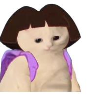
幽灵展示!

是不是特别帅,简直就和我本人一样,哈哈哈哈哈哈哈哈哈哈哈哈哈哈哈哈哈哈哈
接下来就是代码展示咯
html
<div class='ghost'>
    <div class='eyes'></div>
    <div class='mouth'>
        <div class='mouth__part'>
            <div class='bubble'></div>
            <div class='bubble'></div>
        </div>
        <div class='mouth__part'>
            <div class='bubble low'></div>
        </div>
        <div class='mouth__part'></div>
        <div class='mouth__part'></div>
        <div class='mouth__part'>
            <div class='bubble low'></div>
            <div class='bubble low'></div>
        </div>
        <div class='mouth__part'>
            <div class='bubble'></div>
            <div class='bubble'></div>
        </div>
        <div class='blood-drips'>
            <div class='blood-drips__drip'></div>
        </div>
    </div>
    <div class='arms'>
        <div class='arm'></div>
        <div class='arm'></div>
    </div>
</div>
<div class='shadow'></div>
css
- 先设置body的背景颜色
body {
    background: #1f1f1f;
}
- 设置身体的轮廓
.ghost {
    display: block;
    width: 40vh;
    height: 40vh;
    background: #f2d5fa;
    border-radius: 50%;
    will-change: transform;
    z-index: 10;
    position: absolute;
    top: 50%;
    left: 50%;
    -webkit-animation: bob 2s;
    animation: bob 2s;
    -webkit-animation-iteration-count: infinite;
    animation-iteration-count: infinite;
    -webkit-animation-direction: alternate-reverse;
    animation-direction: alternate-reverse;
}
- 设置幽灵的两个小眼睛
.eyes:after, .eyes:before {
    content: "";
    display: block;
    width: 2.5vh;
    height: 4vh;
    position: absolute;
    top: 7vh;
    left: 12vh;
    background: #7963e3;
    border-radius: 50%;
    will-change: margin;
    -webkit-animation: mbob 2s;
    animation: mbob 2s;
    -webkit-animation-iteration-count: infinite;
    animation-iteration-count: infinite;
    -webkit-animation-direction: alternate-reverse;
    animation-direction: alternate-reverse;
}
.eyes:before {
    transform: rotate(20deg);
}
.eyes:after {
    left: auto;
    right: 12vh;
    transform: rotate(-20deg);
}
- 画个小嘴巴
.mouth {
    display: block;
    width: 13vh;
    height: 5.25vh;
    margin: 15vh auto;
    margin-left: 20.5vh;
    position: relative;
    -webkit-animation: bob 2s;
    animation: bob 2s;
    -webkit-animation-iteration-count: infinite;
    animation-iteration-count: infinite;
    -webkit-animation-direction: alternate-reverse;
    animation-direction: alternate-reverse;
}

.mouth__part {
    display: block;
    width: 3vh;
    height: 5vh;
    border: 0vh solid #7963e3;
    margin: -0.5vh;
    float: left;
    position: relative;
    background: #7963e3;
    border-radius: 50%;
    overflow: hidden;
    transform: rotate(0deg);
}

.mouth__part:nth-child(2),
.mouth__part:nth-child(5) {
    margin-top: -0.85vh;
}

.mouth__part:nth-child(3),
.mouth__part:nth-child(4) {
    margin-top: -1vh;
}
哈哈哈哈哈哈哈哈,歪嘴战神
- 嘴巴里加点小口水
.bubble {
    display: block;
    width: 1vh;
    height: 1vh;
    background: #78d9e1;
    position: absolute;
    bottom: -0.3vh;
    left: 0;
    border-radius: 50%;
    margin-top: 100px;
    -webkit-animation: bob-bot 2s;
    animation: bob-bot 2s;
    -webkit-animation-iteration-count: infinite;
    animation-iteration-count: infinite;
    -webkit-animation-direction: alternate-reverse;
    animation-direction: alternate-reverse;
}
.bubble.low {
    bottom: -0.5vh;
    left: 0.3vh;
}
.bubble:nth-child(2) {
    display: block;
    width: 2vh;
    height: 2vh;
    bottom: -1vh;
    left: 0.5vh;
}
.bubble:nth-child(2).low {
    bottom: -1.5vh;
}
.blood-drips__drip {
    display: block;
    width: 1vh;
    height: 1vh;
    background: #78d9e1;
    position: absolute;
    bottom: 0.2vh;
    right: 2vh;
    border-radius: 50%;
    -webkit-animation: drip 1s ease-in;
    animation: drip 1s ease-in;
    -webkit-animation-iteration-count: infinite;
    animation-iteration-count: infinite;
}
- 把小手装上去
.arm {
    display: block;
    width: 5vh;
    height: 8vh;
    position: absolute;
    top: 16vh;
    left: 0vh;
    background: #f2d5fa;
    border-radius: 50%;
    transform-origin: center top;
}
.arm:nth-child(1) {
    transform: rotate(30deg);
    border-right: 1vh solid #c3b9f3;
    -webkit-animation: left-arm-wobble 1s ease-in;
    animation: left-arm-wobble 1s ease-in;
    -webkit-animation-iteration-count: infinite;
    animation-iteration-count: infinite;
    -webkit-animation-direction: alternate-reverse;
    animation-direction: alternate-reverse;
}
.arm:nth-child(2) {
    transform: rotate(-30deg);
    border-left: 1vh solid #c3b9f3;
    left: auto;
    right: 0vh;
    -webkit-animation: right-arm-wobble 1s ease-in;
    animation: right-arm-wobble 1s ease-in;
    -webkit-animation-iteration-count: infinite;
    animation-iteration-count: infinite;
    -webkit-animation-direction: alternate-reverse;
    animation-direction: alternate-reverse;
}
- 把地下的影子添加上去
.shadow {
    display: block;
    width: 30vh;
    height: 6vh;
    background: #fddc4f;
    border-radius: 50%;
    margin: 0 auto;
    margin-top: 68vh;
    -webkit-animation: shadow 2s;
    animation: shadow 2s;
    -webkit-animation-iteration-count: infinite;
    animation-iteration-count: infinite;
    -webkit-animation-direction: alternate-reverse;
    animation-direction: alternate-reverse;
}
ok,此时还有点小瑕疵,接下来等我加上动画就完全ok,在动画的基础下,浅浅的修改了初始位置
@-webkit-keyframes shadow {
    from {
        -webkit-transform: scale(0.5);
    }
    to {
        -webkit-transform: scale(1);
    }
}
@keyframes shadow {
    from {
        transform: scale(0.5);
    }
    to {
        transform: scale(1);
    }
}
@-webkit-keyframes bob {
    from {
        -webkit-transform: translateY(-70%) translateX(-50%);
    }
    to {
        -webkit-transform: translateY(-50%) translateX(-50%);
    }
}
@keyframes bob {
    from {
        transform: translateY(-70%) translateX(-50%);
    }
    to {
        transform: translateY(-50%) translateX(-50%);
    }
}
@-webkit-keyframes mbob {
    from {
        margin-top: 0;
    }
    to {
        margin-top: -1vh;
    }
}
@keyframes mbob {
    from {
        margin-top: 0;
    }
    to {
        margin-top: -1vh;
    }
}
@-webkit-keyframes bob-bot {
    from {
        -webkit-transform: translateY(0vh) rotate(0deg);
    }
    to {
        -webkit-transform: translateY(-0.5vh) rotate(360deg);
    }
}
@keyframes bob-bot {
    from {
        transform: translateY(0vh) rotate(0deg);
    }
    to {
        transform: translateY(-0.5vh) rotate(360deg);
    }
}
@-webkit-keyframes drip {
    from {
        -webkit-transform: translateY(0vh);
    }
    to {
        -webkit-transform: translateY(5vh);
    }
}
@keyframes drip {
    from {
        transform: translateY(0vh);
    }
    to {
        transform: translateY(5vh);
    }
}
@-webkit-keyframes left-arm-wobble {
    from {
        -webkit-transform: rotate(10deg);
    }
    to {
        -webkit-transform: rotate(30deg);
    }
}
@keyframes left-arm-wobble {
    from {
        transform: rotate(10deg);
    }
    to {
        transform: rotate(30deg);
    }
}
@-webkit-keyframes right-arm-wobble {
    from {
        -webkit-transform: rotate(-10deg);
    }
    to {
        -webkit-transform: rotate(-30deg);
    }
}
@keyframes right-arm-wobble {
    from {
        transform: rotate(-10deg);
    }
    to {
        transform: rotate(-30deg);
    }
}
此时,我的小幽灵就画完了,哈哈哈哈哈哈哈哈哈哈哈哈哈哈哈哈哈,就到这吧
最后请不要忘记每一个对你来说重要的人,请记住你的每一位家人、每一位友人,无论你们曾经的回忆中包含着的是欢乐还是伤痛!
