

我正在参加「创意开发 投稿大赛」详情请看:掘金创意开发大赛来了!
虽然我前端菜的抠jio,但是对图片、设计、颜色、插图这类的东西很喜欢,然后掘金又常常有这样的创意更文活动和一些前端比较好参加的活动,让我常常羡慕大伙~
然后这次就尝试了一下,就有了下面的东东。
一、效果图
说起来也奇怪,我一开始完全没想过写这个东西~~,原本打算也是写其他的小玩意的(我==菜鸡)
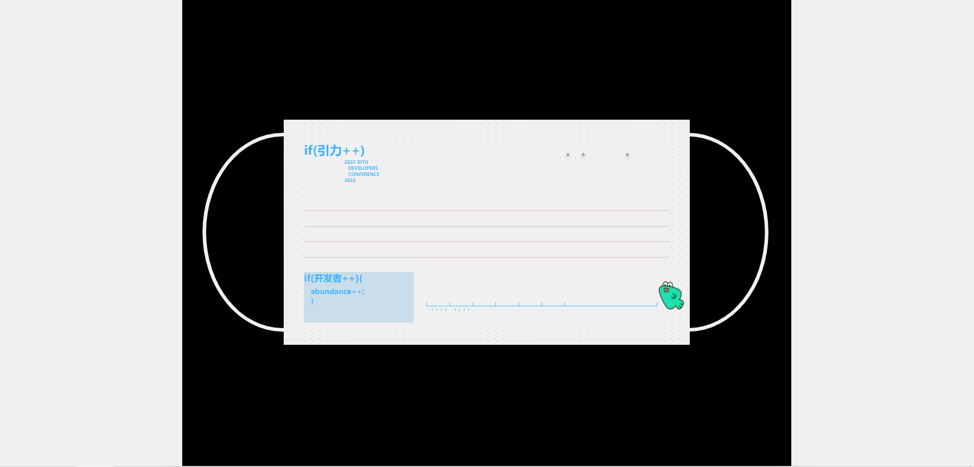
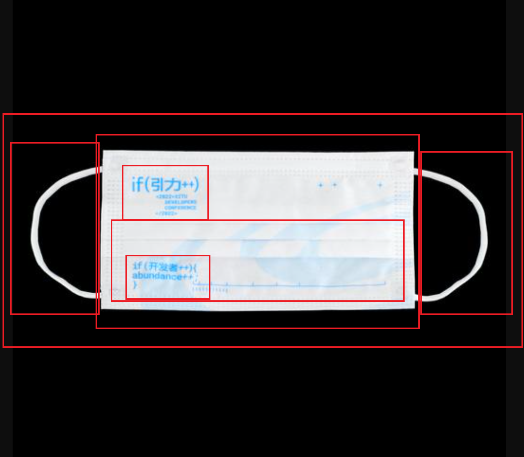
那天在看大会直播的时候,就去逛了掘金小商铺,看到这个口罩,一下就被 get 到了~😯
心里就冒出了这个想法,这也是因为平时掘金的推荐,导致我也看了不少前端文章,让我觉得我能复刻出来。
还有一张这样的~
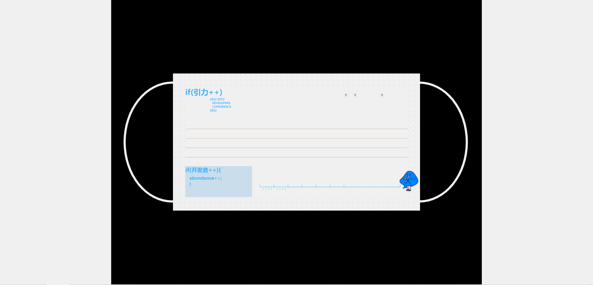
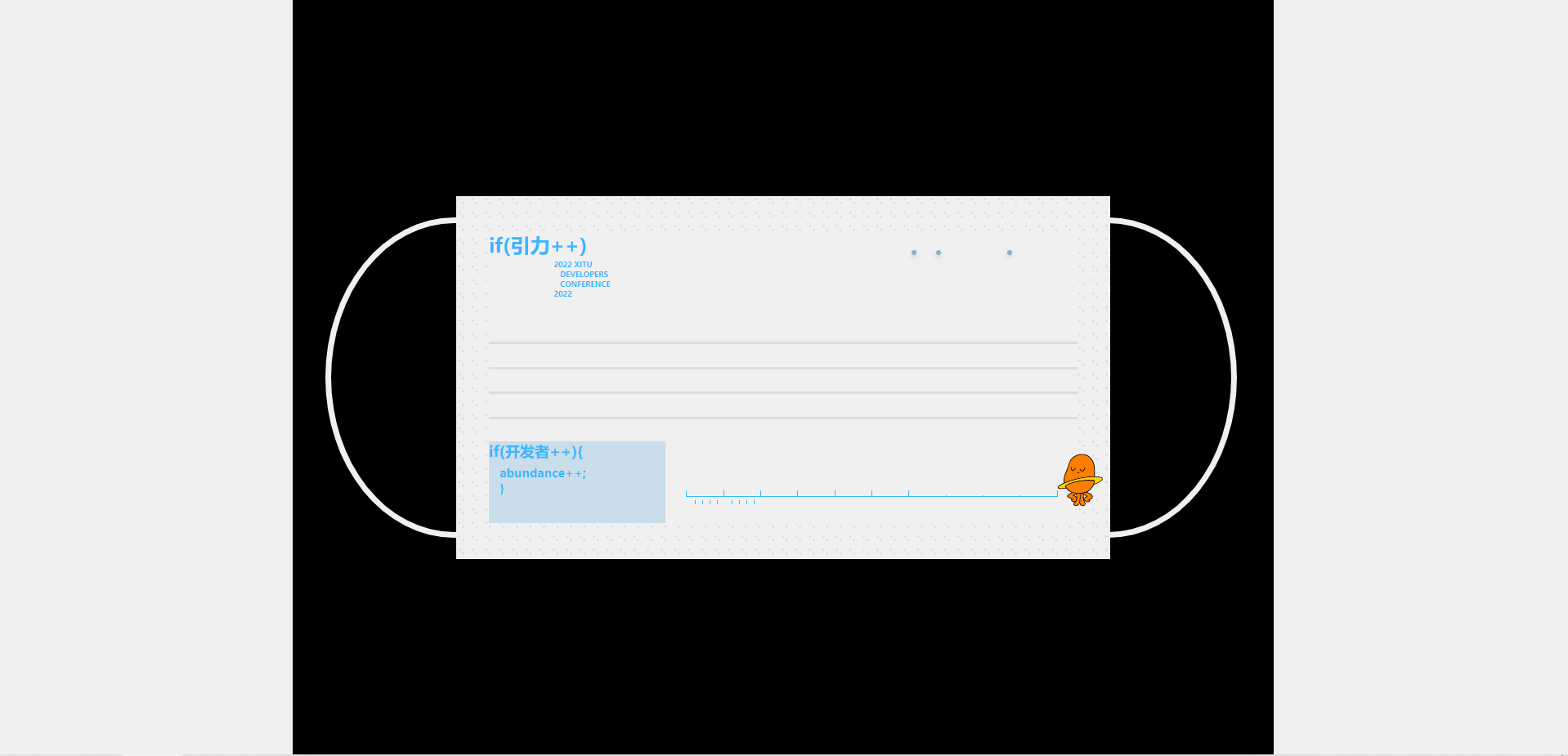
其实理想状态应该把这一个做出那种咱们戴起来的那种样子的,emmm,周一到周五被迫多干了些活,回来也不想整~,最后就止步于此,稍微水了一点点,我有错
此处@法医,创意是医医给我升级的~,有那么亿丢丢浪费,😊,下次我一定好好做,
法医,一只治疗系前端码猿🐒,读书圈 圈主,热爱阅读,聊天十分愉快!
其实很多细节,我没有复刻,能力不足(😭),另外就是我代码中的写法可能有那么一点点傻,大佬们轻喷~
(图片说明:稀土掘金大会口罩宣传图)
背景没能复刻出来,这个背景问了一些前端小伙伴,如果用 css 画,能画,但是就是真的在拿 css 画画的画,然后我就放弃了~ 有更好的方法的话,大佬们给一点建议,非常感谢~
码上掘金

二、关于代码
1、html方面
布局方面就是使用简单的 flex 布局,很简单的,一下就能上手啦,还不会的小伙伴可以看一下 阮一峰 大佬的博客,也有很多其他质量颇高的文章。
这里我也木有什么思路,就是堆div堆出来的,拿着图片简单画了一下就上手了~
<div class="body-container">
<div class="main-container">
<div class="parent-container">
<div class="circle-container left-container">
<div class="circle"></div>
</div>
<div class="center-container">
<div class="inside-container">
<div class="up-container">
<div class="up-code">
<span>if(引力++)</span>
<br>
<span class="up-code-span">
2022 XITU
<br>
<span class="up-code-span-2"> DEVELOPERS</span>
<br>
<span class="up-code-span-3"> CONFERENCE</span>
<br>
2022
</span>
</div>
<div class="stars">
<div class="dot dot1"></div>
<div class="dot dot2"></div>
<div class="dot dot3"></div>
<img src="./image/block_32768.png" style="width:45px;height: 45px;
position: absolute;
top: 180px;
right: -25px;"></img>
</div>
</div>
<div class="down-container">
<div class="line-up">
<div class="line-box"></div>
<div class="line-box"></div>
<div class="line-box"></div>
<div class="line-box"></div>
</div>
<div class="line-down">
<div class="code">
<span>
if(开发者++){</span>
<span class="down-code-span"> abundance++;
<br>
}</span>
</div>
<div class="left-line">
<div class="ruler">
<div class="cm">
<div class="mm"></div>
<div class="mm"></div>
<div class="mm"></div>
<div class="mm"></div>
</div>
<div class="cm">
<div class="mm"></div>
<div class="mm"></div>
<div class="mm"></div>
<div class="mm"></div>
</div>
<div class="cm"></div>
<div class="cm"></div>
<div class="cm"></div>
<div class="cm"></div>
<div class="cm"></div>
<div class="cm"></div>
<div class="cm"></div>
<div class="cm"></div>
<div class="cm"></div>
</div>
</div>
</div>
</div>
</div>
</div>
<div class="circle-container right-container">
<div class="circle"></div>
</div>
</div>
</div>
</div>
2、css 方面
使用到的属性都非常常见,我会的就只有这么多😭 代码中含有注释。
html,
body {
width: 100%;
height: 100%;
margin: 0;
padding: 0;
overflow: hidden;
background-color: #f0f0f0;
}
.body-container {
width: 800px;
height: 100%;
/* 居中 */
margin: 0 auto;
background-color: #000000;
/* 实现子元素垂直居中布局 */
display: flex;
justify-content: center;
align-items: center;
}
.main-container {
width: 800px;
height: 370px;
min-height: 370px;
background-color: #000000;
display: flex;
justify-content: center;
align-items: center;
}
.parent-container {
height: 80%;
width: 100%;
display: flex;
}
.left-container {
width: 20%;
height: 100%;
background-color: #000;
}
.circle-container{
display: flex;
justify-content: center;
flex-direction: column;
}
.left-container .circle {
width: 150%;
height: 85%;
margin-left: 20%;
border-bottom-left-radius: 100%;
border-top-left-radius: 100%;
border: 5px solid #f0f0f0;
}
.center-container {
width: 80%;
height: 296px;
min-height: 296px;
background-color: #f0f0f0;
display: flex;
justify-content: center;
align-items: center;
/*这里是设置口罩外边的边框斑点,我这里的做法是将外层容器的背景直接做成斑点
然后内层容器还重新加个背景,感觉不是最优做法,感觉应该拿边框也可以做出来吧。
*/
background-image: radial-gradient(#d2d9df 9%, transparent 0),
radial-gradient(#d2d9df 9%, transparent 0);
background-size: 11px 11px;
background-position: 0 0, 30px 30px;
z-index: 10;
}
/* 此处样式为设置大背景的样式*/
.inside{
background-image: url(https://p1-juejin.byteimg.com/tos-cn-i-k3u1fbpfcp/332aad251fbc4eda9219bc3fcff28d0f~tplv-k3u1fbpfcp-watermark.image?);
background-repeat: no-repeat;
background-size: cover;
background-position: center;
}
.inside-container {
height: 80%;
width: 90%;
}
.up-container {
width: 100%;
height: 30%;
display: flex;
}
.up-code {
width: 40%;
height: 100%;
color: #37b8fb;
font-weight: bold;
}
.up-code-span {
font-size: 12px;
transform: scale(0.5); /*将文字缩小到浏览器所允许的12px 以下*/
display: inline-block;
margin-left:30px;
margin-top: -15px;
}
.up-code-span-2 {
margin-left:10px;
}
.up-code-span-3 {
margin-left:10px;
}
.stars {
width: 60%;
height: 100%;
position: relative;
}
.dot {
position: absolute;
width: 4px;
height: 4px;
border-radius: 100%;
background-color: #8eafc4;
box-shadow: 0 2px 4px 0 rgba(0, 0, 0, 0.2); /*设置阴影*/
}
.dot1 {
top: 20%;
left: 80%;
}
.dot2 {
top: 20%;
left: 60%;
}
.dot3 {
top: 20%;
left: 53%;
}
.down-container {
width: 100%;
height: 70%;
}
/* start 口罩的横线 这里的做法就算设置div的宽高加一个背景 嘿嘿,加上flex 布局就做完了
但是距离理想状态,仍然有段距离
理想状态它应该是画成折痕的状态的,或者是画成手绘的那种风格~
*/
.line-up {
height: 60%;
width: 100%;
display: flex;
flex-direction: column;
justify-content: space-evenly;
}
.line-box {
height: 2px;
width: 100%;
background-color: #e4dbd9;
}
/* end 口罩的横线 */
.line-down {
height: 40%;
width: 100%;
display: flex;
}
.code {
height: 100%;
width: 30%;
background-color: #c9ddeb;
font-weight: bold;
font-size: 12px;
color: #37b8fb;
}
.down-code-span {
font-size: 12px;
/* 设置字体大小 小于浏览器的12px */
transform: scale(0.8);
display: inline-block;
}
/* 右边圆环 这里就是用border做的,难度不大,border可玩性也很高,大家感兴趣的可以去多了解了解 */
.right-container {
width: 20%;
height: 100%;
}
.right-container .circle {
margin-left: -80%;
width: 150%;
height: 85%;
border-bottom-right-radius: 100%;
border-top-right-radius: 100%;
border: 5px solid #f0f0f0;
z-index: 1;
}
/* 刻度尺 */
.left-line {
height: 100%;
width: 70%;
}
.ruler {
position: relative;
width: 90%;
margin: 40px auto;
height: 14px;
}
.ruler .cm,
.ruler .mm {
position: absolute;
border-left: 1px solid #37b8fb;
height: 4px;
width: 10%;
}
.cm {
border-bottom: 1px solid #37b8fb;
}
.mm {
position: absolute;
top: 8px;
}
.ruler .cm:after {
position: absolute;
font: 11px/1 sans-serif;
}
.ruler .mm {
height: 3px;
}
.ruler .mm:nth-of-type(5) {
height: 10px;
}
.ruler .cm:nth-of-type(1) {
left: 0%;
}
.ruler .cm:nth-of-type(2) {
left: 10%;
}
.ruler .cm:nth-of-type(3) {
left: 20%;
}
.ruler .cm:nth-of-type(4) {
left: 30%;
}
.ruler .cm:nth-of-type(5) {
left: 40%;
}
.ruler .cm:nth-of-type(6) {
left: 50%;
}
.ruler .cm:nth-of-type(7) {
left: 60%;
}
.ruler .cm:nth-of-type(8) {
left: 70%;
height: 0;
top: 4px;
}
.ruler .cm:nth-of-type(9) {
left: 80%;
height: 0;
top: 4px;
}
.ruler .cm:nth-of-type(10) {
left: 90%;
height: 0;
top: 4px;
}
.ruler .cm:nth-of-type(11) {
left: 100%;
width: 0;
}
.ruler .mm:nth-of-type(1) {
left: 20%;
}
.ruler .mm:nth-of-type(2) {
left: 40%;
}
.ruler .mm:nth-of-type(3) {
left: 60%;
}
.ruler .mm:nth-of-type(4) {
left: 80%;
}
3、遇到的问题
-
字体调整到12px以下
-
口罩四周做的那个小点点
-
右下角的那个刻度尺
-
口罩两边的圆环
此处是使用边框做的。
后记
开始尝试用CSS去画出一些东西,你会惊奇的发现,一切都是皆有可能的,可以看一看 codepen 上面的创意,很多小项目真的让人耳目一新,代码都是熟悉的,但是做出来的效果却非常的好。
偶尔尝试一些新的东西,蛮有趣的,写文周六周日的生活变得更加的充实啦。
近期一直在参与读书圈里的沸点活动,每天坚持写一篇旧书的读后感,好像在那里也找到了一种写文和分享的快乐😀
在这还推荐一篇文章我是如何开始制作CSS图片的 ,我也同有作者的这种喜欢,不会画画,但也想通过自己的手,创造出一些美丽的东西。
