

教程介绍
在本教程中,我们将解释如何用ggplot2在R中创建饼图,ggplot2是一个非常流行和易于使用的软件包,可以在R中创建令人惊叹的图形和可视化。
ggplot2中饼图的语法
在ggplot2中创建饼图的最小语法如下
ggplot(, mapping = aes())+ geom_bar(stat="identity") +
coord_polar(theta = <"x" or "y">)
意思是首先用geom_bar()创建条形图,然后用coord_polar()将其转换为饼图,其中theta标志着饼的角度应该映射到x坐标还是y坐标。
关于 coord_polar() 的更多细节可以在这里找到。
ggplot2可以让你在绘图中添加更多的层,如主题、实验室等,以创建更高级的饼图。
R中使用ggplot2绘制饼图的例子
加载ggplot2
应首先加载ggplot2库,如下图所示 -
在[0]中:
library(ggplot2)
数据集
我们将创建我们自己的移动电话公司及其市场份额的玩具样本数据集。这将被加载到一个数据框'data'中,在整个ggplot2饼图实例中都会用到。
在[1]中:
#create data frame
data <- data.frame(brand = c('Xiaomi','Samsung','Vivo','Realme','Oppo','Others'),
                   percent= c(27,18,21,8,12,14))
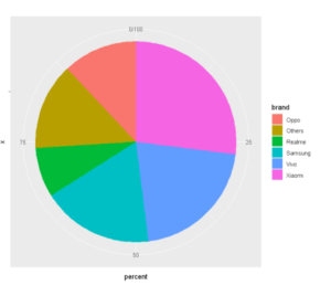
例1:ggplot2中的基本饼图
我们将加载我们的数据框,其中包括移动电话公司和他们各自在某一季度的市场份额(百分比)。
在[1]中:
#create pie chart
ggplot(data, aes(x="", y=percent, fill=brand)) +
  geom_bar(stat="identity", width=1) +
  coord_polar("y", start=0)
Out[1]:
例2:在ggplot2中用geom_text()给饼图添加标签
为了在可视化时获得一些观点,我们将在饼图上贴上标签,表示数值,并在上面附加百分比符号。为此,我们将使用geom_text()层并输入所需的标签。
In[2]:
ggplot(data, aes(x="", y=percent, fill=brand)) +
geom_bar(stat="identity", width=1) +
coord_polar("y", start=0) +
geom_text(aes(label = paste0(percent, "%")), position = position_stack(vjust=0.5)) +
labs(x =NULL, y = NULL, fill = NULL)
输出[2]:
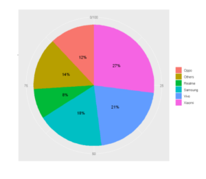
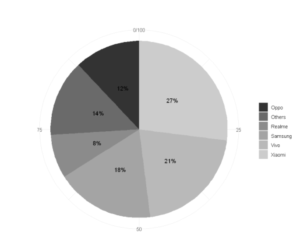
例3:使用scale_fill_manual()给饼图着色
在这个例子中,我们将明确地把每个饼的颜色作为一个参数传递给scale_fill_manual(),并且在最终的饼图中呈现出同样的内容。
In[3]:
ggplot(data, aes(x="", y=percent, fill=brand)) +
geom_bar(stat="identity", width=1) +
coord_polar("y", start=0) +
geom_text(aes(label = paste0(percent, "%")), position = position_stack(vjust=0.5)) +
labs(x =NULL, y = NULL, fill = NULL) +
scale_fill_manual(values=c("#FF5733", "#75FF33", "#33DBFF", "#BD33FF",'orange','royalblue'))
Out[3]:
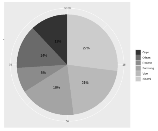
例4:使用scale_fill_grey()将灰度应用到饼图上
如果我们想在ggplot2中选择灰色调色板为饼图着色,那么我们可以使用scale_fill_grey(),如下面的例子中所示。
In[4]:
ggplot(data, aes(x="", y=percent, fill=brand)) +
geom_bar(stat="identity", width=1) +
coord_polar("y", start=0) +
geom_text(aes(label = paste0(percent, "%")), position = position_stack(vjust=0.5)) +
labs(x =NULL, y = NULL, fill = NULL) +
scale_fill_grey()
Out[4]:
例子5:用theme_minimal()使用极简主题
默认情况下,用ggplot2创建的饼图有一个背景网格,这可能不是所有人都需要的。在这种情况下,可以使用 theme_minimal(),如下面的例子所示------。
In[4]:
ggplot(data, aes(x="", y=percent, fill=brand)) +
geom_bar(stat="identity", width=1) +
coord_polar("y", start=0) +
geom_text(aes(label = paste0(percent, "%")), position = position_stack(vjust=0.5)) +
labs(x =NULL, y = NULL, fill = NULL) +
scale_fill_grey() +
theme_minimal()
Out[4]:
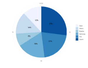
例子6:用scale_fill_brewer()使用RColorBrewer色板
为了使用RColorBrewer包中的颜色,我们将添加一个层scale_fill_brewer()
In[5]:
ggplot(data, aes(x="", y=percent, fill=brand)) +
geom_bar(stat="identity", width=1) +
coord_polar("y", start=0) +
geom_text(aes(label = paste0(percent, "%")), position = position_stack(vjust=0.5)) +
labs(x =NULL, y = NULL, fill = NULL) +
scale_fill_brewer(palette="Blues")+
theme_minimal()
输出[5]:
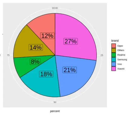
例7: 使用geom_label()给饼图添加标签
我们可以不使用geom_text,而使用geom_label,它还可以在数值周围添加一个边框。
在 [7]:
ggplot(data, aes(x = "",y=percent, fill=brand)) +
geom_col(color = "black") +
geom_label(aes(label = paste0(percent, "%")), position = position_stack(vjust = 0.5), size=8, show.legend = FALSE) +
coord_polar(theta = "y")
输出[7]:
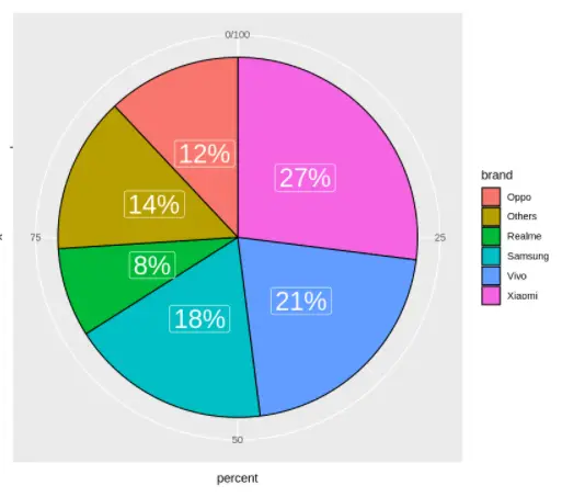
例8:给标签涂色
为了应用所需的标签颜色,我们应使用geom_label层内的颜色参数。在下面的例子中,我们将颜色传递为白色。
In[8]:
ggplot(data, aes(x = "",y=percent, fill=brand)) +
geom_col(color = "black") +
geom_label(aes(label = paste0(percent, "%")), color = "white", position = position_stack(vjust = 0.5), size=8, show.legend = FALSE) +
coord_polar(theta = "y")
输出[8]:
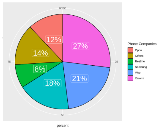
例九:添加自定义图例标题
图例的标题可以通过guide()层进行自定义,如下例所示,标题被改为 "电话公司"
在[9]中:
ggplot(data, aes(x = "",y=percent, fill=brand)) +
geom_col(color = "black") +
geom_label(aes(label = paste0(percent, "%")), color = "white", position = position_stack(vjust = 0.5), size=8, show.legend = FALSE) +
coord_polar(theta = "y") +
guides(fill = guide_legend(title = "Phone Companies"))
Out[9]:
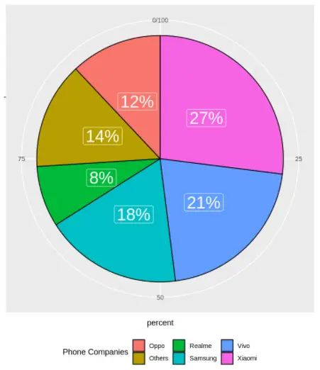
例10:改变图例的位置
图例可以放置在几个地方,可能的放置值是 "底部"、"左侧"、"顶部 "和 "右侧"(默认)。要将图例放置在底部,请在主题层中使用 legend.position = "bottom"。
In[10]:
ggplot(data, aes(x = "",y=percent, fill=brand)) +
geom_col(color = "black") +
geom_label(aes(label = paste0(percent, "%")), color = "white", position = position_stack(vjust = 0.5), size=8, show.legend = FALSE) +
coord_polar(theta = "y") +
guides(fill = guide_legend(title = "Phone Companies")) +
theme(legend.position = "bottom")
Out[10]:
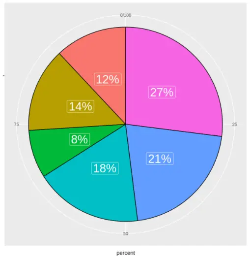
例11:从饼图中删除图例
如果你想删除图例,在主题层中设置 legend.position = "none"。
在[11]中:
ggplot(data, aes(x = "",y=percent, fill=brand)) +
geom_col(color = "black") +
geom_label(aes(label = paste0(percent, "%")), color = "white", position = position_stack(vjust = 0.5), size=8, show.legend = FALSE) +
coord_polar(theta = "y") +
guides(fill = guide_legend(title = "Phone Companies")) +
theme(legend.position = "none")
Out[11]:
- 还可以阅读 - ggplot2中的条形图教程及实例
