

移动应用程序通常有各种类别的内容提供。例如,Google Play Store应用将其内容分为游戏、应用、电影和书籍等类别。在Flutter应用程序中,BottomNavigationBar小组件使用户能够在应用程序开始时看到任何一个类别,只需用手指轻轻一点就能快速查看其他类别。
在本教程中,我们将告诉你关于Flutter中BottomNavigationBar的一切。我们将演示它是如何工作的,走过一些用例,并向您展示如何在您的Flutter应用程序中定制BottomNavigationBar小组件。
以下是我们将讨论的内容。
- 什么是 Flutter 中的 BottomNavigationBar?
- 定制 BottomNavigationBar
- 如何保留页面的状态
- 如何将TabBar与BottomNavigationBar结合起来
- 在滚动时隐藏底部导航条
什么是 Flutter 中的 BottomNavigationBar?
BottomNavigationBar 是一个小部件,在 Flutter 应用程序的底部显示一排小部件。通常情况下,它用来显示大约三到五个项目。每个项目必须有一个标签和一个图标。BottomNavigationBar允许你一次选择一个项目,并快速导航到一个指定的页面。
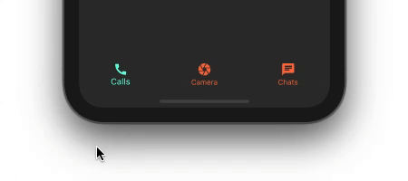
现在让我们一步一步地走过创建一个简单的BottomNavigationBar的过程。完成后的产品将看起来如下。
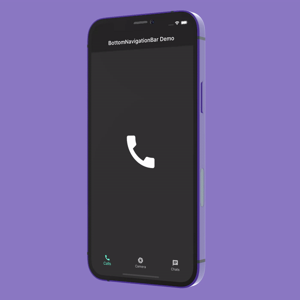
显示BottomNavigationBar
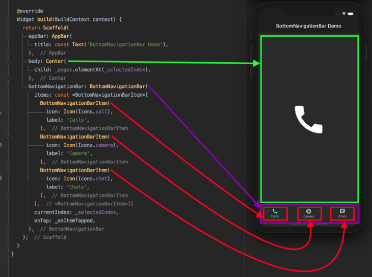
BottomNavigationBar小组件被赋予了Scaffold的bottomNavigationBar属性。
Scaffold(
  appBar: AppBar(
    title: const Text('BottomNavigationBar Demo'),
  ),
  bottomNavigationBar: BottomNavigationBar(
    items: const <BottomNavigationBarItem>[
      BottomNavigationBarItem(
        icon: Icon(Icons.call),
        label: 'Calls',
      ),
      BottomNavigationBarItem(
        icon: Icon(Icons.camera),
        label: 'Camera',
      ),
      BottomNavigationBarItem(
        icon: Icon(Icons.chat),
        label: 'Chats',
      ),
    ],
  ),
);
BottomNavigationBar有一个名为items 的必要属性。items 接受一个类型为BottomNavigationBarItem 的小组件。BottomNavigationBarItem 只是用来显示BottomNavigationBar里面的实际项目。
上面的代码只是在显示BottomNavigationBar的时候默认选择了第一个项目。当我们点击其他项目时,它还没有改变选择。
显示选择的项目
为了显示其他项目的选择,我们将使用两个属性:onTap 和currentIndex 。
int _selectedIndex = 0; //New
BottomNavigationBar(
  items: const <BottomNavigationBarItem>[
    ...
  currentIndex: _selectedIndex, //New
  onTap: _onItemTapped,         //New
)
//New
void _onItemTapped(int index) {
  setState(() {
    _selectedIndex = index;
  });
}
_selectedIndex 变量持有当前所选项目的值。_selectedIndex 被赋予了currentIndex 属性。
_onItemTapped() 回调被分配给BottomNavigationBar的onTap ,当项目被点选时,它返回索引。只需将当前选定的项目索引分配给_selectedIndex ,并进行setState ,就可以在BottomNavigationBar中显示该项目为选定项目。
显示所选项目的页面
到目前为止,我们还没有任何基于所选项目的页面可以显示。因此,让我们继续前进,并且很好地显示它。
//New
static const List<Widget> _pages = <Widget>[  Icon(    Icons.call,    size: 150,  ),  Icon(    Icons.camera,    size: 150,  ),  Icon(    Icons.chat,    size: 150,  ),];
Scaffold(
  appBar: AppBar(
    title: const Text('BottomNavigationBar Demo'),
  ),
  body: Center(
    child: _pages.elementAt(_selectedIndex), //New
  ),
  bottomNavigationBar: BottomNavigationBar(
    ...
  ),
);
_pages ,持有一个小工具的列表。为了简单起见,我们只是显示项目本身的一个大图标。
根据项目的_selectedIndex ,在屏幕中心显示一个页面,从_pages ,将完成其余的魔法。
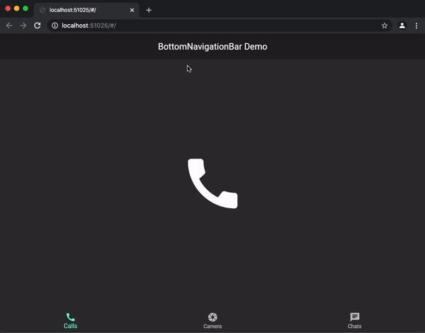
现在我们有了BottomNavigationBar并开始运行。
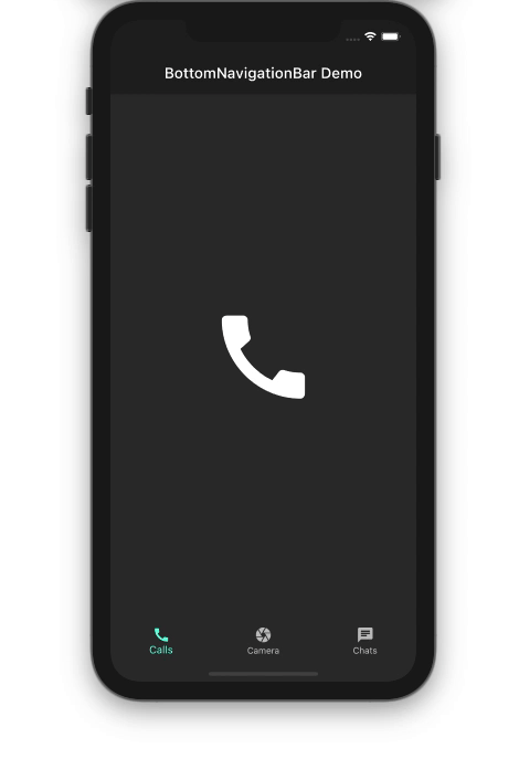
下面的插图显示了代码是如何转化为设计的。
定制BottomNavigationBar
BottomNavigationBar有很多选项可以根据你的需要进行定制。让我们放大一下你可以定制的一些属性。
背景颜色
你可能想改变BottomNavigationBar的背景颜色以配合你的品牌。你只需使用backgroundColor 属性就可以做到这一点。
BottomNavigationBar(
  backgroundColor: Colors.blueAccent,
  items: const <BottomNavigationBarItem>[
    ...
  ],
)
高度
默认情况下,BottomNavigationBar被设置为从表面抬高8 点,以便它出现在页面的顶部。你可以将这个属性设置为任何值。
BottomNavigationBar(
  backgroundColor: Colors.white10,
  elevation: 0,
  items: const <BottomNavigationBarItem>[
   ...
  ],
)
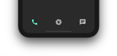
图标大小
你可以使用iconSize 属性一次缩小或放大所有图标的大小。
BottomNavigationBar(
  iconSize: 40,
  items: const <BottomNavigationBarItem>[
    ...
  ],
)
鼠标指针
当在网络上运行时,你可以自定义鼠标指针,当它悬停在BottomNavigationBar上的一个项目上时。
BottomNavigationBar(
  mouseCursor: SystemMouseCursors.grab,
  items: const <BottomNavigationBarItem>[
    ...
  ],
)
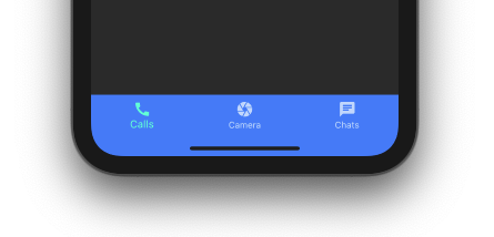
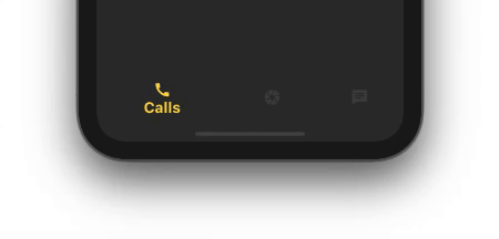
选定的项目
你可以使用BottomNavigationBar的几个选定的属性使选定的项目与未选定的项目显得不同。
BottomNavigationBar(
  selectedFontSize: 20,
  selectedIconTheme: IconThemeData(color: Colors.amberAccent, size: 40),
  selectedItemColor: Colors.amberAccent,
  selectedLabelStyle: TextStyle(fontWeight: FontWeight.bold),
  items: const <BottomNavigationBarItem>[
    ...
  ],
)
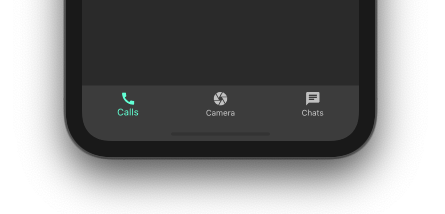
未选择的项目
你也可能想改变未选择的项目的外观和感觉。BottomNavigationBar有几个未选择的属性,你可以使用。
BottomNavigationBar(
  unselectedIconTheme: IconThemeData(
    color: Colors.deepOrangeAccent,
  ),
  unselectedItemColor: Colors.deepOrangeAccent,
  items: const <BottomNavigationBarItem>[
    ...
  ],
)
移除标签
如果你想完全去掉标签,你可以使用showSelectedLabels 和showUnselectedLabels 。
BottomNavigationBar(
  iconSize: 40,
  showSelectedLabels: false,
  showUnselectedLabels: false,
  items: const <BottomNavigationBarItem>[
    ...
  ],
)
强调选中的项目
你可以通过将BottomNavigationBar的类型设置为BottomNavigationBarType.shifting ,来强调选中的项目。
BottomNavigationBar(
  type: BottomNavigationBarType.shifting,
  selectedFontSize: 20,
  selectedIconTheme: IconThemeData(color: Colors.amberAccent),
  selectedItemColor: Colors.amberAccent,
  selectedLabelStyle: TextStyle(fontWeight: FontWeight.bold),
  items: const <BottomNavigationBarItem>[
    ...
  ],
)
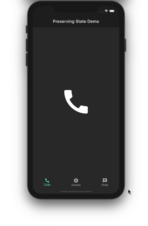
如何保留页面的状态
虽然BottomNavigationBar的基本版本运行良好,但我们有一个问题:无论什么动作--例如搜索、过滤、输入文本、滚动浏览列表、填写联系表格等--在页面上正在进行的操作都会在从BottomNavigationBar中选择另一个项目时丢失。

在上面的演示中,我们正试图找到一个联系人。当我们在完成搜索之前切换到相机部分,然后返回到聊天部分时,之前输入的文字就完全消失了。
不要害怕--解决方案非常简单。只需用IndexedStack替换现有的小组件。IndexedStack小组件持有一叠小组件,但每次只显示一个。因为所有的小部件都留在堆栈中,所以状态被保留下来。
//Before
Center(
  child: _pages.elementAt(_selectedIndex),
)
//After
IndexedStack(
  index: _selectedIndex,
  children: _pages,
)
index 属性用于显示_pages 中的一个页面,它被赋予了 children 属性。
如何用BottomNavigationBar包含TabBar
有时候,一个页面不足以覆盖BottomNavigationBar里面的父类中的各种子类。例如,Google Play Store应用程序有一些子类别,标记为For you、Top charts、Kids,等等。像这样的场景就需要Flutter TabBar小部件。
为了演示的目的,让我们尝试在通话部分内添加TabBar,用于接收、拨出和未接来电,如下图所示。
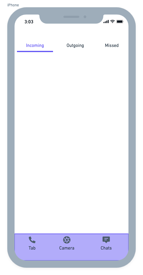
BottomNavigationBar的整体结构保持不变。你可能需要为你想包含TabBar的页面创建一个单独的类。为此,创建了CallsPage ,并添加到页面列表中。
static const List<Widget> _pages = <Widget>[
  CallsPage(),
  // Camera page
  // Chats page
];
CallsPage 看起来像这样。
DefaultTabController(
  length: 3,
  child: Scaffold(
    appBar: AppBar(
      flexibleSpace: Column(
        mainAxisAlignment: MainAxisAlignment.end,
        children: [
          TabBar(
            tabs: [
              Tab(
                text: 'Incoming',
              ),
              Tab(
                text: 'Outgoing',
              ),
              Tab(
                text: 'Missed',
              ),
            ],
          )
        ],
      ),
    ),
    body: TabBarView(
      children: [
        IncomingPage(),
        OutgoingPage(),
        MissedPage(),
      ],
    ),
  ),
);
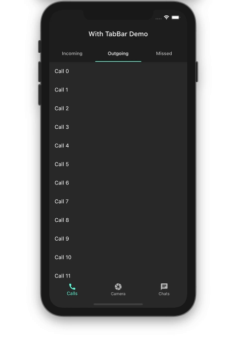
下面是输出结果。
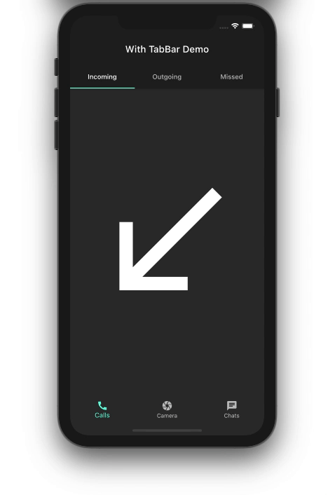
滚动时隐藏BottomNavigationBar
当构建一个Flutter应用程序时,你总是希望尽可能有效地利用屏幕空间。当用户在你的应用程序中的某个页面上滚动浏览一个长的项目列表时,你可以顺利地隐藏BottomNavigationBar。这种行为改善了用户体验,因为你只显示了那一刻需要的内容。
就目前而言,在滚动浏览呼出电话的列表时,BottomNavigationBar保持原样。
让我们一步步走过隐藏BottomNavigationBar的过程。
首先,将你的列表视图包裹在NotificationListenerwidget里面。NotificationListener监听ListView上发生的滚动通知。
NotificationListener<ScrollNotification>(
  onNotification: _handleScrollNotification,
  child: Scaffold(
    body: Center(
      child: ListView.builder(
        itemCount: items.length,
        itemBuilder: (context, index) {
          return ListTile(
            title: Text('${items[index]}'),
          );
        },
      ),
    ),
  ),
);
接下来,实现_handleScrollNotification 方法来确定滚动方向。当用户向下滚动时,通知承载BottomNavigationBar的页面来隐藏它。
bool _handleScrollNotification(ScrollNotification notification) {
  if (notification.depth == 0) {
    if (notification is UserScrollNotification) {
      final UserScrollNotification userScroll = notification;
      switch (userScroll.direction) {
        case ScrollDirection.forward:
          widget.isHideBottomNavBar(true);
          break;
        case ScrollDirection.reverse:
          widget.isHideBottomNavBar(false);
          break;
        case ScrollDirection.idle:
          break;
      }
    }
  }
  return false;
}
将BottomNavigationBar包裹在SizeTransition小组件中。SizeTransition会对BottomNavigationBar的大小进行动画处理。
AnimationController animationController =
    AnimationController(vsync: this, duration: Duration(milliseconds: 300));
SizeTransition(
  sizeFactor: animationController,
  axisAlignment: -1.0,
  child: BottomNavigationBar(
    items: const <BottomNavigationBarItem>[
      ...
    ],
  ),
)
在收到来自拥有ListView的页面的回调时开始隐藏动画。
CallsPage(
  isHideBottomNavBar: (isHideBottomNavBar) {
    isHideBottomNavBar
        ? animationController.forward()
        : animationController.reverse();
  },
)
下面是结果。
就这样了!这个Flutter BottomNavigationBar例子的完整代码可以在GitHub上找到。
总结
在本教程中,我们展示了如何整合BottomNavigationBar并对其进行定制。我们还通过实例了解了各种用例,这些用例是你在开发一个成熟的Flutter应用时可能会遇到的。我希望我们在这篇文章中研究的实际例子能帮助你理解这些重要的概念。
The postHow to build a bottom navigation bar in Flutterappeared first onLogRocket Blog.
