

在收集用户数据时,一个反复出现的挑战是格式化答案选择,以便使问题的指示对用户来说是隐含的。单选按钮是一个图形化的用户界面元素,它展示了一个预定义的相互排斥的答案选择列表,通过其设计解决了这个问题。
单选按钮经常是简短的,而且容易扫描,使它们成为移动应用程序的一个很好的选择。在Flutter中,默认的单选按钮并不保持任何状态。相反,每次选择一个选项时,它都会调用onChange 回调函数。
在本教程中,我们将使用Flutter的内置方法建立一个简单的单选按钮,然后建立我们自己的Flutter小部件来定制单选按钮。要跟上本教程,您需要。
- 在您的机器中安装 Flutter
- Flutter的基本知识
- 熟悉Dart
- 在您的机器上安装Xcode或Android Studio
- 用于测试的 iOS 模拟器或 Android 仿真器
- 一个代码编辑器,即VS Code
让我们开始吧!
开始吧
首先,我们将建立一个新的Flutter项目。导航到您的工作目录,然后复制并粘贴下面的代码。
flutter create radio_button_app
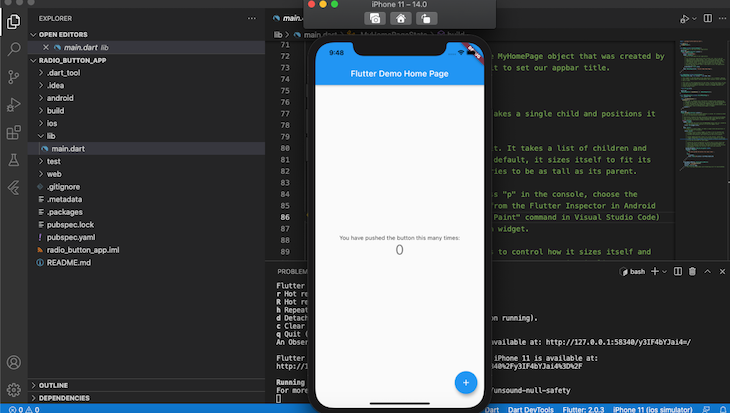
一旦初始化完成,打开您的Android模拟器或iOS模拟器。导航到stripe_app 文件夹,用下面的命令运行该应用程序。
cd radio_button_app && flutter run
你的应用程序看起来应该与下面的截图相似,表明你的应用程序安装成功了。
在Flutter中建立一个单选按钮
首先,让我们使用FlutterMaterial Components部件构建一个单选按钮。通过将下面的代码添加到main.dart 文件的顶部来导入该包。
import 'package:flutter/material.dart';
创建一个无状态小部件
接下来,我们需要创建一个无状态的部件,它是不可改变的,允许我们在它上面建立其他应用程序。让我们创建一个名为MyApp 的无状态部件,它将作为根部件并容纳我们应用程序的支架。将下面的代码添加到main.dart 。
void main() => runApp(const MyApp());

class MyApp extends StatelessWidget {
  const MyApp({Key key}) : super(key: key);
  static const String _title = 'Radio buttons';

  @override
  Widget build(BuildContext context) {
    return MaterialApp(
      title: _title,
      debugShowCheckedModeBanner: false,
      theme: ThemeData(
        primaryColor: Colors.black,
        accentColor: Colors.black,
        ),
      home: Scaffold(
        appBar: AppBar(title: const Text(_title)),
        body: const Center(
          child: MyStatefulWidget(),
        ),
      ),
    );
  }
}
在上面的代码中,我们把MyApp widget传递给runApp 函数,使其成为widget树的根。
void main() => runApp(const MyApp());
MyApp widget并不持有任何状态。因此,为了构建像单选按钮这样的可变或有状态的部件,我们需要创建一个有状态的部件,并把它作为一个子部件传递给根部件。
child: MyStatefulWidget(),
创建一个有状态的部件
接下来,让我们通过添加下面的代码到main.dart 来创建MyStatefulWidget 。
class MyStatefulWidget extends StatefulWidget {
  const MyStatefulWidget({Key key}) : super(key: key);
  @override
  State<MyStatefulWidget> createState() => _MyStatefulWidgetState();
}
MyStatefulWidget 依赖于一个私有状态,该状态由createState ,一个立即调用的函数(IIF)触发。因此,MyStatefulWidget 调用_MyStatefulWidgetState 私有状态。
为了建立_MyStatefulWidgetState 私有状态,让我们在我们的main.dart 文件中添加下面的代码。
class _MyStatefulWidgetState extends State<MyStatefulWidget> {
  Pet _pet = Pet.dog;

  @override
  Widget build(BuildContext context) {

    return Column(

      children: <Widget>[
        ListTile(
          title: const Text('Dog'),
          leading: Radio<Pet>(
            fillColor: MaterialStateColor.resolveWith((states) => Colors.green),
            focusColor: MaterialStateColor.resolveWith((states) => Colors.green),
            value: Pet.dog,
            groupValue: _pet,
            onChanged: (Pet value) {
              setState(() {
                _pet = value;
              });
            },
          ),
        ),
        ListTile(
          title: const Text('Cart'),
          leading: Radio<Pet>(
            fillColor: MaterialStateColor.resolveWith((states) => Colors.green),
            value: Pet.cat,
            groupValue: _pet,
            onChanged: (Pet value) {
              setState(() {
                _pet = value;
              });
            },
          ),
        ),
      ],
    );
  }
}
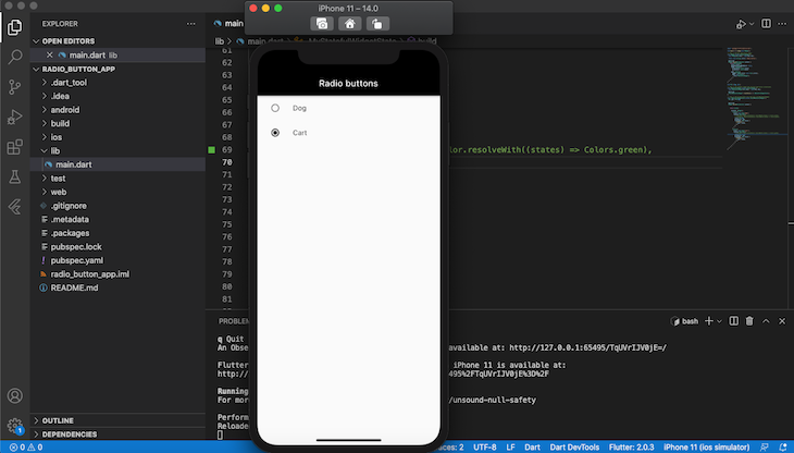
在这个例子中,我们将创建一个简单的放射状按钮,要求用户在猫或狗之间进行选择。首先,我们将Pet 的值设置为Pet.dog ,这是在main.dart 的全局上下文中声明的一个枚举。
enum Pet { dog, cat }
你可以在main.dart 的任何地方添加枚举值的代码,只要它可以通过全局上下文访问。
每个单选按钮都是用ListTile 材质类构建的,允许文本、图标和按钮的组合。
每个被选中的选项的值被传递到groupValue ,它由MyStatefulWidget 维护。每当一个单选按钮被选中,按钮的状态就会被更新,将_pet 的值改为当前选中的选项。
这一部分的完整代码在下面。
import 'package:flutter/material.dart';
void main() => runApp(const MyApp());
/// This is the main application widget.
class MyApp extends StatelessWidget {
  const MyApp({Key key}) : super(key: key);
  static const String _title = 'Radio buttons';

  @override
  Widget build(BuildContext context) {
    return MaterialApp(
      title: _title,
      debugShowCheckedModeBanner: false,
      theme: ThemeData(
        primaryColor: Colors.black,
        accentColor: Colors.black,
        ),
      home: Scaffold(
        appBar: AppBar(title: const Text(_title)),
        body: const Center(
          child: MyStatefulWidget(),
        ),
      ),
    );
  }
}
enum Pet { dog, cat }
/// This is the stateful widget that the main application instantiates.
class MyStatefulWidget extends StatefulWidget {
  const MyStatefulWidget({Key key}) : super(key: key);
  @override
  State<MyStatefulWidget> createState() => _MyStatefulWidgetState();
}
/// This is the private State class that goes with MyStatefulWidget.
class _MyStatefulWidgetState extends State<MyStatefulWidget> {
  Pet _pet = Pet.dog;

  @override
  Widget build(BuildContext context) {

    return Column(

      children: <Widget>[
        ListTile(
          title: const Text('Dog'),
          leading: Radio<Pet>(
            value: Pet.dog,
            groupValue: _pet,
            onChanged: (Pet value) {
              setState(() {
                _pet = value;
              });
            },
          ),
        ),
        ListTile(
          title: const Text('Cart'),
          leading: Radio<Pet>(
            value: Pet.cat,
            groupValue: _pet,
            onChanged: (Pet value) {
              setState(() {
                _pet = value;
              });
            },
          ),
        ),
      ],
    );
  }
}
当你运行你的应用程序时,它看起来应该与下面的截图相似。
设计一个单选按钮的样式
现在我们已经在Flutter中完成了我们的单选按钮,我们可以使用造型属性来改变它的外观和感觉,如activeColor,focusColor,fillColor, 和hoverColor 。
让我们用Start copy 和End copy 之间的代码更新我们的两个ListTile 组件。
ListTile(
          title: const Text('Dog'),
          leading: Radio<Pet>(
//Start copy
            fillColor: MaterialStateColor.resolveWith((states) => Colors.green),
            focusColor: MaterialStateColor.resolveWith((states) => Colors.green),
// End copy
            value: Pet.dog,
            groupValue: _pet,
            onChanged: (Pet value) {
              setState(() {
                _pet = value;
              });
            },
          ),
        ),
现在,你的应用程序应该看起来像下面的屏幕截图。

在Flutter中定制一个单选按钮
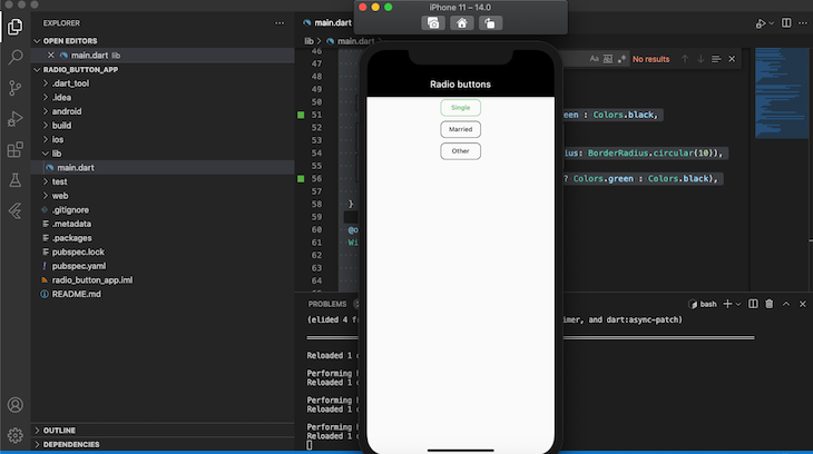
虽然它是功能性的,但默认的单选按钮可能太简单了,不符合你的需求,这取决于你所构建的应用程序的类型。现在我们知道了如何使用默认的Flutter单选部件来建立一个单选按钮,让我们为更高级的用例建立我们自己的自定义单选按钮。
首先,让我们创建我们自己的widget,名为CustomRadioButton 。
int value = 0;
Widget CustomRadioButton(String text, int index){
      return OutlineButton(onPressed: (){
        setState(() {
          value = index;
        });
      },
      child: Text(
        text,
        style: TextStyle(
          color: (value == index) ? Colors.green  : Colors.black,
        ),
      ),
      shape: RoundedRectangleBorder(borderRadius: BorderRadius.circular(10)),
      borderSide: BorderSide(color: (value == index) ? Colors.green  : Colors.black),
      );
  }
在上面的代码中,我们使用OutlineButton 来建立我们的单选按钮,类似于我们在上一节中使用ListStyle 的方式。
CustomRadioButton 小组件有两个参数,text 和index 。text 是单选的名称,而index 包含当前选择的单选的索引号。
当用户选择一个按钮时,index 的value 将根据在CustomRadioButton 上设置的值被更新,导致Radio 按钮以新的状态重新渲染。
让我们建立一个单选按钮,要求用户在单身、已婚或其他之间进行选择。
import 'package:flutter/material.dart';
void main() => runApp(const MyApp());
/// This is the main application widget.
class MyApp extends StatelessWidget {
  const MyApp({Key key}) : super(key: key);
  static const String _title = 'Radio buttons';
  @override
  Widget build(BuildContext context) {
    return MaterialApp(
      title: _title,
      debugShowCheckedModeBanner: false,
      theme: ThemeData(
        primaryColor: Colors.black,
        accentColor: Colors.black,
      ),
      home: Scaffold(
        appBar: AppBar(title: const Text(_title)),
        body: const Center(
          child: MyStatefulWidget(),
        ),
      ),
    );
  }
}
/// This is the stateful widget that the main application instantiates.
class MyStatefulWidget extends StatefulWidget {
  const MyStatefulWidget({Key key}) : super(key: key);
  @override
  State<MyStatefulWidget> createState() => _MyStatefulWidgetState();
}
/// This is the private State class that goes with MyStatefulWidget.
class _MyStatefulWidgetState extends State<MyStatefulWidget> {
  int value = 0;
  Widget CustomRadioButton(String text, int index) {
    return OutlineButton(
      onPressed: () {
        setState(() {
          value = index;
        });
      },
      child: Text(
        text,
        style: TextStyle(
          color: (value == index) ? Colors.green : Colors.black,
        ),
      ),
      shape: RoundedRectangleBorder(borderRadius: BorderRadius.circular(10)),
      borderSide:
          BorderSide(color: (value == index) ? Colors.green : Colors.black),
    );
  }
  @override
  Widget build(BuildContext context) {
    return Column(
      children: <Widget>[
        CustomRadioButton("Single", 1),
        CustomRadioButton("Married", 2),
        CustomRadioButton("Other", 3)
      ],
    );
  }
}
上述代码的输出应该与下面的屏幕截图相似。
结论
单选按钮因其简单有效而成为流行的UI元素,特别是在移动应用程序中。在本教程中,我们使用默认的Flutter单选按钮部件建立了一个简单的单选按钮,我们还建立了自己的部件来定制和设计一个复杂的单选按钮。我希望你喜欢这个教程!
创建和定制Flutter单选按钮》一文出现在LogRocket博客上。
