

如今,我们做什么都用刷子的手势。它只是觉得在我们的屏幕上留下肮脏的污点是很直观的。无论你是在寻找约会,还是在浏览外卖,或者是在查看你的银行余额--无论你在手机上做什么,你都知道这个惯例:刷卡,刷卡,点击
在本教程中,我们将使用Expo为各种用例构建五个不同的React Native刷卡器组件。我们将涵盖以下内容。
- 创建一个Expo项目
- 构建一个介绍性屏幕
[FlatList](#flatlist)[DATA](#data)[material-top-tabs](#material-top-tabs)[react-native-snap-carousel](#react-native-snap-carousel)[react-native-swipe-list-view](#react-native-swipe-list-view)
如果你想跟着学习,我已经为我们所涉及的每个组件创建了一个分支。
[react-native-app-intro-slider](https://github.com/Jacse/react-native-app-intro-slider)[FlatList](https://reactnative.dev/docs/flatlist)[@react-navigation/material-top-tabs](https://reactnavigation.org/docs/material-top-tab-navigator/)[react-native-snap-carousel](https://github.com/meliorence/react-native-snap-carousel)[react-native-swipe-list-view](https://github.com/jemise111/react-native-swipe-list-view)
下面是我们要做的东西的一个偷窥。一如既往,你可以在我的GitHub上找到完整的代码。
创建一个世博项目
初始化你的项目,并选择tabs (TypeScript) (如果你想跟着JavaScript走,你可以从代码示例中删除类型定义)。
expo init RN-swiper-components && cd RN-swiper-components
现在你只需要启动你喜欢的IDE,我们就可以开始了。如果你使用的是VS Code,你可以用打开项目。
code .
构建一个介绍性屏幕
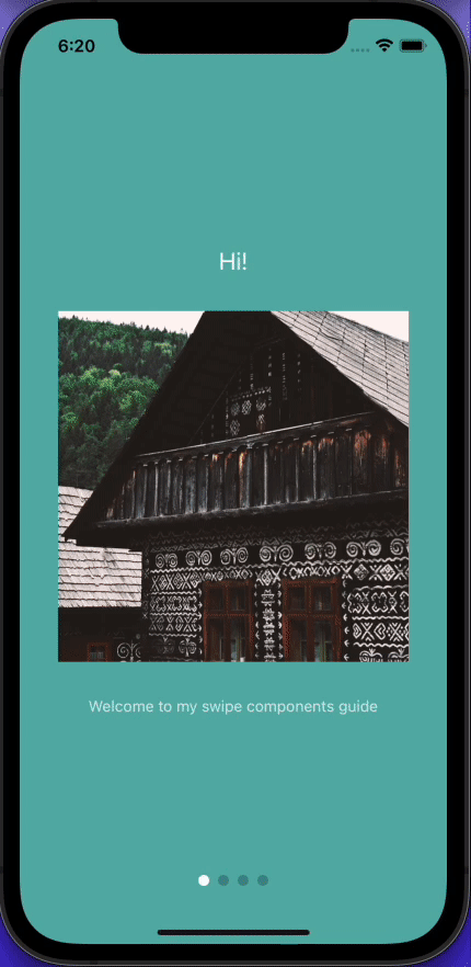
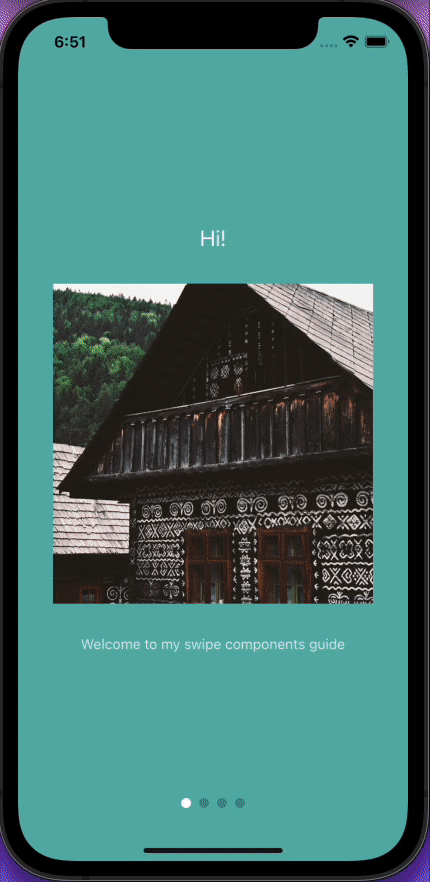
第一印象很重要,所以让我们建立一个让用户大吃一惊的介绍屏幕。React Native App Intro Slider是一个易于使用的应用介绍库,它使用React Native FlatList。
expo install react-native-app-intro-slider
我们的介绍幻灯片使用四张随机图片。你可以添加你自己的并重命名它们,或者在这里下载例子,然后将它们添加到assets/images 。
在你的screens 文件夹内,创建一个名为Intro.tsx 的文件并添加以下内容。
// Intro.tsx
import { StackNavigationProp } from "@react-navigation/stack";
import React, { useRef } from "react";
import {
  View,
  SafeAreaView,
  Text,
  Image,
  StyleSheet,
  StatusBar,
  Pressable,
} from "react-native";
import AppIntroSlider from "react-native-app-intro-slider";
import { RootStackParamList } from "../types";
const data = [
  {
    title: "Hi!",
    text: "Welcome to my swipe components guide",
    image: require("../assets/images/1.jpg"),
    bg: "#59b2ab",
  },
  {
    title: "Coming up...",
    text: "Lot's of cool libraries!",
    image: require("../assets/images/2.jpg"),
    bg: "#febe29",
  },
  {
    title: "Guess what!?",
    text: "This is the first swipe component!",
    image: require("../assets/images/3.jpg"),
    bg: "#22bcb5",
  },
  {
    title: "Time to gimme your data",
    text: "Joking!",
    image: require("../assets/images/4.jpg"),
    bg: "#febe29",
  },
];
type Item = typeof data[0];
type RenderPaginationProps = {
  data: any[];
  activeIndex: number;
  slider: AppIntroSlider | null;
  onIntroCompleted: () => void;
};
type IntroNavigationProps = StackNavigationProp<RootStackParamList, "Intro">;
interface IntroProps {
  navigation: IntroNavigationProps;
}
const styles = StyleSheet.create({
  slide: {
    flex: 1,
    alignItems: "center",
    justifyContent: "center",
    backgroundColor: "blue",
  },
  image: {
    width: 320,
    height: 320,
    marginVertical: 32,
  },
  text: {
    color: "rgba(255, 255, 255, 0.8)",
    textAlign: "center",
  },
  title: {
    fontSize: 22,
    color: "white",
    textAlign: "center",
  },
  paginationContainer: {
    position: "absolute",
    bottom: 16,
    left: 16,
    right: 16,
  },
  paginationDots: {
    height: 16,
    margin: 16,
    flexDirection: "row",
    justifyContent: "center",
    alignItems: "center",
  },
  dot: {
    width: 10,
    height: 10,
    borderRadius: 5,
    marginHorizontal: 4,
  },
  buttonContainer: {
    flexDirection: "row",
    marginHorizontal: 24,
  },
  button: {
    flex: 1,
    paddingVertical: 20,
    marginHorizontal: 8,
    borderRadius: 24,
    backgroundColor: "#1cb278",
  },
  buttonText: {
    color: "white",
    fontWeight: "600",
    textAlign: "center",
  },
});
const renderItem = ({ item }: { item: Item }) => (
  <View
    style={[
      styles.slide,
      {
        backgroundColor: item.bg,
      },
    ]}>
    <Text style={styles.title}>{item.title}</Text>
    <Image source={item.image} style={styles.image} />
    <Text style={styles.text}>{item.text}</Text>
  </View>
);
const RenderPagination = ({
  activeIndex,
  slider,
  data,
  onIntroCompleted,
}: RenderPaginationProps) => {
  const handleIntroCompleted = () => {
    onIntroCompleted();
  };
  return (
    <View style={styles.paginationContainer}>
      <SafeAreaView>
        <View style={styles.paginationDots}>
          {data.length > 1 &&
            data.map((_, i) => (
              <Pressable
                key={i}
                style={[
                  styles.dot,
                  i === activeIndex
                    ? { backgroundColor: "white" }
                    : { backgroundColor: "rgba(0, 0, 0, 0.2)" },
                ]}
                onPress={() => slider?.goToSlide(i, true)}
              />
            ))}
        </View>
        {activeIndex === data.length - 1 && (
          <View style={styles.buttonContainer}>
            <Pressable
              onPress={handleIntroCompleted}
              style={[styles.button, { backgroundColor: "#023e3f" }]}>
              <Text style={styles.buttonText}>Log in</Text>
            </Pressable>
            <Pressable onPress={handleIntroCompleted} style={styles.button}>
              <Text style={styles.buttonText}>Sign up</Text>
            </Pressable>
          </View>
        )}
      </SafeAreaView>
    </View>
  );
};
export const Intro = ({ navigation }: IntroProps) => {
  const sliderEl = useRef(null);
  const keyExtractor = (item: Item) => item.title;
  const onIntroCompleted = () => {
    navigation.navigate("Root");
  };
  return (
    <View style={{ flex: 1 }}>
      <StatusBar translucent backgroundColor="transparent" />
      <AppIntroSlider
        keyExtractor={keyExtractor}
        renderItem={renderItem}
        renderPagination={(activeIndex) => (
          <RenderPagination
            data={data}
            activeIndex={activeIndex}
            slider={sliderEl.current}
            onIntroCompleted={onIntroCompleted}
          />
        )}
        data={data}
        ref={sliderEl}
      />
    </View>
  );
};
<AppIntroSlider /> 是所有魔法发生的地方,所以让我们深入挖掘。renderItem 从data 中获取一个项目并将其渲染到列表中。
<AppIntroSlider
        keyExtractor={keyExtractor}
        renderItem={renderItem}
        renderPagination={(activeIndex) => (
          <RenderPagination
            data={data}
            activeIndex={activeIndex}
            slider={sliderEl.current}
            onIntroCompleted={onIntroCompleted}
          />
        )}
        data={data}
        ref={sliderEl}
      />
renderPagination 使用相同的data 数组来跟踪列表中的当前项目。我们从可变的useRef 对象中提供activeIndex 和当前值,以及一个回调函数。
renderPagination 函数包含幻灯片末尾的注册和登录按钮的逻辑,并提供屏幕底部的小导航点。这个教程是关于滑动的,但值得注意的是,这些小圆点是可以点击的。
当activeIndex 与阵列的长度相匹配时,就会显示按钮。
 {activeIndex === data.length - 1 && (
         ...
        )}
为了确保介绍屏幕显示为第一个屏幕,在导航文件夹中打开index.tsx ,并粘贴以下内容。
import {
  NavigationContainer,
  DefaultTheme,
  DarkTheme,
} from "@react-navigation/native";
import { createStackNavigator } from "@react-navigation/stack";
import * as React from "react";
import { ColorSchemeName } from "react-native";
import { Intro } from "../screens/Intro";
import NotFoundScreen from "../screens/NotFoundScreen";
import { RootStackParamList } from "../types";
import BottomTabNavigator from "./BottomTabNavigator";
import LinkingConfiguration from "./LinkingConfiguration";
export default function Navigation({
  colorScheme,
}: {
  colorScheme: ColorSchemeName;
}) {
  return (
    <NavigationContainer
      linking={LinkingConfiguration}
      theme={colorScheme === "dark" ? DarkTheme : DefaultTheme}>
      <RootNavigator />
    </NavigationContainer>
  );
}

const Stack = createStackNavigator<RootStackParamList>();
function RootNavigator() {
  return (
    <Stack.Navigator screenOptions={{ headerShown: false }}>
      <Stack.Screen name="Intro" component={Intro} />
      <Stack.Screen name="Root" component={BottomTabNavigator} />
      <Stack.Screen
        name="NotFound"
        component={NotFoundScreen}
        options={{ title: "Oops!" }}
      />
    </Stack.Navigator>
  );
}
在根项目文件夹中打开types.tsx ,并编辑RootStackParamList ,使其看起来像这样(如果你使用的是JavaScript,则跳过这一步)。
export type RootStackParamList = {
  Intro: undefined;
  Root: undefined;
  NotFound: undefined;
};
现在重新启动你的应用程序,你就有了你的介绍幻灯片。在这一点上,你可以实现你的注册/签到逻辑,并导航到相关的屏幕。但我们在这里是刷卡,而不是打字。所以,请继续往前走,进入下一个组件!
FlatList
FlatList 是许多刷卡器库的后台,所以它是我们了解情况的一个好地方。
在组件文件夹中,创建一个名为FlatList.tsx 的文件并粘贴以下内容。
import React from "react";
import {
  SafeAreaView,
  View,
  FlatList,
  StyleSheet,
  Text,
  Image,
} from "react-native";
import { DATA } from "../utils";
type ItemProps = typeof DATA[0];
const Item = ({ title, image, id }: ItemProps) => (
  <View key={id} style={styles.item}>
    <Image style={styles.image} source={{ uri: image }} />
    <Text style={styles.title}>{title}</Text>
  </View>
);
export const FlatListComponent = () => {
  const renderItem = ({ item }: { item: ItemProps }) => (
    <Item id={item.id} image={item.image} title={item.title} />
  );
  return (
    <SafeAreaView style={styles.container}>
      <FlatList
        data={DATA}
        renderItem={renderItem}
        keyExtractor={(item) => item.id}
        horizontal
      />
    </SafeAreaView>
  );
};
const styles = StyleSheet.create({
  container: {
    flex: 1,
  },
  item: {
    backgroundColor: "#2dbded",
    padding: 20,
    marginVertical: 8,
    marginHorizontal: 16,
    height: 200,
    width: 150,
  },
  title: {
    fontSize: 18,
  },
  image: {
    flex: 1,
  },
});
FlatList有一个名为horizontal 的属性,它将我们的标准可滚动FlatList 变成一个可滑动(左/右)组件。
<FlatList
        data={DATA}
        renderItem={renderItem}
        keyExtractor={(item) => item.id}
        horizontal
      />
DATA
为了提供跨组件的熟悉性,我已经创建了一个模拟数据函数,为我们其他的组件提供数据。跳回你的终端,安装Faker。
expo install faker && yarn add -D @types/faker
在你的项目文件夹的根部,创建一个名为utils 的文件夹,然后添加以下两个文件。
index.ts 。
export { DATA } from "./GenerateImages";
GenerateImages.tsx 。
import faker from "faker";
const generateImage = () => ({
  id: faker.datatype.uuid(),
  title: faker.lorem.words(3),
  image: "https://picsum.photos/200/300?random",
});
const generateImages = (numberOfImages: number) =>
  Array.from({ length: numberOfImages }, () => generateImage());
export const DATA = generateImages(20);
Faker提供了随机数据--在我们的例子中,我们的title 和一个随机的id 的三个单词。generateImages 函数生成了一个由20个对象组成的数组供我们玩耍。每个对象都有一个id,title, 和image 属性。
让我们看看我们已经得到了什么。转到 screens 文件夹中的TabOneScreen.tsx 并添加以下内容。
import * as React from "react";
import { StyleSheet } from "react-native";
import { FlatListComponent } from "../components/FlatList";
import { View } from "../components/Themed";
export default function TabOneScreen() {
  return (
    <View style={styles.container}>
      <FlatListComponent />
    </View>
  );
}
const styles = StyleSheet.create({
  container: {
    flex: 1,
  },
});
material-top-tabs
当我们初始化项目时,已经配置了React Navigation。它有一个很好的顶部标签组件,便于在标签之间实现流畅的滑动体验。要安装 [material-top-tabs](https://www.npmjs.com/package/@react-navigation/material-top-tabs):
expo install @react-navigation/material-top-tabs react-native-tab-view@^2.16.0
在组件文件夹中创建一个新文件,名为TopTabsBar.tsx 。
import { MaterialTopTabBarProps } from "@react-navigation/material-top-tabs";
import React, { FC } from "react";
import { Pressable, View } from "react-native";
import Animated from "react-native-reanimated";

interface TopTabsBarProps extends MaterialTopTabBarProps {}

export const TopTabsBar = ({
  state,
  descriptors,
  navigation,
  position,
}: TopTabsBarProps) => (
  <View
    style={{
      flexDirection: "row",
    }}>
    {state.routes.map((route, index) => {
      const { options } = descriptors[route.key];
      const label = options.title !== undefined ? options.title : route.name;
      const isFocused = state.index === index;
      const onPress = () => {
        const event = navigation.emit({
          type: "tabPress",
          target: route.key,
          canPreventDefault: true,
        });
        if (!isFocused && !event.defaultPrevented) {
          navigation.navigate(route.name);
        }
      };
      const onLongPress = () => {
        navigation.emit({
          type: "tabLongPress",
          target: route.key,
        });
      };
      const inputRange = state.routes.map((_: any, i: number) => i);
      const opacity = Animated.interpolateNode(position, {
        inputRange,
        outputRange: inputRange.map((i: number) => (i === index ? 1 : 0.2)),
      });
      return (
        <Pressable
          style={{
            flex: 1,
            padding: 10,
          }}
          key={index}
          onPress={onPress}
          onLongPress={onLongPress}>
          <Animated.Text style={{ opacity, textAlign: "center" }}>
            {label}
          </Animated.Text>
        </Pressable>
      );
    })}
  </View>
);
注意未被选中的屏幕的标题的不透明度是如何降低的。当你滑动时,不透明度逐渐变化的效果是通过对Text 组件不透明度的样式进行动画处理而产生的--将活动索引从1 (全不透明)变为0.2 。
现在,我们将创建两个占位符屏幕来测试我们的TopTabBar 组件。在你的屏幕文件夹中,创建以下两个文件。
Carousel.tsx 。
import * as React from "react";
import { StyleSheet, Text } from "react-native";
import { View } from "../components/Themed";
export const Carousel = () => {
  return (
    <View style={styles.container}>
      <View style={styles.separator} />
      <Text>Swipe left to go to the next tab</Text>
    </View>
  );
};
const styles = StyleSheet.create({
  container: {
    flex: 1,
  },
  separator: {
    marginVertical: 5,
    height: 30,
    width: "80%",
  },
});
SwipeList.tsx 。
import * as React from "react";
import { StyleSheet, Text } from "react-native";
import { View } from "../components/Themed";
export const SwipeList = () => {
  return (
    <View style={styles.container}>
      <View style={styles.separator} />
      <Text style={styles.text}>Swipe right to go back to the first tab</Text>
    </View>
  );
};
const styles = StyleSheet.create({
  container: {
    flex: 1,
  },
  separator: {
    marginVertical: 5,
    height: 30,
    width: "80%",
  },
  text: {
    textAlign: "center",
  },
});
在你的导航文件夹中,创建一个名为TopTabNavigator.tsx 的文件。
import React from "react";
import { createMaterialTopTabNavigator } from "@react-navigation/material-top-tabs";
import { TopTabsBar } from "../components/TopTabsBar";
import { Carousel } from "../screens/Carousel";
import { SwipeList } from "../screens/SwipeList";
export type TopTabParamList = {
  Carousel: undefined;
  SwipeList: undefined;
};
const { Navigator, Screen } = createMaterialTopTabNavigator<TopTabParamList>();
export const TopTabNavigator = () => (
  <Navigator
    tabBar={(props) => <TopTabsBar {...props} />}
    initialRouteName="Carousel">
    <Screen
      name="Carousel"
      component={Carousel}
      options={{ title: "Carousel" }}
    />
    <Screen
      name="SwipeList"
      component={SwipeList}
      options={{ title: "Swipe List" }}
    />
  </Navigator>
);
更新types.tsx 与。
export type RootStackParamList = {
  Intro: undefined;
  Root: undefined;
  NotFound: undefined;
};
export type BottomTabParamList = {
  TabOne: undefined;
  TabTwo: undefined;
};
export type TabOneParamList = {
  TabOneScreen: undefined;
};
export type TabTwoParamList = {
  TopTabNavigator: undefined;
};
为了在TabTwo 上显示我们的TopTabNavigator ,用以下内容编辑BottomTabNavigator.tsx 。
import { Ionicons } from "@expo/vector-icons";
import { createBottomTabNavigator } from "@react-navigation/bottom-tabs";
import { createStackNavigator } from "@react-navigation/stack";
import * as React from "react";
import Colors from "../constants/Colors";
import useColorScheme from "../hooks/useColorScheme";
import TabOneScreen from "../screens/TabOneScreen";
import TabTwoScreen from "../screens/TabTwoScreen";
import { BottomTabParamList, TabOneParamList, TabTwoParamList } from "../types";
import { TopTabNavigator } from "./TopTabNavigator";
const BottomTab = createBottomTabNavigator<BottomTabParamList>();
export default function BottomTabNavigator() {
  const colorScheme = useColorScheme();
  return (
    <BottomTab.Navigator
      initialRouteName="TabOne"
      tabBarOptions={{ activeTintColor: Colors[colorScheme].tint }}>
      <BottomTab.Screen
        name="TabOne"
        component={TabOneNavigator}
        options={{
          tabBarIcon: ({ color }) => (
            <TabBarIcon name="ios-code" color={color} />
          ),
        }}
      />
      <BottomTab.Screen
        name="TabTwo"
        component={TabTwoNavigator}
        options={{
          tabBarIcon: ({ color }) => (
            <TabBarIcon name="ios-code" color={color} />
          ),
        }}
      />
    </BottomTab.Navigator>
  );
}

function TabBarIcon(props: {
  name: React.ComponentProps<typeof Ionicons>["name"];
  color: string;
}) {
  return <Ionicons size={30} style={{ marginBottom: -3 }} {...props} />;
}

const TabOneStack = createStackNavigator<TabOneParamList>();
function TabOneNavigator() {
  return (
    <TabOneStack.Navigator>
      <TabOneStack.Screen
        name="TabOneScreen"
        component={TabOneScreen}
        options={{ headerTitle: "Swipe-able FlatList" }}
      />
    </TabOneStack.Navigator>
  );
}
const TabTwoStack = createStackNavigator<TabTwoParamList>();
function TabTwoNavigator() {
  return (
    <TabTwoStack.Navigator>
      <TabTwoStack.Screen
        name="TopTabNavigator"
        component={TopTabNavigator}
      />
    </TabTwoStack.Navigator>
  );
}
react-native-snap-carousel

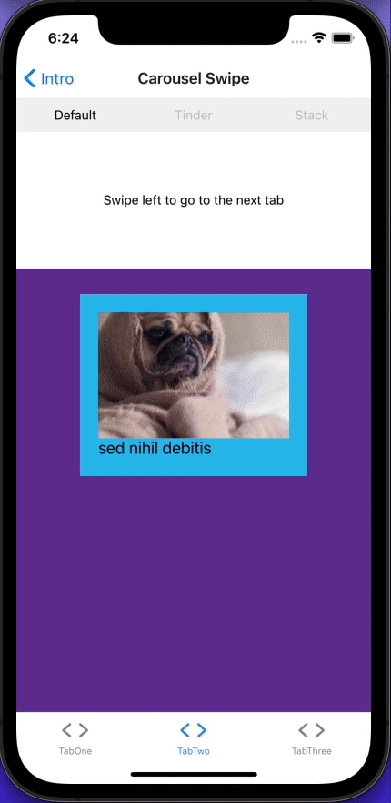
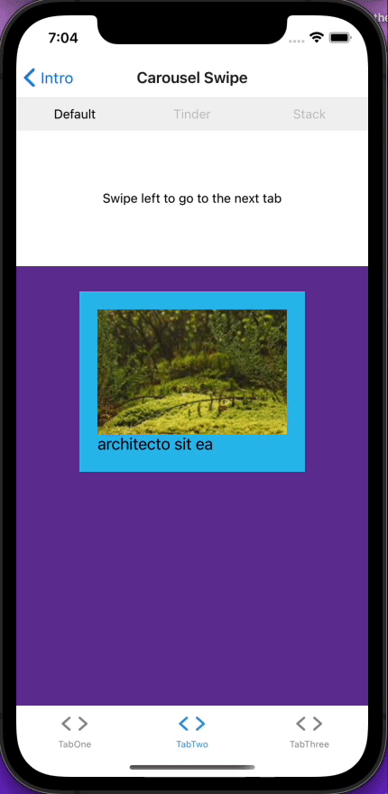
在GitHub上有8.6K颗星,每月有50多万次下载。 [react-native-snap-carousel](https://github.com/meliorence/react-native-snap-carousel)是一个非常受欢迎的库。它有三种内置的布局--默认、堆栈和tinder--我们将探讨所有这些布局。但如果这还不够,你可以创建你自己的自定义插图。
我们将创建三个屏幕,然后在我们之前创建的顶部标签组件中渲染它们。如果这是你一直在等待的,那就不要再等了。
expo install react-native-snap-carousel && yarn add -D @types/react-native-snap-carousel
当我们创建FlatList 组件时,我们建立了一个名为Item 的组件。由于它返回一个带有标题和图片的卡片,现在可能是重构代码并创建一个可重用的Card 组件的好时机。
创建components/Card.tsx 。
import React from "react";
import { View, Text, StyleSheet, Image } from "react-native";
import { DATA } from "../utils";
export type CardProps = typeof DATA[0];
export const Card = ({ title, image, id }: CardProps) => (
  <View key={id} style={styles.container}>
    <View key={id} style={styles.item}>
      <Image style={styles.image} source={{ uri: image }} />
      <Text style={styles.title}>{title}</Text>
    </View>
  </View>
);
const styles = StyleSheet.create({
  container: {
    flex: 1,
    alignItems: "center",
  },
  item: {
    backgroundColor: "#2dbded",
    padding: 20,
    marginVertical: 8,
    marginHorizontal: 16,
    height: 200,
    width: 250,
  },
  title: {
    fontSize: 18,
  },
  image: {
    flex: 1,
  },
});
编辑FlatList.tsx ,使用新的Card 组件。
import React from "react";
import { SafeAreaView, FlatList, StyleSheet } from "react-native";
import { DATA } from "../utils";
import { CardProps, Card } from "./Card";
export const FlatListComponent = () => {
  const renderItem = ({ item }: { item: CardProps }) => (
    <Card id={item.id} image={item.image} title={item.title} />
  );
  return (
    <SafeAreaView style={styles.container}>
      <FlatList
        data={DATA}
        renderItem={renderItem}
        keyExtractor={(item) => item.id}
        horizontal
      />
    </SafeAreaView>
  );
};
const styles = StyleSheet.create({
  container: {
    flex: 1,
  },
});
现在我们将创建一个可重用的Carousel 组件和三个屏幕来显示不同的内置布局。在你的组件文件夹中,创建一个名为Carousel.tsx 的文件并添加以下内容。
import React, { useState, useRef } from "react";
import { View } from "react-native";
import Carousel from "react-native-snap-carousel";
import { DATA } from "../utils";
import { CardProps, Card } from "./Card";
type LayoutProps = { layout?: "default" | "stack" | "tinder" | undefined };
export const CarouselComponent = ({ layout }: LayoutProps) => {
  const [_, setActiveIndex] = useState<number>(0);
  const carouselEl = useRef(null);
  const handleSnapToItem = (index: number) => {
    setActiveIndex(index);
  };
  const renderItem = ({ item, index }: { item: CardProps; index: number }) => (
    <Card key={index} id={item.id} image={item.image} title={item.title} />
  );
  return (
    <View style={{ flex: 1, alignItems: "center" }}>
      <View
        style={{
          paddingTop: 20,
        }}>
        <Carousel
          layout={layout}
          ref={carouselEl}
          data={DATA}
          sliderWidth={300}
          itemWidth={300}
          renderItem={renderItem}
          onSnapToItem={(index) => handleSnapToItem(index)}
          layoutCardOffset={18}
          inactiveSlideScale={0.94}
          inactiveSlideOpacity={0.7}
          initialNumToRender={3}
        />
      </View>
    </View>
  );
};
Carousel 组件使用的是我们之前创建的Card 组件,所以它应该看起来很熟悉。如果你想添加像Intro 幻灯片中那样的分页,那是非常直接的。
// #1 Add activeIndex to useState
 const [activeIndex, setActiveIndex] = useState<number>(0);
// #2 create pagination function
const pagination = () => (
    <Pagination
      dotsLength={DATA.length}
      activeDotIndex={activeIndex}
      containerStyle={{ backgroundColor: "rgba(0, 0, 0, 0.75)" }}
      dotStyle={{
        width: 10,
        height: 10,
        borderRadius: 5,
        marginHorizontal: 8,
        backgroundColor: "rgba(255, 255, 255, 0.92)",
      }}
      inactiveDotStyle={
        {
          // Define styles for inactive dots here
        }
      }
      inactiveDotOpacity={0.4}
      inactiveDotScale={0.6}
    />
  );

// #3 Return it below your Carousel component.

return (
    <View style={{ flex: 1, alignItems: "center" }}>
      <View
        style={{
          paddingTop: 20,
        }}>
        <Carousel
          {...}
        />
        {pagination()}
      </View>
    </View>
  );
现在,Carousel 组件已经全部设置好了,现在是消耗它的时候了。在screen文件夹中创建三个新文件,并添加以下代码。
DefaultCarousel.tsx 。
import * as React from "react";
import { StyleSheet, Text } from "react-native";
import { CarouselComponent } from "../components/Carousel";
import { View } from "../components/Themed";
export const DefaultCarousel = () => {
  return (
    <View style={styles.container}>
      <View style={styles.separator}>
        <Text style={styles.text}>Swipe left to go to the next tab</Text>
      </View>
      <CarouselComponent layout="default" />
    </View>
  );
};
const styles = StyleSheet.create({
  container: {
    flex: 1,
    alignItems: "center",
    backgroundColor: "rebeccapurple",
  },
  separator: {
    width: "100%",
    height: 150,
    justifyContent: "center",
  },
  text: {
    textAlign: "center",
  },
});
StackCarousel.tsx 。
import * as React from "react";
import { StyleSheet, Text } from "react-native";
import { CarouselComponent } from "../components/Carousel";
import { View } from "../components/Themed";
export const StackCarousel = () => {
  return (
    <View style={styles.container}>
      <View style={styles.separator}>
        <Text style={styles.text}>Swipe right to go to go back</Text>
      </View>
      <CarouselComponent layout="stack" />
    </View>
  );
};
const styles = StyleSheet.create({
  container: {
    flex: 1,
    alignItems: "center",
    backgroundColor: "rebeccapurple",
  },
  separator: {
    width: "100%",
    height: 150,
    justifyContent: "center",
  },
  text: {
    textAlign: "center",
  },
});
TinderCarousel.tsx 。
import React from "react";
import { StyleSheet, Text } from "react-native";
import { CarouselComponent } from "../components/Carousel";
import { View } from "../components/Themed";
export const TinderCarousel = () => {
  return (
    <View style={styles.container}>
      <View style={styles.separator}>
        <Text style={styles.text}>Swipe left or right</Text>
      </View>
      <CarouselComponent layout="tinder" />
    </View>
  );
};
const styles = StyleSheet.create({
  container: {
    flex: 1,
    alignItems: "center",
    backgroundColor: "rebeccapurple",
  },
  separator: {
    width: "100%",
    height: 150,
    justifyContent: "center",
  },
  text: {
    textAlign: "center",
  },
});
转到你的导航文件夹中的TopTabNavigator ,并将其编辑成这样。
import React from "react";
import { createMaterialTopTabNavigator } from "@react-navigation/material-top-tabs";
import { TopTabsBar } from "../components/TopTabsBar";
import { DefaultCarousel } from "../screens/DefaultCarousel";
import { TinderCarousel } from "../screens/TinderCarousel";
import { StackCarousel } from "../screens/StackCarousel";
export type TopTabParamList = {
  Default: undefined;
  Tinder: undefined;
  Stack: undefined;
};
const { Navigator, Screen } = createMaterialTopTabNavigator<TopTabParamList>();
export const TopTabNavigator = () => (
  <Navigator
    tabBar={(props) => <TopTabsBar {...props} />}
    initialRouteName="Default">
    <Screen
      name="Default"
      component={DefaultCarousel}
      options={{ title: "Default " }}
    />
    <Screen
      name="Tinder"
      component={TinderCarousel}
      options={{ title: "Tinder" }}
    />
    <Screen
      name="Stack"
      component={StackCarousel}
      options={{ title: "Stack" }}
    />
  </Navigator>
);
前往BottomTabNavigator ,并将其更新为以下内容。
import { Ionicons } from "@expo/vector-icons";
import { createBottomTabNavigator } from "@react-navigation/bottom-tabs";
import { createStackNavigator } from "@react-navigation/stack";
import * as React from "react";
import Colors from "../constants/Colors";
import useColorScheme from "../hooks/useColorScheme";
import TabOneScreen from "../screens/TabOneScreen";
import { BottomTabParamList, TabOneParamList, TabTwoParamList } from "../types";
import { TopTabNavigator } from "./TopTabNavigator";
const BottomTab = createBottomTabNavigator<BottomTabParamList>();
export default function BottomTabNavigator() {
  const colorScheme = useColorScheme();
  return (
    <BottomTab.Navigator
      initialRouteName="TabOne"
      tabBarOptions={{ activeTintColor: Colors[colorScheme].tint }}>
      <BottomTab.Screen
        name="TabOne"
        component={TabOneNavigator}
        options={{
          tabBarIcon: ({ color }) => (
            <TabBarIcon name="ios-code" color={color} />
          ),
        }}
      />
      <BottomTab.Screen
        name="TabTwo"
        component={TabTwoNavigator}
        options={{
          tabBarIcon: ({ color }) => (
            <TabBarIcon name="ios-code" color={color} />
          ),
        }}
      />
    </BottomTab.Navigator>
  );
}
function TabBarIcon(props: {
  name: React.ComponentProps<typeof Ionicons>["name"];
  color: string;
}) {
  return <Ionicons size={30} style={{ marginBottom: -3 }} {...props} />;
}
const TabOneStack = createStackNavigator<TabOneParamList>();
function TabOneNavigator() {
  return (
    <TabOneStack.Navigator>
      <TabOneStack.Screen
        name="TabOneScreen"
        component={TabOneScreen}
        options={{ headerTitle: "Swipe-able FlatList" }}
      />
    </TabOneStack.Navigator>
  );
}
const TabTwoStack = createStackNavigator<TabTwoParamList>();
function TabTwoNavigator() {
  return (
    <TabTwoStack.Navigator>
      <TabTwoStack.Screen
        name="TopTabNavigator"
        component={TopTabNavigator}
        options={{ headerTitle: "Carousel Swipe" }}
      />
    </TabTwoStack.Navigator>
  );
}
react-native-swipe-list-view
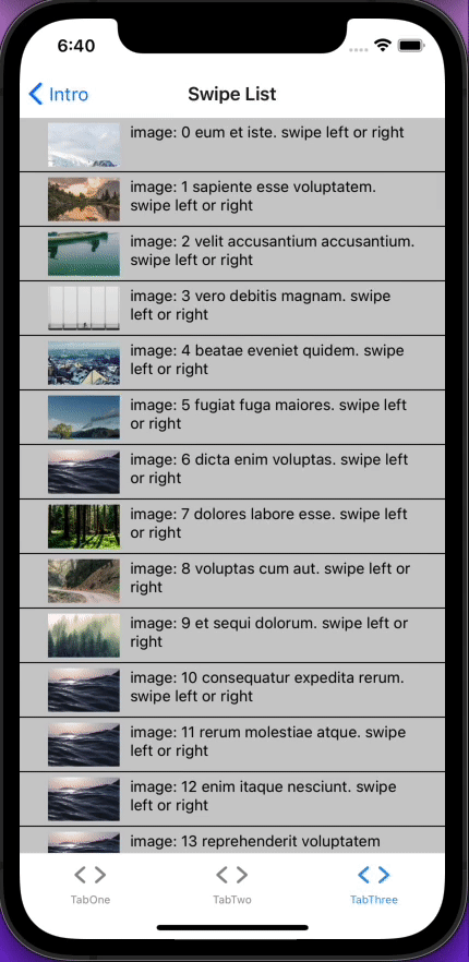
如果你正在构建一个带有可滑动列表的应用程序,这个库适合你。 [react-native-snap-carousel](https://github.com/meliorence/react-native-snap-carousel)是一个垂直的ListView ,有动画的可滑动行。
不多说了,让我们安装它并开始吧。
expo install react-native-swipe-list-view
接下来你将需要垃圾桶的图片。从GitHub上下载它,并把它添加到assets/images 。
在你的组件文件夹中,创建一个名为SwipeList.tsx 的文件并添加以下内容。
import React, { useState } from "react";
import {
  Image,
  StyleSheet,
  Text,
  TouchableHighlight,
  View,
  TouchableOpacity,
  Alert,
} from "react-native";
import Animated from "react-native-reanimated";
import { SwipeListView } from "react-native-swipe-list-view";
import { DATA } from "../utils";
const initialList = DATA.map((data, index) => ({ ...data, key: `${index}` }));
const rowSwipeAnimatedValues: any = {};
initialList.forEach((_, i) => {
  rowSwipeAnimatedValues[`${i}`] = new Animated.Value(0);
});
type Item = typeof initialList[0];
const renderItem = ({ item }: { item: Item }) => (
  <TouchableHighlight
    onPress={() => console.log("You touched me")}
    style={styles.rowFront}
    underlayColor={"#AAA"}>
    <View style={styles.item}>
      <Image style={styles.image} source={{ uri: item.image }} />
      <Text style={styles.text}>
        image: {item.key} {item.title}. swipe left or right
      </Text>
    </View>
  </TouchableHighlight>
);
export const SwipeList = () => {
  const [listData, setListData] = useState(initialList);
  const closeRow = (rowMap: any, rowKey: string) => {
    console.log("this is the rowMap: ", rowMap);
    if (rowMap[rowKey]) {
      rowMap[rowKey].closeRow();
    }
  };
  const deleteRow = (rowMap: Map<string, Object>, rowKey: string) => {
    closeRow(rowMap, rowKey);
    const newData = [...listData];
    const prevIndex = listData.findIndex((item) => item.key === rowKey);
    newData.splice(prevIndex, 1);
    setListData(newData);
  };
  const alertRow = (rowMap: Map<string, Object>, rowKey: string) => {
    closeRow(rowMap, rowKey);
    const indexOfFilm: number = listData.findIndex(
      (item) => item.key === rowKey
    );
    Alert.alert("do something else with this item:", listData[indexOfFilm].key);
  };
  const onRowDidOpen = (rowKey: string) => {
    console.log("This row opened", rowKey);
  };
  const onSwipeValueChange = ({
    key,
    value,
  }: {
    key: string;
    value: number;
  }) => {
    rowSwipeAnimatedValues[key].setValue(Math.abs(value));
  };
  const renderHiddenItem = ({ item }: { item: Item }, rowMap: any) => (
    <View style={styles.rowBack}>
      <TouchableOpacity onPress={() => alertRow(rowMap, item.key)}>
        <Text>Click</Text>
      </TouchableOpacity>
      <TouchableOpacity
        style={[styles.backRightBtn, styles.backRightBtnLeft]}
        onPress={() => closeRow(rowMap, item.key)}>
        <Text style={styles.backTextWhite}>Close</Text>
      </TouchableOpacity>
      <TouchableOpacity
        style={[styles.backRightBtn, styles.backRightBtnRight]}
        onPress={() => deleteRow(rowMap, item.key)}>
        <Animated.View
          style={[
            styles.trash,
            {
              transform: [
                {
                  scale: rowSwipeAnimatedValues[item.key].interpolate({
                    inputRange: [45, 90],
                    outputRange: [0, 1],
                    extrapolate: "clamp",
                  }),
                },
              ],
            },
          ]}>
          <Image
            source={require("../assets/images/trash.png")}
            style={styles.trash}
          />
        </Animated.View>
      </TouchableOpacity>
    </View>
  );
  return (
    <View style={styles.container}>
      <SwipeListView
        data={listData}
        renderItem={renderItem}
        renderHiddenItem={renderHiddenItem}
        leftOpenValue={75}
        rightOpenValue={-150}
        previewRowKey={"0"}
        previewOpenValue={-40}
        previewOpenDelay={3000}
        onRowDidOpen={onRowDidOpen}
        onSwipeValueChange={onSwipeValueChange}
      />
    </View>
  );
};
const styles = StyleSheet.create({
  container: {
    backgroundColor: "white",
    flex: 1,
  },
  backTextWhite: {
    color: "#FFF",
  },
  rowFront: {
    alignItems: "center",
    backgroundColor: "#CCC",
    borderBottomColor: "black",
    borderBottomWidth: 1,
    justifyContent: "center",
    height: 50,
  },
  rowBack: {
    alignItems: "center",
    backgroundColor: "#DDD",
    flex: 1,
    flexDirection: "row",
    justifyContent: "space-between",
    paddingLeft: 15,
  },
  backRightBtn: {
    alignItems: "center",
    bottom: 0,
    justifyContent: "center",
    position: "absolute",
    top: 0,
    width: 75,
  },
  backRightBtnLeft: {
    backgroundColor: "blue",
    right: 75,
  },
  backRightBtnRight: {
    backgroundColor: "red",
    right: 0,
  },
  trash: {
    height: 25,
    width: 25,
  },
  item: {
    padding: 10,
    marginVertical: 8,
    marginHorizontal: 16,
    flexDirection: "row",
  },
  image: {
    flex: 1,
    alignContent: "flex-start",
    height: 40,
    width: 50,
  },
  text: {
    flex: 4,
    paddingLeft: 10,
  },
});
哇,这可是一大堆代码啊!我们把它分解一下。让我们把它分解一下。
首先,我们给我们原来的DATA 数组对象添加了一个新的key 属性。这是因为React Native Scroll List View要求你的DATA 数组对象包含一个key属性。否则,你必须向SwipeListView 传递一个keyExtractor 。
const initialList = DATA.map((data, index) => ({ ...data, key: `${index}` }));
我们初始化了rowSwipeAnimatedValues ,并为我们initialList 数组对象中的每个对象创建了一个新的动画值。
const rowSwipeAnimatedValues: any = {};
initialList.forEach((_, i) => {
  rowSwipeAnimatedValues[`${i}`] = new Animated.Value(0);
我们用initialList 来初始化传递给SwipeListView 组件 (data={listData}) 的状态。
closeRow,deleteRow, 和alertRow 是renderHiddenItem 的辅助函数。这是React Native Scroll List View的主要内容。
向右滑动暴露了该行左边的一个按钮。你可以通过onPress 道具对它做任何事情,但在本教程中,它为该行打开一个警报。如果你向左滑动,你会看到另外两个隐藏的按钮:一个关闭按钮来关闭暴露的按钮,以及一个随着你滑动而变大的动画垃圾桶。这种效果是通过将Image 包裹在一个动画的View 。
<Animated.View
          style={[
            styles.trash,
            {
              transform: [
                {
                  scale: rowSwipeAnimatedValues[item.key].interpolate({
                    inputRange: [45, 90],
                    outputRange: [0, 1],
                    extrapolate: "clamp",
                  }),
                },
              ],
            },
          ]}>
          <Image
            source={require("../assets/images/trash.png")}
            style={styles.trash}
          />
        </Animated.View>
现在我们已经建立了这个组件,现在是时候让你的屏幕变得漂亮和邋遢了。再过几步,你就可以回到你的滑动、滑动、点击的程序中去了。
在屏幕文件夹中,创建一个名为SwipeListView.tsx 的文件,并把这个粘贴进去。
import React from "react";
import { StyleSheet, View } from "react-native";
import { SwipeList } from "../components/SwipeList";
export const SwipeListViewScreen = () => {
  return (
    <View style={styles.container}>
      <SwipeList />
    </View>
  );
};
const styles = StyleSheet.create({
  container: {
    backgroundColor: "white",
    flex: 1,
  },
});
将BottomTabNavigator.tsx 改为。
import { Ionicons } from "@expo/vector-icons";
import { createBottomTabNavigator } from "@react-navigation/bottom-tabs";
import { createStackNavigator } from "@react-navigation/stack";
import * as React from "react";
import Colors from "../constants/Colors";
import useColorScheme from "../hooks/useColorScheme";
import { SwipeListViewScreen } from "../screens/SwipeListView";
import TabOneScreen from "../screens/TabOneScreen";
import {
  BottomTabParamList,
  TabOneParamList,
  TabTwoParamList,
} from "../types";
import { TopTabNavigator } from "./TopTabNavigator";
export type TabThreeParamList = {
  SwipeListView: undefined;
};
const BottomTab = createBottomTabNavigator<BottomTabParamList>();
export default function BottomTabNavigator() {
  const colorScheme = useColorScheme();
  return (
    <BottomTab.Navigator
      initialRouteName="TabOne"
      tabBarOptions={{ activeTintColor: Colors[colorScheme].tint }}>
      <BottomTab.Screen
        name="TabOne"
        component={TabOneNavigator}
        options={{
          tabBarIcon: ({ color }) => (
            <TabBarIcon name="ios-code" color={color} />
          ),
        }}
      />
      <BottomTab.Screen
        name="TabTwo"
        component={TabTwoNavigator}
        options={{
          tabBarIcon: ({ color }) => (
            <TabBarIcon name="ios-code" color={color} />
          ),
        }}
      />
      <BottomTab.Screen
        name="TabThree"
        component={TabThreeNavigator}
        options={{
          tabBarIcon: ({ color }) => (
            <TabBarIcon name="ios-code" color={color} />
          ),
        }}
      />
    </BottomTab.Navigator>
  );
}
function TabBarIcon(props: {
  name: React.ComponentProps<typeof Ionicons>["name"];
  color: string;
}) {
  return <Ionicons size={30} style={{ marginBottom: -3 }} {...props} />;
}
const TabOneStack = createStackNavigator<TabOneParamList>();
function TabOneNavigator() {
  return (
    <TabOneStack.Navigator>
      <TabOneStack.Screen
        name="TabOneScreen"
        component={TabOneScreen}
        options={{ headerTitle: "Swipe-able FlatList" }}
      />
    </TabOneStack.Navigator>
  );
}
const TabTwoStack = createStackNavigator<TabTwoParamList>();
function TabTwoNavigator() {
  return (
    <TabTwoStack.Navigator>
      <TabTwoStack.Screen
        name="TopTabNavigator"
        component={TopTabNavigator}
        options={{ headerTitle: "Carousel Swipe" }}
      />
    </TabTwoStack.Navigator>
  );
}
const TabThreeStack = createStackNavigator<TabThreeParamList>();
function TabThreeNavigator() {
  return (
    <TabThreeStack.Navigator>
      <TabThreeStack.Screen
        name="SwipeListView"
        component={SwipeListViewScreen}
        options={{ headerTitle: "Swipe List" }}
      />
    </TabThreeStack.Navigator>
  );
}
结语
我们已经介绍了React Native App Intro Slider,React Native的FlatList组件,React Navigation Material Top Tabs,React Native Snap Carousel,以及React Native Swipe List View。到现在,你应该对使用React Native FlatList的库创建动画刷卡器组件感到非常舒服了。
The postImplementing swiper components in React Nativeappeared first onLogRocket Blog.
