开端
使用echarts
1.使用npm下载echarts依赖
2.在main.js里引入echarts
import * as echarts from "echarts"
3.在mian.js里将echarts绑定在vue原型上,方便多个页面使用
4.在页面组件里使用
<div ref="drawLineContentTrend"
v-loading="loading.pie"
element-loading-text="数据加载中"
element-loading-background="#f6f8ff"
id="drawLineContentTrend"
:style="{ height: '320px' }"></div>
this.barChart = this.$echarts.init(document.getElementById("drawLineContentTrend"))
this.barChart.setOption({
backgroundColor:"",
color:"",
title:{
},
tooltip:{
},
toolbox:{
},
legend:{
},
grid:{
},
xAxis:{
},
yAxis:{
},
series:{
},
})
5.一般设置样式都是用的驼峰命名样式再设置即可,默认单位是px,设置时候不带单位,可以%,
颜色设置可以是十六进制,也可以是rgb,rgba
属性
设置echarts的背景颜色
backgroundColor: "#FFFFFF"
默认色板
color: ["#4394FF", "#2B43DA", "#DB2293", "#AB74FF"]
- 设置了后每一项图例的颜色会从色板里面取
图表标题设置
title:'标题',
subtext:'副标题',
show:true,//控制标题模块的显示和隐藏,默认true,
x: 'left', // 水平安放位置,默认为左对齐,可选为:
// 'center' ¦ 'left' ¦ 'right'
// ¦ {number}(x坐标,单位px)`
y: 'top',
backgroundColor: '#ADFADF'
borderColor: '#ccc',
borderWidth: 0,
padding: 5,
itemGap: 10,
textStyle: {
fontSize: 18,
fontWeight: 'bolder',
color: '#333',
.........类似驼峰命名样式即可
},
subtextStyle: {
同主标题
}
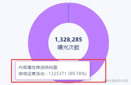
tooltip相关(如图红框圈的提示框)
1.基础:
show: true,
trigger: 'axis',
triggerOn: 'mousemove',
enterable: false,
showDelay: 20,
hideDelay: 100,
transitionDuration : 0.4,
borderRadius: 4,
backgroundColor: '#FFFFFF',
borderColor: '#333',
borderWidth: 0,
padding: 5,
textStyle: {
color: '#fff',
fontStyle: 'normal',
fontWeight: 'normal',
fontFamily: 'sans-serif',
fontSize: 14,
},
extraCssText: 'box-shadow: 0 0 3px rgba(0, 0, 0, 0.3);',
------------------------------------------------------------------------------------------
2.toolTip里展示数据处理或再插入一个图例:
1.展示数据处理(使用formatter)
formatter: "{a} <br/>{b} : {c} ({d}%)",
2.再插入一个图例
formatter: function(param) {
setTimeout(function() {
that.childRegByChart(param, "regChart");
}, 100);
var res = "<div style='width:320px;height:150px' id='regChart'></div>";
return res;
}
childRegByChart(param, ele) {
this.childrenData = [];
for (let i in name) {
this.childrenData.push({
value: name[i].data,
name: name[i].seriesName
});
}
var myChart = this.$echarts.init(document.getElementById(ele));
myChart.setOption({
里面正常设置图例的属性和数据
})
},
toolbox(如图圈起来的展示)
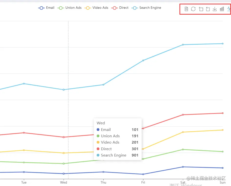
toolbox: { //可视化的工具箱
                show: true,
                feature: {
                    dataView: { //数据视图
                        show: true
                    },
                    restore: { //重置
                        show: true
                    },
                    dataZoom: { //数据缩放视图
                        show: true
                    },
                    saveAsImage: {//保存图片
                        show: true
                    },
                    magicType: {//动态类型切换
                        type: ['bar', 'line']
                    }
                }
            },
legend属性设置(如图圈起来的展示)
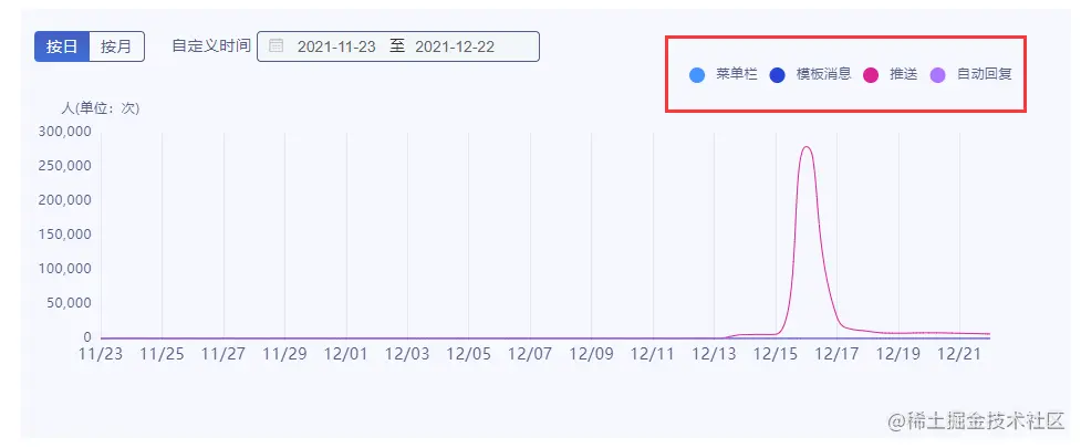
data:[],//数据
show: true, //是否显示
type: "plain", // 图例的类型 'plain':普通图例 'scroll':可滚动翻页的图例
zlevel: 1, // 所有图形的 zlevel 值。
icon: "circle",
top: "5%",
right: "5%",
width: "auto",
height: "auto",
orient: "horizontal",
align: "auto",
padding: 5,
itemWidth: 6,
itemGap: 20,
itemHeight: 14,
symbolKeepAspect: true,
legend.data.icon)是 path:
selectedMode: true,
inactiveColor: "#ccc",
textStyle: {
color: "#556677",
fontStyle: "normal",
fontWeight: "normal",
.........类似驼峰命名样式即可
rich: {
a: {
color: "red",
lineHeight: 10,
},
b: {
color: "#fff",
lineHeight: 10,
},
}
formatter: function (name) {
对图例特殊展示的处理,样式则会使用textSty的rich样式
最后返回格式
return name + "{"+rich的属性+"|"+值+"}",该值就会用到rich里面的样式
},
使用图例如下

grid(控制图表大小)
x: 80,
y: 60,
x2: 80,
y2: 60,
// width: {totalWidth} - x - x2,
// height: {totalHeight} - y - y2,
backgroundColor:
borderWidth: 1,
`borderColor:
...
//设置图例本身相关的,可以数值或百分比
xAxis,yAxis(坐标轴设置)
name:"坐标轴类别名"
position: 'bottom',
nameLocation: 'end',
boundaryGap: true,
nameTextStyle: {
color: "#505B85",
fontSize: 12
},
textStyle: {
color: "#505B85",
fontSize: 14
}
axisLine: {
show: true,
lineStyle: {
color: '#48b',
width: 2,
type: 'solid'
}
},
axisTick: {
show: true,
inside : false,
length :5,
lineStyle: {
color: '#333',
width: 1
}
},
axisLabel: {
show: true,
textStyle: {
color: '#333'
},
interval: (*index*, *value*) => {
*
if (value.indexOf("月") !== -1) return true;
return false;
},
},
splitLine: {
show: true,
lineStyle: {
color: ['#ccc'],
width: 1,
type: 'solid'
}
},
splitArea: {
show: false,
areaStyle: {
color: ['rgba(250,250,250,0.3)','rgba(200,200,200,0.3)']
}
}
series
name:"名称"
type:"pie"
data:[]
color: "#2B43DA",
此处还有许多属性,图形种类不同格式也不一样,具体还是看官方文档可能更清楚些。
遇到的一些还记得的问题
1.There is a chart instance already initialized on the dom.
原因:在vue中将echarts绑定到vue原型中,相当于在vue原型里封装了一个创建echarts方法,所以每次调用该方法时候创建的图表使用的dom节点都会是同一个,就会在控制台报警告。
解决:先调用`echarts.getInstanceByDom()`方法判断是否已经存在echarts实例,如果不存在再去初始化。
代码实现:
this.myChart = this.$echarts.getInstanceByDom(document.getElementById("drawLineContentTrendTwo"));
if (this.myChart == null) {
this.myChart = this.$echarts.init(document.getElementById("drawLineConten tTrendTwo"));
}
------------------------------------- -------------------------------------
2.echarts series not exists. Legend data should be same with series name or data name
原因:legend的name名称和series的的name值不匹配
解决:检查legend的data值与series的name匹配即可
------------------------------------- -------------------------------------
3.echarts注销
解决:this.myChart.clear();
------------------------------------- -------------------------------------
4.在vue里将echarts封装至组件在一个页面通过v-show显示隐藏多个,两个图标设置的样式属性会互相影响
解决:使用v-if;
5.Cannot read properties of null (reading 'getAttribute')
原因:在两个页面都有echarts实例时候,其中一个页面的数据接口没调通,实例还没有生成就切换了页面,导致生产 实例后找不到dom节点
解决:先判断页面是否存在该节点再选择将实例绑在dom上,例如
if (!this.$refs.drawLineContentTrend) {
return;
}


