vue3按钮组件的自定义封装
封装按钮组件 button.vue
<template>
  <button class="xtx-button ellipsis" :class="[size,type]">
    <slot />
  </button>
</template>
<script>
import Button from 'button.vue
export default {
  name: 'Button',
  props: {
    size: {
      type: String,
      default: 'middle'
    },
    type: {
      type: String,
      default: 'default'
    }
  }
}
</script>
<style scoped lang="less">
.xtx-button {
  appearance: none;
  border: none;
  outline: none;
  background: #fff;
  text-align: center;
  border: 1px solid transparent;
  border-radius: 4px;
  cursor: pointer;
}
.large {
  width: 240px;
  height: 50px;
  font-size: 16px;
}
.middle {
  width: 180px;
  height: 50px;
  font-size: 16px;
}
.small {
  width: 100px;
  height: 32px;
  font-size: 14px;
}
.mini {
  width: 60px;
  height: 32px;
  font-size: 14px;
}
.default {
  border-color: #e4e4e4;
  color: #666;
}
.primary {
  border-color:#27BA9B;;
  background: #27BA9B;;
  color: #fff;
}
.plain {
  border-color:#27BA9B;;
  color: #27BA9B;;
  background: lighten(#27BA9B;,50%);
}
.gray {
  border-color: #ccc;
  background: #ccc;;
  color: #fff;
}
</style>
封装组件的使用
<Button type="primary" style="margin-top:20px;">自定义按钮名字</Button>
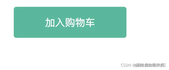
<Button type="primary" style="margin-top:20px;">加入购物车</Button>
实现效果


