如何让一个盒子水平垂直居中,我想大家都有自己的办法了,但是我还是想系统化的收集、比较和总结一下,以方便自己的学习,那让我们来交流讨论一下吧,如果错了的地方,欢迎大家指点,如果大家还有其他没有提到的方法欢迎在评论区教下我,谢谢!
首先,我们先弄一个父盒子和一个子盒子,然后给他们一宽度,高度,背景颜色来区分他们,like this:
<body>
    <div class="father">
      <div class="children"></div>
    </div>
</body>
<style>
    .father{
       width: 1000;
       height: 500;
       background-color: aquamarine;

    }
    .children{
       width: 100px;
       height: 200px;
       background-color: black;

    }
</style>
在页面中的效果like this:
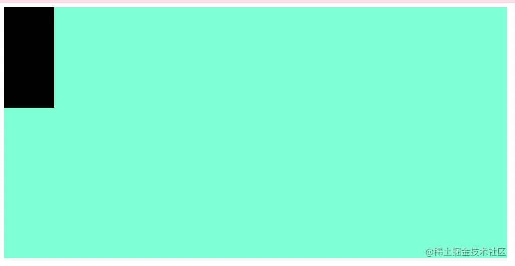
那现在我们的目的就是让这个黑div在这个蓝绿(我也不知道这是啥颜色)div里面水平垂直居中!
so,let's get it!
第一种方案:定位然后给子div left,top属性
我们给father加上一个position:relative(相对定位),然后给children加个一个position: absolute(绝对定位),简称父相子绝,这样我们通过调整children相对于father的位置即可做到水平垂直居中,代码如下:
<body>
    <div class="father">
      <div class="children"></div>
    </div>
</body>
<style>
    .father{
       height: 500px;
       width: 1000px;
       background-color: aquamarine;

       position: relative;
    }
    .children{
       width: 100px;
       height: 200px;
       background-color: black;

       position: absolute;
       top: 50%;
       left:50%;
    }
</style>
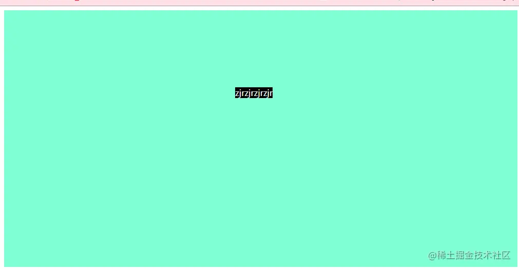
但是有个地方要注意一下,就是当给children加上top: 50%;left:50%;之后他的居中是相对于children左上角那个点的居中,但是不是children整体的居中,示意图如下:
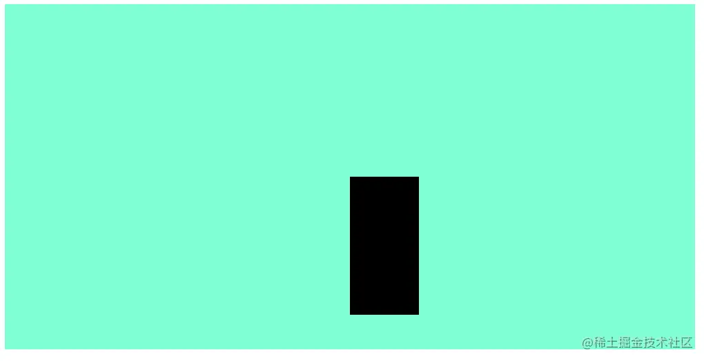
所以我们还需要做一下小调整,也就是把整个盒子往左上移动一点,具体就是往左边移动半个宽度,往上面移动半个高度!(这里是没有边框的情况,有边框的还要考虑边框的宽度)
那我们怎么移动呢?这里就有几种方法了
第一种:用margin-top和margin-top取赋值即可!也就是在children里面加个margin-top: -100px;margin-left: -50px;(高度的一半和宽度的一半!)
第二种:既然是移动,那么我们为啥不能用css3里面transform:translate()呢?所以我们就在children里面加个transform:translate(-50%,-50%);向左和向上都是负的,这个50%是相对于children的50%。
虽然这两种移动都能成功,但是如果仔细取对比一下,可以发现区别很大,区别如下:
1.margin-top和margin-left需要填盒子具体的负宽高/2,如果盒子的宽高变化的话,显然这个margin-top和margin-left里面的数字也要重新计算然后改变,就失去了灵活性!相比之下,transform:translate(-50%,-50%)是相对于children宽高百分比,是随着children宽高的变化而变化的,这样就不需要再去管chidren的宽高了!
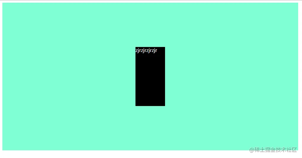
2.transform:translate(-50%,-50%)当盒子宽高没有时还是可以是的垂直水平居中生效!此时宽高就是div内部东西所占的宽高,如下图:
transform:translate(-50%,-50%);children有宽高:
transform:translate(-50%,-50%);children不设置宽高:
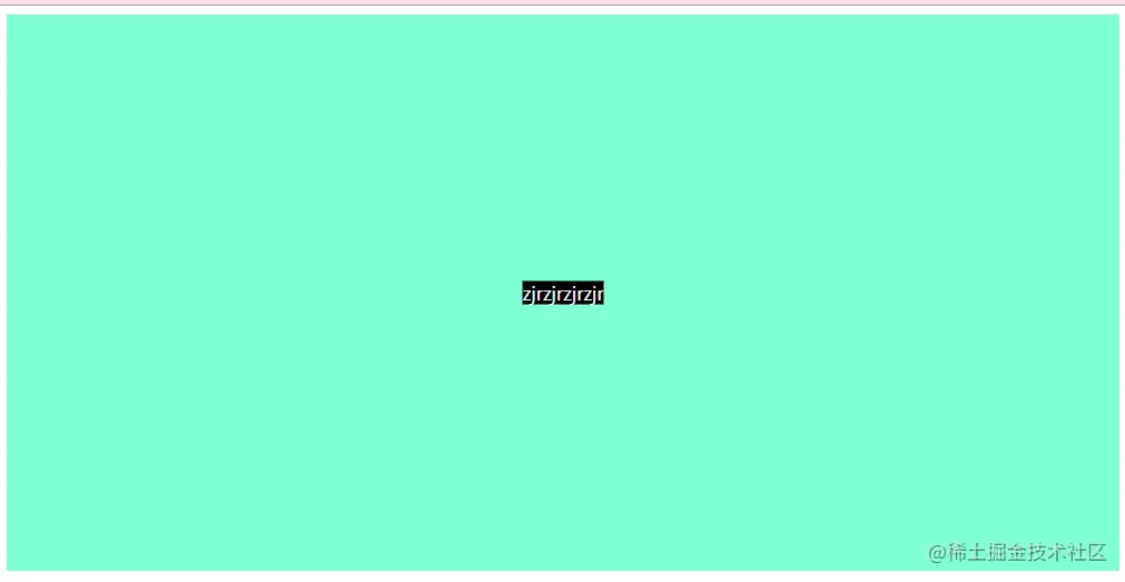
margin-top:-100px; margin-left: -50px children;不设置宽高( 明显歪了,因为不设置宽高之后,childre就是文字的宽高,但是margin-top:-100px; margin-left: -50px;显然不适配此时的宽高):
3.以上是定位后移动的两种方案,还有一种是定位之后用margin来定位,我们称他为第三种:同样还是先父相子绝定位,但是children里面直接用margin:auto来实现水平垂直居中,但是注意这里children里面要要top,left,right,bottom都为0(原因我也不清楚,自己的理解就是应该先把位置对应关系清掉再用margin来实现居中)children代码如下:
.children{
       width: 100px;
       height: 200px;
       background-color: black;
       color: aliceblue;

       position: absolute;
       top: 0;
       left:0;
       right: 0;
       bottom: 0;
       margin: auto;
    }
这种方法的优先就是也不要计算宽高了,直接用margin:auto就搞定,缺点就是:虽然不用管chidren宽高,但是children一定要有宽高!!!!,chidren没有宽高就会变成这样(直接占满father):
这就是使用定位方案实现水平垂直居中的三种办法,总的来说定位之后left:50%;top:50%之后再transform:translate(-50%,-50%)是最不需要宽高的,但是有可能带来不兼容的问题
第二种方案:display
4.现在我们来讲第四种方法了,它是基于display:flex(弹性伸缩盒模型)的方法,相对来说,代码就会少很多了。当给father一个display:flex(display 属性可以设置元素的内部和外部显示类型,flex是元素的内部显示类型,可以控制其子元素的布局)时,然后用justify-content来控制左右(水平)的布局,用align-items来控制上下(垂直)的布局即可。所以只要在father里面写下如下代码即可:
.father{
       height: 500px;
       width: 1000px;
       background-color: aquamarine;

       display: flex;
       justify-content: center;
       align-items: center;
    }
5.第五种是也是用display,但是使用另外一个属性display: table-cell;这相当于是对于行内元素的居中,所以children中需要加上display: inline-block属性;然后father中用vertical-align: middle;text-align: center;对children进行居中,代码如下:
<style>
.father{
height: 500px;
width: 1000px;
background-color: aquamarine;
display: table-cell;
vertical-align: middle;
text-align: center;
}
.children{
display: inline-block;
width: 100px;
height: 200px;
background-color: black;
color: aliceblue;
}
</style>
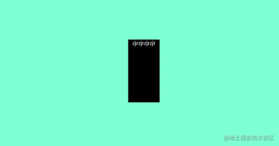
这种方法不仅仅children水平垂直居中了,连children里面的文字都跟着左右居中了!如图:
第三种方案:js
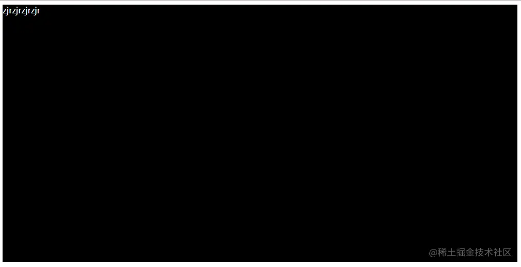
6.第六种方法是用js获取father div的宽高w1,h1、children div的宽高w2,h2,然后定位之后用top:(h1-h2)/2;left:(w1-w2)/2;代码如下:
<body>
    <div class="father" id="father">
      <div class="children" id="children">zjrzjrzjrzjr</div>
    </div>
</body>
<style>
    .father{
       height: 500px;
       width: 1000px;
       background-color: aquamarine;
       position: relative;
    }
    .children{
       width: 100px;
       height: 200px;
       background-color: black;
       color: aliceblue;
       position:absolute;
    }
</style>
<script>
    let father = document.getElementById('father');
    let children = document.getElementById('children');
    children.style.left=(father.offsetWidth-children.offsetWidth)/2+'px';
    children.style.top=(father.offsetHeight-children.offsetHeight)/2+'px';
</script>
写在最后:好累,写了好久,如果看了你对有一点点帮助的话点个赞再走吧哈哈哈!


