flex轮播
<template>
    <div class="visable-list">
        <div class="goods-list">
            <GoodsCard
                v-for="recommendProduct in recommendProductList"
                :key="recommendProduct.sku_id"
                class="slide-item"
                :pro-info="recommendProduct"
            />
        </div>
    </div>
</template>

<script>
import GoodsCard from '@/components/GoodsCard'
import { getMarketNewUserInfo } from '@/request/api/activity-list'
export default {
    components: {
        GoodsCard
    },
    data() {
        return {
            recommendProductList: []
        }
    },
    mounted() {
        this.getInfo()
    },
    methods: {
        async getInfo() {
            let [err, res] = await getMarketNewUserInfo({ adp: this.adp })
            this.recommendProductList = res.recommend_product_list
        }
    }
}
</script>

<style lang="scss" scoped>
.visable-list {
    width: 100%;
    overflow-x: auto;
    overflow-y: hidden;
    &::-webkit-scrollbar {
        display: none;
    }
    .goods-list {
        display: flex;
        flex-wrap: nowrap;
        ::v-deep .goods-card {
            flex-grow: 0;
            flex-shrink: 0;
            width: 276px;
            position: relative;
            margin-right: 16px;
        }
    }
}
</style>
flex轮播测试代码
<!DOCTYPE html>
<html lang="en">
<head>
  <meta charset="UTF-8">
  <meta http-equiv="X-UA-Compatible" content="IE=edge">
  <meta name="viewport" content="width=device-width, initial-scale=1.0">
  <title>Document</title>
  <style lang="scss">
    .wrapper{
      width: 100vw;
    }
    .content{
        display: flex;
        flex-wrap: nowrap;
        overflow-x: auto;
        overflow-y: hidden ;
      }
      .item{
        flex-grow: 0;
        flex-shrink: 0;
          width: 200px;
          height: 100px;
          margin-right: 16px;
          background-color: skyblue;
      }
  </style>
</head>
<body>
  <div class="wrapper">
    <div class="content">
      <div class="item">1</div>
      <div class="item">2</div>
      <div class="item">3</div>
      <div class="item">4</div>
      <div class="item">5</div>
    </div>
  </div>
</body>
</html>
原始轮播
<!DOCTYPE html>
<html lang="en">
<head>
  <meta charset="UTF-8">
  <meta http-equiv="X-UA-Compatible" content="IE=edge">
  <meta name="viewport" content="width=device-width, initial-scale=1.0">
  <title>Document</title>
  <style >
    .wrapper{
      width: 100vw; // 轮播的可是区域
      white-space:nowrap;  // 原生css实现,轮播,这里必须加 white-space:nowrap
    }
    .content{
        display: inline-block; // 必须加
        overflow-x: auto;
        overflow-y: hidden;
    }
    .item{
        display: inline-block;
        width: 200px;
        height: 100px;
        margin-right: 16px;
        background-color: skyblue;
    }
  </style>
</head>
<body>
  <div class="wrapper">
    <div class="content">
      <div class="item">1</div>
      <div class="item">2</div>
      <div class="item">3</div>
      <div class="item">4</div>
      <div class="item">5</div>
    </div>
  </div>
</body>
</html>
<!DOCTYPE html>
<html lang="en">
<head>
<meta charset="UTF-8">
<meta http-equiv="X-UA-Compatible" content="IE=edge">
<meta name="viewport" content="width=device-width, initial-scale=1.0">
<title>Document</title>
<style >
.wrapper{
width: 300px;
border: 5px solid red;
white-space:nowrap;
overflow-x: auto;
overflow-y: hidden;
}
.content{
display: inline-block;
&:last-child {
margin-right: 0;
}
}
.item{
display: inline-block;
width: 100px;
height: 100px;
margin-right: 16px;
background-color: skyblue;
}
</style>
</head>
<body>
<div class="wrapper">
<div class="content">
<div class="item">1</div>
<div class="item">2</div>
<div class="item">3</div>
<div class="item">4</div>
<div class="item">5</div>
</div>
</div>
</body>
</html>
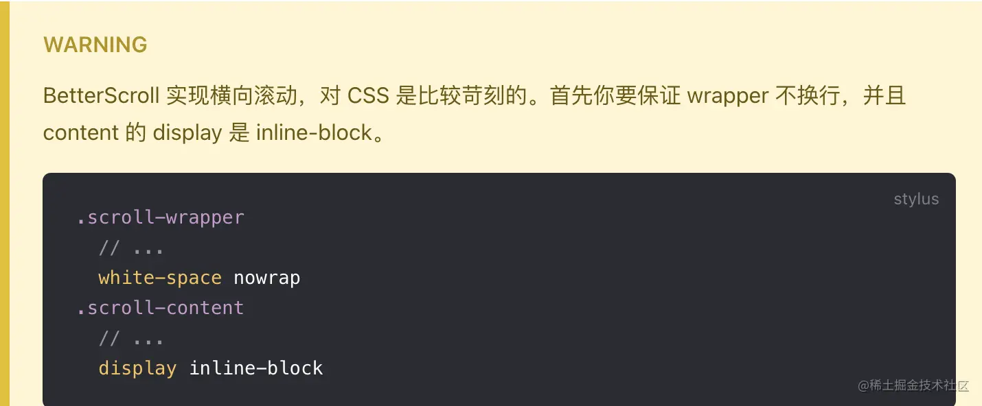
better-scroll
better-scroll.github.io/docs/zh-CN/…


