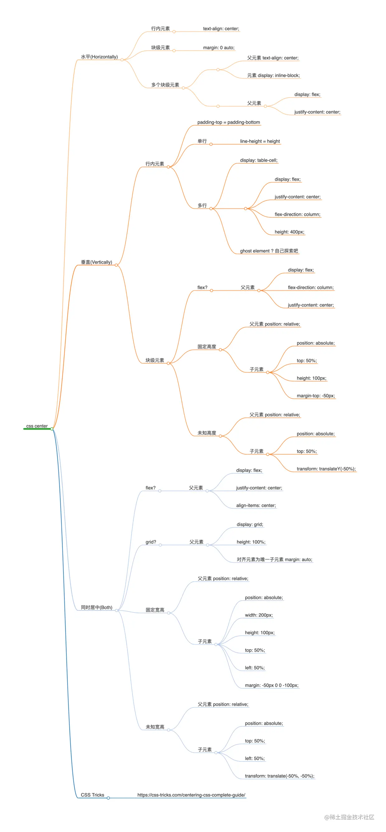
原生手写弹框-高度和宽度不固定随着屏幕大小变化
<!DOCTYPE html>
<html lang="en">
<head>
<meta charset="UTF-8">
<meta http-equiv="X-UA-Compatible" content="IE=edge">
<meta name="viewport" content="width=device-width, initial-scale=1.0">
<title>Document</title>
</head>
<style>
.dialog-Mask{
position: fixed;
display: none;
top: 0;
left: 0;
background-color: rgba(0, 0, 0, 0.2);
justify-content: center;
align-items: center;
width: 100%;
height: 100%;
}
.dialog-inner{
  position: relative;
  border: 1px solid #eee;
  width: 50%;
  height:50%;// 宽高不固定不成比列
}
.close{
position: absolute;
top: 0;
right: 0;
}
.dialog-content{
position: absolute;
top: 0;
bottom: 0;
left: 0;
right: 0;
display: flex;
justify-content: center;
align-items: center;
}
</style>
<body>
<button id="btn">
弹框
</button>
<div class="dialog-Mask">
<div class="dialog-inner">
<div class="dialog-content">居中</div>
<button class="close">x</button>
</div>
</div>
</body>
</html>
<script>
const btn = document.querySelector('#btn')
const close = document.querySelector('.close')
const dialogMask = document.querySelector('.dialog-Mask')
btn.addEventListener('click',function(){
dialogMask.style.display='flex'
})
close.addEventListener('click',function(){
dialogMask.style.display='none'
})
</script>
宽高不固定不成比例
.dialog-inner{
position: relative;
border: 1px solid #eee;
width: 50%;
height:50%;// 宽高不固定不成比列
}
宽高不固定且按一定的比例
.dialog-inner{
  position: relative;
  border: 1px solid #eee;
  width: 50%;
  padding-bottom: 20%; // 20% 是按照宽度的长度的20%-相当于w:h=5:2
}
css居中聚集