

莫与日常,通过vue3+css实现水波烟雾特效。
先看效果
实际操作
水波特效:
分析:大家应该都有打水漂的经历,石头落入水中,激起的涟漪一层层荡开。那如果我们要通过我们的css仿制这种特效,该怎么做呢?今天给大家介绍一下水波特效。
水波特效原理比较简单,先构建一个圆圈,添加阴影,然后添加动画,进行缩放由小到大。同时控制透明度,让其组件透明,这样就可以形成一个逐渐扩大最后消失的水波。
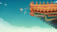
烟雾特效:
这里用的是相关图片进行平移动画完成。
/*
creator:lc
date: 2021/7/6 下午4:27
name: "login"
description:
*/
<template>
  <div id="waterBox" :style="{height: wrapHeight + 'px',backgroundImage: `url(${backSrc})`}"
       style="background-size: 100% 100%;background-position: center;text-align: center;" @click="clickWater">
    <div class="fontBox" style="display: flex;">
      <div class="font_1" style="margin-left: 40px">小荷才露尖尖角</div>
      <div class="font_2">早有蜻蜓立上头</div>
    </div>
<!--    按钮-->
    <div style="position: absolute;top: 30%;left: 59%;height: 30px;width: 30px" @click="login"></div>
  </div>
</template>

<script>
import {inject} from 'vue'
export default {
  name: 'login',
  setup () {
    let backSrc = require('../assets/bg.jpeg')
    let wrapHeight = inject('wrapHeight')
    let wrapWidth = inject('wrapWidth')
    // 点击水波特效
    const clickWater = (event) => {
      console.log(event)
      let water = document.createElement('div')
      let box = (document.getElementById('waterBox'))
      water.className = 'water'
      // water.setAttribute('class', 'water')
      box.appendChild(water)
      water.style.top = `${event.clientY}px`
      water.style.left = `${event.clientX}px`
      setTimeout(() => {
        box.removeChild(water)
      }, 2000)
    }
    //点击打开
    const login = () => {
      // if (document.getElementsByClassName('fog')) {
      //   return
      // }
      console.log('打开')
      const fog = document.createElement('div')
      let box = (document.getElementById('waterBox'))
      fog.className = 'fog'
      fog.style.height = '100%'
      fog.style.width = '100%'
      box.appendChild(fog)
    }
    return{
      backSrc,
      wrapWidth,
      wrapHeight,
      clickWater,
      login
    }
  }
}
</script>

<style scoped>
>>>.water{
  position: absolute;
  width: 50px;
  height: 50px;
  border-radius: 50%;
  margin-left: -25px;
  margin-top: -25px;
  box-shadow: 0 0 5px #999999;
  animation-name: waterDrop;
  animation-duration: 2s;
  transform: scale(0.1);
  animation-timing-function: linear;
}
>>>.water::before{
  content: '';
  position: absolute;
  width: 40px;
  height: 40px;
  border-radius: 50%;
  margin-left: -20px;
  margin-top: 5px;
  box-shadow: 0 0 5px #999999;
  transform: scale(0.1);
  animation-name: waterDrop;
  animation-duration: 1.75s;
  animation-delay: 0.25s;
  animation-timing-function: linear;
}
>>>.water::after{
  content: '';
  position: absolute;
  width: 20px;
  height: 20px;
  border-radius: 50%;
  margin-left: -10px;
  margin-top: 15px;
  box-shadow: 0 0 5px #999999;
  transform: scale(0.05);
  animation-name: waterDrop;
  animation-duration: 1.875s;
  animation-delay: 0.125s;
  animation-timing-function: linear;
}
>>>.fog{
  position: absolute;
  top: 0;
}
>>>.fog::after{
  content: url("../assets/fog.png");
  position: absolute;
  bottom: -30px;
  animation-name: fog;
  animation-duration: 10s;
  animation-timing-function: linear;
  animation-iteration-count: infinite;
  animation-direction: alternate-reverse;
}
>>>.fog::before{
  content: url("../assets/fog2.png");
  position: absolute;
  bottom: -30px;
  animation-name: fog; /* 动画名称 */
  animation-duration: 10s; /* 动画时长 */
  animation-delay: 2s; /* 动画延迟 */
  animation-timing-function: linear; /* 动画运行方式,线性运动*/
  animation-iteration-count: infinite; /* 动画执行次数,无穷次*/
  animation-direction: alternate; /* 运动完成后下一次的运行方向*/
}
@keyframes fog {
  0% {
    transform: translateX(-100%);
  }
  100%{
    transform: translateX(50%);
  }
}
  @keyframes waterDrop {
    0% {
      transform: scale(0.4);
    }
    20% {
      transform: scale(0.7);
      opacity: 0.8;
    }
    50% {
      transform: scale(1);
      opacity: 0.6;
    }
    70% {
      transform: scale(1.2);
      opacity: 0.3;
    }
    100% {
      transform: scale(1.5);
      opacity: 0;
    }
  }
</style>
最后希望大家越来越棒,加油秃头! :云雾链接
