

你对创建你自己的可主题的React组件库感兴趣吗?也许你想完全控制你的项目的调色板,并希望有大量不同的主题提供给你的用户。也许你只是一个业余爱好者,想锻炼一下自己的创意肌肉。无论你在哪个阵营,都可以在这篇文章中找到答案。
我们将为创建一个可扩展的、完全可定制的、有主题的React组件库打下基础。
对于我们的示例项目,我们将使用Tailwind CSS来为我们的组件做主题。如果你以前没有使用过Tailwind CSS,那么你就错过了。
Tailwind是由一大批实用的CSS类组成的。这意味着你不必编写任何CSS--你只需将适当的Tailwind类添加到你的HTML元素中,以应用所需的样式。边距、填充、背景颜色以及其他一切都只需要一个类。
将其与可重用的React组件结合起来,你就可以很好地创建一个可扩展的、有主题的库。
设置项目
让我们从创建我们的React项目开始。
$ yarn create react-app themed-react-project
$ cd themed-react-project
接下来,我们将按照官方文档的指示来设置Tailwind。首先,我们将安装Tailwind和它的同行依赖。
$ yarn add -D tailwindcss@npm:@tailwindcss/postcss7-compat postcss@^7 autoprefixer@^9
现在我们需要安装CRACO。
$ yarn add @craco/craco
在你的package.json 文件中,修改你的start,build, 和test 脚本,使用craco 而不是react-scripts 。
{
  /* ... */
  "scripts": {
      "start": "craco start",
      "build": "craco build",
      "test": "craco test",
      "eject": "react-scripts eject"
  },
  /* ... */
}
注意,我们在eject 脚本中没有使用CRACO。
在项目根目录下创建一个craco.config.js 文件,内容如下。
// craco.config.js
module.exports = {
  style: {
    postcss: {
      plugins: [
        require('tailwindcss'),
        require('autoprefixer'),
      ],
    },
  },
}
在项目根目录下创建一个tailwind.config.js 文件,其内容如下。
// tailwind.config.js
module.exports = {
  purge: ["./src/**/*.{js,jsx,ts,tsx}", "./public/index.html"],
  darkMode: false,
  theme: {
    extend: {},
  },
  variants: {
    extend: {},
  },
  plugins: [],
};
最后,用以下内容替换src/index.css ,这让Tailwind在构建时使用其样式。
// src/index.css
@tailwind base;
@tailwind components;
@tailwind utilities;
我们已经完成了所有的设置!现在让我们开始制作我们的主题。
用Tailwind编写主题
关于Tailwind最好的一点是它的可配置性。开箱后,它有一个巨大的调色板。不过,如果你要为你的网站创建主题组件,默认的调色板可能有点太多。
让我们一开始就定义三种颜色:主色、次色和一种文本颜色。我们可以通过改变我们的tailwind.config.js 文件来轻松做到这一点。
// tailwind.config.js
module.exports = {
  purge: ["./src/**/*.{js,jsx,ts,tsx}", "./public/index.html"],
  darkMode: false, // or 'media' or 'class'
  theme: {
    colors: {
      primary: "blue",
      secondary: "red",
      "text-base": "white",
    },
    extend: {},
  },
  variants: {
    extend: {},
  },
  plugins: [],
};
现在我们可以将这些颜色用于任何接受颜色的Tailwind工具类。让我们通过创建一个自定义按钮组件来测试一下我们的主题。
在src 文件夹中,创建一个名为components 的文件夹。现在在其中创建一个Button.js 文件。我们将使用我们在Tailwind配置中定义的颜色来定义背景和文本颜色。我们还将使用一些内置的Tailwind类来圆角,并为按钮添加一些填充。
// src/components/Button.js
const Button = ({ children, ...rest }) => {
  return (
    <button className="rounded-md bg-primary text-text-base px-3 py-1">
      {children}
    </button>
  );
};

export default Button;
请注意,我们在rest 变量中捕获任何额外的道具,然后将它们传递给基础HTMLbutton 组件。这是为了让我们可以定义任何典型的按钮行为,比如onClick 回调。
让我们到App.js ,测试一下我们的按钮。我们将删除模板代码,只添加我们创建的按钮。
// src/App.js
import Button from "./components/Button";
function App() {
  return (
    <div className="flex justify-center mt-5">
      <Button>Themed Button</Button>
    </div>
  );
}
export default App;
你应该看到我们的自定义按钮,其背景是我们的主色调!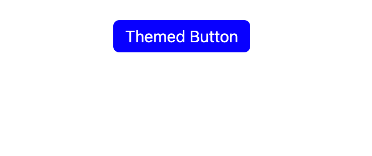
这是伟大的第一步,但我们的按钮并不是非常可定制的,因为我们把颜色硬编码为bg-primary 。如果我们想用我们的次要颜色作为背景呢?没问题--让我们把颜色作为一个道具传入,并使用字符串插值来动态地定义我们的按钮的颜色。
// src/components/Button.js
const Button = ({ children, color, ...rest }) => {
  return (
    <button className={`rounded-md bg-${color} text-text-base px-3 py-1`} {...rest}>
      {children}
    </button>
  );
};

Button.defaultProps = {
  color: "primary",
};
export default Button;
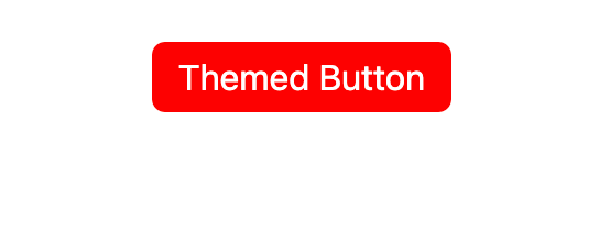
我们把默认颜色设置为原色,这样我们就不必每次都传入道具。让我们试着在App.js ,把颜色改成secondary ,以确保它的工作。
import Button from "./components/Button";
function App() {
  return (
    <div className="flex justify-center mt-5">
      <Button color="secondary">Themed Button</Button>
    </div>
  );
}
export default App;
这很好,但如果能强制执行我们传入的道具就更好了。这样一来,如果有人在color 道具上打错了字,控制台就会有一条警告信息,解释为什么组件的行为不符合预期。
在我们的components 文件夹中,让我们建立一个名为themeProps.js 的文件,在这里我们将定义所有主题组件所共有的道具。
// src/components/themeProps.js
import { oneOf } from "prop-types";
const props = {
  color: oneOf(["primary", "secondary"]),
};
export default props;
现在我们可以在我们的自定义Button 组件中使用themeProps 。
// src/components/Button.js
import themeProps from "./themeProps";
const Button = ({ children, color, ...rest }) => {
  return (
    <button className={`rounded-md bg-${color} text-text-base px-3 py-1`} {...rest}>
      {children}
    </button>
  );
};

Button.propTypes = {
  ...themeProps,
};

Button.defaultProps = {
  color: "primary",
};

export default Button;
有了我们的道具类型,让我们继续动态地定义我们的主题。
动态地定义主题
现在,我们在我们的Tailwind配置文件中定义了我们的主色、辅色和文本颜色。
我们可以在我们的Tailwind主题配置中定义任意多的颜色,但是我们有一个限制:我们挑选的颜色是硬编码到配置文件中的。如果我们想在运行时动态地切换主题呢?例如,如果我们有一个黑暗模式,而用户想在夜间以黑暗模式查看我们的网站,这就很有用。
与其直接在我们的Tailwind配置中硬编码我们的调色板,不如使用CSS变量来定义我们的颜色。然后,我们可以在运行时动态地改变这些变量的值,以便按照我们的意愿改变主题。改变你的tailwind.config.js 文件,使其看起来像这样。
// tailwind.config.js
module.exports = {
  purge: ["./src/**/*.{js,jsx,ts,tsx}", "./public/index.html"],
  darkMode: false, // or 'media' or 'class'
  theme: {
    colors: {
      primary: "var(--theme-primary)",
      secondary: "var(--theme-secondary)",
      "text-base": "var(--theme-text-base)",
    },
    extend: {},
  },
  variants: {
    extend: {},
  },
  plugins: [],
};
在我们的Tailwind配置文件中,我们正在使用三个名为--theme-primary 、--theme-secondary 和--theme-text-base 的变量。它们现在还没有被定义,所以让我们来解决这个问题。在你的React项目的src 文件夹中,创建一个名为themes 的新文件夹,并添加一个名为base.js 的文件。这将是我们的基础主题,以后我们可以根据需要添加其他主题。把这个放在你的base.js 文件中。
// src/themes/base.js
const baseTheme = {
 "--theme-primary": "blue",
 "--theme-secondary": "red",
 "--theme-text-base": "white"
};
export default baseTheme;
这就把我们的CSS变量的名称映射到我们希望与该变量相关联的颜色,但CSS变量本身仍然不会被定义。幸运的是,在JavaScript中设置CSS变量很容易,所以让我们做一个函数,接受一个主题对象,并用我们定义的值创建相应的CSS变量。
在你的themes 文件夹中创建一个utils.js 文件,并添加以下内容。
// src/themes/utils.js
export function applyTheme(theme) {
  const root = document.documentElement;
  Object.keys(theme).forEach((cssVar) => {
    root.style.setProperty(cssVar, theme[cssVar]);
  });
}
现在,让我们使用这个函数在我们的应用程序被安装时应用我们的基本主题。我们可以用useEffect钩子来做这件事。修改你的App.js 文件,看起来像这样。
import { useEffect } from "react";
import Button from "./components/Button";
import { applyTheme } from "./themes/utils";
import baseTheme from "./themes/base";

function App() {
  useEffect(() => {
    applyTheme(baseTheme);
  }, []);
  return (
    <div className="flex justify-center mt-5">
      <Button color="secondary">Themed Button</Button>
    </div>
  );
}

export default App;
在浏览器中,这个应用程序应该仍然是以前的样子。现在我们只有我们的基本主题,如果能创建一个黑暗主题就更好了。然而,在我们这样做之前,我们可以清理一下我们定义主题的方式。我们的base.js 主题文件直接将CSS变量名映射到颜色上,但如果能以一种更友好的方式定义我们的颜色就更好了。
让我们在我们的utils.js 文件中创建一个createTheme 函数,它将把primary 和secondary 这样的名字映射到我们决定使用的相应的CSS变量名。这是我们更新的utils.js 文件。
export function applyTheme(theme) {
  const root = document.documentElement;
  Object.keys(theme).forEach((cssVar) => {
    root.style.setProperty(cssVar, theme[cssVar]);
  });
}

export function createTheme({
  primary,
  secondary,
  textBase,
}) {
  return {
    "--theme-primary": primary,
    "--theme-secondary": secondary,
    "--theme-text-base": textBase,
  };
}
现在让我们调整一下我们的base.js 主题文件,以使用createTheme 函数。
import { createTheme } from "./utils";
const baseTheme = createTheme({
  primary: "blue",
  secondary: "red",
  textBase: "white",
});
export default baseTheme;
让我们在我们的themes 文件夹中创建一个dark.js 文件,使用相同的模式来定义一个黑暗主题。
import { createTheme } from "./utils";
const darkTheme = createTheme({
  primary: "#212529",
  secondary: "#343A40",
  textBase: "white",
});
export default darkTheme;
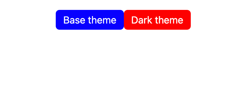
让我们修改App.js ,显示两个可以动态修改我们主题的按钮。
import { useEffect } from "react";
import Button from "./components/Button";
import { applyTheme } from "./themes/utils";
import baseTheme from "./themes/base";
import darkTheme from "./themes/dark";

function App() {
  useEffect(() => {
    applyTheme(baseTheme);
  }, []);
  return (
    <div className="flex justify-center mt-5">
      <Button onClick={() => applyTheme(baseTheme)}>Base theme</Button>
      <Button color="secondary" onClick={() => applyTheme(darkTheme)}>
        Dark theme
      </Button>
    </div>
  );
}

export default App;
首先你会看到我们的基本主题。
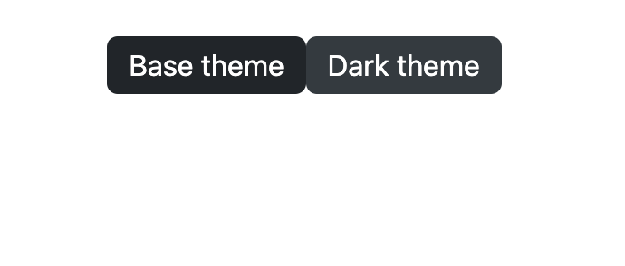
现在点击暗色主题按钮,你会看到它们的切换!
添加hover
我们可以添加任意多的主题和任意多的颜色,但我们的按钮还是有点无聊。它们总是同样的颜色--我们应该让它们在用户悬停在它们上面时变成浅色。
对我们来说,幸运的是,Tailwind让这一切变得超级简单。我们所要做的就是给任何我们只想在组件被悬停时应用的类添加一个hover: 前缀。
对于我们的黑暗主题和基本主题,让我们再定义两种颜色,当按钮被悬停时,将被应用:primary-light 和secondary-light 。让我们首先更新我们的tailwind.config.js 文件,以使用由CSS变量--theme-primary-light 和--theme-primary-dark 定义的这些颜色。
// tailwind.config.js
module.exports = {
  purge: ["./src/**/*.{js,jsx,ts,tsx}", "./public/index.html"],
  darkMode: false, // or 'media' or 'class'
  theme: {
    colors: {
      primary: "var(--theme-primary)",
      "primary-light": "var(--theme-primary-light)",
      secondary: "var(--theme-secondary)",
      "secondary-light": "var(--theme-secondary-light)",
      "text-base": "var(--theme-text-base)",
    },
    extend: {},
  },
  variants: {
    extend: {},
  },
  plugins: [],
};
接下来,在我们的主题utils.js 文件中,我们将更新我们的createTheme 函数来创建这些新变量。
// src/themes/utils.js
export function applyTheme(theme) {
  const root = document.documentElement;
  Object.keys(theme).forEach((cssVar) => {
    root.style.setProperty(cssVar, theme[cssVar]);
  });
}

export function createTheme({
  primary,
  primaryLight,
  secondary,
  secondaryLight,
  textBase,
}) {
  return {
    "--theme-primary": primary,
    "--theme-primary-light": primaryLight,
    "--theme-secondary": secondary,
    "--theme-secondary-light": secondaryLight,
    "--theme-text-base": textBase,
  };
}
现在让我们在我们的base.js 主题文件中定义主色和次色的浅色变体。
// src/themes/base.js
import { createTheme } from "./utils";

const baseTheme = createTheme({
  primary: "blue",
  primaryLight: "#4d4dff",
  secondary: "red",
  secondaryLight: "#ff4d4d",
  textBase: "white",
});

export default baseTheme;
现在,我们将为我们的深色主题做同样的事情。
// src/themes/dark.js
import { createTheme } from "./utils";

const darkTheme = createTheme({
  primary: "#212529",
  primaryLight: "#464f58",
  secondary: "#343A40",
  secondaryLight: "#737f8c",
  textBase: "white",
});

export default darkTheme;
最后,我们将把悬停变体应用于我们的按钮。记住,由于color 是作为一个道具传入的,我们可以使用字符串插值来动态地应用正确的悬停变体。
我们需要做的就是添加一个名为hover:bg-${color}-light 的类,然后根据道具的不同,它就会变成hover:bg-primary-light 或hover:bg-secondary-light 。
// src/components/Button.js
import themeProps from "./themeProps";

const Button = ({ children, color, ...rest }) => {
  return (
    <button
      className={`rounded-md bg-${color} hover:bg-${color}-light text-text-base px-3 py-1`}
      {...rest}
    >
      {children}
    </button>
  );
};

Button.propTypes = {
  ...themeProps,
};

Button.defaultProps = {
  color: "primary",
};
export default Button;
在你的浏览器中尝试一下,你会发现当你把鼠标悬停在按钮上时,你的按钮会改变颜色!
结论
我们只做了一个主题按钮组件,但我们可以用这里开始的代码轻松地创建一个巨大的主题组件阵列。
任何主题库都需要一个比我们在这个项目中定义的调色板大得多的颜色。然而,正如我们在添加主色和次色的变体时看到的那样,我们很容易根据需要为我们的主题添加更多的颜色。
关于完整的源代码,你可以在我的GitHub账户上访问它。
The postTheming React components with Tailwind CSSappeared first onLogRocket Blog.
