

这是我参与更文挑战的第5天,活动详情查看: 更文挑战
本文翻译自 Accompanist 官方文档 - Insets
目前有一个正在进行的 Jetpack Compose中文手册 项目,旨在帮助开发者更好的理解和掌握Compose框架,目前仍还在开荒中,欢迎大家进行关注与加入! 这篇文章由本人翻译撰写,目前已经发布到该手册中,欢迎进行查阅。
概述
Jetpack Compose 的 Insets 采用了 View 系统中 Insetter 组件库的设计理念,使其可以在 composables 中被使用。
用法
为了能在你的 composables 中使用 Insets , 你需要使用 ProvideWindowInsets 方法并将你的视图内容声明在尾部lambda中。这步操作通常要在你的composable层级的顶部附近进行。
setContent {
  MaterialTheme {
    ProvideWindowInsets {
      // your content
    }
  }
}
⚠️ 为了使你的 view 层级能够获取到 Insets, 你需要确保在你Activity中使用 WindowCompat.setDecorFitsSystemWindows(window, false)。如果你还想为你的系统状态栏设置颜色,可以使用Accompanist组件库提供的系统UI控制器组件来完成。
通过使用 ProvideWindowInsets 方法将允许本组件在 content 中设置一个 OnApplyWindowInsetsListener,这个Listener将会被用来更新 LocalWindowInsets 这个 CompositionLocal。
LocalWindowInsets 持有了一个 WindowInsets 实例,其中包含了各种 WindowInsets types 数值信息,例如状态栏、导航栏、输入法等。你通常可以像这样使用这些数值信息。
Composable
fun ImeAvoidingBox() {
    val insets = LocalWindowInsets.current
		// 切记,这些信息都是px单位,使用时要根据需求转换单位
    val imeBottom = with(LocalDensity.current) { insets.ime.bottom.toDp() }
    Box(Modifier.padding(bottom = imeBottom))
}
但是本组件同样也提供了一些易于使用的Modifier。
Modifiers
本组件提供了两种 Modifier 类型用于轻松适配特定 insets 的 padding 与 size.
Padding Modifier
使用 Padding Modifier 将允许为你的 composable 施加 padding 来适配一些特定的 insets,当前提供了如下几种扩展方法。
- Modifier.statusBarsPadding()
- Modifier.navigationBarsPadding()
- Modifier.systemBarsPadding()
- Modifier.imePadding()
- Modifier.navigationBarsWithImePadding()
这些方法通常会被用来将 composable 移出系统状态栏或导航栏等,FloatingActionButton 就是一个典型的例子,通常我们都希望将这个悬浮按钮移动至系统导航栏上方, 不希望被系统导航栏遮盖。
FloatingActionButton(
    onClick = { /* TODO */ },
    modifier = Modifier
        .align(Alignment.BottomEnd)
        .padding(16.dp) // normal 16dp of padding for FABs
        .navigationBarsPadding() // Move it out from under the nav bar
) {
    Icon(imageVector = Icons.Default.Add, contentDescription = null)
}
Size Modifier
通过 Size Modifier 将允许为你的 composable 施加 size 来适配一些特定的 Insets,当前提供了如下几种扩展方法。
我门通常可以让 composable 为系统栏提供背景,类似如下。
Spacer(
    Modifier
        .background(Color.Black.copy(alpha = 0.7f))
        .statusBarsHeight() // Match the height of the status bar
        .fillMaxWidth()
)
PaddingValues
Compose 提供了 PaddingValues 的理念,该数据类包含着所有要被施加的 padding 信息(类似于一个 Rect)。通常会被用于一些容器类型 composables,例如为 LazyColumn 设置内容 padding。
你可能需要使用某个具体 Inset 信息作为内容 padding,所以本组件提供了 rememberInsetsPaddingValues() 扩展方法用于将 Inset 转化为 PaddingValues,下面的例子中就获取了系统栏Inset信息。
LazyColumn(
    contentPadding = rememberInsetsPaddingValues(
        insets = LocalWindowInsets.current.systemBars,
        applyTop = true,
        applyBottom = true,
    )
) {
    // content
}
对于更复杂的场景,可以查阅例子 EdgeToEdgeLazyColumn
可感知 Inset 的 Layouts (insets-ui)
不幸的是,目前大多数 Compose 所提供的 Material 风格的 Layout 还不支持使用内容 padding,这意味着下面的代码可能不会产生与你的预期相同的结果。
// 😥 This likely doesn't do what you want
TopAppBar(
    // content
    modifier = Modifier.statusBarsPadding()
)
为了应对这种情况,我们提供了 insets-ui 这个兄弟组件库,其中包含了常用布局,并增加了一个名为 contentPadding 的参数。下面的例子就是为 TopAppBar 提供状态栏的Inset信息作为内容的 padding。
import com.google.accompanist.insets.ui.TopAppBar

TopAppBar(
    contentPadding = rememberInsetsPaddingValues(
        insets = LocalWindowInsets.current.statusBars,
        applyStart = true,
        applyTop = true,
        applyEnd = true,
    )
) {
    // content
}
这个兄弟组件库还提供了Scaffold的修改版,通过在content中绘制顶部和底部栏,更好地支持边靠边的布局。
Scaffold(
    topBar = {
        // We use TopAppBar from accompanist-insets-ui which allows us to provide
        // content padding matching the system bars insets.
        TopAppBar(
            title = { Text(stringResource(R.string.insets_title_list)) },
            backgroundColor = MaterialTheme.colors.surface.copy(alpha = 0.9f),
            contentPadding = rememberInsetsPaddingValues(
                LocalWindowInsets.current.statusBars,
                applyBottom = false,
            ),
        )
    },
    bottomBar = {
        // We add a spacer as a bottom bar, which is the same height as
        // the navigation bar
        Spacer(Modifier.navigationBarsHeight().fillMaxWidth())
    },
) { contentPadding ->
    // We apply the contentPadding passed to us from the Scaffold
    Box(Modifier.padding(contentPadding)) {
        // content
    }
}
有关库中提供的其他布局的列表,请参见 API 文档。
🚧试验性功能
接下来的功能还在试验中,需要开发者选择性使用。
Insets动画支持
功能介绍
本组件库当前试验性支持 WindowInsetsAnimations, 这将允许你的UI内容可以根据Insets动画发生改变,例如当软键盘弹出或关闭时, imePadding() 或 navigationBarsWithImePadding() 在这种场景下就可以被使用了。 在 API >= 21 的设备上,无论 WindowInsetsAnimationCompat 是否工作,在任意时刻都进行使用。
为了能够使用Insets动画,你需要一个使用 ProvideWindowInsets 的重载方法,并且设置 windowInsetsAnimationsEnabled = true
使用方法
ProvideWindowInsets(windowInsetsAnimationsEnabled = true) {
    // content
}
你能够像这样使用 navigationBarsWithImePadding()
OutlinedTextField(
    // other params,
    modifier = Modifier.navigationBarsWithImePadding()
)
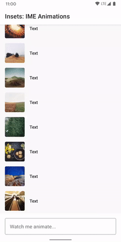
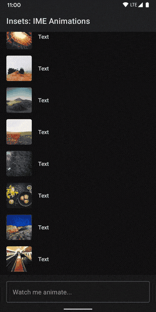
可以查阅例子 ImeAnimationSample
软键盘动画
功能介绍
如果你希望使用 Insets 动画支持软键盘动画,你需要确保在 AndroidManifest 清单中配置当前 Activity 的 windowSoftInputMode 属性为 adjustResize。
<activity
      android:name=".MyActivity"
      android:windowSoftInputMode="adjustResize">
</activity>
windowSoftInputMode 默认值应该也有效,但是Compose当前没有设置必要的标识 (详情看 这里)
本组件库已经支持通过手势操作来控制软键盘,这将允许你的可滚动的组件将软键盘拉进或拉出屏幕,对于这种嵌套手势滑动可以使用内置的 NestedScrollConnection 接口进行实现,本组件提供了 rememberImeNestedScrollConnection() 方法直接获取这种软键盘动画场景的嵌套手势滑动实现类。
⚠️ 此功能仅在 API >= 30 的设备上才能正常运行。
使用方法
// Here we're using ScrollableColumn, but it also works with LazyColumn, etc.
ScrollableColumn(
    // We use the nestedScroll modifier, passing in the
    // the connection from rememberImeNestedScrollConnection()
    modifier = Modifier.nestedScroll(
        connection = rememberImeNestedScrollConnection()
    )
) {
    // list content
}
可以查阅例子 ImeAnimationSample
配置Gradle依赖
repositories {
    mavenCentral()
}

dependencies {
    implementation "com.google.accompanist:accompanist-insets:<version>"
    // If using insets-ui
    implementation "com.google.accompanist:accompanist-insets-ui:<version>"
}
每个版本可以在 快照仓库 中被找到,每次提交时都会更新。
可能出现的问题
如果你发现运行时出现了一些问题,这里有一个错误清单可以查阅。
- 确保你在Activity中执行了
WindowCompat.setDecorFitsSystemWindows(window, false)。除非你这么做了,否则 DecorView 将消费这些insets,他们的信息不回被分配到 content 中。 - 如果有什么跟软键盘相关的操作,确保 AndroidManifest 清单中当前 Activity 的
windowSoftInputMode属性被设置为adjustResize。否则 IME 的可见性变化将不会作为Insets 变化而发送。 - 相似的,如果你设置 android:windowFullscreen 属性为 true (或使用了
.Fullscreen主题) 。当发现adjustResize没有正常工作,请 查阅文档 以了解替代方案。 - 如果你在视图系统的多个层级中(同时在Activity与其中的Fragment中) 使用了
ProvideWindowInsets(或 ViewWindowInsetObserver) ,你需要关闭 Insets 的消费。当执行ProvideWindowInsets(或 ViewWindowInsetObserver) 时会完全消费所有经过的 Insets。在Activity与其中的Fragment同时使用ProvideWindowInsets(或 ViewWindowInsetObserver) 时意味着Activity将获取到 Insets,但是Fragment将不回,为了禁用消费需要设置ProvideWindowInsets方法参数consumeWindowInsets = false或者使用ViewWindowInsetObserver.start()。
本文同步已发表于微信公众号,搜索
Jetpack Compose 博物馆即可关注
