

什么是BFC
BFC,全称Block Formatting Context,即块级格式化上下文。 由CSS2.1规范规定,是关于CSS渲染定位的一个概念。
要了解BFC,首先要了解一下什么是CSS中的Box(盒模型)。 盒模型时CSS技术所使用的一种思维模型,一个盒子为网页中的一个矩形区域。
盒的类型可以由display属性决定。
块盒(block box)
块级盒子有以下特性:
- 当元素的display为block,list-item或table时,它就是一个块级元素。
- 块级元素竖直排列。
- 参与块格式化上下文。
- 每个块级元素至少生成一个块级盒,称为主要块级盒。 一些元素,如
- ,生成额外的盒子来防止项目符号。
行内盒(inline box)
- 当display为inline,inline-block,inline-table时,称他为行内级元素。
- 视觉上他将内容与其他行内元素排列为多行。
- 行内级元素生成行内级盒,参与行内格式化上下文。
- 不参与生成行内格式化上下文的行内级盒成为原子行内级盒。
匿名盒(anonymous box)
匿名盒也有份匿名块盒与匿名行内盒,因为匿名盒没有名字,不能利用选择器来选择它们,所以它们的所有属性都为inherit或初始默认值;
BFC特性
BFC是一个独立的布局环境,其中的元素布局是不受外界的影响,并且在一个BFC中,块盒与行盒(行盒由一行中所有的内联元素所组成) 都会垂直的沿着其父元素的边框排列。
BFC的布局规则
- BFC内部的元素会垂直排列
- 属于同一个BFC的两个相邻Box的margin会发生重叠
- BFC的区域不会与float box重叠
- BFC就是页面上的一个隔离的独立容器,容器里面的子元素不会影响到外面的元素。反之也如此
- 计算BFC的高度时,浮动元素也参与计算
如何创建BFC
float的值不是noneposition的值不是static或者relativedisplay的值是inline-block、table-cell、flex、table-caption或者inline-flexoverflow的值不是visible
BFC的作用
- 避免margin重叠
<!DOCTYPE html>
<html>
	<head>
		<meta charset="utf-8">
		<title></title>
	</head>
	<body>
		<p style="background: grey;">我的margin是多少</p>
		<p style="background-color: cadetblue">我的margin是多少</p>
	</body>
	<style type="text/css">
		p{
			width: 200px;
			height: 150px;
			margin: 20px;
		}
	</style>
</html>
此时由于两个p元素处于同一个BFC(即body中),会发生margin重叠,效果如下:
因为此时两个p元素处在同一个BFC中,所以只要再让一个p元素处在另一个BFC中,就可以解决margin重叠的问题。如下
<!DOCTYPE html>
<html>
	<head>
		<meta charset="utf-8">
		<title></title>
	</head>
	<body>
                <div>
                    <p style="background: grey;">我的margin是多少</p>
                </div>
		<p style="background-color: cadetblue">我的margin是多少</p>
	</body>
	<style type="text/css">
		p{
			width: 200px;
			height: 150px;
			margin: 20px;
		}
		div{
			display: inline-block;
		}
	</style>
</html>
给下面的p元素套上一个div,并且将该div变成BFC,此时可以看到margin不会重叠了
- 避免高度塌陷
对于高度由子元素撑起的父盒子,如果子元素是浮动的,那么父元素会发生高度塌陷
例如:
<!DOCTYPE html>
<html>
	<head>
		<meta charset="utf-8">
		<title></title>
	</head>
	<body>
		<div class="father">
			<div class="son"></div>
			<div class="son"></div>
			<div class="son"></div>
		</div>
	</body>
	<style type="text/css">
		.father{
			width: 300px;
			background: #46BD87;
			min-height: 10px;
		}
		.son{
			width: 50px;
			height: 50px;
			margin: 10px;
			float: left;
			background: palevioletred;
		}
	</style>
</html>
此时由于子元素全部浮动,父元素没有设置高度,会出现子元素无法撑起父元素的高度,即
高度塌陷。为了更直观一点,我给父元素设置了最小高度。
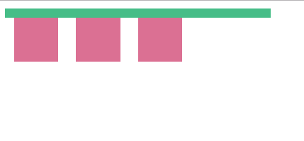
利用BFC解决:
<!DOCTYPE html>
<html>
	<head>
		<meta charset="utf-8">
		<title></title>
	</head>
	<body>
		<div class="father">
			<div class="son"></div>
			<div class="son"></div>
			<div class="son"></div>
		</div>
	</body>
	<style type="text/css">
		.father{
			width: 300px;
			background: #46BD87;
			min-height: 10px;
			overflow: hidden;
		}
		.son{
			width: 50px;
			height: 50px;
			margin: 10px;
			float: left;
			background: palevioletred;
		}
	</style>
</html>
此时将父盒子变成了一个BFC,BFC的特性就是浮动元素也会参与到高度计算内,因此解决了高度塌陷的问题
- 阻止元素被浮动元素覆盖
<html>
	<head>
		<meta charset="utf-8">
		<title></title>
	</head>
	<body>
	    <div class="float"></div>
		<div class="father">
			<div class="son"></div>
		</div>

	</body>
	<style type="text/css">
		.float{
			float: left;
			width: 100px;
			height: 100px;
			background: #282C34;
		}
		.father{
			width: 300px;
			height: 300px;
			background: #46BD87;
		}
		.son{
			width: 50px;
			height: 50px;
			background: #5D82A6;
			float: left;
		}
	</style>
</html>
此时float元素浮动,脱离了文档流,会将father元素覆盖,而father元素内部的浮动元素的位置与会被float挤占
解决方法:将father变成BFC
<html>
	<head>
		<meta charset="utf-8">
		<title></title>
	</head>
	<body>
	    <div class="float"></div>
		<div class="father">
			<div class="son"></div>
		</div>

	</body>
	<style type="text/css">
		.float{
			float: left;
			width: 100px;
			height: 100px;
			background: #282C34;
		}
		.father{
			width: 300px;
			height: 300px;
			background: #46BD87;
			overflow:hidden;
		}
		.son{
			width: 50px;
			height: 50px;
			background: #5D82A6;
			float: left;
		}
	</style>
</html>
此时father框就不会与浮动元素发生重叠了,其内部也不会受到外部影响(BFC内部是一个独立的布局)
