1.安装postcss-pxtorem
npm install postcss-pxtorem -D
2.在项目根目录创建postcss.config.js文件
写入如下内容
module.exports = {
plugins: {
'autoprefixer': {},
'postcss-pxtorem': {
'rootValue': 10,
propList: ['*']
}
}
}
3.动态改变根元素的fontSize大小(卸载main.js中即可)
function resizeCount() {
const baseConstn = 192
const nowWidth = document.documentElement.clientWidth
const nowCount = nowWidth / baseConstn
document.querySelector('html').style.fontSize = nowCount + 'px'
}
resizeCount()
window.addEventListener('resize', () => {
resizeCount()
})
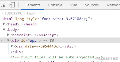
4.打开页面,查看html元素是否随窗口宽度变化而变化
5.参考链接
https:


