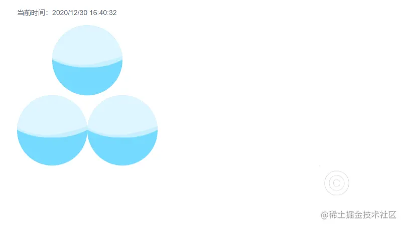
效果:
html:
<template>
<div class="timer-page">
<p>当前时间:{{timeFormat()}}</p>
<div class="wave-container">
<div class="circle circle-1"></div>
<div class="circle circle-2 fl"></div>
<div class="circle circle-3 fl"></div>
</div>
<div class="animate wave1">
<div class="w1"></div>
<div class="w2"></div>
<div class="w3"></div>
<div class="w4"></div>
</div>
</div>
</template>
js:
<script>
export default {
name: "timer",
data() {
return {
date: new Date(),
timer: null
}
},
mounted() {
this.timer = setInterval(() => {
this.date = new Date();
}, 1000)
},
destroyed() {
if (this.timer) {
clearInterval(this.timer)
}
},
methods: {
setZero(a) {
return a < 10 ? `0${a}` : a;
},
timeFormat() {
let year = this.date.getFullYear();
let month = this.setZero(this.date.getMonth() + 1);
let date = this.setZero(this.date.getDate());
let hour = this.setZero(this.date.getHours());
let minute = this.setZero(this.date.getMinutes());
let second = this.setZero(this.date.getSeconds());
return `${year}/${month}/${date} ${hour}:${minute}:${second}`
},
},
}
</script>
less:
<style lang="less" scoped>
    @keyframes wave {
        50% {
            transform: translate(-50%, -73%) rotate(180deg);
        }
        100% {
            transform: translate(-50%, -70%) rotate(360deg);
        }
    }

    @keyframes wave1 {
        from {
            width: 0;
            height: 0;
            top: 50%;
            left: 50%;
        }
        to {
            width: 100%;
            height: 100%;
            top: 0;
            left: 0;
        }
    }

    .timer-page {
        margin-left: 100px;

        p {
            font-size: 20px;
            line-height: 72px;
        }

        .wave-container {
            width: 400px;
            height: 400px;

            .circle {
                width: 200px;
                height: 200px;
                background-color: rgb(118, 218, 255);
                border-radius: 50%;
                position: relative;
                overflow: hidden;

                &:before, &:after {
                    content: '';
                    position: absolute;
                    width: 400px;
                    height: 400px;
                    border-radius: 45%;
                    left: 50%;
                    background-color: rgba(255, 255, 255, .4);
                    transform: translate(-50%, -70%) rotate(0);
                    animation: wave 6s linear infinite;
                }

                &:after {
                    border-radius: 47%;
                    background-color: rgba(255, 255, 255, .6);
                    animation: wave 6s linear 5s infinite;
                }
            }

            .circle-1 {
                margin: 0 auto;
            }
        }

        .wave1 {
            width: 100px;
            height: 100px;
            margin: 0 auto;
            position: relative;

            div {
                position: absolute;
                border: 1px solid #ccc;
                border-radius: 50%;
                animation: wave1 4s linear infinite;
            }

            .w2 {
                animation-delay: 1s;
            }

            .w3 {
                animation-delay: 2s;
            }

            .w4 {
                animation-delay: 3s;
            }
        }
    }
</style>


